, 4 tweets, 2 min read Read on Twitter
I now have enough data in my Nouveau Power map to begin experimenting with network analysis metrics to start telling the story behind the data… kumu.io/steveparks/nou…
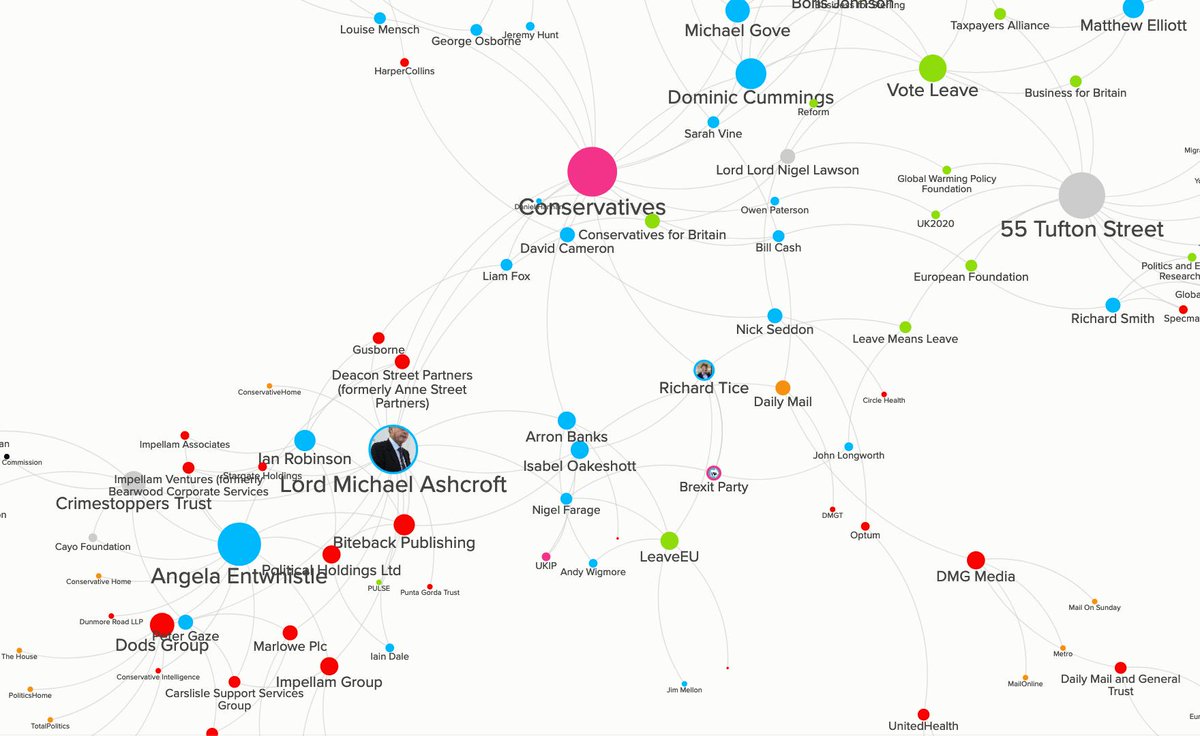
I’m starting with the simplest approach possible - just colouring each type of entity, and sizing based on degree of connectedness. Now as I put more data in I can monitor how the story of the map evolves and extend the analysis as necessary
There’s still plenty more data to add, but it’s amazing how stories are already making themselves clear… look at the connections between the Conservatives and the cluster of far right campaign groups at 55 Tufton Street for example… or Lord Ashcroft’s sphere of influence
If you’re interested to know more, I blogged last week with a bit of background on this project… steveparks.co.uk/mapping-the-no…
Missing some Tweet in this thread?
You can try to force a refresh.

Like this thread? Get email updates or save it to PDF!

Subscribe to Steve Parks
Profile picture

Get real-time email alerts when new unrolls are available from this author!

This content may be removed anytime!

Twitter may remove this content at anytime, convert it as a PDF, save and print for later use!

Try unrolling a thread yourself!

how to unroll video

1) Follow Thread Reader App on Twitter so you can easily mention us!

2) Go to a Twitter thread (series of Tweets by the same owner) and mention us with a keyword "unroll" @threadreaderapp unroll

You can practice here first or read more on our help page!

Follow Us on Twitter!

Did Thread Reader help you today?

Support us! We are indie developers!


This site is made by just three indie developers on a laptop doing marketing, support and development! Read more about the story.

Become a Premium Member ($3.00/month or $30.00/year) and get exclusive features!

Become Premium

Too expensive? Make a small donation by buying us coffee ($5) or help with server cost ($10)

Donate via Paypal Become our Patreon

Thank you for your support!