,
21 tweets,
7 min read
Read on Twitter
Latest income distribution, poverty and health insurance coverage numbers have just been released by the Census Bureau. Follow along as I dig into the numbers.
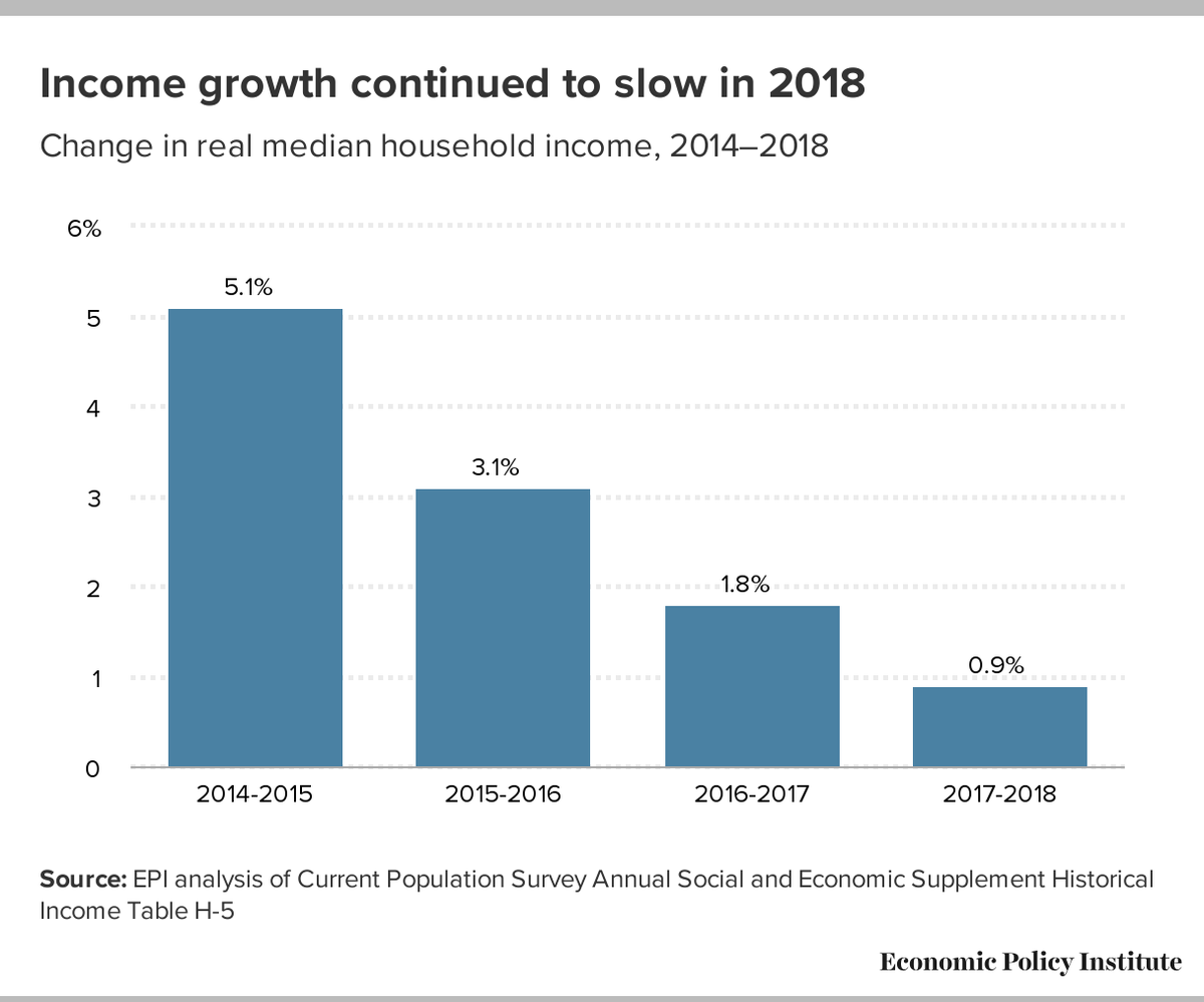
Median household income (adjusted for inflation) is up only a tick, suggesting that the ongoing economic expansion still isn't delivering much for the middle class.
Over the longer run, the failure of median household income to rise over the past two decades is disappointing.
Over the longer run, the failure of median household income to rise over the past two decades is disappointing.

The official poverty rate is down again this year -- by a solid 0.5 percentage points. It's a robust reminder that the most effective anti-poverty program we have is a robust macroeconomy with low unemployment.

The Census Bureau has done some nifty work, allowing us to better compare household income over time. And it tells a pretty darn depressing story: Median household income today is right where it was in 1999.
Two decades with no progress for the middle class.
Two decades with no progress for the middle class.

Latest measures of the distribution of income, y'all:
- The top fifth got more income than the other four-fifths combined: 52% of total income
- To two-fifths combined got 75% of all income, leaving a much smaller slice for the rest.
- The top fifth got more income than the other four-fifths combined: 52% of total income
- To two-fifths combined got 75% of all income, leaving a much smaller slice for the rest.

And within that rich top 20%?
Well, the top 5% of the income distribution took home 23% of all income.
If you want to know about the top 1% share, I'm afraid these data don't have enough detail on the top end. For that, you'll need the Saez et al data from the IRS stats.
Well, the top 5% of the income distribution took home 23% of all income.
If you want to know about the top 1% share, I'm afraid these data don't have enough detail on the top end. For that, you'll need the Saez et al data from the IRS stats.

I'm not a huge fan of using the Gini index to summarize inequality (I don't find it particularly interpretable), but I know others disagree. So here it is:
The Gini index is down a tick from last year, but likely still near the highest it's been in more than fifty years.
The Gini index is down a tick from last year, but likely still near the highest it's been in more than fifty years.

Latest gender wage gap data:
- Earnings rose last year for men and women in roughly equal measure, so the gap is unchanged.
- After many decades of rapid closing, further gains slowed starting around 2000.
- Women earn, on average, 82 cents for each dollar earned by men.
- Earnings rose last year for men and women in roughly equal measure, so the gap is unchanged.
- After many decades of rapid closing, further gains slowed starting around 2000.
- Women earn, on average, 82 cents for each dollar earned by men.

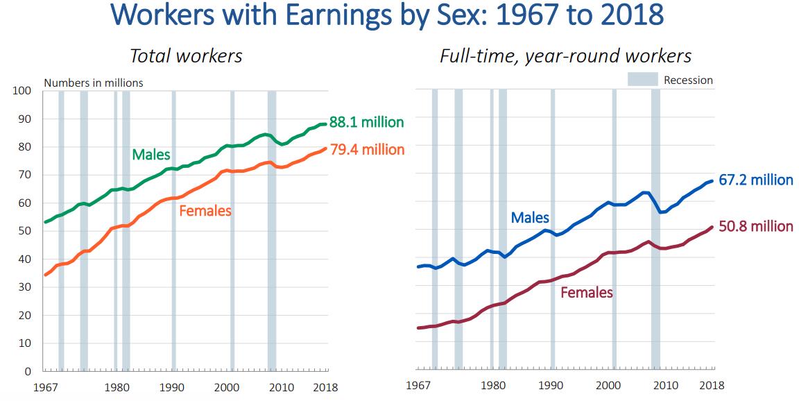
Gender differences aren't just about wage rates among workers, but there are also differences in how many men and women are working. The long-run trend toward more women in the workforce is continuing...
Alright, let's return to poverty.
Don't forget the absolute magnitude: Around 1 in 8 Americans lives below the (meager) poverty line.
Compared with past years, the poverty rate is currently relatively low -- though not surprisingly low given the current unemployment rate.
Don't forget the absolute magnitude: Around 1 in 8 Americans lives below the (meager) poverty line.
Compared with past years, the poverty rate is currently relatively low -- though not surprisingly low given the current unemployment rate.

You know that expression "a rising tide lifts all boats"? It's really about how a strong economy helps those who need it most, including those in poverty, and historically-disadvantaged groups.

But childhood poverty remains a serious problem. In 2018, 16.2% of kids lived in a household that was in poverty. That compares to 10.7% for adults aged 18-64, and 9.7% for the elderly (thank you, social security!)

All of these numbers are based on the "official poverty rate." But there are a raft of problems with this measure, which was invented over 50 years ago. The Census Bureau has a more modern measure, and it confirms that poverty is falling, but not quite as rapidly.

And if you want to know the effect of the safety net in keeping people out of poverty, this chart tells a pretty amazing story: It works.

Finally, health insurance coverage. These data list the number of people who were uninsured throughout the entire year. (You get higher numbers if you analyze who was uninsured at any given point in time.)

The share of the population who were uninsured rose from 8% to 8.5%, a notable increase. And it's partly due to a drop in Medicaid, and partly due to a drop in private coverage.
THIS IS THE FIRST YEAR-TO-YEAR INCREASE SINCE 2008-09.
THIS IS THE FIRST YEAR-TO-YEAR INCREASE SINCE 2008-09.

I may add more as I dig into these numbers through the day, but wanted to end with three big headlines:
1. Real median household income today is the same as it was in 1999.
2. Poverty rates continue to decline.
3. The share who are uninsured rose for the first time in a decade.
1. Real median household income today is the same as it was in 1999.
2. Poverty rates continue to decline.
3. The share who are uninsured rose for the first time in a decade.
And my favorite part of the briefing that the @uscensusbureau provided was the staffer who smiled kindly and said unironically:
"Policy makers use this information to make data-driven decisions."
"Policy makers use this information to make data-driven decisions."
@uscensusbureau And do yourself a favor: Dig into these numbers yourself, and learn about the full distribution of the economic lives of your fellow citizens. Tables are here: census.gov/library/public…
@uscensusbureau My students find it revealing to learn the income distribution:
Last year, 10% of American households got by with income of <$14,600
20% got <$25,600
30% got <$37,000
40% got <$50,000
50% got <$63,200
60% got <$79,500
70% got <$100k
80% got <$130k
90% got <$185k
95% got <$249k
Last year, 10% of American households got by with income of <$14,600
20% got <$25,600
30% got <$37,000
40% got <$50,000
50% got <$63,200
60% got <$79,500
70% got <$100k
80% got <$130k
90% got <$185k
95% got <$249k
@uscensusbureau My advice: Next time you describe folks as "middle class," make sure you take a look at these numbers to see whether your perceptions fit the facts.