
,
39 tweets,
9 min read
Read on Twitter
so Seattle, a profoundly unfashionable city (in terms of clothes, that is--moving here is apparently very fashionable PLEASE STOP BEFORE WE TURN INTO SAN FRANCISCO) recently had two museums do fashion exhibits and I went to them both and let's talk about user experience
Okay, so the first was the Alexander McQueen exhibit at MoPOP. mopop.org/about-mopop/th…
This was a traveling exhibit, and it looked *expensive.* 
I went with a friend who's a curator, and she said when you're writing text, you're supposed to assume an 8th grade reading level. I've worked in games long enough to have seen a lot of research about how much text people will read on a screen, and have a hunch a wall is similar.
So the McQueen exhibit was divided up into archetypes of queens/women.
This... is way too much text. (Why isn't the list of symbols *visuals* rather than just paragraphs of text?)
This... is way too much text. (Why isn't the list of symbols *visuals* rather than just paragraphs of text?)

More to the point, these archetypes were very high-falutin', but they didn't actually feel like logical conceptual categories for what you were seeing. I couldn't come up with reasons why most of the pieces were in one category rather than another they'd make as much sense in.

There wasn't anything in the exhibit to suggest that McQueen or the other designers had these archetypes in mind for the pieces when they were designing them--this was a weird, complex, and top-heavy framework imposed on a collection of clothes.
(Much to the horror of my curator friend, you could get close enough to reach out and touch a lot of the clothes. Finger oils, tugging, dirt--definitely what you want with your valuable textiles.)

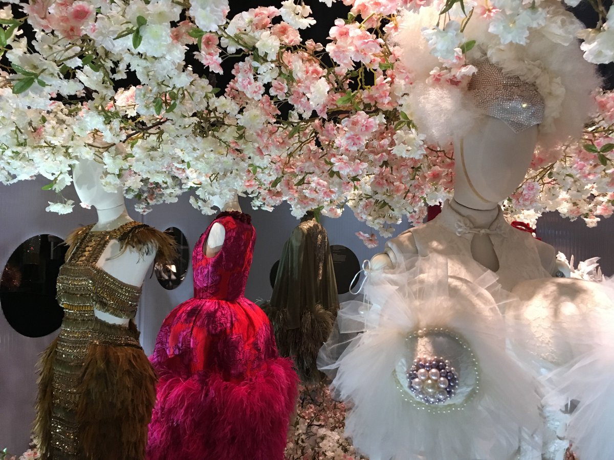
One of my biggest frustrations was just how *cluttered* the displays were. They felt like department store window displays from the 80s--designed to catch attention.
But the exhibit already has my attention. I've already paid and am inside. I want to *learn about stuff.*
But the exhibit already has my attention. I've already paid and am inside. I want to *learn about stuff.*

These cherry blossoms inside a giant box you can only see into through round portholes are certainly PRETTY, but I'm having trouble seeing the hats/headdresses. This would be a cool Vogue shoot, but again, *this is a museum.*
I want to be able to *see* the clothes.
I want to be able to *see* the clothes.

(There also wasn't a discernible flow to how you were
supposed to proceed through the exhibit. And things were weirdly broken up. I'm not even sure which archetype this display was supposed to go with.
supposed to proceed through the exhibit. And things were weirdly broken up. I'm not even sure which archetype this display was supposed to go with.

In the entire exhibit, this was probably the best part. I can actually *see* the clothes (although the lighting isn't great, the mannequins on the end at least had mirrors behind them so you could see the entire dress), I can compare them to each other, etc.

But, like, okay, let's back up. This exhibit contained a LOT of information about a subject that's pretty arcane to your average person--high-end, sort of avant-garde fashion.
Like any art form, fashion is in dialogue with its history, its canon.
Like any art form, fashion is in dialogue with its history, its canon.
And high fashion's history and trends and tropes are less accessible to most people than many art forms'. We read Shakespeare in middle and high school. We don't study fashion.
So to most people, the vocabulary here is a completely foreign language.
So to most people, the vocabulary here is a completely foreign language.
And so this stuff tends to look outlandish, bizarre, nonsensical.
E.g. if you don't know what makes a kimono a kimono, and you don't know how and where and when kimonos were worn and what they *mean,* a deconstructed kimono is just going to look... strange.
E.g. if you don't know what makes a kimono a kimono, and you don't know how and where and when kimonos were worn and what they *mean,* a deconstructed kimono is just going to look... strange.
You won't understand what it's *saying,* what it's commenting on, etc.
And in a museum exhibit about fashion, you're not just there to look at clothes. You can do that on the internet. You're there to have someone curate and guide your looking, to put it in context, to connect dots for you and translate that vocabulary.
That's why, like any good user interface, museum exhibits usually have a set order in which you're supposed to see things. They don't just stick everything in a big room and send you in there to wander around. They control the way in which you see. They create a *narrative.*
Narrative is vital here because that's how we learn. We have a lot of trouble absorbing and retaining information that doesn't fit into a story.
So a bit part of teaching, of curating information, is deciding what that narrative is and choosing information that fits it.
So a bit part of teaching, of curating information, is deciding what that narrative is and choosing information that fits it.
(There's obviously a dark side to this, but on its face, here, I'm not talking about the ominous side of choosing information that fits. I'm just saying curation is vital to teaching. Good teachers provide pointers to information left out so learners can further explore.)
In this case, there wasn't really a narrative. There were these archetypes, but they didn't help show what McQueen and the other designers were actually trying to *say* with this stuff, what they were commenting on, etc.
Like, look, if what you want is to see interesting McQueen clothes, you can just google that.
It was so top-heavy it felt like it was more about showing off the work of the display designers than the clothes themselves.
It was so top-heavy it felt like it was more about showing off the work of the display designers than the clothes themselves.
And that's the opposite of good UX design. Good UX here would have been that we didn't *notice* the work of the people who designed the display. It's supposed to help us see and appreciate the actual subject of the exhibit: the clothes.
The clothes almost seemed to be secondary.
And you can tell because it looks like very little attention was given to the mannequins themselves--they weren't built out to fit the clothes.
And you can tell because it looks like very little attention was given to the mannequins themselves--they weren't built out to fit the clothes.
Here's the cool thing that I learned from my curator friend about building out mannequins: when you do it right, you get to see the ghost of the person who wore the clothing.
She can build out a mannequin to fit a dress and learn, in doing it, that the Victorian woman who wore this dress had one hip higher than the other, that this dress was designed for a young girl because there's no actual room in it for breasts, though it's padded to create them.
(She was the one who taught me about conservation bias. You know how supposedly old-timey people were all super-small and skinny because all the clothes we have left are tiny? Yeah, that's because larger clothes got remade into other things.)
But more to the point, just like tailored clothes on actual bodies look better, tailored *mannequins* make clothes look better.
Take a look at the red dress in this photo.
Take a look at the red dress in this photo.

I should have gotten a picture from the front, too, because the mannequin wasn't fitted to it. Look at the gaping armholes. The front was kind of baggy. It's not being shown as its best.
After attending that exhibit... I'd seen some interesting clothes.
I didn't come away with greater *understanding*.
I didn't come away with greater *understanding*.
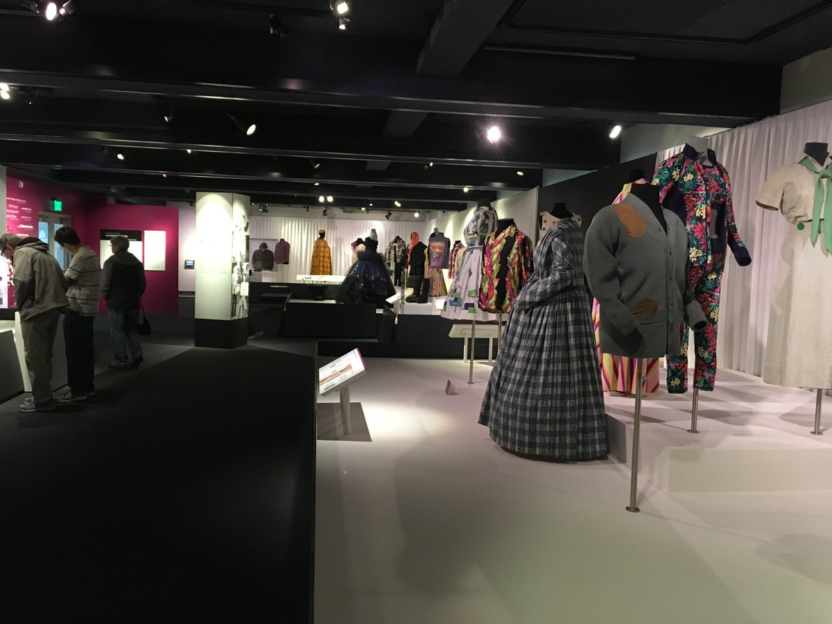
In contrast, MOHAI currently has an exhibit about Seattle fashion. You walk through a room done in whites and grays with pops of wine color for some of the text. The room makes you see the clothes in a certain order, organized around the influences on Seattle fashion.
There's a section that talks about the weather and Seattle's outdoorsiness, and how that's kept fashion casual, how elements of rugged outerwear have stayed present for over a century.
As you move from section to section, you see examples of these different influences and how they've affected everything from officewear to formalwear.
You can understand why it's funny that REI's April Fools' product was covered in zippers.
You can understand why it's funny that REI's April Fools' product was covered in zippers.
Like, note the nod to Seattle's burlesque scene in this gorgeous (50s, IIRC?) evening dress.

Here's a rare example of a 1920s gown for a woman who wasn't super-tiny. It probably survived because of all the beading--the fabric couldn't be repurposed easily.
And note that it's not hanging loosely on a generic mannequin. You can actually *see* the body it was made for.
And note that it's not hanging loosely on a generic mannequin. You can actually *see* the body it was made for.

There aren't a lot of display bells and whistles here. A TON of careful decisions were made about what to display and how to display it, but that display design is largely invisible. What you're seeing is the *clothes.* And you're getting info about what they mean.
MOHAI is a great museum. It gets way less attention, especially from tourists, than MoPOP, because MoPOP has an attention-grabby exterior and is at the Seattle Center and all that.
If you're visiting, do MOHAI. You'll come out actually understanding the city and its personality
If you're visiting, do MOHAI. You'll come out actually understanding the city and its personality
Also MOHAI's got a lot of strangely timely old stuff.


But anyway, it's not often I attend two museum exhibits with the same sort of theme, in the same city, so close together, and the contrast was so pointed that I had to talk about it.
TL;DR: good UX design is usually invisible, not flashy.
TL;DR: good UX design is usually invisible, not flashy.


