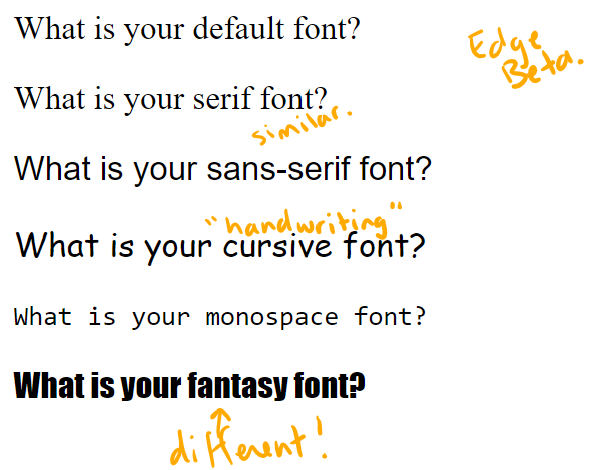
It's time for backgrounds and fonts...
Defaults to 'transparent' so the stuff behind it shows through.
The background fills the margins and the borders. (It shows under dashed borders)
makes a picture show.
How big the picture is depends on the intrinsic properties of the image (width, height, ratio). Anybody know how to find out whether an image file has these?
You can turn this off with
background-repeat: no-repeat
or make it only go sideways or down with 'repeat-x' or 'repeat-y'
This doesn't always work for the page body. It does in a div.
"scroll" is the default and makes sense; the background scrolls with the rest of the page.
"fixed" makes the background freeze. Please only use this for the page body. Using it on smaller elements does something weird.
jessitron.github.io/own-site/play/…
I couldn't get it to do anything for the body, but inside an element, you can
background-position: center center
to put the image in the middle.
But if you give it lengths, that's an offset. Moves the top-left corner of the image.
Remember that any property you don't specify gets reset to its default. So do 'background' first if you want to refine the others in later lines.
It's handy for fallbacks. Put your fallback first, top choice last:
background: blue;
background: url("holding-still-sky.png") fixed;
so a browser that doesn't support 'background-attachment: fixed' can ignore the whole line.
CSS and the browser need to consider
- sets of fonts the browser has
- poorly standardized properties
- other languages
- available characters
- sizes
- weights
font-family: "Hoefler", "Garamond", "Helvetica", serif;
It can be 'italic' which will also accept a font labeled as 'oblique'
'font-variant' is only about small-caps. (why is that so important?)


