Ahoy, @JoshApos! I really like where your typeface is going. It’s an interesting moment to look at this together, because your drawings are in great shape, but there’s a missing piece that will make your life easier. (And I have an S trick to share.) —> 
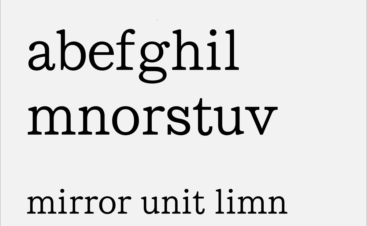
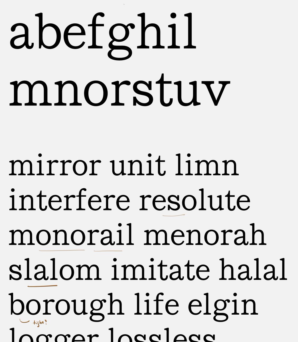
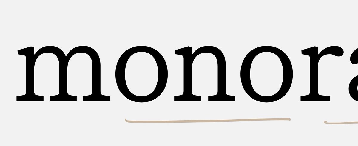
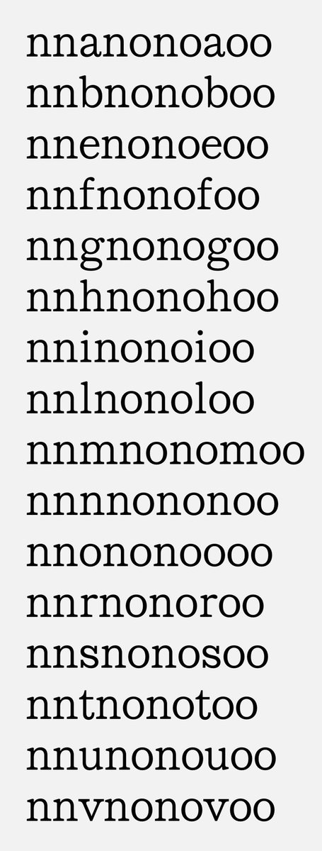
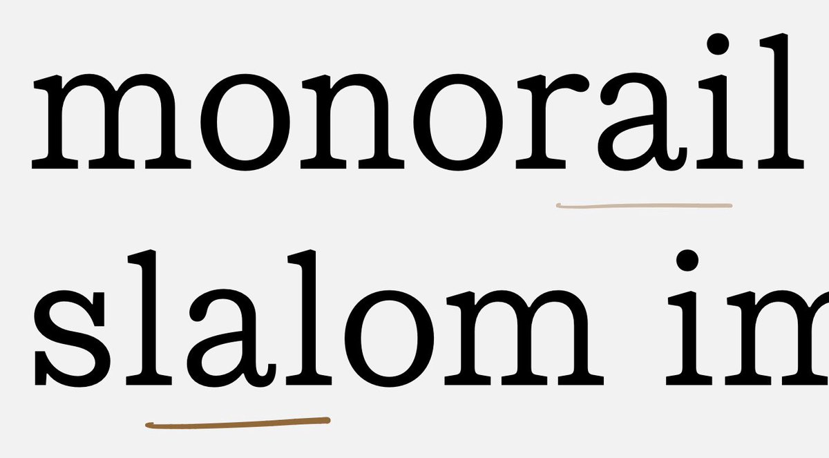
I’ve added a couple of words to your proof that might be illustrative. (Ultimately you’ll want lots more.) Take a look at the word ‘monorail’: to my eye, there’s something funny happening in the rhythm of m/o/n/o: —>
It feels to me as if the M and N are falling behind, and need a push to the right: —>
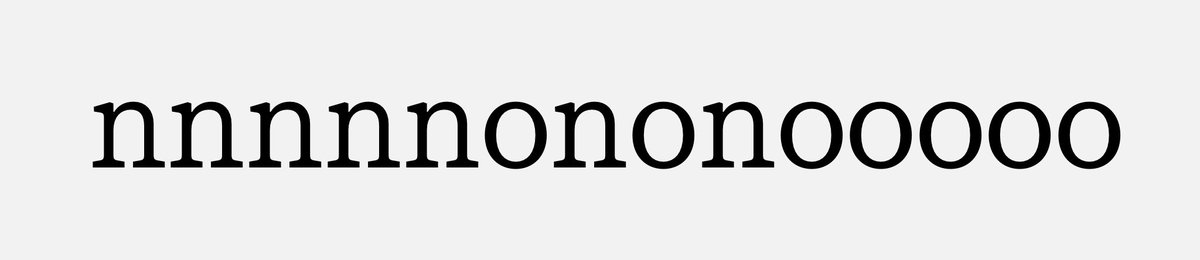
This btw is a useful string for seeing how flats & rounds are getting along: it’s a line of flat characters (n), a line of round ones (o), and an even mix in the middle. Let’s look at the n/o/n/o part: —>
One conclusion could be that yes, the N needs to shift right, in order to feel optically centered... —>
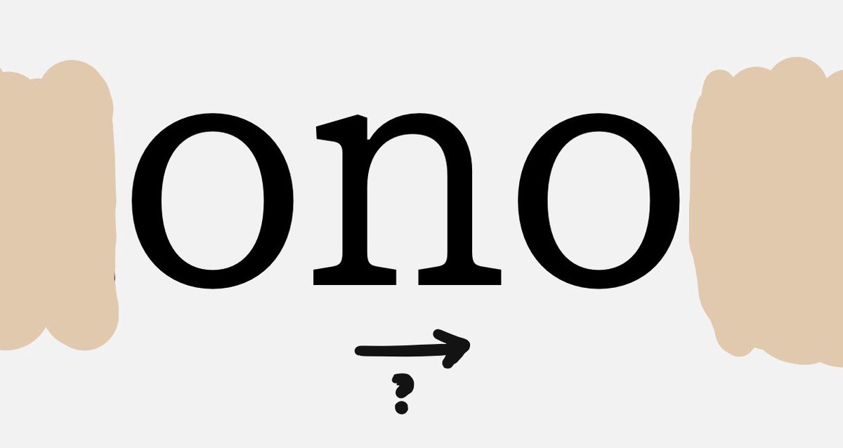
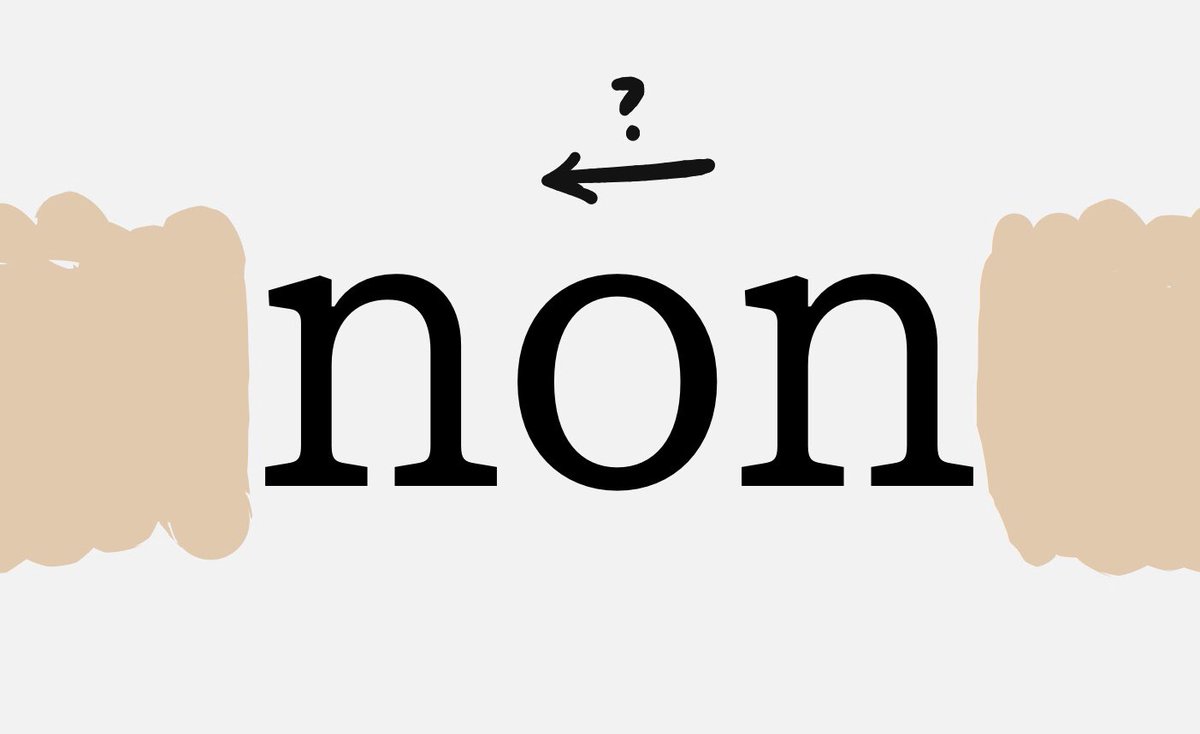
...but if you focus on the ‘non’ part of the line, perhaps it’s the O that needs to shift left? Thankfully, since we know the O should have the same side bearings left & right, you can start there, and once you have this solid foundation, adjust the N. —>
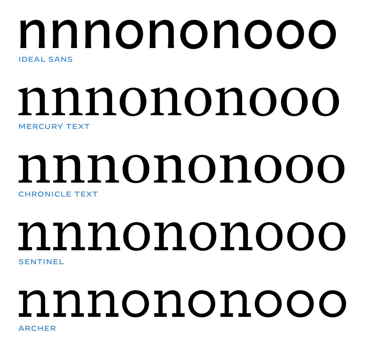
In theory — I’ll qualify this in a moment — once you’ve settled on a fit for the N and O in which they’re both centered, and produce the same color and rhythm, you can evaluate all the other letters in this context: nn_nono_oo: —>
Here fwiw are some “control strings” from some of our fonts, in which I was especially pleased with the fit. The thing is, though, there’s only one way of confirming your conclusion, and that’s to add one more letter: —>
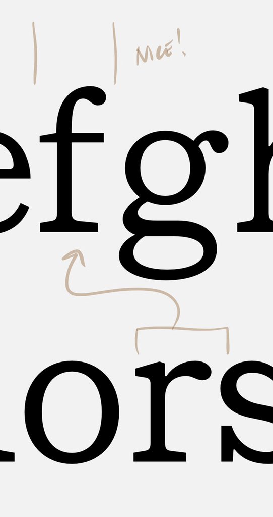
the lowercase P. The idea is that the flat left side of the P should share the same sidebearing as the flat left side of the N, and its round right side should match the O. (Easier on a sans, of course — and only if the shapes of these bowls match, which they seldom will.) —>
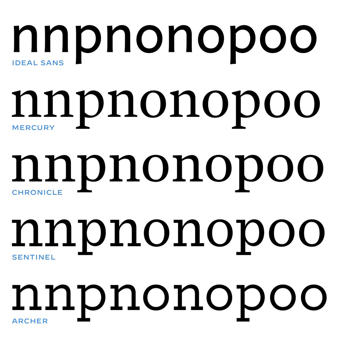
What’s so tricky about this is that the P may often seem to lean right between Os, and lean left between Ns, on first blush. I think there’s a whiff of this in your B right now, a decent proxy in a pinch, but I’d go ahead & draw the P. —>
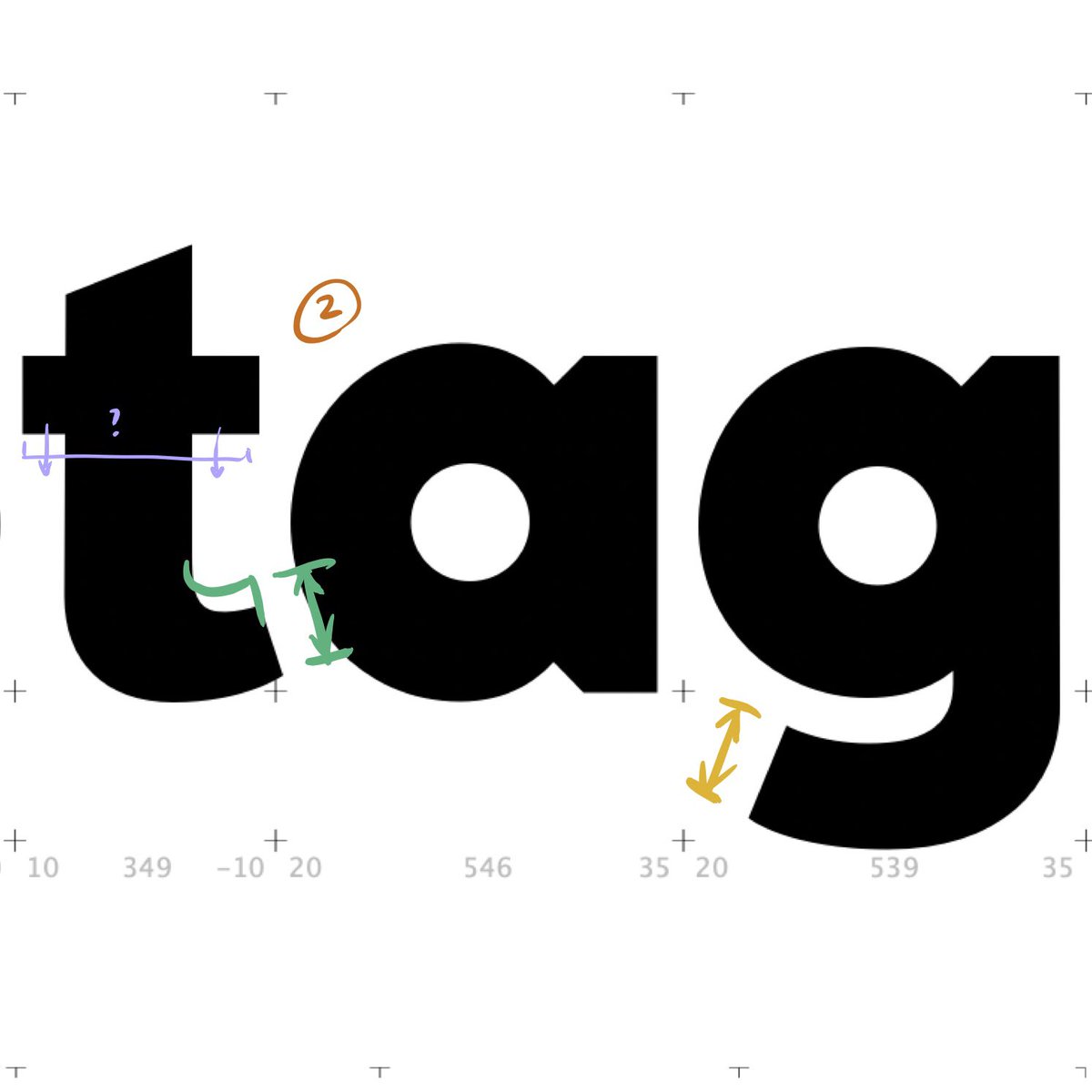
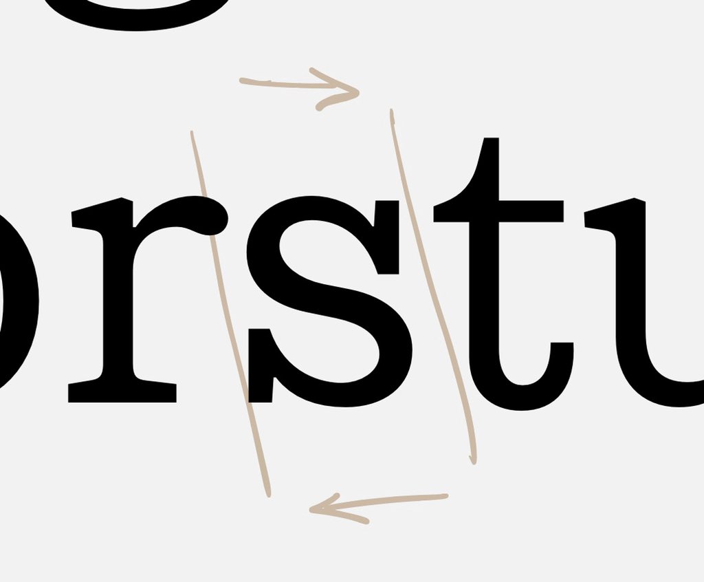
Other tricky letters to fit... There’s the A, which I think here might be either leaning left, or just too loose on its right side. (Tip for another time: you can always skew the lc A forward, so its stem actually slants: see Adobe Garamond, Hoefler Titling, etc.) —>
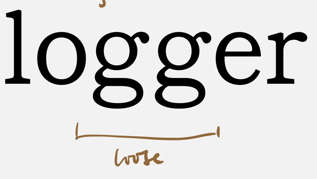
In every typeface, the lc G is, famously, a real bastard. In addition to the control string “nngnonogoo,” I like to see “nnggnonoggoo”, which can be revealing. I think yours might be loose, though you might prefer the address this in the drawing, rather than the spacing. —>
Btw I absolutely love your lc F: it’s sporty and compact, and will save you from having to draw ligatures. I wonder what happens if you treat the R with this same economy? Could look sharp; you’d have to try it to see. —>
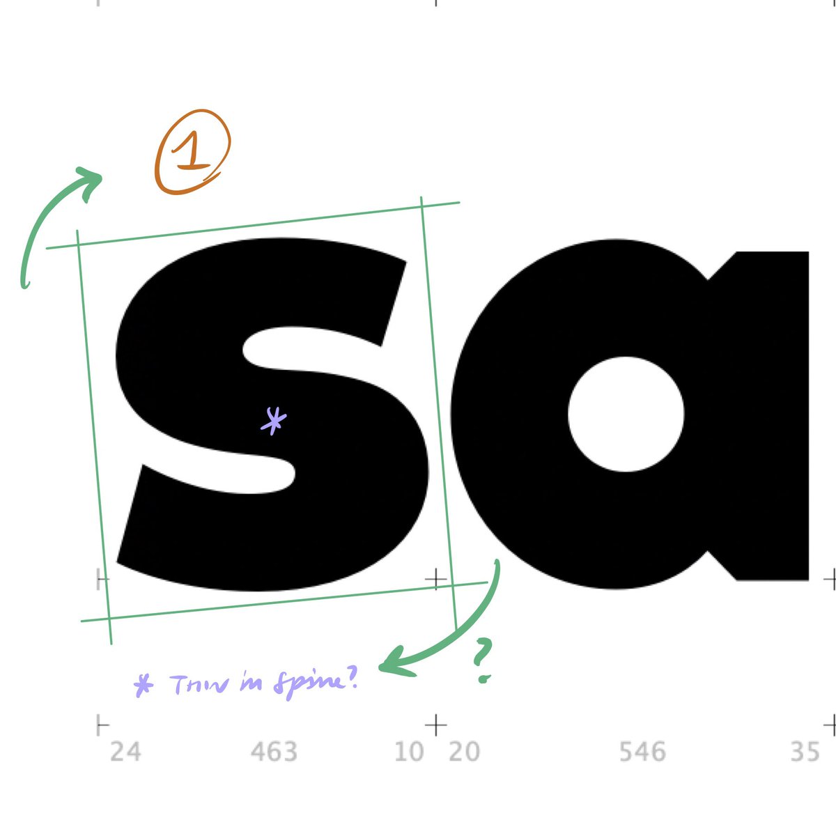
And finally, a thought on the S. I wondered if it was tipping backward, —>
...which you can easily check by skewing it forward: I’d take the entire form and slant it to the right to see what you think. (It’ll ruin the point placement, which you’ll have to fix later, but it’s a useful & quick test.) If you try that, —>
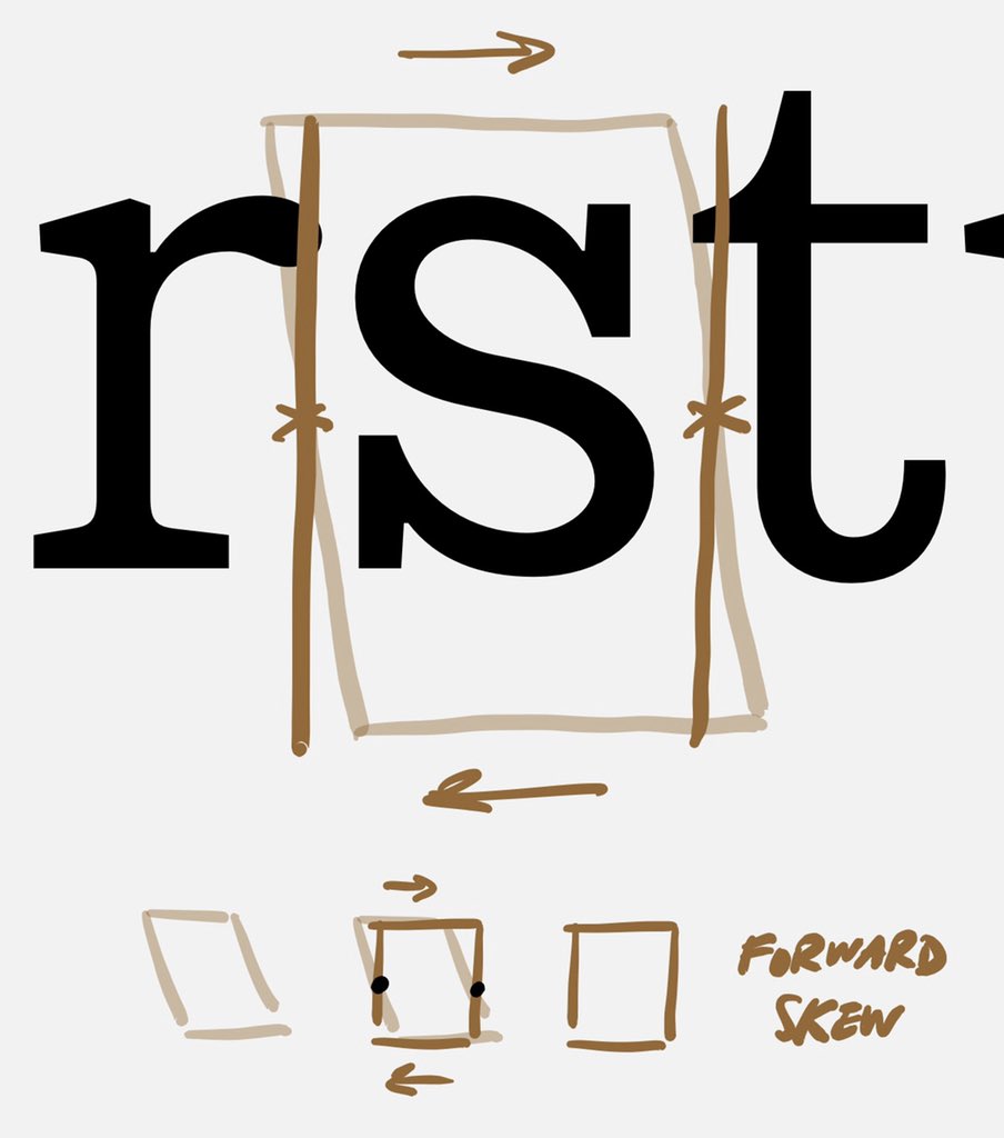
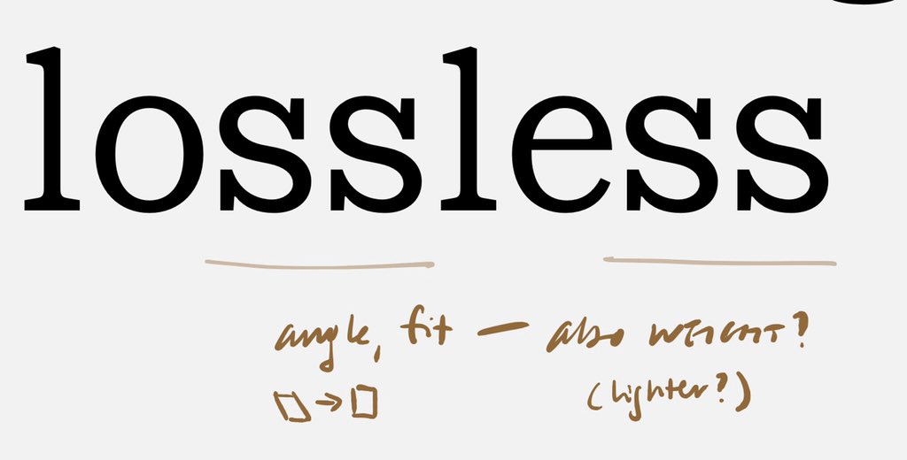
...try a word like this one, to see how you feel about its angle, fit, and weight. Here are my thoughts on the current draft; I wonder if you’re seeing the same? # Finally, a trick. In the S, —>
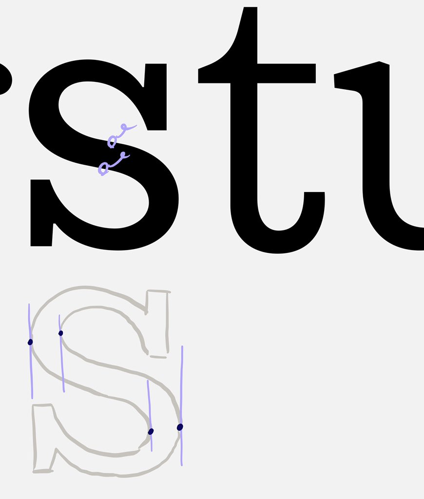
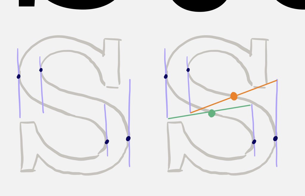
Before you start adjusting the shape, try eliminating the two “inflection points” in the center, where the curves tip over from concave to convex. If you can get close to matching your original shape without them — or, once you’ve refined the shape — try this... —>
Draw a line between the opposing off-curve points that define each half. The location where this line intersects the curve is the place to drop your inflection points. :) Usually works, or indicates something about the curves that needs attention. —>
I hope some of this is useful to you. Let me know how things turn out! Regards, Jonathan