Ahoy, @Kron98_! Jorge, thank you for this project — it’s intriguing. Some background for anyone listening in: Jorge is designing a typeface inspired by the school in his mother’s village, as part of a project to highlight depopulation in rural Spain. -> 
He’d written to ask about whether his initial draft was becoming too generic, and losing the charm of the original — an important and very delicate question. I’m always apprehensive of projects that revive “naive” lettering, because they run the risk of... ->
...making fun of craftspeople who work outside of so-called “mainstream” traditions. Fetishizing awkward drawings always makes me feel uncomfortable, when these (below) are seen as the two options. But I think there’s a solution. ->

A more interesting approach might be to separate “draftsmanship” from “intent,” and look at things in this kind of matrix. ->
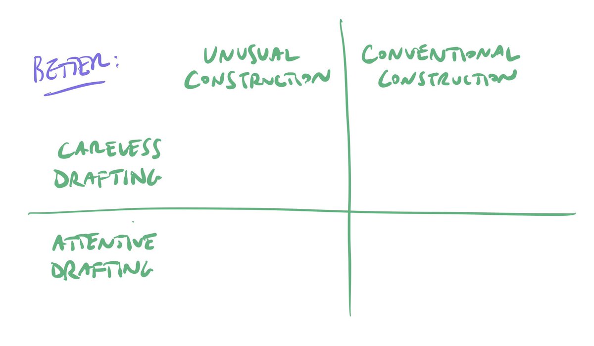
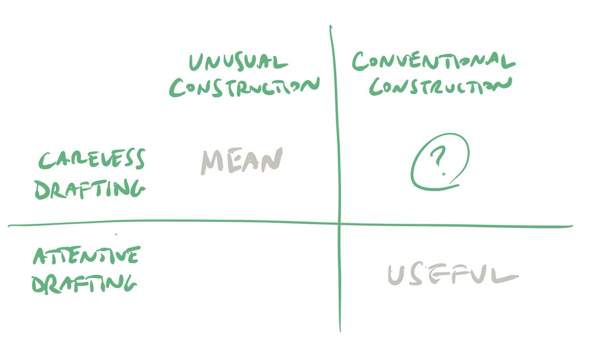
Drawing unorthodox letters carelessly is cruel, and suggests that only well-drawn “conventional” letters are useful. But what about those other quadrants? ->
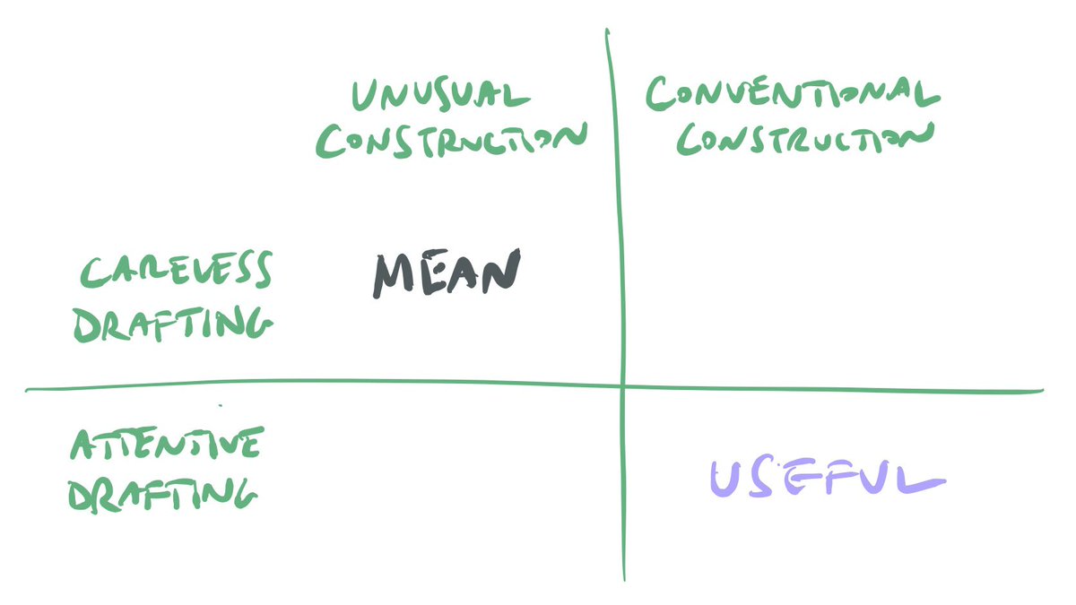
“Conventional letters drawn awkwardly” are sometimes just lazy, but plenty of designers have worked in this area to create work that’s knowing, antagonistic, witty, heavily coded — see Jon Barnbrook & Jeff Keedy’s work for Emigre, especially. And that last corner? ->
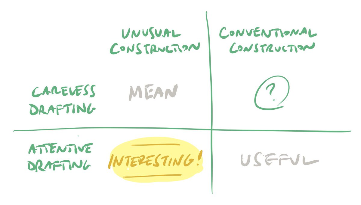
I think that’s where your project might find its strength. What are the unexpected qualities in the school fascia that merit your interpretive skills as a designer, and produce a versatile outcome? A few that came to mind for me were the following... ->
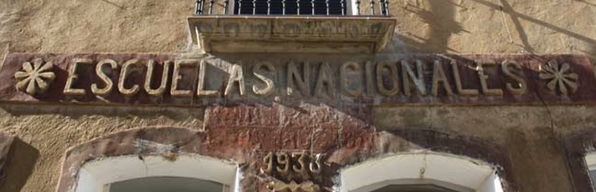
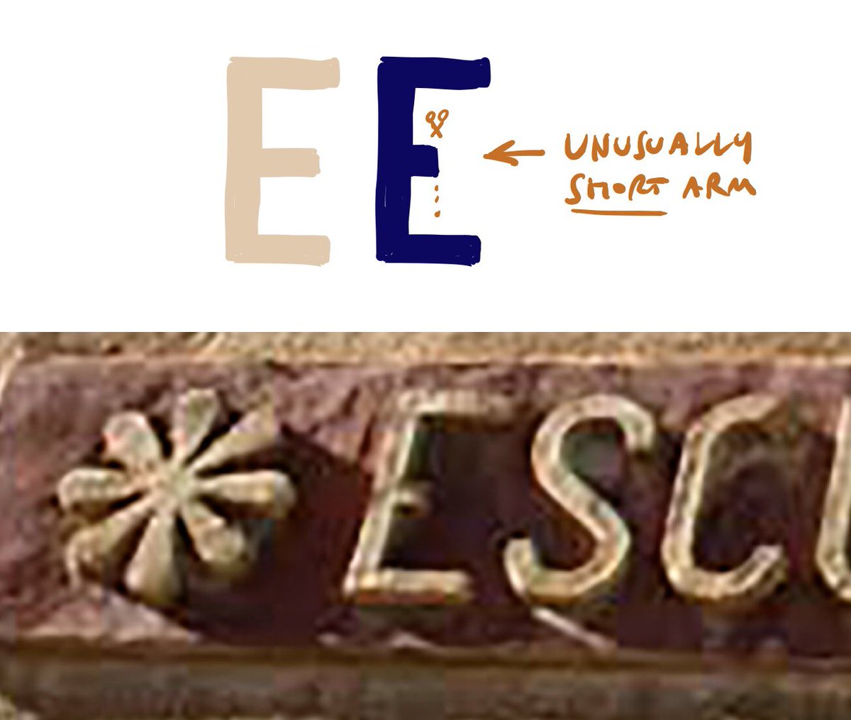
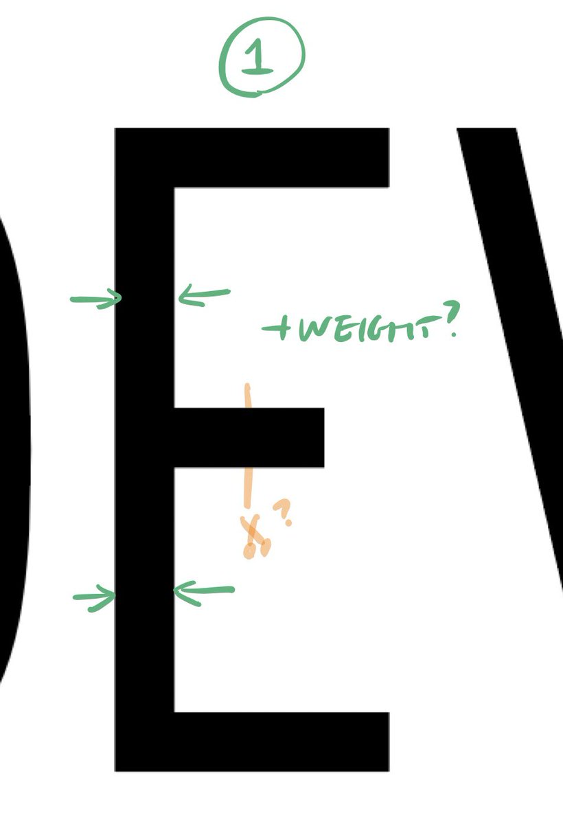
The short arm of this E. It’s unusual; maybe it’s worth preserving? ->
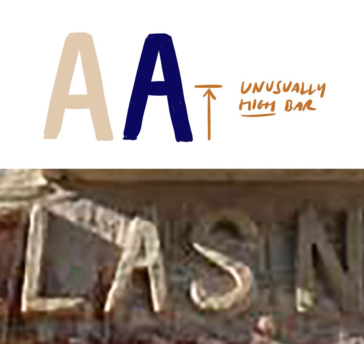
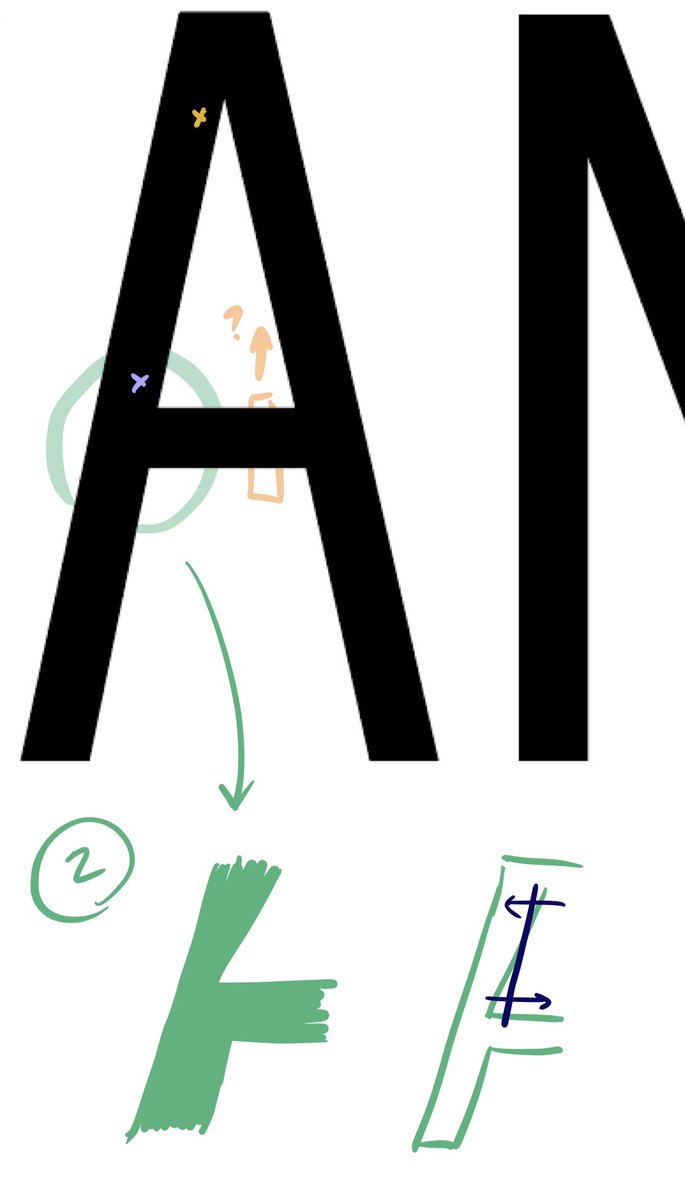
How about the bar of the A? It’s unusually high; could you abstract a theme from what these two gestures do?
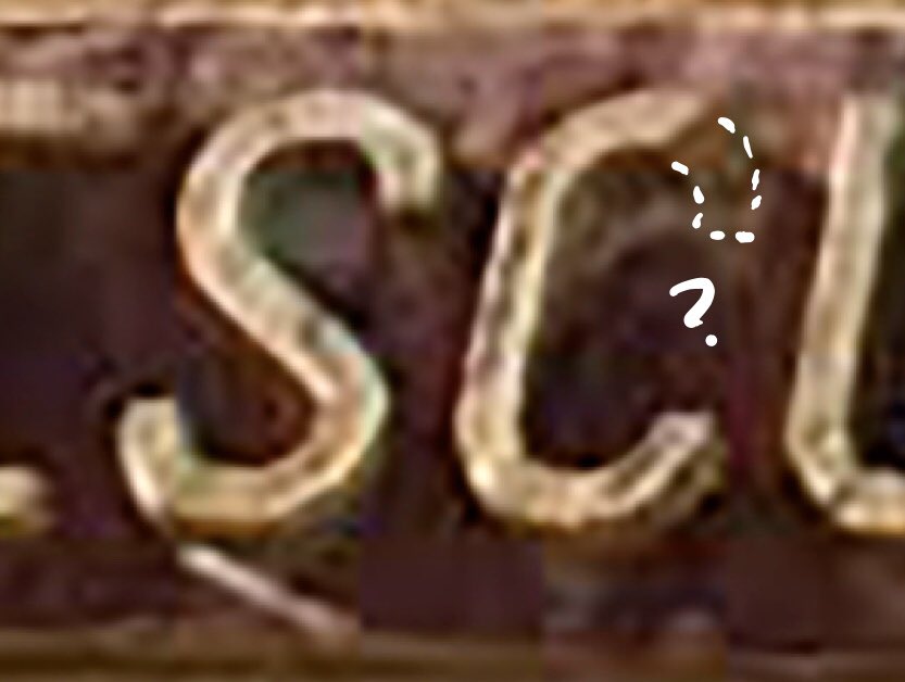
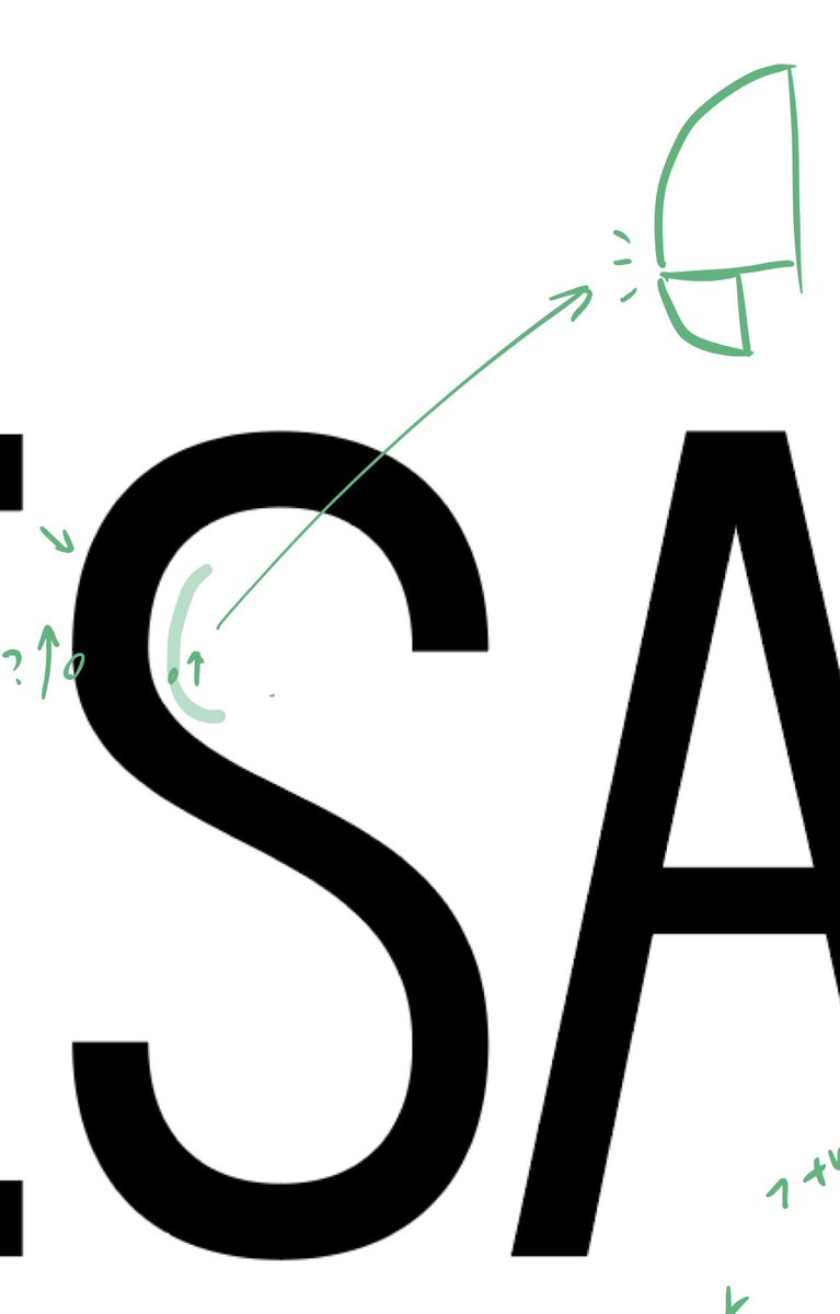
Once I started thinking about these shy or abrupt moments, I noticed the C — probably just a broken letter, but perhaps there’s something useful in this? ->
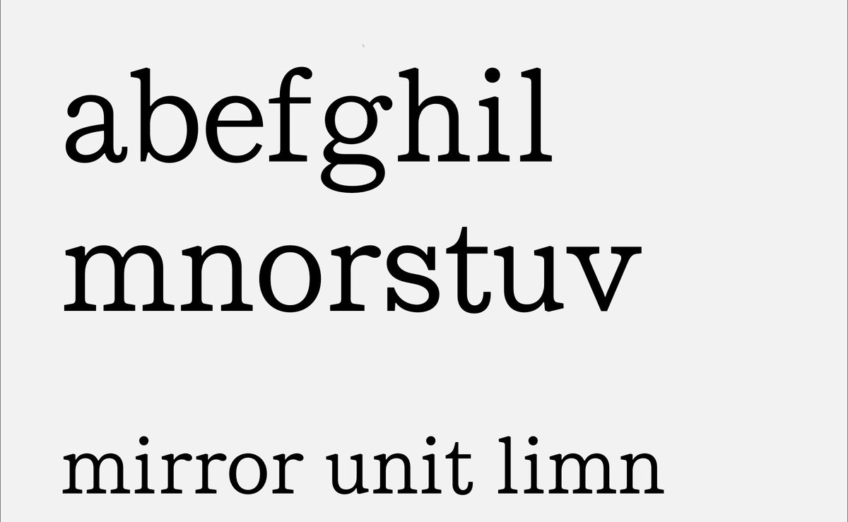
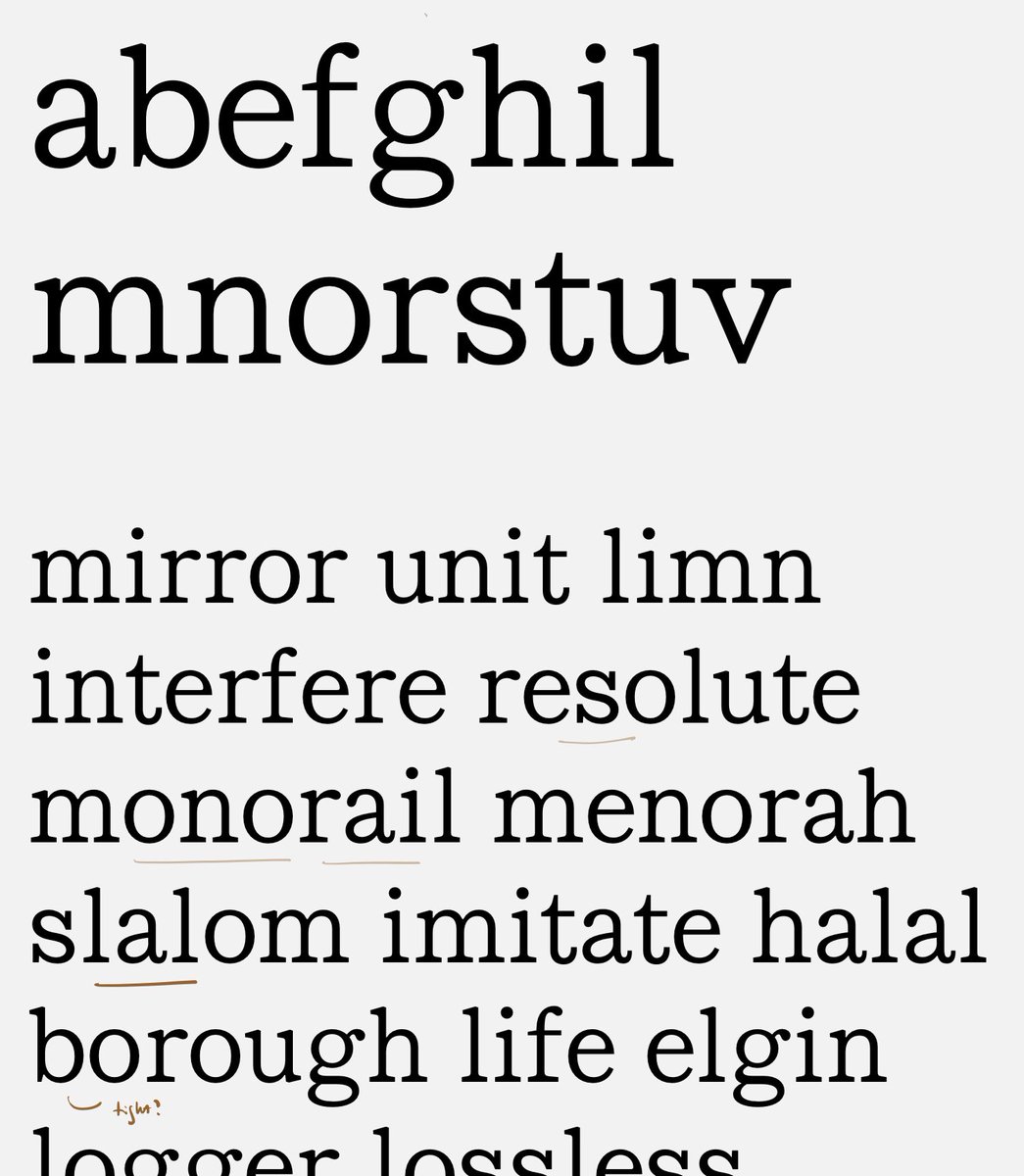
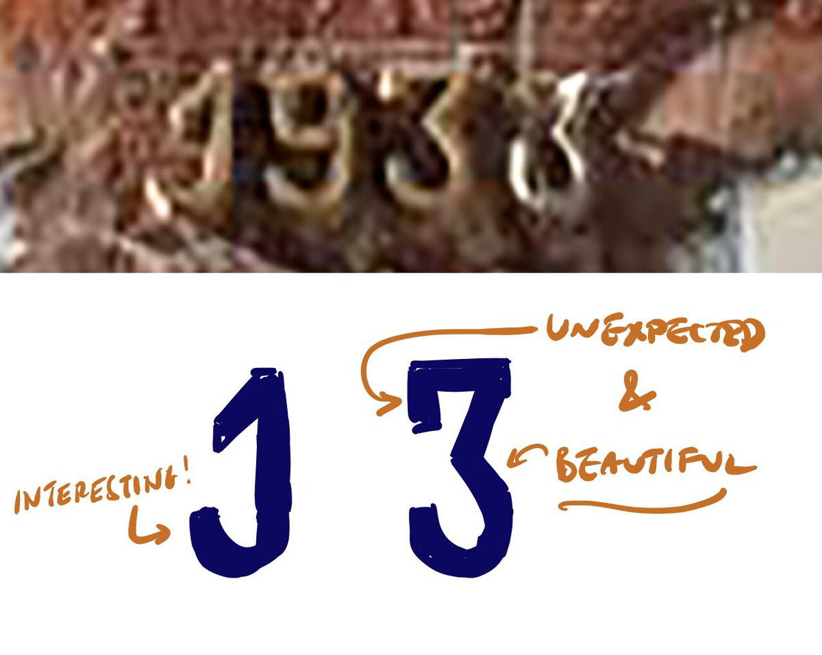
By the way, these figures are really delightful. The tailed 1 is so unexpected, but charming (& certainly has historical precedent in Renaissance and Rococo italics); that 3 is beautiful to me. Are there things you can borrow from here for your other characters? ->
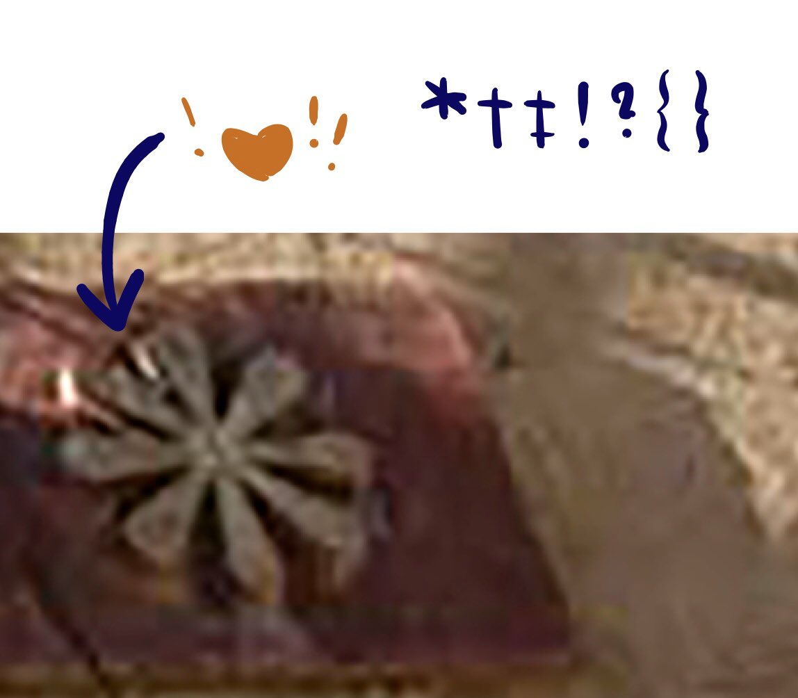
And this — OMG, I wouldn’t be able to resist sneaking some of its personality into the punctuation. (Ornaments, too? :) ->
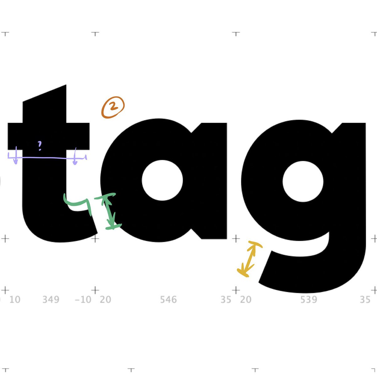
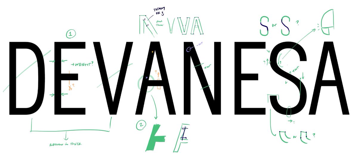
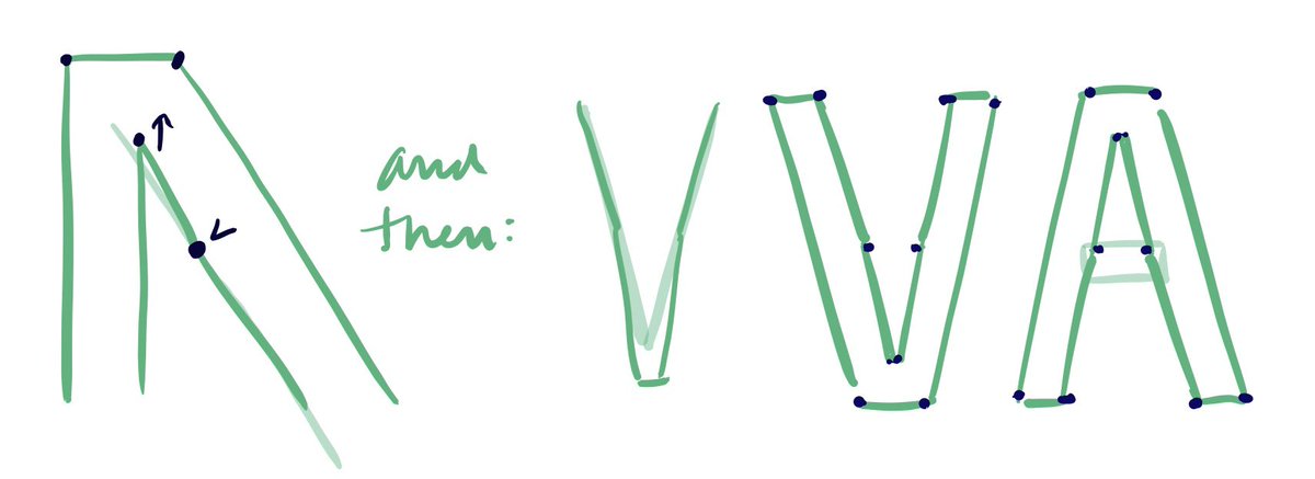
On to your drawings. Starting with the E, I think your contrast might be just on the verge of flipping over: does the vertical stem *feel* lighter than the horizontal arms? ->
On the A, take a look at how the left stem meets the crossbar. Does it appear to be “digging in” where I’ve marked the blue X — and is this stroke perhaps too heavy at the top, by the orange X? If you’re seeing that too... —>
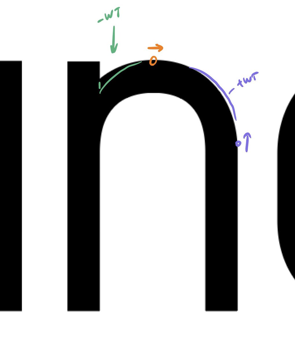
...and also thinking that the N could use more weight in the middle, but stand to lose some at the top and bottom... ->
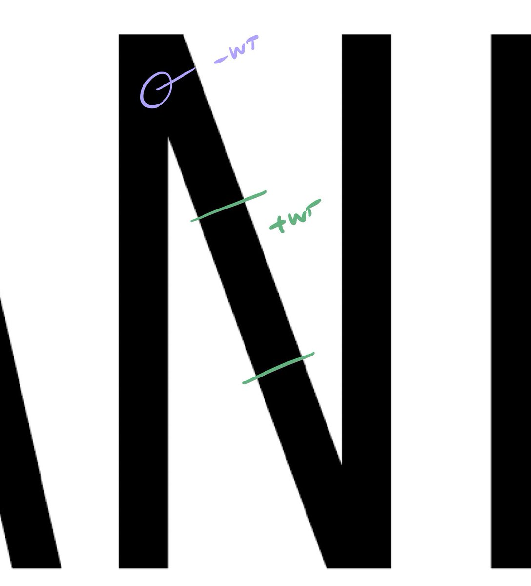
...then you might considering adding an additional point in the diagonal (or the stem, though that’s harder to camouflage), which could relieve some weight in the corner. ->
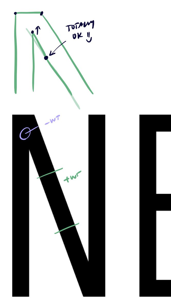
If that works, you can get away with the same in the V, A, W, T, K... :) ->
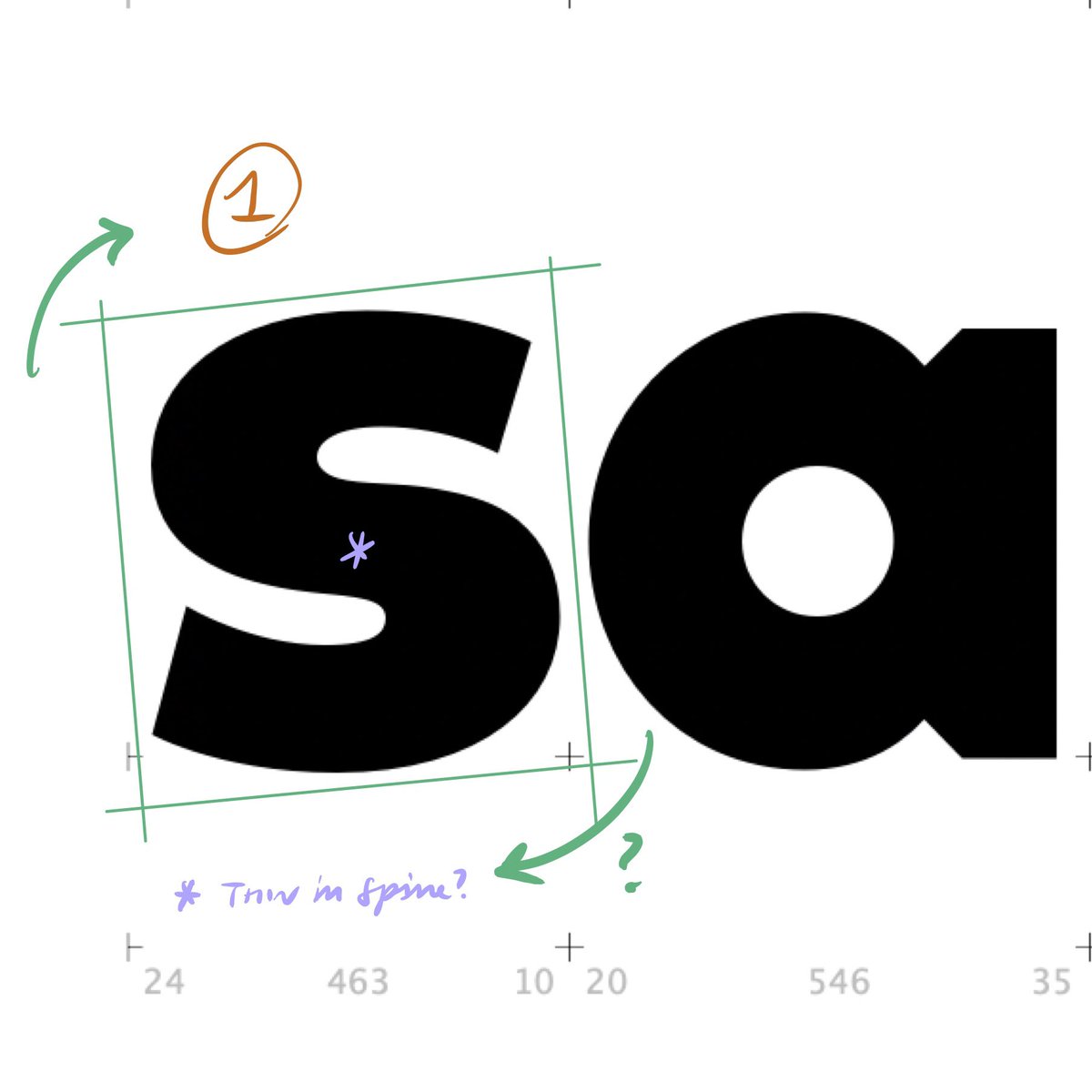
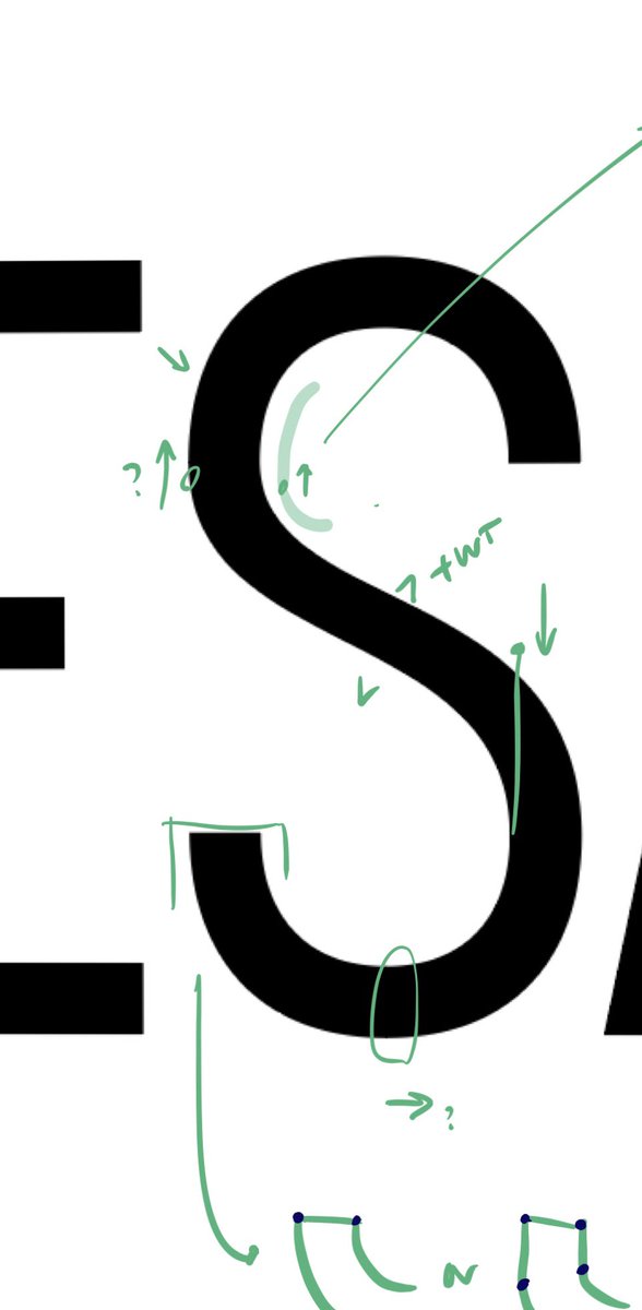
Let’s look at the S. I was reluctant to mark this up without asking what your goal was: do you want a spine with a sharp bend, or a more sinuous one? ->
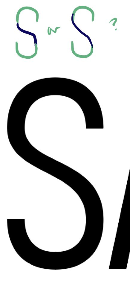
Similarly, do you imagine defining the outer terminations with an arc, or an arc that transitions into a short flat segment? ->
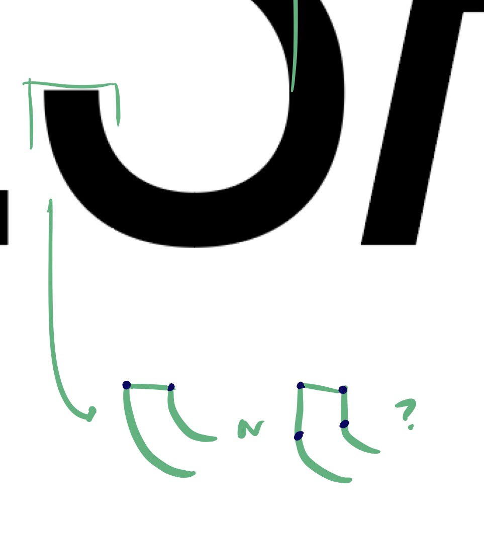
I’d give these (difficult!) interior curves a look. To my eye, it feels as if an arc with a large radius is meeting an arc with a smaller one. You might find that raising the on-curve point helps here; from there you can feel your way through adjusting the off-curve points. ->
These edits might help. See what you think: the real challenge here is making sure that there’s a consistent approach to both parts of the letter — unless you intentionally want them to differ, in which case I’d turn up the volume. ->
I’d like to look at the lowercase together after you’re 100% happy with the caps — I have a feeling that adjusting the proportion of the lc might happen as you look at the caps from the sign itself. ->
I hope this helps — let me know how it develops! (And draw that giant asterisk! I wouldn’t be able to resist.) Kindest Regards, Jonathan