Outbreaks compared
🗓️Day 20

For log-scale super fans (and the rest of us) - charts comparing biggest #covid19aus outbreaks

1/6 ... 7 biggest outbreaks in NSW / VIC
👙Bondi - blue (330 cases)

covid19data.com.au/compare-outbre…

#covidsydney #COVID19 #covidnsw #COVID19nsw #COVID19Vic
2/6 ... What does it look like on a log scale?

Useful bc it doesn't only show us whether cases are growing, but how quickly they're growing

#FlattenTheCurve
3/6 ... 'Hold the line': 3 biggest outbreaks

Shows daily cases and 7-day averages on log scale

Useful because it shows whether we are 'holding the line' against daily growth in cases

👙Bondi - blue
🌊VIC 2nd wave - light grey (took off around now)
🍺Crossroads - dark grey
4/6 ... 🔎Unlinked cases in NSW outbreaks

👙Bondi: 23 (+2 today)
☀️Avalon: 7
🍺Crossroads: 15
5/6 ... 🤧All local cases in NSW outbreaks

👙Bondi: 330 (+18 today)
☀️Avalon: 190
🍺Crossroads: 186

(Remember, these numbers refer to 'day 20' for each outbreak)
6/6 ... And here it is on log scale

The intervals are not very easy to see on this chart

But as an indicator, Bondi outbreak took about 5 days to double from 100 to 200. 5 days later, we're at 330. So doubling rate slowing.*
All live charts are embeddable and released under CC4.0.

See new page:
covid19data.com.au/compare-outbre…
*Footnote - our covid literacy is getting better all the time, so we understand these are fairly crude indicators, and the stories and factors behind these numbers are just as important

• • •

Missing some Tweet in this thread? You can try to force a refresh
 

Keep Current with Juliette O'Brien

Juliette O'Brien Profile picture

Stay in touch and get notified when new unrolls are available from this author!

Read all threads

This Thread may be Removed Anytime!

PDF

Twitter may remove this content at anytime! Save it as PDF for later use!

Try unrolling a thread yourself!

how to unroll video
  1. Follow @ThreadReaderApp to mention us!

  2. From a Twitter thread mention us with a keyword "unroll"
@threadreaderapp unroll

Practice here first or read more on our help page!

More from @juliette_io

7 Jul
Lockdown lite?

Has Sydney's lockdown been too lax?

We have Mobility Data up to Wed 1 July. It gives a picture of people's movements in the first 5 days of #Sydneylockdown

Heads up, to understand these charts there are a few tweets of pre-reading ...

#nswcovid #covidnsw
1/9
In the middle of the y-axis, you'll see the number 0

This is the baseline of movement in the community

Baseline = the 'normal' amount of movement on a particular day of the week

Movement on Sundays is different from Wednesdays, so each day has its own normalised baseline

2/9
Google has calculated 'normal' for each day of the week, by finding each day's median throughout a 5-week period from *3 January to 6 February 2020*

That means we need to keep in mind the seasonal and local characteristics of each state during that time of year
Read 10 tweets
6 Jul
NSW cases under investigation:

🔎20 (-3 since morning)

LGAs-

Canterbury-Bankstown: 5
Cumberland: 4
Waverley: 4 (-1)
Fairfield: 3 (+1)
Strathfield: 1
Woollahra: 1
Liverpool: 1 (+1)
Sydney: 1
Georges River: 0 (-1)
Randwick: 0 (-1)

#covidnsw #covid19nsw #covidsydney #COVID19Aus
View of cases under investigation based on true notification dates -
Canterbury-Bankstown: 5
Read 7 tweets
8 Feb
We've collected a wealth of data re NSW clusters, showing the effective whack-a-mole / suppression since mid 2020.

But the most interesting bits are the 'cluster trees'.

A few things they show... 1/6

*Thanks to super thorough work by @DanDbab, Daniel Klein
#COVID19nsw #COVID19 Covid-19 clusters in NSW, Australia.
'Cluster trees' are the way we refer to the meta-clusters, if you like, made up of sub-clusters and outbreaks across primary, secondary and tertiary locations, as well as household and social contacts linked to these.

Here is part of the Crossroads cluster tree.

2/6 Breakdown of Crossroads Hotel cluster. Total 57 cases.
And here is part of the Thai Rock (Wetherill Park) cluster tree.

In both, we can see the spike of transmissions from the primary location and their immediate households / social contacts, then the trickling outwards.

3/6 NSW clusters. Thai Rock, Wetherill Park, cluster tree. Total
Read 8 tweets
12 Sep 20
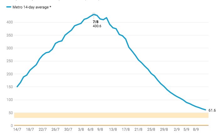
We finally have the history of the 14-day avg for metro and regional #CovidVic .

Now we can see the curve. Think it rose quickly? It appears to have fallen even faster. Really started to fall away three weeks ago. Frustrating shallowing now. Keep going Vic!

#COVID19Vic
Here it is for regional. The 14-day avg peaked at 31.3 cases / day one month ago.

(Data note - we had to wait for @VicGovDHHS to provide all this b/c the raw data aren't published. Big thanks to @migga @covidliveau for passing it onto me! <3 )
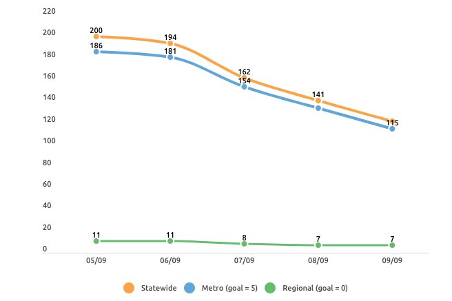
3/5. Here is the other key roadmap trigger - total number of cases with an unknown source in the last two weeks. (Note these figures are delayed by a few days). Metro goal = 5. Regional goal = 0.
Read 7 tweets
6 Sep 20
Charts tracking trigger points in Victoria's roadmap to recovery: (thread, 1/5).

1. Avg daily cases in metro Melbourne. Goal: blue line to reach gold band (30-50 / day, 14-day trailing avg).

#COVID19Victoria #COVID19Vic #COVID19Aus #COVID19
2. Avg. daily cases in regional Victoria. Goal: green line going for gold. (<5 / day, 14-day trailing avg).
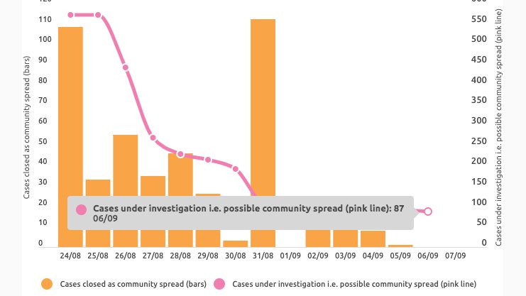
3. Community spread (orange) + still under investigation (pink line).

*Metro Step 2 contingent on these*. Metro Step 3 may start with <5 unknowns in last 2 weeks. Regional Step 3 may start with 0 unknowns in regional VIC (tho geo data re community spread not provided).
Read 10 tweets
19 Apr 20
Here's a wrap of some of the key charts on covid19data.com.au right now.

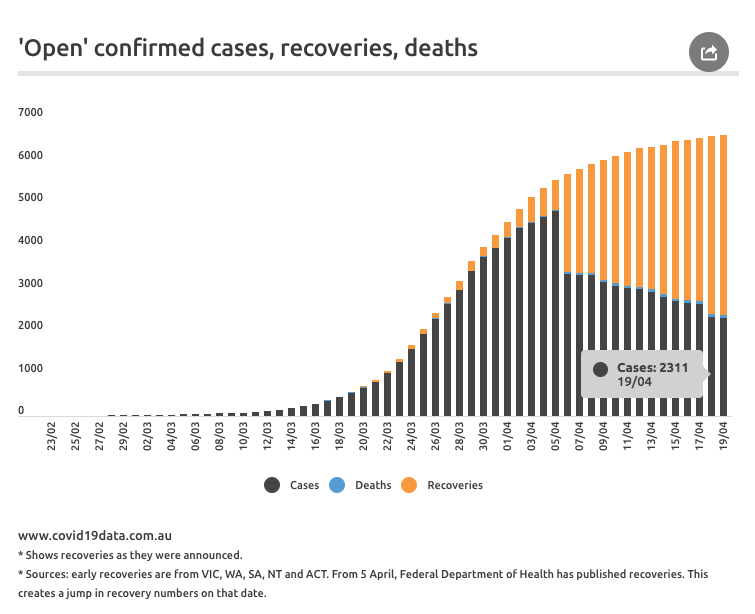
1/8 - Reported recoveries (yellow) and deaths (blue) as a proportion of confirmed cases to give a timeline view of 'open' cases (black) | covid19data.com.au
#covid19australia #Covid_19australia
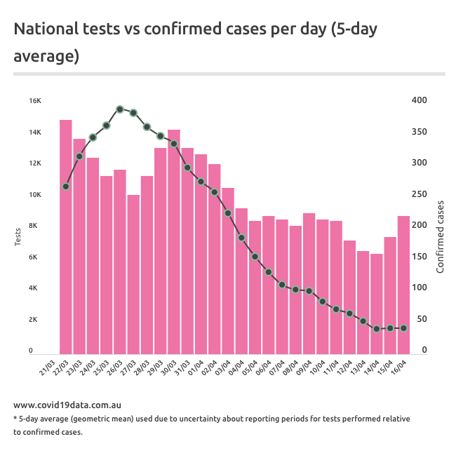
2/8 - The site now has charts for tests / day (national and state / territories ) but this analysis compares 5-day average of tests (pink bars) with new confirmed cases (black line) |
covid19data.com.au/testing
3/8 - The daily confirmed cases each day is the key graph atm.
Read 9 tweets

Did Thread Reader help you today?

Support us! We are indie developers!


This site is made by just two indie developers on a laptop doing marketing, support and development! Read more about the story.

Become a Premium Member ($3/month or $30/year) and get exclusive features!

Become Premium

Too expensive? Make a small donation by buying us coffee ($5) or help with server cost ($10)

Donate via Paypal Become our Patreon

Thank you for your support!

Follow Us on Twitter!

:(