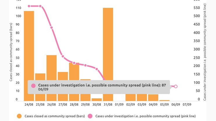
NSW cases under investigation:
🔎20 (-3 since morning)
LGAs-
Canterbury-Bankstown: 5
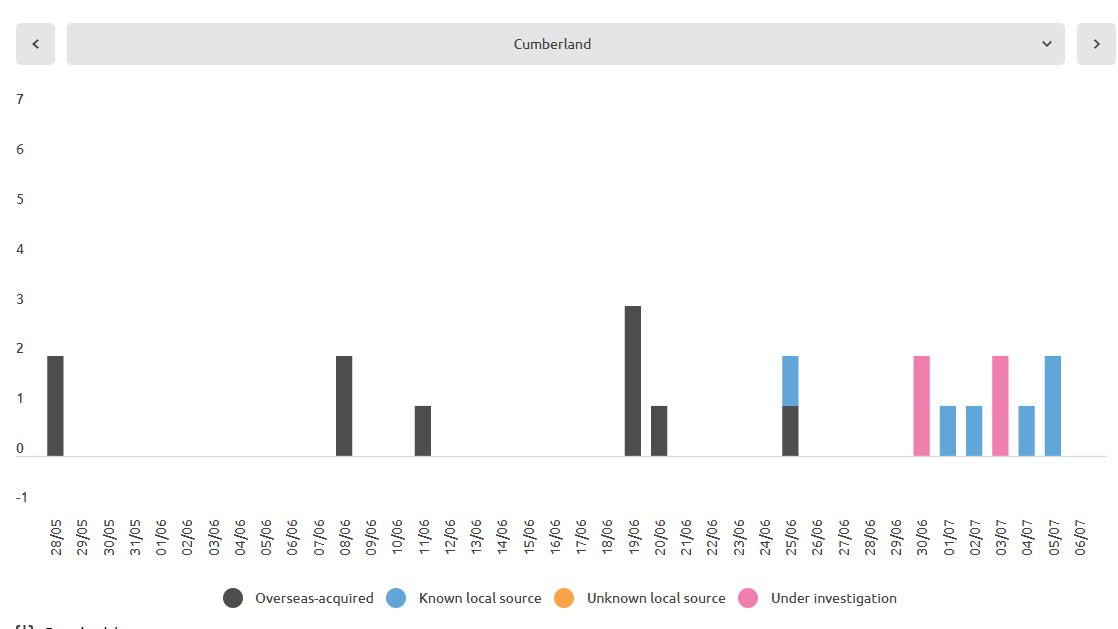
Cumberland: 4
Waverley: 4 (-1)
Fairfield: 3 (+1)
Strathfield: 1
Woollahra: 1
Liverpool: 1 (+1)
Sydney: 1
Georges River: 0 (-1)
Randwick: 0 (-1)
#covidnsw #covid19nsw #covidsydney #COVID19Aus
🔎20 (-3 since morning)
LGAs-
Canterbury-Bankstown: 5
Cumberland: 4
Waverley: 4 (-1)
Fairfield: 3 (+1)
Strathfield: 1
Woollahra: 1
Liverpool: 1 (+1)
Sydney: 1
Georges River: 0 (-1)
Randwick: 0 (-1)
#covidnsw #covid19nsw #covidsydney #COVID19Aus
View of cases under investigation based on true notification dates - 
Canterbury-Bankstown: 5

Cumberland: 4

Waverley: 4
Fairfield: 3

• • •
Missing some Tweet in this thread? You can try to
force a refresh