I'm excited to see an interactive US precinct map. But I think @nytimes did a disservice by not factoring in voter density. nytimes.com/interactive/20…
No, I apologize. They lied by not factoring in density.
And here's why. By shading only on the basis of Trump-v-Clinton they visually highlight areas with fewer votes. What do I mean? I mean that areas with very few people LOOK LIKE THEY ARE VERY IMPORTANT BECAUSE THEY ARE A DARK RED OR BLUE
And yes, there is a very important story here: rural parts of the country vote differently than urban parts. As a boy from rural Arkansas, I know. I get it. And that's lovely. That is truly what is cool about a democracy. So many different people VOTING differently.
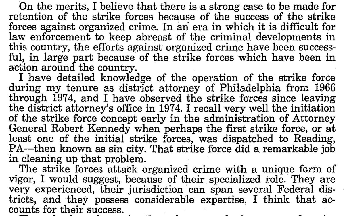
But when you shade without thinking about density you highlight things that do not need to be highlighted. Take Bakersfield, California. A lovely desert city. Where is it in the map on the left? Can you even see the city? The place where more people live? 
Or, is your eye drawn to the BIG RED AREA north of the city? There aren't nearly the number of people living up there, but that is visually higher in the hierarchy than it needs to be. And does the blue area look like it's surrounded in an HUGE SEA OF RED?
Ok. Now, when we make maps we all lie. We're trying to flatten out the world (which aint flat). And when you show data in maps you have to make decisions. What's the most important thing to show? How do we show that? Is that the right message?
I think it's in poor taste to highlight something that doesn't need to be highlighted as severely as it is. But it's just my opinion. Just some kid from Arkansas.
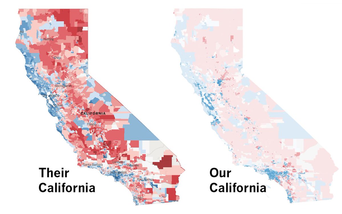
For two months after the 2016 election @joemfox @priyakkumar and @LATimesGraphics turned California's election results into a big interactive map and we released the data github.com/datadesk/calif…
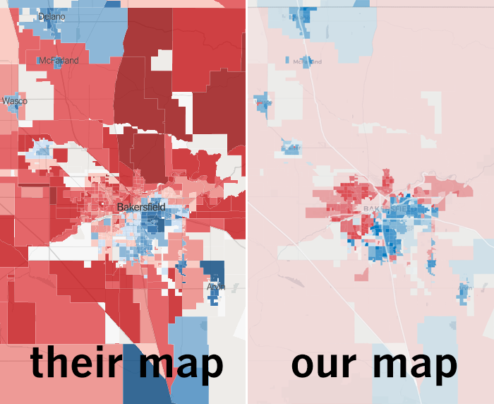
Here's a look at the 2016 NYT California versus the LAT California. When you look at "their" map, who do you think won? Then look at our map. What message do you see?
This stuff is SO hard. You have a ton of data you compile over months and years. And what's the message? Do you even have the technical ability to adjust for voter density? It's so difficult. But! That's why it's so much damn fun.