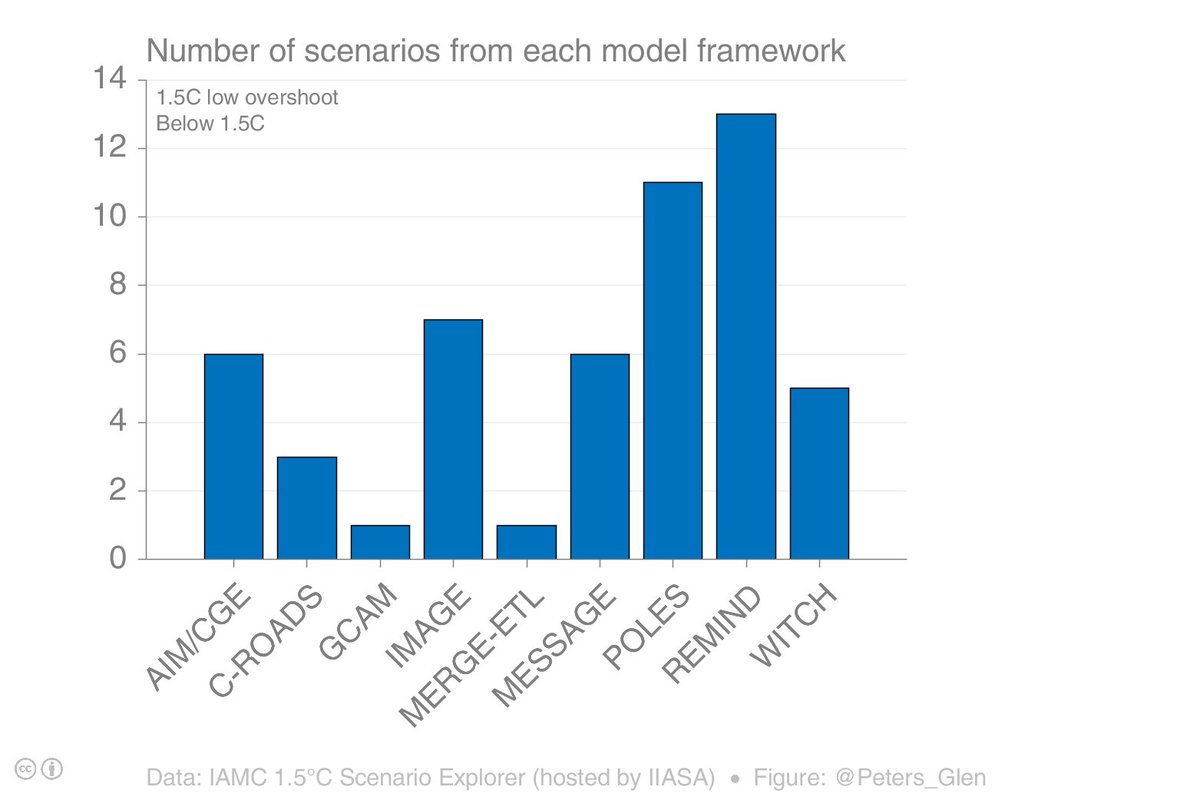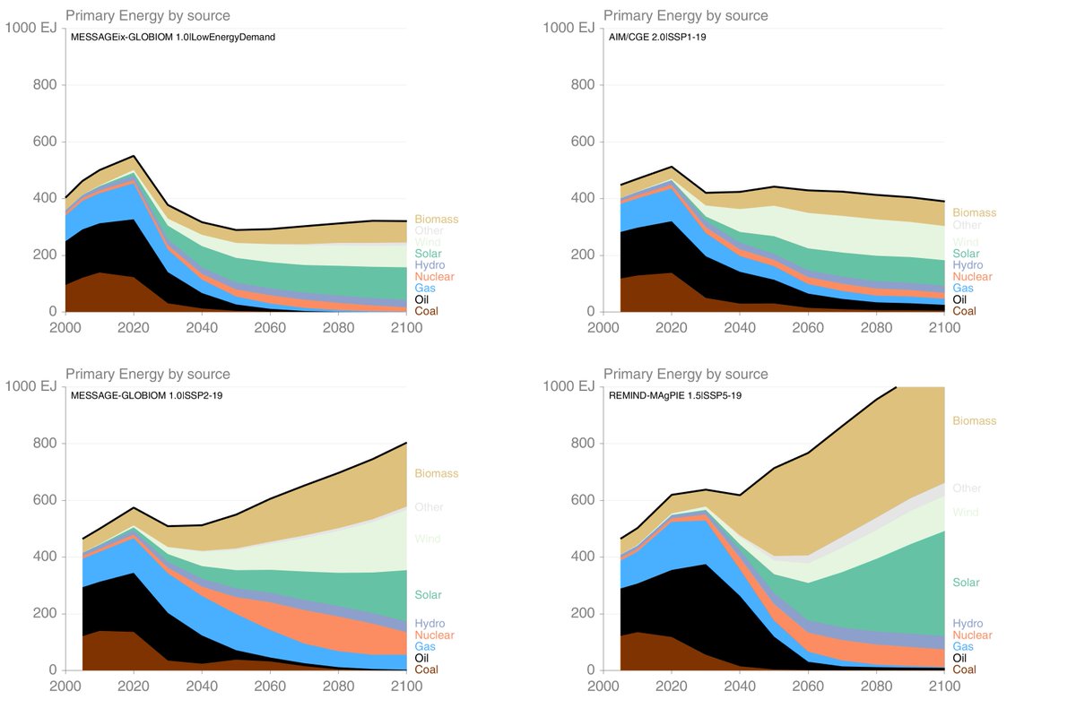
This is how the illustrative scenarios are presented in the #SR15 SPM. The energy system is shown by the table, the figures seem to give the key characteristics. It seems the selection was based on the use of biomass. 2/ 
P1 (LED) & P2 (S1) have the lowest use of biomass across scenarios, P4 (S5) has the highest use of biomass. They are outliers, which was perhaps the point of the selection? Because they are outliers, they potentially give a skewed perception of how most models get to 1.5°C! 3/

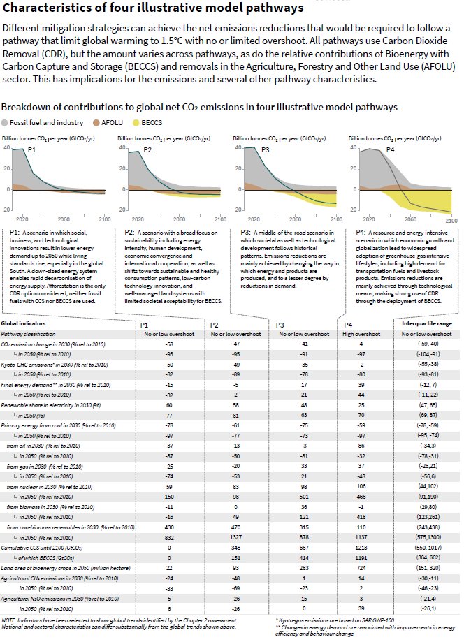
There is an assumption, it seems, that P1 must use less land for mitigation & P4 the most. This is in fact wrong, as the land use for afforestation, used in all illustrative scenarios, dominates! (note colours in the figure parts do not correspond) 4/

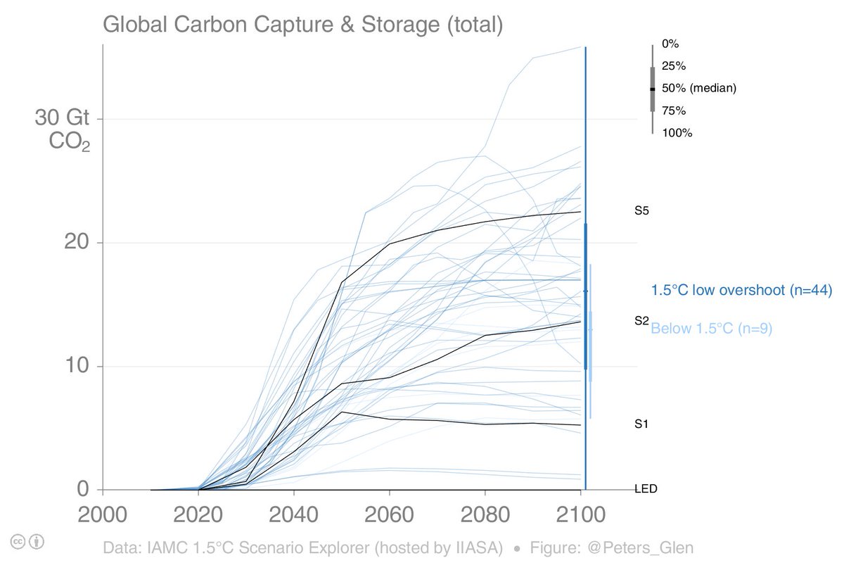
There also seems to be an assumption that there is some continuum of scenarios from P1 to P4. This maybe approximately true for CCS, but it is not true for other parts of the energy system. 5/

For all these reasons, I am quite sceptical of picking out one scenario, or sets of scenarios, to represent 1.5°C. If I had to choose one figure, I would rather plot the median. Even though the scenario database is not a random sample, the median is probably more robust. 6/

Also possible to do for CO2, as then you see the role of LUC (afforestation) and BECCS (negative emissions) in the scenarios. 7/

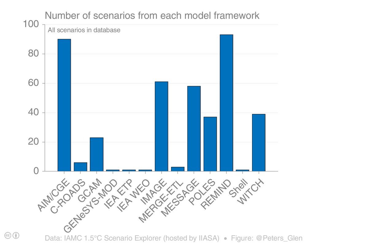
The sample consistent of 53 scenarios (not all series are fully populated). I have taken the median, smoothed the data (10 year window), & matched historical & future data sets to ensure a smooth transition. Across the model ensemble, this is what 1.5°C looks like. 8/
I get both positive & negative feedback on this figure. My goal was to simplify to one figure the energy system, so I can in one or two slides, show the "key characteristics" of a 1.5°C. I also show for CO2. Happy to get feedback... 9/9
Bonus tweet. Here is a presentation where I used the figures (5 minute presentation). cicero.oslo.no/en/posts/news/…