,
26 tweets,
7 min read
Read on Twitter
So I'm going to try something here. I'm going to do a monster thread about using stories to help visualize the relationship between design and business in order to make more intentional, ethical choices.
Let's go!
Let's go!
For all the efforts of smart and well-meaning professionals, the interfaces between humans and the economic entities we’ve created seem not to be so much on the side of the humans and trending worse.
This is *the* central problem of digital interactive systems design.
This is *the* central problem of digital interactive systems design.
The tendency for designers to consider system design only from the point of the user—and emphasize empathy—has contributed to this.
Design is only as “human-centered” as the business model allows and designers have been treating business models as givens.
Design is only as “human-centered” as the business model allows and designers have been treating business models as givens.
To the the extent that a business takes place in software, designing the software is designing the business.
Unless designers consider and influences the whole system, they risk contributing to a beautiful experience that exploits people, or to a beautiful experience that fails.
Unless designers consider and influences the whole system, they risk contributing to a beautiful experience that exploits people, or to a beautiful experience that fails.
We need to move from user-centered design, to value-oriented design. This means thinking about designing the exchange of value between an organization and its customers in a real-world context. (May @MrAlanCooper forgive me for conflating user/customer for the sake of a model.) 

The tension between design and business turns on the type of data used to make decisions and express value. Value to humans/users is qualitative. Value to business is quantitative.
In order to make holistic decisions, we need a representation that makes that translation.
In order to make holistic decisions, we need a representation that makes that translation.
Services that offer a sleight-of-hand conversion of messy human experience to tidy numbers turn a tidy profit. They make out like bandits—even when the numbers are meaningless—because managers demand measurements.

Humans run on stories. Narrative is how we organize and coordinate our frankly disordered experience of life. As much as we want to think we are analytic and "data-driven", we all make choices based on habits and stories, *then* figure out how to explain those choices.
Kurt Vonnegut had an idea about stories that is exceedingly useful to both business and design.
He graphed stories along a timeline showing the good fortune and misfortune of the protagonist. For example, Cinderella from downtrodden to happily ever after:
He graphed stories along a timeline showing the good fortune and misfortune of the protagonist. For example, Cinderella from downtrodden to happily ever after:

You can also graph the prince's story AND show the prince and Cinderella in the same view. Sadness at midnight. Happiness after shoe fits.
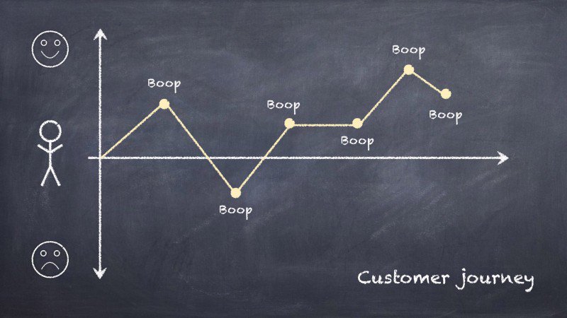
Designers are familiar with story graphs like Vonnegut's as "Customer Journey Maps" or similar, but usually only one perspective at a time.
Designers are familiar with story graphs like Vonnegut's as "Customer Journey Maps" or similar, but usually only one perspective at a time.


The customer journey map represents a story—a series of interactions between a person and whatever a company offers. (Each interaction is called a "touchpoint", which is a little gross. So, I’ve replaced touchpoints with “boop.” Suggest you do same.)
But it only shows one side.
But it only shows one side.
Businesses have storylines too. The successful ones tend to resemble one another.
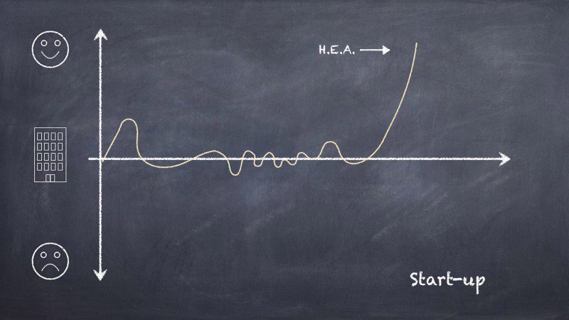
For example, here is Paul Graham’s well-known-in-Silicon Valley start-up graph. This diagram is popular because it tells a clear, aspirational story.
Cinderella for early stage companies.
For example, here is Paul Graham’s well-known-in-Silicon Valley start-up graph. This diagram is popular because it tells a clear, aspirational story.
Cinderella for early stage companies.
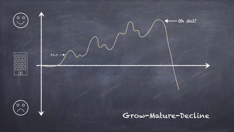
But what happens if you zoom out and extend the business story timeline?
Even for the luckiest companies, that high growth "happily ever after" tends to maturity and decline.
Even for the luckiest companies, that high growth "happily ever after" tends to maturity and decline.
As industries and businesses mature, and prospects for continued growth fade, companies look for new ideas that will plump their value without cannibalizing their core business.
They acquire bright young things, or start internal “innovation labs”, or turn to "design thinking".
They acquire bright young things, or start internal “innovation labs”, or turn to "design thinking".

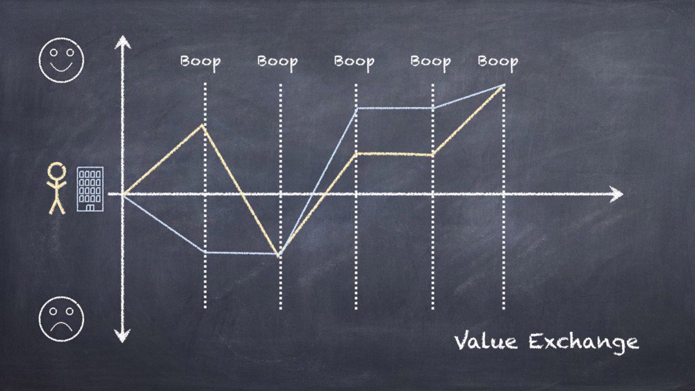
So, designers have customer journey maps, lines graphs representing value to the user. And businesses have line graphs representing the value of the business.
Even though people and businesses are interdependent, we've been missing a simple combined visualization.
Huh.
Even though people and businesses are interdependent, we've been missing a simple combined visualization.
Huh.
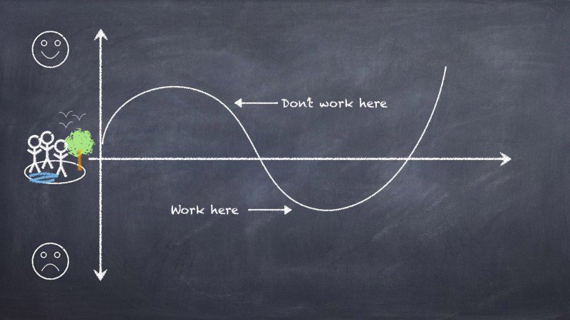
In order to visualize the exchange of value, we could just plot both customer and business story on one graph.
At every point of interaction, it's easy to see who is benefitting and how much, in a rough, for the sake of discussion way.
This is the view we've been missing:
At every point of interaction, it's easy to see who is benefitting and how much, in a rough, for the sake of discussion way.
This is the view we've been missing:
Everything I’m talking about here is an over-simplification. But the only way we can work together across disciplines to solve hard problems is by creating a lingua franca of conceptual simplicity.
Complex representations, intentional or not, can hide a lot of dirty dealing.
Complex representations, intentional or not, can hide a lot of dirty dealing.
A lot of business is based on identifying a resource (petroleum reserves, idle automobiles, human attention) extracting value from it, and often depleting it.
If business success means harm to the system, every individual contributing to that success is doing harm.
If business success means harm to the system, every individual contributing to that success is doing harm.
How often do designers stand back and ask whether they are creating a real harm—a problem or injury not reflected in the balance sheet—at the same they are solving a business problem, or "delighting" an individual customer?
Not often enough.
Because it's not "part of the job".
Not often enough.
Because it's not "part of the job".
Of course, we are talking about wicked problems with no definitive solution and many trade-offs, but we have to stop burying our heads in the details of our discipline-specific documentation.
We can't work as though "user empathy" and "shareholder value" are different planets.
We can't work as though "user empathy" and "shareholder value" are different planets.
Try this with your own business or product or service.
Draw one line for customer well-being.
One for business success.
One for the surrounding environment (industry/society/planet/whatever)
See how well they align at each point. Discuss different scenarios and timescales.
Draw one line for customer well-being.
One for business success.
One for the surrounding environment (industry/society/planet/whatever)
See how well they align at each point. Discuss different scenarios and timescales.
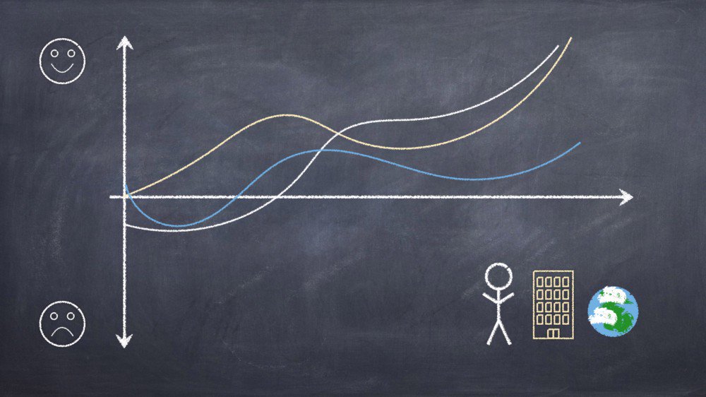
Graphing multiple perspectives against one another doesn't take special skills, or tools, or software. You can use it to visualize historic correlations or discuss hypothetical scenarios.
You should make it part of your basic practice.
You should make it part of your basic practice.
The only way to design ethically is to design so that business success, customer wellbeing, and environmental health are in alignment, or at least not in opposition.
This requires that you keep the big picture in mind at all times.
This requires that you keep the big picture in mind at all times.
Thank you for coming to my TED talk.