,
20 tweets,
6 min read
Read on Twitter
Alright, ready to learn my approach for simplifying science?
We have to start with a poll, of course!
What do you think is the most important part of the scientific work (that you'll be making an #SciComm #infographic of)?
We have to start with a poll, of course!
What do you think is the most important part of the scientific work (that you'll be making an #SciComm #infographic of)?
I don't have an answer to this question bc I think it really depends on the actual scientific work. But what I CAN answer is what I think is the most important part of the infographic. (Get to it in a sec & I think it may be what many of you think of as impact)
The very first thing you should decide for your infographic is the size. Is this going to go on Instagram (1080 x 1080 px), will it be printed in a magazine (8.5 x 11"), is it for a sidebar on a website? This is going to dictate how much space you have.
Print infographics often need more extra padding around edges, so the amount of space is even less. But web graphics sometimes need larger text, which limits space.
The same infographic can sort of work on different mediums, but not really.
So knowing format == important!
The same infographic can sort of work on different mediums, but not really.
So knowing format == important!
I divide the content for my infographic #SciArt into 4 categories:
- Title
- Background
- Content
- Main Point
- Title
- Background
- Content
- Main Point
The absolute FIRST thing I identify when starting an infographic is the MAIN POINT.
This point defines the infographic, both what visuals I need and what text I need.
This point defines the infographic, both what visuals I need and what text I need.
After talking with a client about their research, I typically ask "What's the one thing you want ppl to remember when they leave the infographic?"
Many actually find this a bit difficult at first, but after a moment of thought, it's obvious to them.
Many actually find this a bit difficult at first, but after a moment of thought, it's obvious to them.
Identifying the ESSENTIAL BACKGROUND information is also important. This gives a clear idea of the starting point for the story.
I usually limit background to 2 sentences.
I usually limit background to 2 sentences.
Once I have framed the story, I try to come up with a TITLE.
Should be short and accurate, but the title is mainly to grab a reader's attention. If the audience gives your infographic only 3-5 seconds, they'll see the images and the title.
Should be short and accurate, but the title is mainly to grab a reader's attention. If the audience gives your infographic only 3-5 seconds, they'll see the images and the title.
Think about how you decide which articles to read, or which posters to look at during a poster session. I definitely look at titles and figures to decide if I'm interested. (Maybe that's just me?)
It may seem counterintuitive, but I write the CONTENT LAST.
By this point, I know the beginning (A) and end (B) of the story.
I need to figure out how to get from A to B in the most concise but complete way possible.
By this point, I know the beginning (A) and end (B) of the story.
I need to figure out how to get from A to B in the most concise but complete way possible.
This is the hardest step for the scientists I work with.
What they think is important (bc IT IS for the research) may not be pivotal to the infographic.
Some things will distract from the main point. This is hard, but a worthwhile step!
What they think is important (bc IT IS for the research) may not be pivotal to the infographic.
Some things will distract from the main point. This is hard, but a worthwhile step!
EVERY detail is not important (for the infographic).
The point is to get someone excited, not to replace a book chapter or a dissertation. As I said earlier, if you have more points to get across, consider a comic or video series.
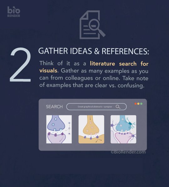
Here's an example story.
The point is to get someone excited, not to replace a book chapter or a dissertation. As I said earlier, if you have more points to get across, consider a comic or video series.
Here's an example story.
I was working on an infographic with a colleague. We met in a conference room, and I had her tell me about her research. We went through my method, and within about 30 minutes, had a few design possibilities for the infographic.
There were 2 pieces of info that she would not, could not back down on. They HAD to be in the infographic, even though I didn't think they were necessary.
So I said okay.
One, I only included visually. The other...I completely forgot about (no really, I did).
So I said okay.
One, I only included visually. The other...I completely forgot about (no really, I did).
We went back and forth a few times on some small details (color, placement of text). And then I asked her for the final okay. She gave it.
It was then that I looked back through my notes and realized I had forgotten this important point that she said HAD to be in it.
It was then that I looked back through my notes and realized I had forgotten this important point that she said HAD to be in it.
I presented this infographic to a group as part of my in-person From Science To Infographic workshop. She was in the audience.
And I brought up this story.
Afterwards, I asked her about it, suggesting she try to make an infographic with all the info she thought was necessary.
And I brought up this story.
Afterwards, I asked her about it, suggesting she try to make an infographic with all the info she thought was necessary.
This thread is full of tips that are meant to help you solve the 1st of the two hard talents in making infographics: simplifying science.
Later on today, let's discuss a few ways to handle the 2nd talent: making the art.
I can't teach you how to draw in tweets, but...
Later on today, let's discuss a few ways to handle the 2nd talent: making the art.
I can't teach you how to draw in tweets, but...
...I definitely think there are principles that can help you along the way.
Have questions? Let me know!
And thank you for all your insights!
Have questions? Let me know!
And thank you for all your insights!