Coming up in a bit, how to deal with that pesky art side of making infographics! 😂
What do you think is the most important part of this?
So let's talk about some principles that will help you with your infographic designs OR for giving constructive criticism of other's designs.
Exceptions exist, of course, especially if you're doing a highly themed piece.
What are good reasons to justify? Check this out. monkeyslunch.com/to-justify-or-…
I mainly center titles, and often not even that. I typically use centering as a type of emphasis.
I'll tell you a secret. You can find color palettes online. I have a Pinterest board full of color palettes. Some work better for some projects than others.
pinterest.com/gaiusdivifiliu…
all by @echoechoR
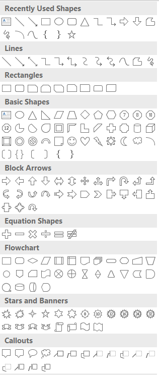
Think outside the box. EG, Powerpoint has all these shapes available! You can use them or combine them to create interesting art.
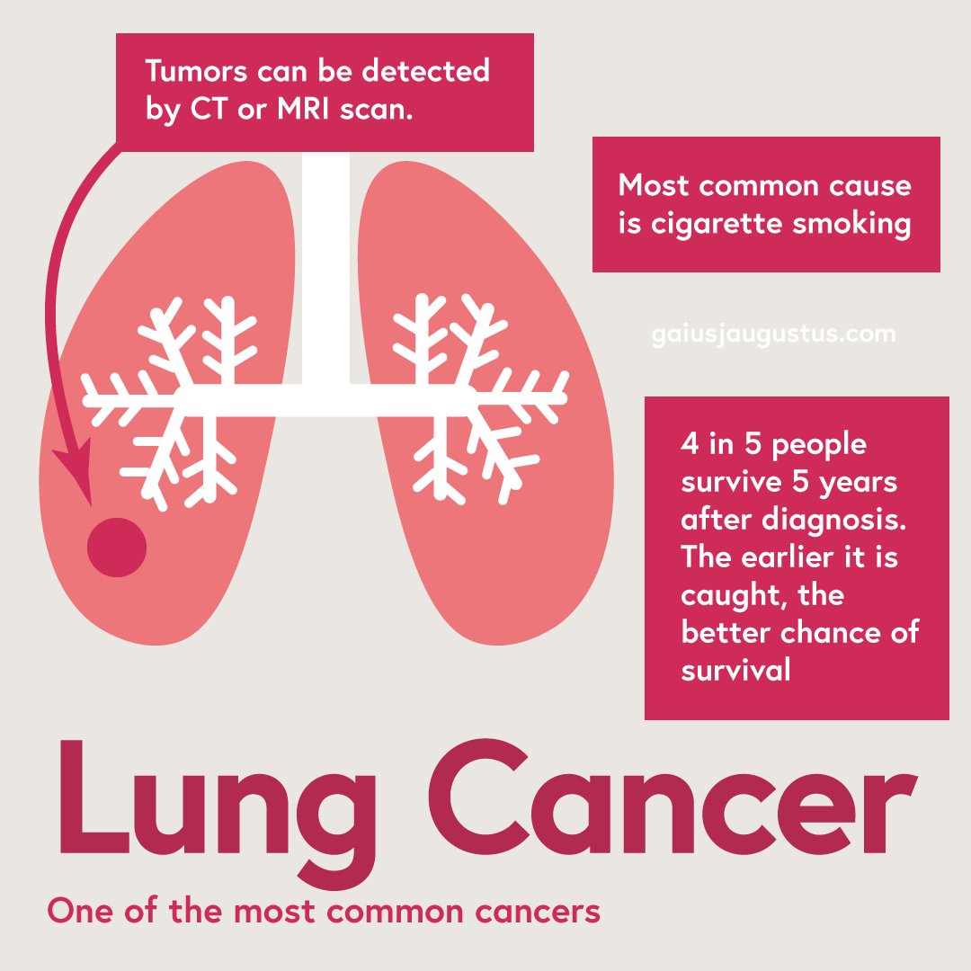
I'm working on a series of blog posts to teach these methods in Adobe Illustrator. If you're interested, you can sign up for my newsletter to find out abt new blog posts, or just check it every once in a while.
I'm also planning to do the same w free/less expensive tools! You shouldn't have to be rich to get started!
And if there's interest, I could do an online workshop. 🤷♂️ We'll see. I'm still figuring it all out.
Just like science, you can find tools and gain skills. But learning some basic principles can take you far!
I'll stop here for the night. If you have questions, I'm happy to answer!

