,
10 tweets,
7 min read
Read on Twitter
Happy Tuesday everyone :) Let's talk journal figures & graphical abstracts! It's a pain point (yet necessity) for many scientists. Here are a few best practices (and what-not-to-dos) 📝
Tip #0 (ie before you start) - Always check journal specs (font/image size etc) & plan ahead!
Tip #0 (ie before you start) - Always check journal specs (font/image size etc) & plan ahead!

Tip #1: 📑 Summarize your research/story in 1-2 sentences (this can be difficult but 100% possible!). NOTE: although tempting, do not sway from this summary as you compose your image. If you find you have more to show, this might warrant another image altogether ✅

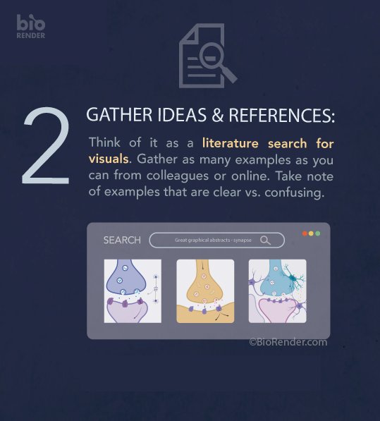
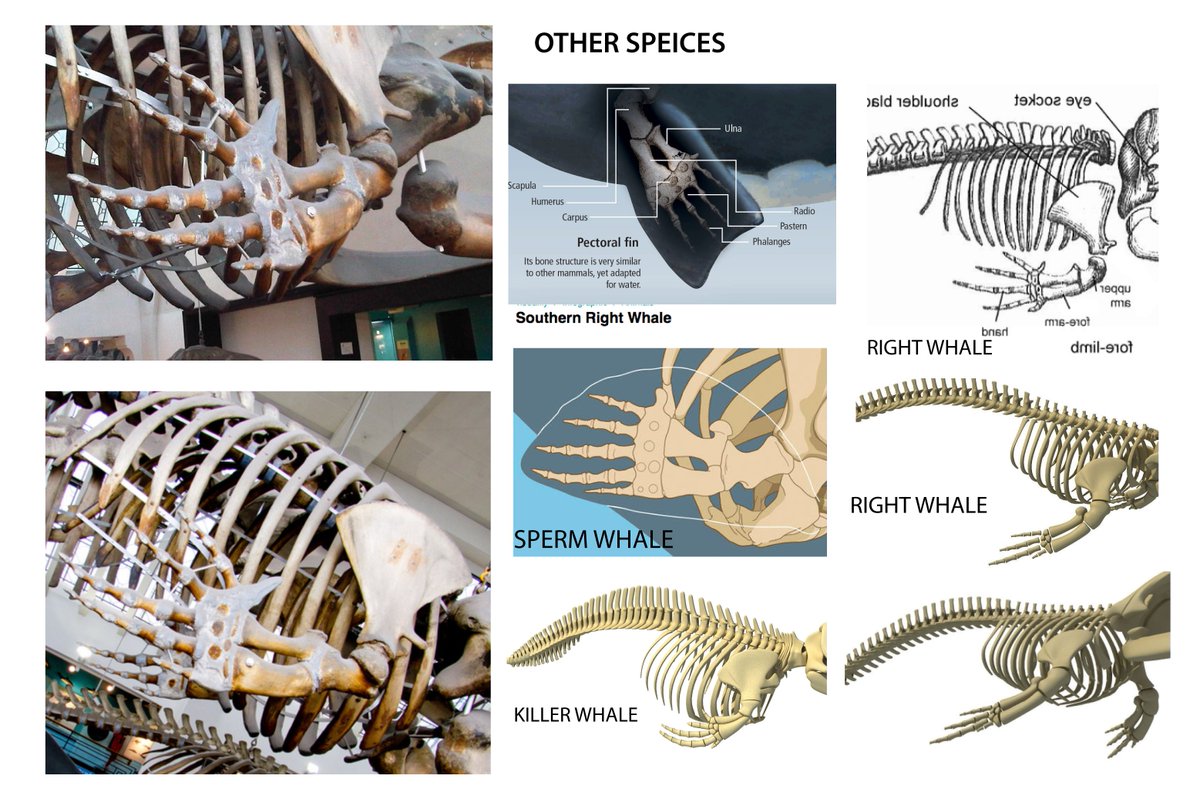
Tip #2: 🖼️ Gather references (both for content & style). Most professional illustrators create visual idea boards (see my messy one for a @NatGeo story below). Lay all out in 1 page like a Pinterest board. NOTE: Don't rely on 1 image to 'copy'! need multiple to ensure accuracy ✅
Tip #3: ✏️ Always, always start with a sketch! Uglier the better. Sketch in your main “stage,” “characters” and minimize any “extras” in the scene 🎭 Professionals still rely heavily on the sketch phase as it’s the fastest way to flesh out ideas 💡✅

Continuing our #graphicalabstracts discussion! 🖼️ You've got your sketch, now you have to make the thing. Here are some tips to keep in mind:
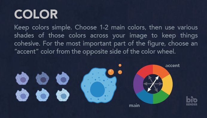
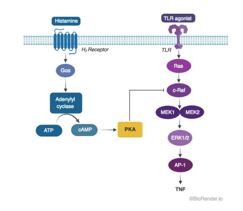
A) Colors: try to limit to 1-2 per concept w/ shades of each. For the most important part of the figure, use "opposite" color as “accent”
A) Colors: try to limit to 1-2 per concept w/ shades of each. For the most important part of the figure, use "opposite" color as “accent”

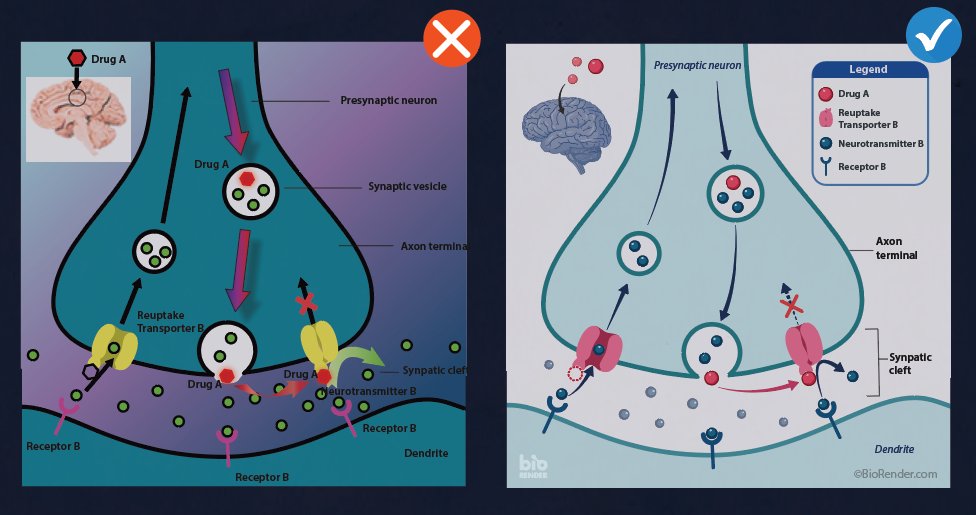
B) Contrast (value!): Color is deceiving, so ensure enough CONTRAST b/w background & objects. Always dark on light / light on dark 🔳🔲 Pro tip: test contrast by converting to grayscale digitally or print figure in black & white. If anything looks unclear, boost contrast 👍🏽


C) Text: 🔤 Be sure to follow journals' specs for font & sizes. Vary font size to indicate hierarchy. Tip: similar to colors, use variations w/in one font family (ie: Arial, Arial Bold, Arial Italics, Arial Narrow, etc)


D) Lines & Arrows 🔄 = your friend! Don’t leave them ‘til last min - include in your sketch 📝 Also try to use arrows for their intended purpose. Eg: faded arrow indicates movement, while dotted arrow shows past/future/potential events ↗️↩️➡️ The key = cosistency!


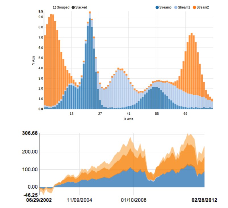
E) Avoid fancy effects like drop shadows, beveled edges, and gradients - these make your graphics look dated! Gradients are especially difficult to do well due to gradual contrast change (see the common pitfall below), so only use it for concentration gradients in experiments! 🧪

F) Margins! 📐 Particularly when making posters, try to keep equal spacing between columns/paragraphs/images across the entire composition. It will make your design look pro! Tip: Imagine Pacman being able to walk between all your margins without getting stuck ▶️▪️▪️▪️▪️▪️