,
19 tweets,
7 min read
Read on Twitter
A while ago I posted a thread exploring the linguistic tricks & flourishes used in ad copy.
This time I thought I'd shine the spotlight on the pictures. So here are some ads I searched out & liked, which have (virtually) no copy.
👇👇👇👇👇👇👇👇👇👇👇👇👇👇👇👇👇👇👇👇👇👇👇
This time I thought I'd shine the spotlight on the pictures. So here are some ads I searched out & liked, which have (virtually) no copy.
👇👇👇👇👇👇👇👇👇👇👇👇👇👇👇👇👇👇👇👇👇👇👇
As a starter for 10, here’s the 1962 Philips ad that @BruceMctague shared on Twitter & that started my hunt 

Here are some that do a good job of evoking physical sensations, emotions & memories.
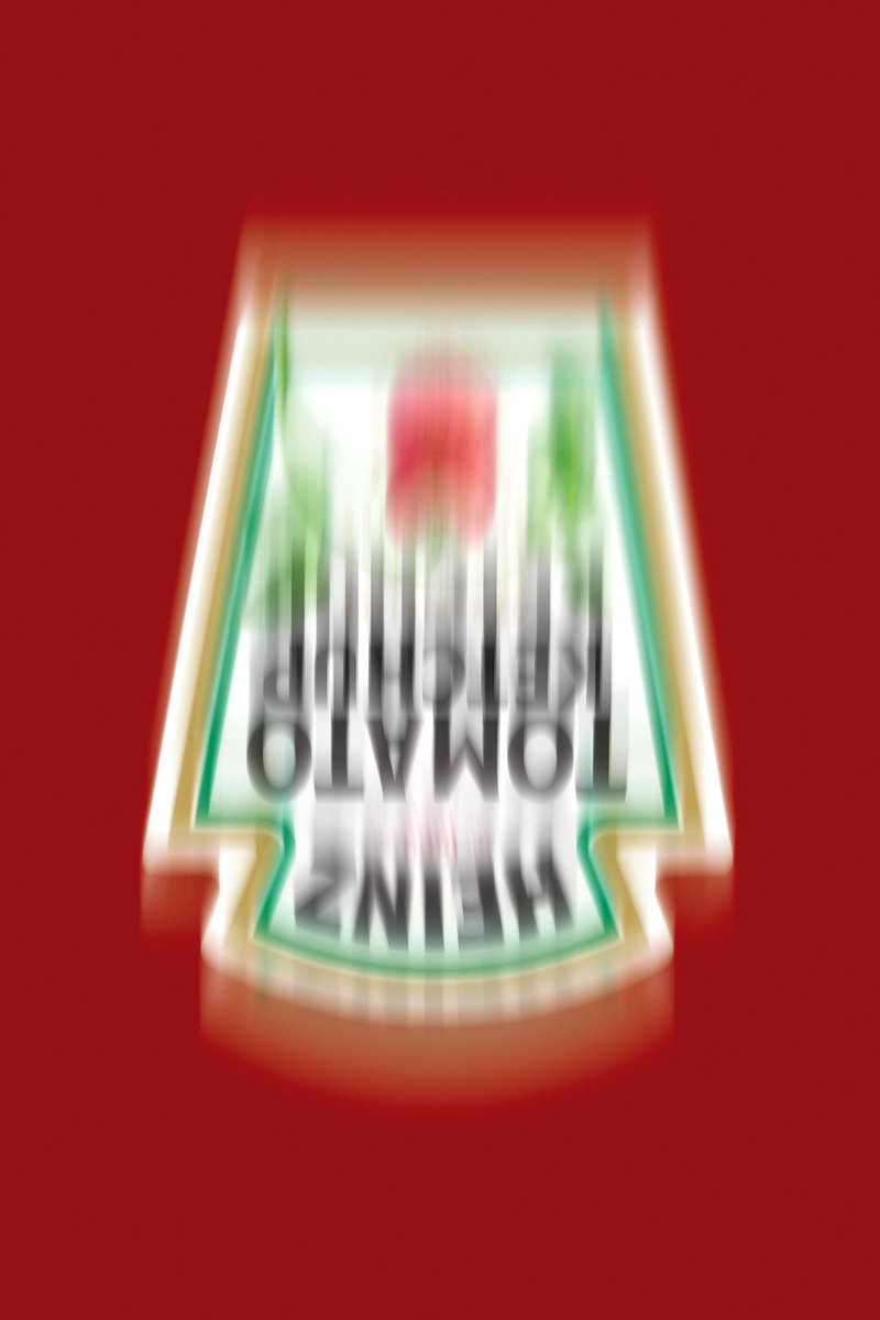
This one’s for Heinz Hot Ketchup. I like the way you can put yourself into the picture & almost feel the tingles
This one’s for Heinz Hot Ketchup. I like the way you can put yourself into the picture & almost feel the tingles

And here’s another one from Heinz, reminding you of shaking the bottle upside down. It’s also a nice way of playing with some of their distinctive assets
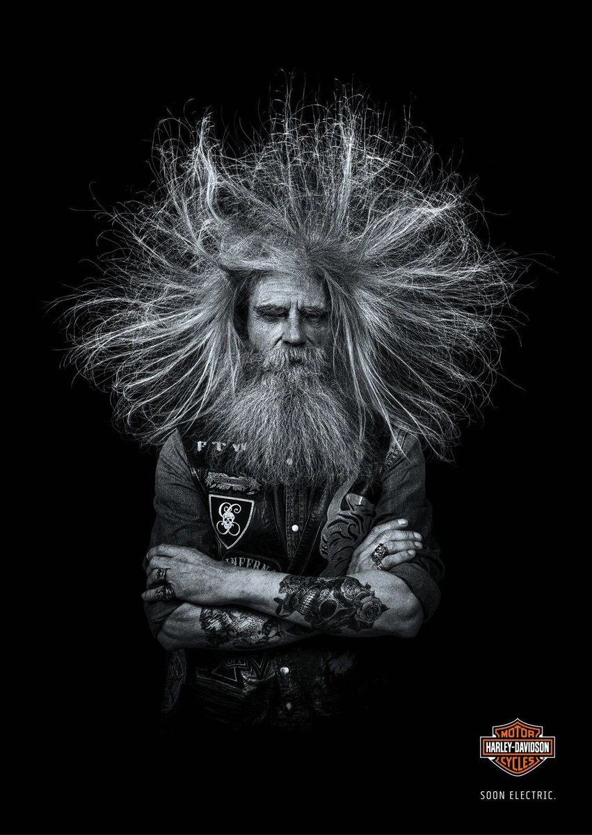
h/t @BMMarketer who shared this one from Harley Davidson announcing the introduction of their electric range.
This one came from @Suzannepope via @rshotton . You can imagine the brief may have been “show me what it feels like to play Jenga”.

Here are some great examples of showing, not telling.
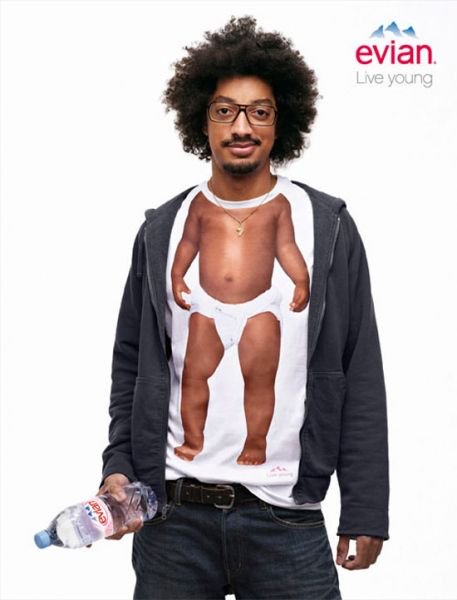
Evian does this in a brilliantly literal way, with a great visual representation of their live young tagline.
Evian does this in a brilliantly literal way, with a great visual representation of their live young tagline.
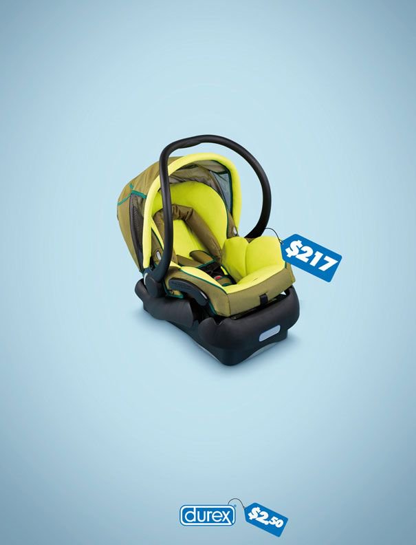
Durex pulls the same trick here, building in some loss-aversion for good measure.
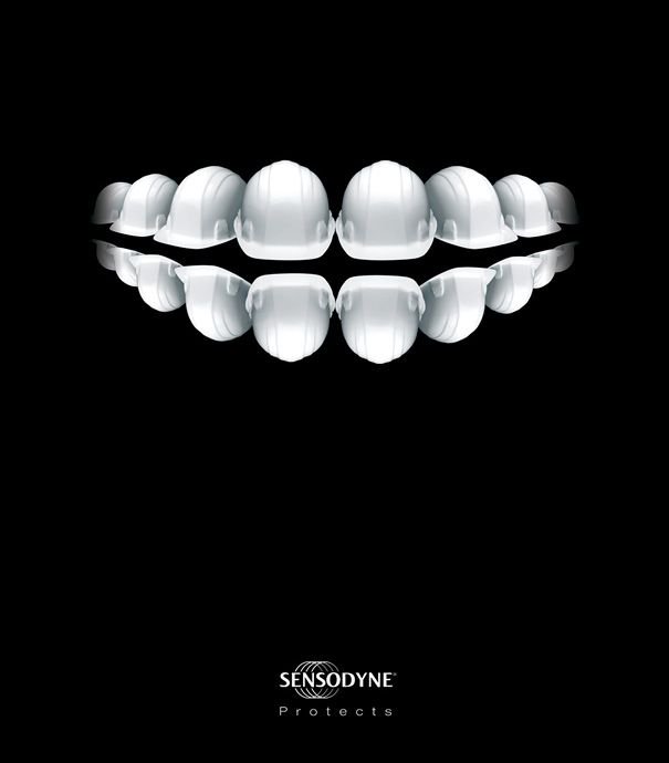
This image is wonderful, but for me the ad’s spoilt slightly by having the word ‘protects’ under the logo.
I wonder if the client insisted on adding it. To, you know, really make sure that people understand the key feature in our new toothpaste is that it protects your teeth.
I wonder if the client insisted on adding it. To, you know, really make sure that people understand the key feature in our new toothpaste is that it protects your teeth.
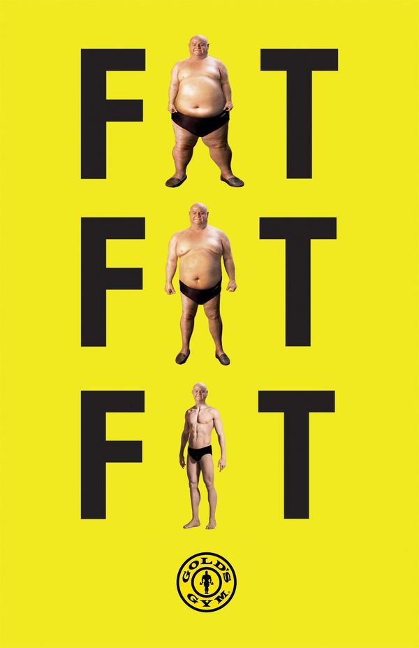
Not much to say about this ad for Gold’s Gym, other than it’s awesome.
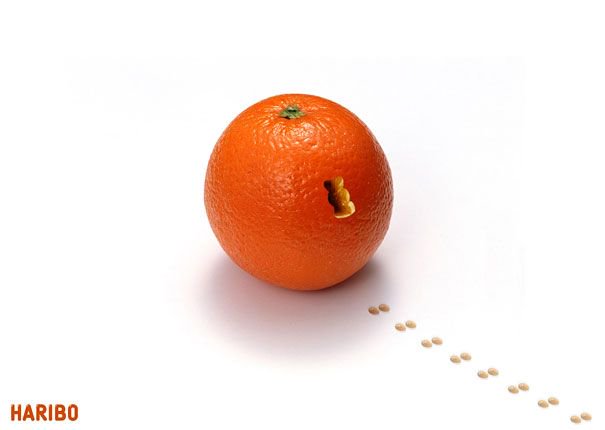
Likewise this one from Haribo.
Frank Lowe wanted these B&H ads to be deliberately nonsensical to circumvent the cigarette advertising regulations.
I love the way the product’s front & centre.
I love the way the product’s front & centre.
Is literal surrealism a thing?
This says nothing about cigarettes, but is most definitely a Silk Cut advert.
This says nothing about cigarettes, but is most definitely a Silk Cut advert.
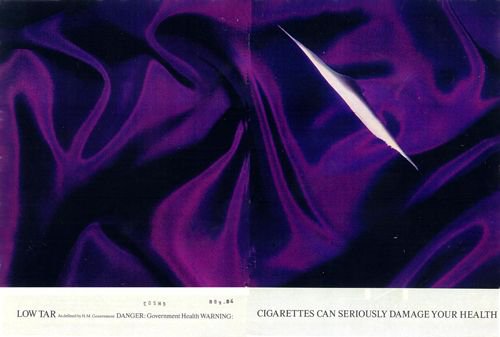
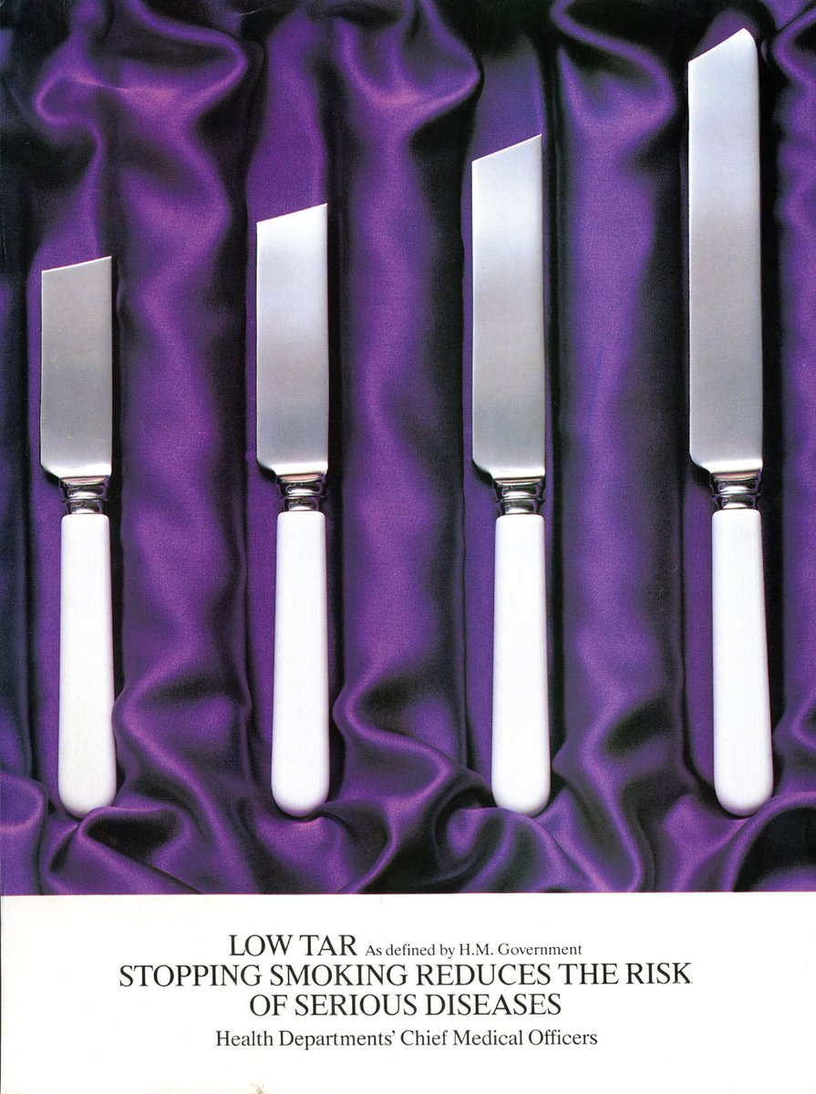
Plus another Silk Cut classic
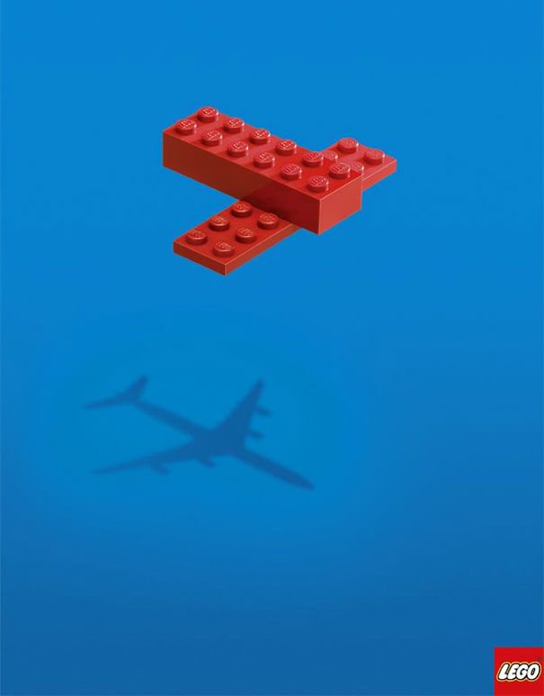
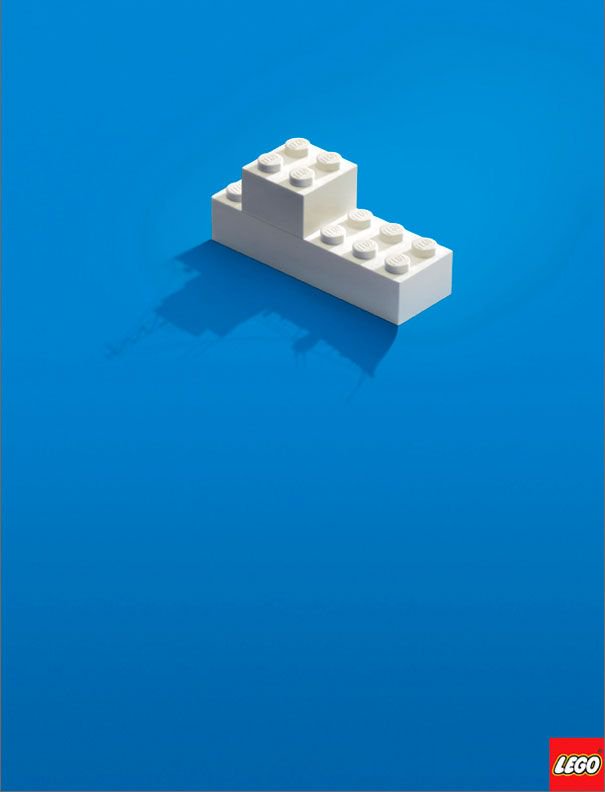
Here are some examples of ads using their distinctive assets.
These Lego ads make brilliant use of the Lego block. They also reinforce Lego’s core brand idea of imagination. The way they’ve created a sense of depth with the plane is astounding.
These Lego ads make brilliant use of the Lego block. They also reinforce Lego’s core brand idea of imagination. The way they’ve created a sense of depth with the plane is astounding.
This one pulls a neat trick of anchoring Lego to something else that’s instantly recognisable — the Mona Lisa. Note also the imagine block at the top left.

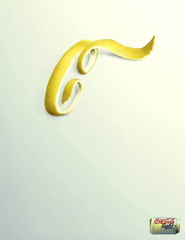
This ad brilliantly makes use of the Coca Cola font as a distinctive asset. I reckon you could probably get away with losing the can in the bottom right.
This ad utilises the yellow on red colour scheme to make it unmistakenly McDonald’s. I don’t think you could classify fries as a McDonald’s distinctive asset, but you definitely associate the two.

I don't know if any of these ever won anything at Cannes, but hopefully they've given you a nice little dose of inspiration.
If you want to see them all in one place, here's a link:
medium.com/@leegrunnell/a…
If you want to see them all in one place, here's a link:
medium.com/@leegrunnell/a…