,
4 tweets,
3 min read
Read on Twitter
It is amazing how little the global energy system has progressed in 70 years. This Sankey diagram, from 1952, looks almost identical today (in aggregate terms)!
Efficiency (primary to final energy) was 35% in 1952, today it is about 40%. Today has much more gas than 1952.
1/
Efficiency (primary to final energy) was 35% in 1952, today it is about 40%. Today has much more gas than 1952.
1/


It is interesting to see how oil & gas seem to replace coal in the energy system (the growth of coal was much higher until 1910 when oil & gas came along).
You can see how the energy system has grown since 1950...
2/
You can see how the energy system has grown since 1950...
2/


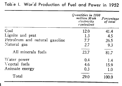
For the energy needs, here are the statistics for 1952... Human labour is included with draft animals in agriculture!
3/
3/
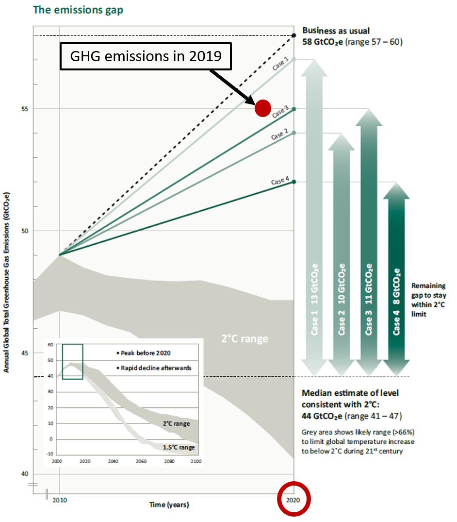
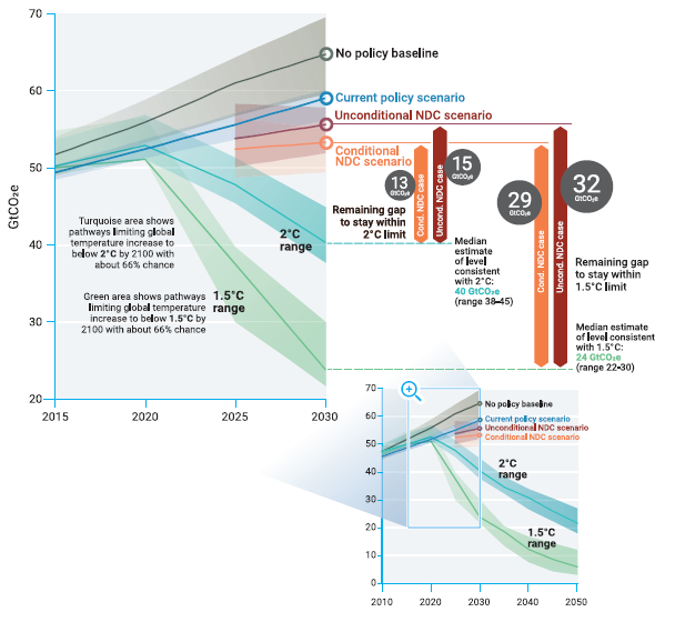
To keep below 2°C, we probably need to do much better...
References:
*
* Image
* More info folk.uio.no/roberan/t/Earl…
4/
References:
*
* Image
* More info folk.uio.no/roberan/t/Earl…
4/