,
29 tweets,
5 min read
Read on Twitter
It is time to tackle the CSS Flexbox specification.
drafts.csswg.org/css-flexbox-1/…
drafts.csswg.org/css-flexbox-1/…
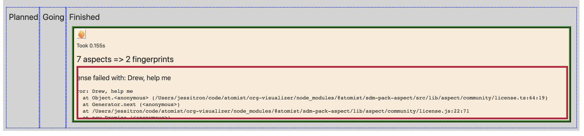
Motivating case: I have a layout problem. I'm tracking the movement of some processing (analysis of repositories) from Planned, to Going, to Finished, in three columns.
(this describes the "why" of that: blog.atomist.com/whats-lurking/)
(this describes the "why" of that: blog.atomist.com/whats-lurking/)
Currently, I laid this out in divs using 'display: inline-block; width: 30%' because I am familiar with inline-block.
This looks fine when the analysis is in process:
github.com/atomist/sdm-pa…
This looks fine when the analysis is in process:
github.com/atomist/sdm-pa…

But this is not helpful when there's stuff in only one column. In this case, I want to see more details of the errors in the "Finished" column, and there's no point having all that width wasted on the empty ones.

I hear that "flexbox" is designed for exactly this kind of thing. I want these columns to flex according to whether they have stuff in them. So let's check it out.
First, the intro nicely summarizes the layouts offered by CSS2.1:
block - for documents (think, newspaper-like)
inline - for text
table - for tables, yeah
positioned - for screwing with stuff that the others don't cover, good luck with this
block - for documents (think, newspaper-like)
inline - for text
table - for tables, yeah
positioned - for screwing with stuff that the others don't cover, good luck with this
'flex' is a new layout. It is most like 'block' in that it's about laying out a document.
what block has that flex doesn't: newspaper-centric stuff like floats and columns.
what flex has that block doesn't: web-app-centric stuff like ways to distribute space and align things.
what block has that flex doesn't: newspaper-centric stuff like floats and columns.
what flex has that block doesn't: web-app-centric stuff like ways to distribute space and align things.
with 'flex' you can reorder elements at the style layer, in case visual order and speech order need to be different.
hadn't thought about that before.
hadn't thought about that before.
Each 'display: flex' element has a *main axis* determined by its 'flex-flow' property, and then a *cross axis* which is ... the other one.
‘display: flex’ makes a containing block that is gonna use flexbox formatting inside it. From the outside, it is treated like a block.
‘display: inline-flex’ makes a containing block with the same formatting inside, but from the outside it works like ‘inline-block’.
‘display: inline-flex’ makes a containing block with the same formatting inside, but from the outside it works like ‘inline-block’.
Any top-level child of a flex container (element with ‘display: flex’) automatically becomes a flex item. It gets its own box in the flexbox. By default, this makes a row of boxes.
Text between items gets wrapped in a box, unless it’s just white space.
Text between items gets wrapped in a box, unless it’s just white space.
A flex item that specifies an inline display gets overridden, it gets the block-style equivalent.
Unless it’s out of flow. Absolute positioning is relative to the flex container (but let’s not).
Unless it’s out of flow. Absolute positioning is relative to the flex container (but let’s not).
In a flexbox, ‘float’ and ‘clear’ are ignored, yay
Margins of flex items do not collapse.
There’s something interesting you can do with ‘margin: auto’ - like, make that margin suck up space. Weird, since that’s usually the default.
There’s something interesting you can do with ‘margin: auto’ - like, make that margin suck up space. Weird, since that’s usually the default.
Something or other about z-ordering, but I haven’t fought with that yet
On a flex item, you can say ‘visibility: collapse’ to make it not show, but keep room for itself in the cross dimension.
That is, if your flexbox is a row, and you collapse its tallest item, the row will still be tall enough to hold it.
That is, if your flexbox is a row, and you collapse its tallest item, the row will still be tall enough to hold it.
But ‘display: none’ is more efficient, so only use ‘collapse’ if you might dynamically un-collapse it.
You can also use the ‘order’ property inside a media query, to change the order of columns based on the screen width. Tricky.
There is a very complicated attempt to find a reasonable minimum size for each flex item.
If this is your important flex item, set yourself a min-width (if this is a row) or min-height (if this is a column).
If this is your important flex item, set yourself a min-width (if this is a row) or min-height (if this is a column).
‘Flex-direction’ on the flex container can be ‘row’ (in the direction of text) or ‘row-reverse’ for backwards.
Or use ‘column’ to go in the direction of blocks (downward, for English) or ‘column-reverse’ for backwards (up).
Or use ‘column’ to go in the direction of blocks (downward, for English) or ‘column-reverse’ for backwards (up).
By default, a flexbox is a single line. If you want it to be multiple lines as necessary, use ‘flex-wrap: wrap’
(Or ‘wrap-reverse’ but that’s weird)
(Or ‘wrap-reverse’ but that’s weird)
‘Flex-flow’ is just shorthand for direction and wrap.
The ‘order’ property lets you put your elements in a logical-for-reading order, and then display them visually in a different order.
The default is zero, so set it to negative to make a flex item sooner, and positive to make it later.
The default is zero, so set it to negative to make a flex item sooner, and positive to make it later.
The main purpose of a flexbox is to distribute space in the main dimension.
Assuming this one is a row:
‘Width’ matters on the flex container,
But on the flex items ‘width’ is ignored. It’s all about the ‘flex’.
Assuming this one is a row:
‘Width’ matters on the flex container,
But on the flex items ‘width’ is ignored. It’s all about the ‘flex’.
‘Flex’ property (on a flex item) is shorthand for three properties.
‘Flex-grow’ is about, when we have extra space, how much do yu get, relative to your siblings?
‘Flex-shrink’ is about, when there’s not enough room, how much do you squish, relative to your siblings?
‘Flex-grow’ is about, when we have extra space, how much do yu get, relative to your siblings?
‘Flex-shrink’ is about, when there’s not enough room, how much do you squish, relative to your siblings?
‘Flex-basis’ is what you specify instead of ‘width’. It’s how wide (for a row) you want to be.
Wow, that’s confusing.
Or you can set ‘flex-basis’ to ‘auto’ and then it uses ‘width’
... which is the default so maybe it works ok?
Wow, that’s confusing.
Or you can set ‘flex-basis’ to ‘auto’ and then it uses ‘width’
... which is the default so maybe it works ok?
Progress so far: instead of using inline-block, I turn the containing div into a flexbox with 'display:flex'.
My columns become flex items.
I remove 'width:30%' to let them flex, and this looks nice:
My columns become flex items.
I remove 'width:30%' to let them flex, and this looks nice:
But now when all the columns are full, the flexbox is wider than the viewport. How do I tell the flexbox as a whole to stay in its containing block?

MYSTERY SOLVED!
@drewmcau reveals the secret. My contain-the-error-text box here had overflow:scroll, but the flexbox grew to hold its whole width.
Drew put overflow:scroll also on the flex item (parent of the box I wanted to scroll) and that gave flexbox a clue. It works now:
@drewmcau reveals the secret. My contain-the-error-text box here had overflow:scroll, but the flexbox grew to hold its whole width.
Drew put overflow:scroll also on the flex item (parent of the box I wanted to scroll) and that gave flexbox a clue. It works now: