**Data visualisation thread**
In the past few years, quite a few papers were published arguing that the way we visualise data in social and biomedical sciences should be more transparent. Below are a couple of do’s and don’ts for a range of designs. 1/
In the past few years, quite a few papers were published arguing that the way we visualise data in social and biomedical sciences should be more transparent. Below are a couple of do’s and don’ts for a range of designs. 1/
Before we start: If you prefer reading a paper over a thread, this one is useful doi.org/10.1161/CIRCUL… 2/
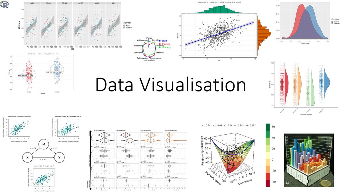
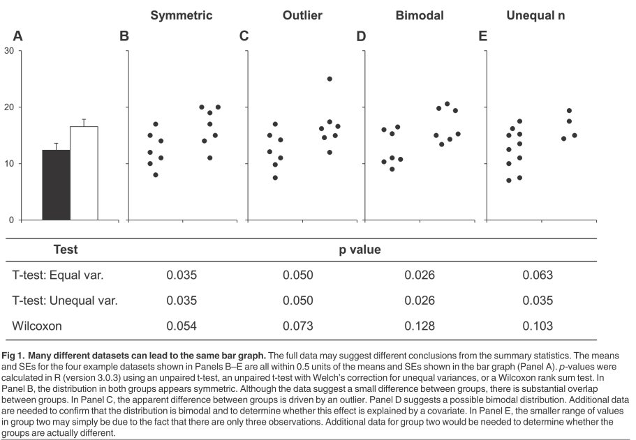
First, bar- or linegraphs should be avoided, especially when sample sizes are small: They conceal information about the distribution of the data.
doi.org/10.1371/journa… 3/
doi.org/10.1371/journa… 3/
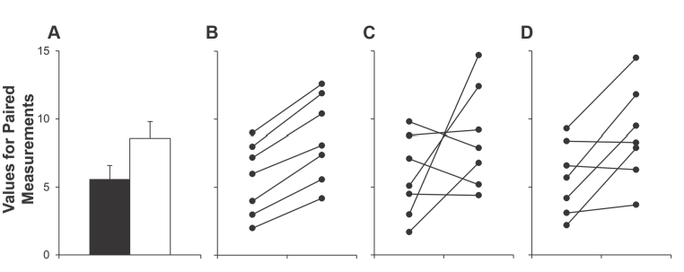
Also for within-subject designs they conceal potentially highly relevant information. doi.org/10.1371/journa… 4/
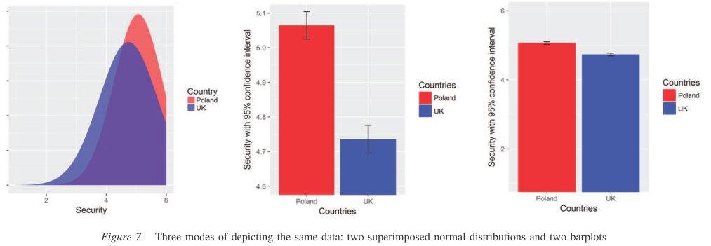
A big red flag is restricted the y-axis. Even when told that the y-axis has been restricted, participants still drastically overestimated the actual effect size. dx.doi.org/10.1037/pspi00… 5/
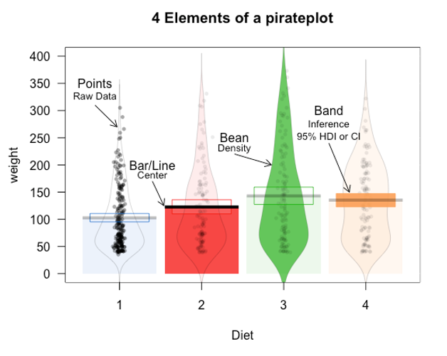
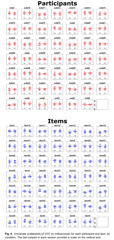
Better: Display the raw data (unless N is very large) alongside the mean/median, potentially smoothed kernel, boxplot or confidence interval. Examples are pirate plots dmyee.files.wordpress.com/2016/03/pirate… or raincloud plots doi.org/10.12688/wellc… 6/
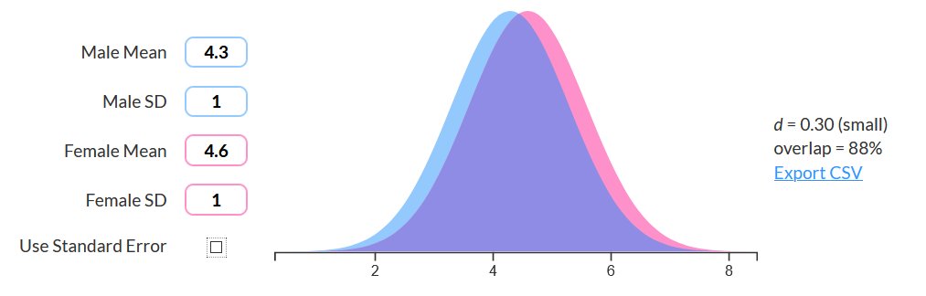
To highlight similarities between two groups (e.g., women and men), this interactive tool is useful sexdifference.org 7/
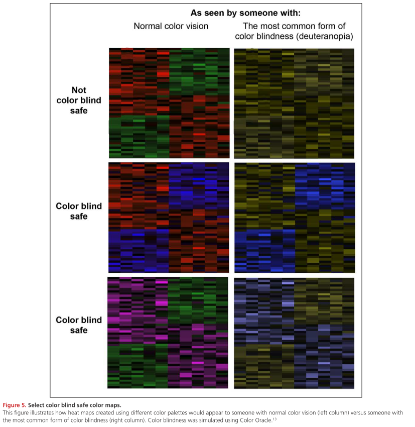
If possible, avoid red and green only graphs doi.org/10.1161/CIRCUL… 8/
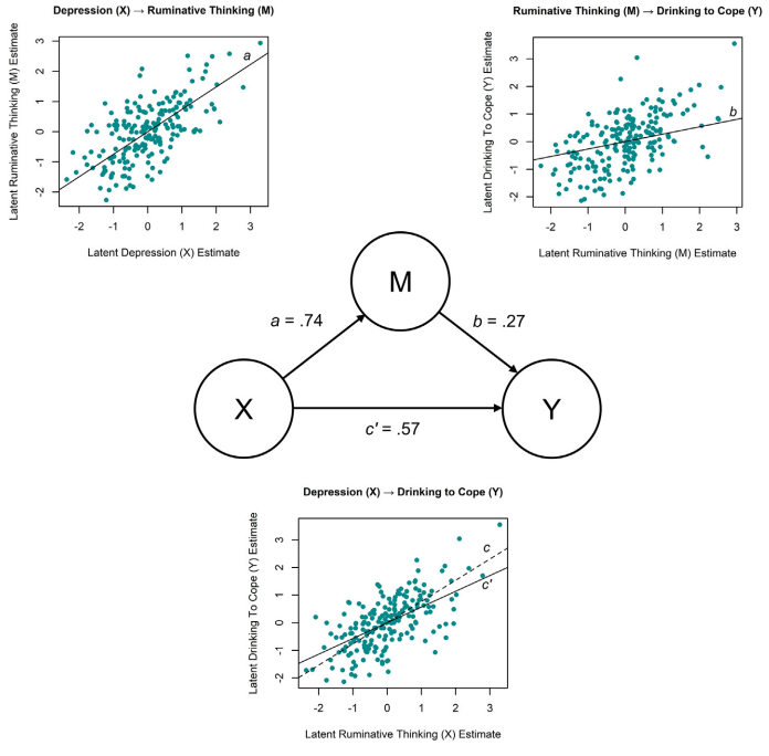
What about more complex designs? For a mediation, Hallgren et al. (2019) are suggesting graphs like this one: doi.org/10.1016/j.addb… 9/
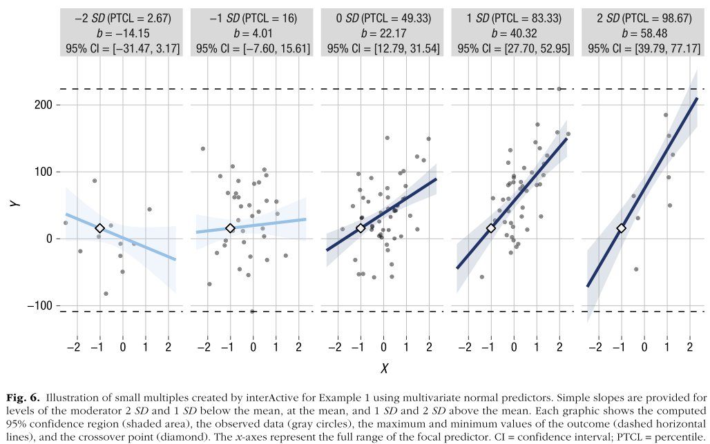
For interactions, McCabe et al. have created a Shinyapp connorjmccabe.shinyapps.io/interactive/ that is useful for creating interaction plots doi.org/10.1177/251524… 10/
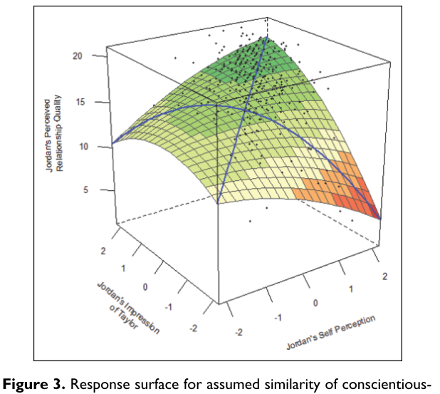
Moving beyond ‘simple’ interactions: To test for congruence, fit, or match, polynomial regressions and response surface analyses are the method of choice doi.org/10.1177/194855… 11/
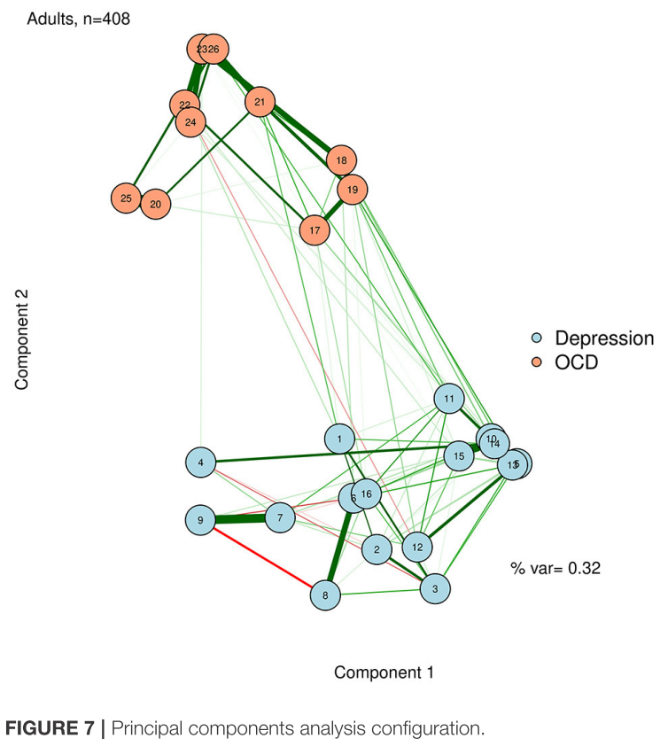
Plotting networks can be difficult. Jones et al. discuss the strengths and weaknesses of a range of plotting algorithms. doi.org/10.3389/fpsyg.… 12/
Visualising data from linear mixed effects models is especially tricky. Different types of plots are needed, argue doi.org/10.1016/j.wocn… 13/
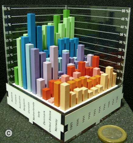
Finally, if you want that others remember your data, consider printing them in 3D, this improves information retrieval compared to on screen charts: doi.org/10.1145/247065… (barcharts have their advantages after all!) end/