Profile picture
Jensen Harris @jensenharris
, 25 tweets, 5 min read Read on Twitter
A few days ago, I wrote about the self-loathing I feel when I get “twitchy Slack finger” and impulsively switch to a channel to read something funny/interesting in Slack and, as a result, lose whatever I was previously reading forever.
There’s nothing easier (or really more cowardly) than poking holes in someone else’s user interface if not paired with constructive thoughts on how it might be improved. So, as promised, here are a few thoughts about some ways forward for Slack’s UI.
Read this for context if you missed the original conversation the first time around:

Ok. Let’s start with just 3 ideas for tonight.
1) Let’s get Slack a Back button. We are all intimately familiar with Back from the web browser, Android phones, Smart TVs, etc., but of course Back has a long and storied history of going in and out of style in software user interfaces.
Windows Phone built their entire UI around Back. iOS shoved it as an afterthought into the upper-left corner. Back can provide context and an easy way to return to a previous state when done well; when done poorly it just leads to a bad experience (for instance, many in-car UIs.)
We ended up taking Back out of Microsoft Outlook as a first-class UI affordance because it seemed to muddle the experience, leading to situations in which we were doing a bad job designing the rest of the navigation because we had the crutch of “you can always click Back.”
While I thought Back wasn’t good for a communications app, I think I was wrong, because nothing has changed my life more over the last week than the discovery that Slack actually HAS “back”—it’s just sadly keyboard-only.

Using Back in Slack:
Mac: ⌘+[
Windows: Alt+Left Arrow
So simple first idea: let’s give Slack a real Back button, front and center. You click on the notification for the GIF of the hilarious cat sliding on the frozen pond. No problemo! Just click Back, and you are right back where you were before. Problem solved.
2) Channel organization is too rigid. Slack in many ways derives from the legacy of IRC, in which there are communities built around topic-specific channels, each containing a self-contained conversation, participants, and rules. There's little overlap between most channels.
But Slack isn’t an IRC client. It’s really an organic, collaborative real-time organizational system. Unlike IRC, there’s a huge overlap between the people in many channels. There’s shared context between the channels. There are shared company rules, customs, emoji.
Organization in Slack can be infuriatingly rigid, because Slack is first writer wins. There are often several potential channels a topic could be discussed in, but whomever posts first gets to decide where the conversation happens, regardless if that makes sense to you.
I don’t know in how many different channels engineers have had conversations about which text editors are awesome/terrible/"how do you quit vim again? hahaha" at my company. Dozens? At least.
There are two traditional ways to organize information, and they work together. The first is containment (folders) and the other is search+filter. What's cool is that search+filter can be made to look like containment. We built Search Folders into Outlook around this idea.
What if Slack had the ability to not just search, but actually create “virtual channels” that looked like containers but were actually real-time smart searches+filters?
Imagine if you could define personal topics (like “stuff-from-my-boss” or “project-foo”) plus a set of keywords/people, and magically all the messages with the right context from the right people were suddenly in YOUR organization, no matter what channel they are _really_ in?
And thus, this points to the actual fundamental challenge for Slack moving forward: it needs the develop the ability to deeply understand language. To actually comprehend what people are writing about and how people and their text relate. Language is laden with signal.
Once I can tell Slack “hey I want a place to see Project Foo” and it creates a virtual channel that seamlessly tracks all of the conversations and context across everything I have access to with an elegant UI, it will become the most powerful communication tool in the world.
3) Last idea for tonight: Slack needs one quick, universal button that means “this is a thing I need to come back to” and then (most importantly) an excellent first-class view that shows me all of them, how many I have left, and the right surrounding context for each item.
One of the challenges with Slack is that it lends itself, chat style, to short messages: often only a few words or a single sentence. This isn’t a problem except that the ⭐️ feature in Slack only stars a single, isolated message within a conversation.
So, when I remember to go to my list of Starred items, they are often things like "Ok, Jensen can you take follow up on this?" and "So that’s why we need to do this really soon.” What? What is? Ugh.
There is a “Jump” button on each item in the Starred list, but that just ejection seats me out to the conversation in the original channel. As a result, my Starred list ends up being a narrow pane full of sentences that I can’t really remember what they mean anymore.
What if, at the time you were ready to Star something, you could select the entire relevant section and click ⭐️? (Not just one message.) Maybe I could draw a box around a relevant section, the way I might clip a screenshot to come back to.
In Outlook 2003, we introduced six colored Quick Flags. The idea was to give each person just enough categories to be able to exert a little bit of control and organization on the chaos around them. Perhaps Slack could benefit from a few different colors for the same reason?
In the end, Slack an amazingly fun set of problems to solve ahead, and a chance to shine the light forward towards the future of productivity and communications software. It will take both simple features and deep breakthroughs in contextual understanding of language to succeed.
I know there’s a ton more we could talk about (and not just about Slack), but I wanted to try to build on last week’s thoughtful conversation with a few ideas. Slack has a talented team and I know they are already deeply thinking about these issues and many more. I remain a fan!
Missing some Tweet in this thread?
You can try to force a refresh.

Like this thread? Get email updates or save it to PDF!

Subscribe to Jensen Harris
Profile picture

Get real-time email alerts when new unrolls are available from this author!

This content may be removed anytime!

Twitter may remove this content at anytime, convert it as a PDF, save and print for later use!
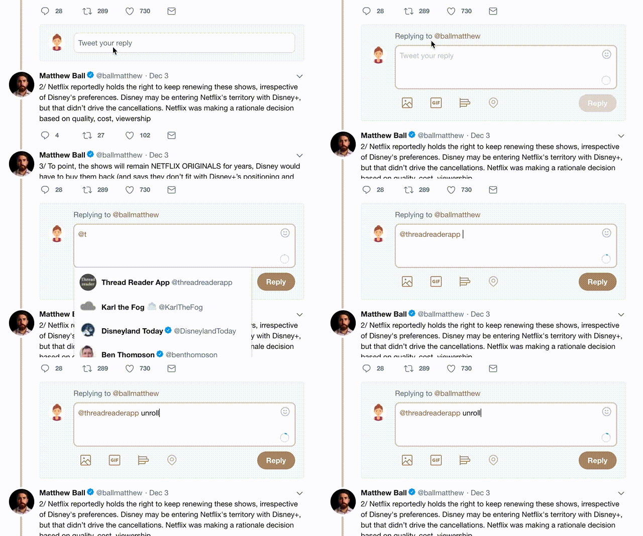
Try unrolling a thread yourself!

how to unroll video

1) Follow Thread Reader App on Twitter so you can easily mention us!

2) Go to a Twitter thread (series of Tweets by the same owner) and mention us with a keyword "unroll" @threadreaderapp unroll

You can practice here first or read more on our help page!

Did Thread Reader help you today?

Support us! We are indie developers!


This site is made by just three indie developers on a laptop doing marketing, support and development! Read more about the story.

Become a Premium Member and get exclusive features!

Premium member ($3.00/month or $30.00/year)

Too expensive? Make a small donation by buying us coffee ($5) or help with server cost ($10)

Donate via Paypal Become our Patreon

Thank you for your support!