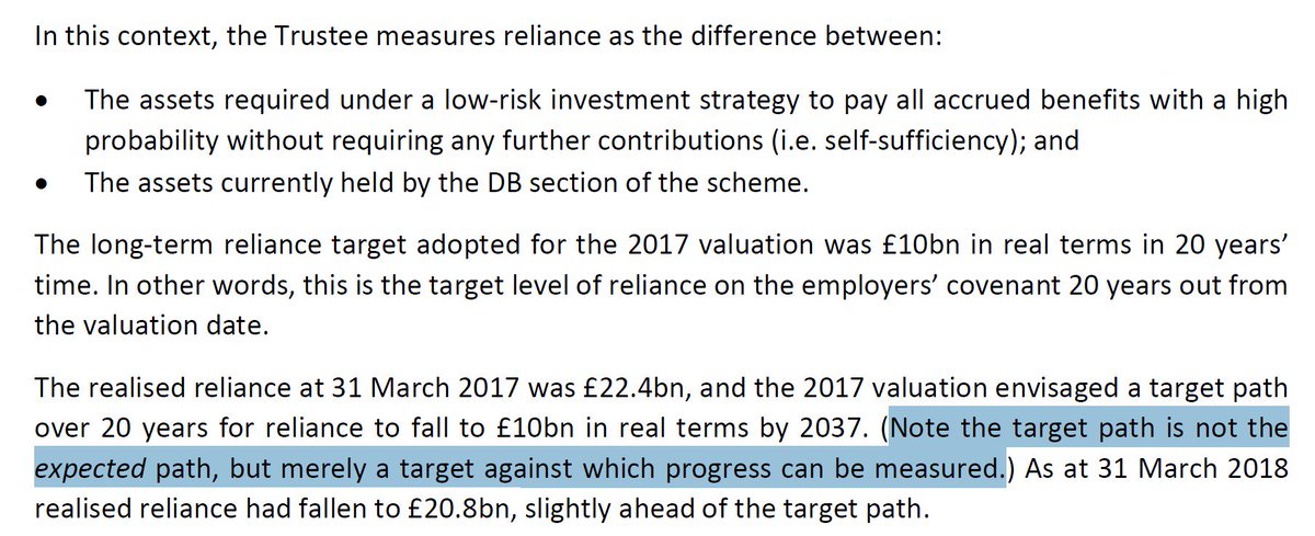
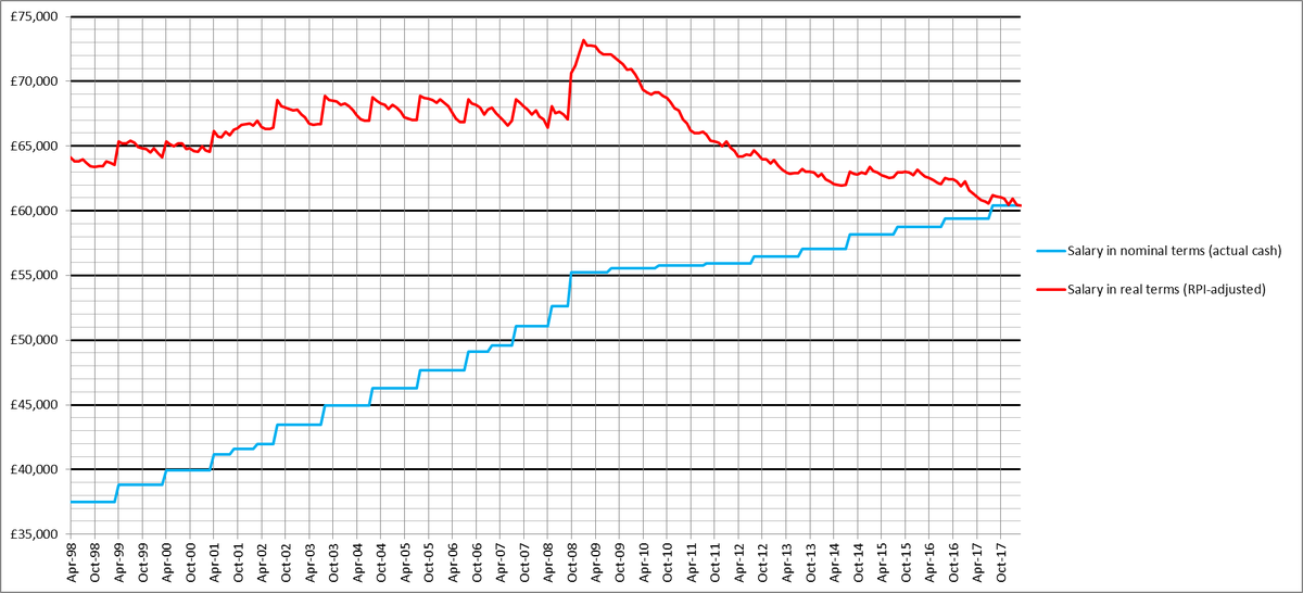
Below are updated graphs I've made, which show how much the salaries of academics have fallen in real terms, by different measures of inflation, during the last 20 years. These graphs represent negotiated increases to the pay scale (illustrated via point 51). 1/
In all of the graphs, the lower blue line represents actual pay, in nominal terms. Steps indicate when negotiated increases took effect. The higher red line indicates how much salaries have changed in real (inflation-adjusted) terms. 2/
This red line indicates how much our salaries have declined in RPI terms: 3/ 
Fortunately, our pay has not actually eroded that much in real terms, since RPI is a flawed measure of inflation, which uses a Carli formula that systematically overestimates inflation. This blog post from 2016 explains what's wrong with Carli: 4/
medium.com/@mikeotsuka/ho…
medium.com/@mikeotsuka/ho…
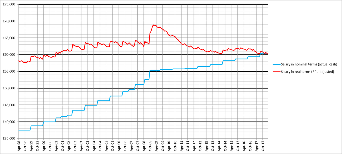
The following graph strips the flawed Carli formula out of RPI and replaces it with a statistically sound Jevons formula, to create the RPIJ measure of inflation ('J' = Jevons). I think RPIJ is the most accurate existing measure of the erosion of household purchasing power. 5/
Here is how much our salaries have declined by the CPI measure of inflation, which constitutes the Bank of England's target inflation rate. 6/
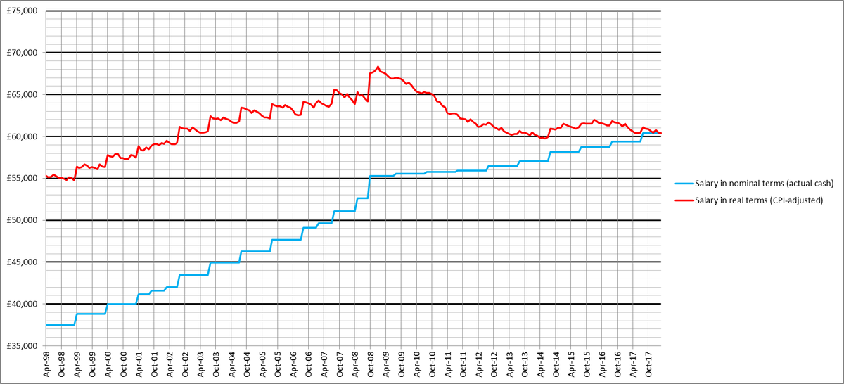
One defect of CPI, when compared with either RPI or RPIJ, is that CPI does not (directly) account for the cost of housing, which is typically a large expense for a typical household measure. 7/
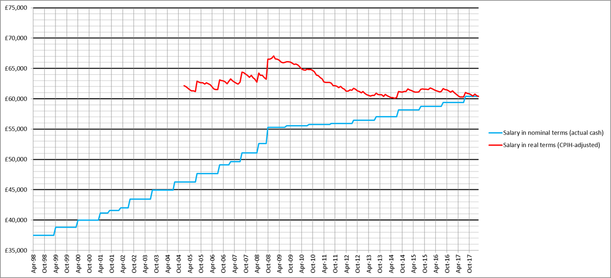
Recently, the government has introduced a CPI measure of inflation, which also accounts for housing costs. It's called CPIH. This is the measure our employer prefers to appeal to in salary negotiations. Here is how our salaries have changed, when measured by CPIH. 8/
But any CPI-based measure of inflation, including CPIH, suffers the following flaw: CPI measures the aggregate rise in prices across the economy, rather than the rise in the cost of living for the typical member of a household. 9/
RPI (and therefore RPIJ) is, by contrast, designed to reflect the cost of living for a typical household member. The government is now developing an improved measure of increases in the cost of living for a typical household measure. 10/
As I explain in this embedded tweet thread, RPIJ most closely tracks the government's household costs index (HCI) under development. 11/
So I would consult the RPIJ graph in tweet '5/', as providing the best representation of the actual effect of negotiated pay increases on our salaries in real terms. 12/
By this most accurate measure, there was a modest rise in our salaries in real terms from 1998 to 2008. Then there was a spike followed by a steep decline in real terms (reflecting a near freeze in salary increases in nominal terms), and then a more gradual decline. 13/
I discuss the 2008 spike in this tweet thread. 14/
One upshot of this thread is that, in real terms, our salaries are back to where they were in about 2001, according to the most relevant (RPIJ) measure of inflation graphed in '5/' above. 15/15
PS: In response to queries from @DameLEGOVC and @ruawall, the graphs are pegged to the top point 51 of the current negotiated national pay scale.
Apart from the very lowest points, where negotiated increases have sometimes been greater, the graphs would look the same if pegged to any other point.
One reason I chose 51 is that there is no (non-discretionary) progression up the points beyond 51. So someone is more likely to remain at that point for a long time than at any of the other 50 points.
I at first tried to choose the point that represented the pay of an entry-level lecturer. But I soon discovered that this point varied from university to university.
Perhaps I should have chosen some other point lower down the scale to plot. According to UCEA's latest pay statement, the median salary for 'Higher education teaching professionals' was £50,918 in 2017. That's c. point 45.
So maybe I should have plotted that point. This point must, however, be higher than the median pay of someone whose pay is affected by these national negotiations. And the actual current median pay point will probably vary over time. So I think I'll stick with point 51.
According to the most recent THES survey, "the mean average full-time salary for the sector was £40,449 in 2015-16". That corresponded to point 38, which is now £41,212. If you adjust my graphs by scaling everything down to about two-thirds, they'll represent average sector pay.
Here's a link to downloadable graphs and data, pegged (for reasons mentioned above) to point 38.
drive.google.com/open?id=1p6W1L…
drive.google.com/open?id=1p6W1L…