Morning, #dataviz folks! Here comes a thread on the "streamgraph" chart type used in the @FinancialTimes graphic on Premier League shirt sponsors.
The research paper by @leeb & @wattenberg that introduced streamgraphs to the world is one of the best dataviz papers I've ever read
The research paper by @leeb & @wattenberg that introduced streamgraphs to the world is one of the best dataviz papers I've ever read
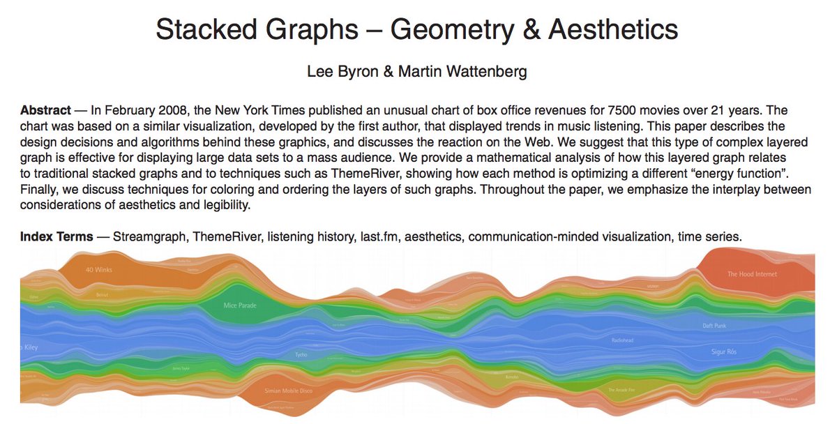
1/16 In November 2008, @leeb & @wattenberg published "Stacked Graphs – Geometry & Aesthetics", a wonderfully comprehensive discussion of the trade-offs between aesthetics & geometry in stacked graphs leebyron.com/streamgraph/st… 
2/ I've been nerding out on key insights & other highlights. Here goes:
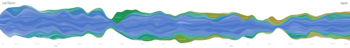
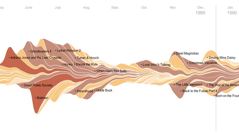
Intro: the paper followed 2 early examples of stacked, meandering graphics
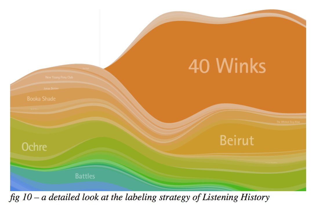
- "Listening Histories": last fm listening data (pic 1)
- "The ebb and flow of movies" by @nytgraphics on box office takings (pic 2)
Intro: the paper followed 2 early examples of stacked, meandering graphics
- "Listening Histories": last fm listening data (pic 1)
- "The ebb and flow of movies" by @nytgraphics on box office takings (pic 2)
3/ Throughout the paper, authors emphasise importance of pleasing aesthetics in effective dataviz, and matching design to tone of subject matter.
imo too much dataviz discourse focuses on geometry & rules. Broad discussion of aesthetics in this paper is 💯 and we need more of it
imo too much dataviz discourse focuses on geometry & rules. Broad discussion of aesthetics in this paper is 💯 and we need more of it
4/ Authors describe the bar charts that first appeared on last.fm as "too statistical", noting that they don't embody the emotion of the music listening data. This is an underrated observation. Matching visual tone to subject matter tone is good design.
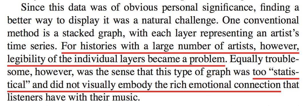
5/ If aesthetics is the 'art' side of things, legibility is the 'science': traditional stacked bars/areas get hard to read when number of categories gets too high, plus a zero baseline makes 2nd, 3rd, 4th etc layers hard to read because their baselines are [increasingly] uneven.
6/ Therefore, goal of streamgraphs is graphics that are:
• Clearly legible when showing large, categorical time series data w/ high volatility over time (volatility per series and in population of series)
• Aesthetically appealing: should feel "organic" & "emotionally pleasing"
• Clearly legible when showing large, categorical time series data w/ high volatility over time (volatility per series and in population of series)
• Aesthetically appealing: should feel "organic" & "emotionally pleasing"

7/ Let's dig into aesthetics: here are some of the [amazing] comments on the NYT movies chart:
• Some people love them
• Some hate them
• Some think they're awesome but kinda gross...
• In general feedback suggests striking aesthetics drew people in and kept them exploring
• Some people love them
• Some hate them
• Some think they're awesome but kinda gross...
• In general feedback suggests striking aesthetics drew people in and kept them exploring

8/ Okay, so the goal is to optimise for a compromise between legibility and pleasing aesthetics. Four ingredients to consider here:
• Overall shape of stacked graph (silhouette)
• Ordering of layers
• Placement & styling of layer labels
• Colours
• Overall shape of stacked graph (silhouette)
• Ordering of layers
• Placement & styling of layer labels
• Colours
9/ First, optimising the underlying geometry:
• Vertically centering around x-axis instead of stacking above x-axis minimises distortion of any given layer, reduces maximum slope in any given layer, reducing horizontal space required
• Vertically centering around x-axis instead of stacking above x-axis minimises distortion of any given layer, reduces maximum slope in any given layer, reducing horizontal space required
10/ Okay, but there are lots of ways to do this:
• ThemeRiver: arrange the layers so the overall silhouette is as flat as possible
• As above, but also aim to get every layer as flat as possible
• As above, but preferentially flatten fatter (more important) layers (winner)
• ThemeRiver: arrange the layers so the overall silhouette is as flat as possible
• As above, but also aim to get every layer as flat as possible
• As above, but preferentially flatten fatter (more important) layers (winner)

11/ Colours! Important for:
• Encoding some information from the data (maybe a category to which a layer belongs, maybe its overall size across the whole time series)
• Creating a boundary between layers [without requiring a stroke]
• Encoding some information from the data (maybe a category to which a layer belongs, maybe its overall size across the whole time series)
• Creating a boundary between layers [without requiring a stroke]
12/ "Listening Histories" example uses [carefully selected] hues for the time when an artist was first played, and uses saturation for artist popularity.
I love the amount of thinking going into palette choices here
I love the amount of thinking going into palette choices here

13/ Layer labelling:
• Placement: at this point I'd actually point to more recent work by @veltman bl.ocks.org/veltman/3195a6…
• Colour: by using white labels on layers whose saturation grows with salience, you automatically make labels jump out more on important layers
• Placement: at this point I'd actually point to more recent work by @veltman bl.ocks.org/veltman/3195a6…
• Colour: by using white labels on layers whose saturation grows with salience, you automatically make labels jump out more on important layers
14/ Layer ordering (love this bit):
• Random ordering of layers is messy
• Sorting vertically in one direction by first appearance -> sloping silhouette. Bad!
• Sorting vertically from inside out [by first appearance] -> beautiful! (you can get super smart within this method)
• Random ordering of layers is messy
• Sorting vertically in one direction by first appearance -> sloping silhouette. Bad!
• Sorting vertically from inside out [by first appearance] -> beautiful! (you can get super smart within this method)

15/ Layer ordering continued:
• If ur data is different — e.g u dnt have churn of new layers present in the movies dataset — u might want to order ur layers inside out by volatility: put least volatile layers in the middle, so outer baselines are distorted as little as possible
• If ur data is different — e.g u dnt have churn of new layers present in the movies dataset — u might want to order ur layers inside out by volatility: put least volatile layers in the middle, so outer baselines are distorted as little as possible
16/16 Why do I love this paper so much? 😍
For me, #dataviz = problem solving & compromise in aesthetics & maths/geometry, in order to effectively communicate a message/story.
This paper embraces all of that, giving each part equal care & thought.
For me, #dataviz = problem solving & compromise in aesthetics & maths/geometry, in order to effectively communicate a message/story.
This paper embraces all of that, giving each part equal care & thought.