,
16 tweets,
3 min read
Read on Twitter
A responsive design should preserve and protect _content_ across different conditions. A responsive design owes little to the preservation of an _interface_ across different conditions.
I'll unpack this a bit more in a blog post.
(Sorry Twitter threads are lower friction than blogging for me at this point in time, I'll unpack here).
At a UI level, mobile apps look different to responsive designs. That's always bothered me and I could never quite put my finger on why.
At a UI level, mobile apps look different to responsive designs. That's always bothered me and I could never quite put my finger on why.
My hunch is that if we set an experiment where two different teams are tasked to build the same product but one of which is a mobile app and the other must be responsive, you'll arrive at two different UI conclusions at a mobile level.
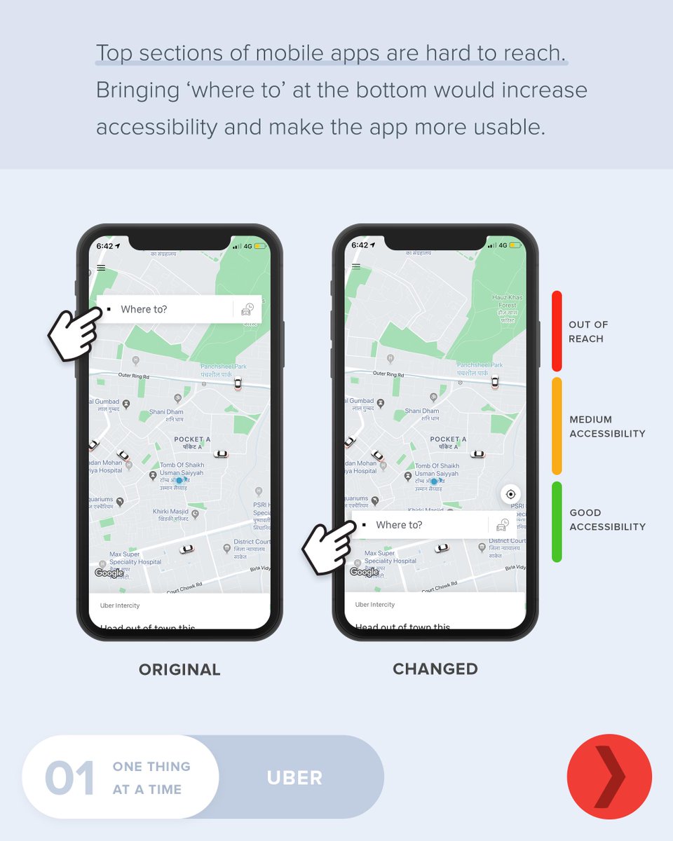
The most obvious example of UI conflict is the navigation. Generally speaking, most mobile apps have a navigation within comfortable reach along the bottom of the UI.
The opposite is true for responsive designs within mobile viewport ranges. I can't think of a strong enough "why" as to why that is other than reasoning by analogy (i.e there's always navigation at the top and that's the way it's always been done so, therefore, it must be right).
From a first principles perspective - or if you ignore all preconceptions of what a mobile app looks like and what a responsive design looks like and build up a UI from scratch within that viewport range, it seems likely that you should arrive at the same UI conclusions? No?
Why should a responsive UI care about the position of a desktop navigation within a mobile viewport range? Any empathetic UI ought to think solely about the user within that context and provide the most comfortable UI for that screen size.
"But what about those with docked windows?" You can't just assume everyone in that viewport range is on a touch device. Sure, it's not universally true but it is DISPROPORTIONATELY the case (add Browser size as a dimension under devices in an analytics tool and see what happens).
We have the hover media feature at our disposal as well to rule out mouse pointers to narrow the docked window number down further to increase the certainty of targeting a touch device.
"The browser chrome gets in the way and moves the navigation to show its own controls in certain scroll behaviours". Same if you had the nav at the top of the screen. I don't believe it's a good enough reason to sacrifice reach comfort.
"It's part of a broader design system though, you need UI consistency across different experiences" Yes, but basic usability shouldn't be a casualty for your design system. No user will thank you for that decision.
Wrapping up: I don't want this to be misrepresented as an attack on responsive design and that I'm somehow advocating for a return of m-dots. You'd struggle to find a bigger advocate for responsive web design.
My theory is: there are bigger nudges we can and should make for UIs where we can come to a solid enough conclusion (i.e the audience is vast majority mobile + touch) and shape UI accordingly, not pre-loaded with irrelevant assumptions about context-irrelevant interface states.
If you give way to "it depends" and the most minuscule of edge cases (the fractional proportion of docked windows that can't ID a hover etc) you'll compromise the experience for the overwhelming majority.
A responsive design should protect the CONTENT at all costs across experiences, it owes little to the preservation of the INTERFACE.