Designing better figures for small studies: Why you shouldn’t use bar graphs for continuous data and what to do instead (A visual Q&A thread)
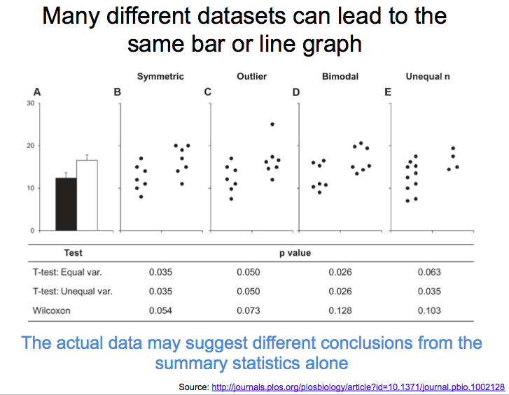
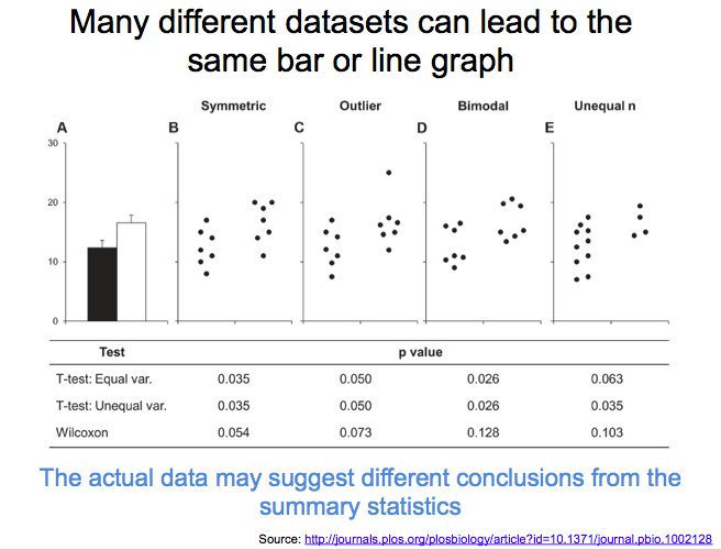
journals.plos.org/plosbiology/ar…
journals.plos.org/plosbiology/ar…


“What should I use instead of a bar graph?”

“Do I need expensive software to do all this?”
No – there are many free tools that make it easier to create more informative graphics.
No – there are many free tools that make it easier to create more informative graphics.


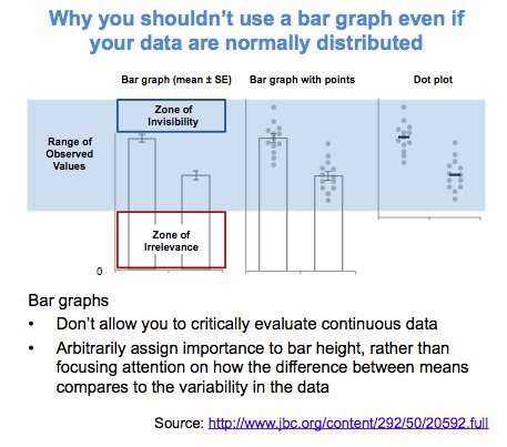
“I still prefer bar graphs because they convey a clear message. Sometimes it’s hard to see what’s going on with dot plots.”
Emphasize the data points and de-emphasize the dots to convey a clear message while allowing readers to critically evaluate the data
Emphasize the data points and de-emphasize the dots to convey a clear message while allowing readers to critically evaluate the data

“Can I just add dots to my bar graph?”
This is better than a bar graph, but it won’t be as clear as a dot plot.
This is better than a bar graph, but it won’t be as clear as a dot plot.

“What is a histogram with dots and why should I avoid this type of figure?”
Upload irregularly spaced data to determine whether your software or code is making a dot plot or a histogram with dots.
Upload irregularly spaced data to determine whether your software or code is making a dot plot or a histogram with dots.

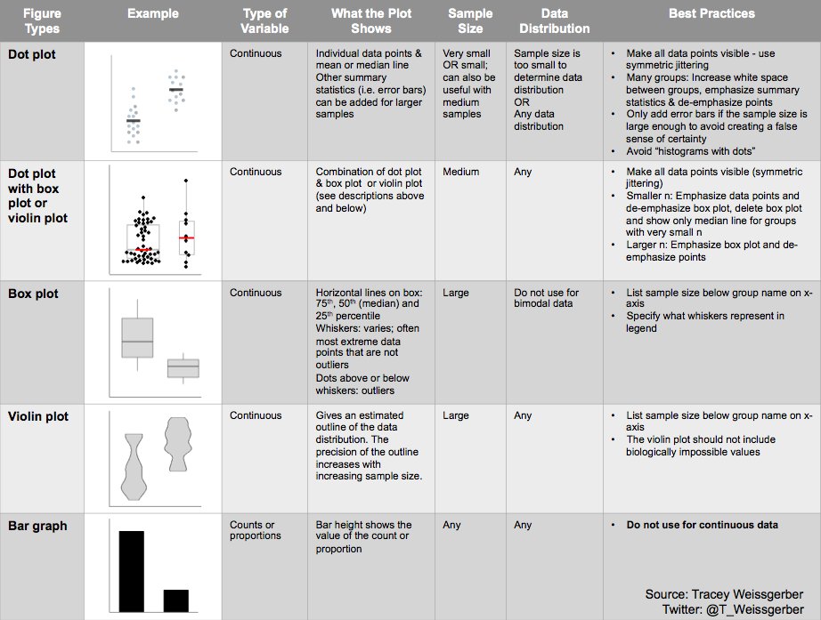
“When is it appropriate to show summary statistics like error bars, box plot and violin plots?”
Summary statistics are only meaningful when there is enough data to summarize
Summary statistics are only meaningful when there is enough data to summarize

“Why shouldn’t I use box plots for bimodal data?”
Box plots conceal the two peaks. Bimodal distributions are easier to see with dot plots (smaller samples) or violin plots (large samples)
Box plots conceal the two peaks. Bimodal distributions are easier to see with dot plots (smaller samples) or violin plots (large samples)
“How do I make effective dot plots with box plots or violin plots?”

“Doesn’t the y-axis always have to start at 0?”
Always consider the purpose of the visualization and properties of the data when designing your figures.
Always consider the purpose of the visualization and properties of the data when designing your figures.


“Does it matter how I did my stats?”
Yes – The structure of the figure gives the reader information about your experimental design and analysis. Avoid sending mixed messages
Yes – The structure of the figure gives the reader information about your experimental design and analysis. Avoid sending mixed messages

“How do I design figures that match my study design & analysis?”
For simple analyses of small datasets, it’s often best to show one graph per analysis. The graph should include all groups, time points, or conditions from the analysis.
For simple analyses of small datasets, it’s often best to show one graph per analysis. The graph should include all groups, time points, or conditions from the analysis.

“What about statistical reporting…?”
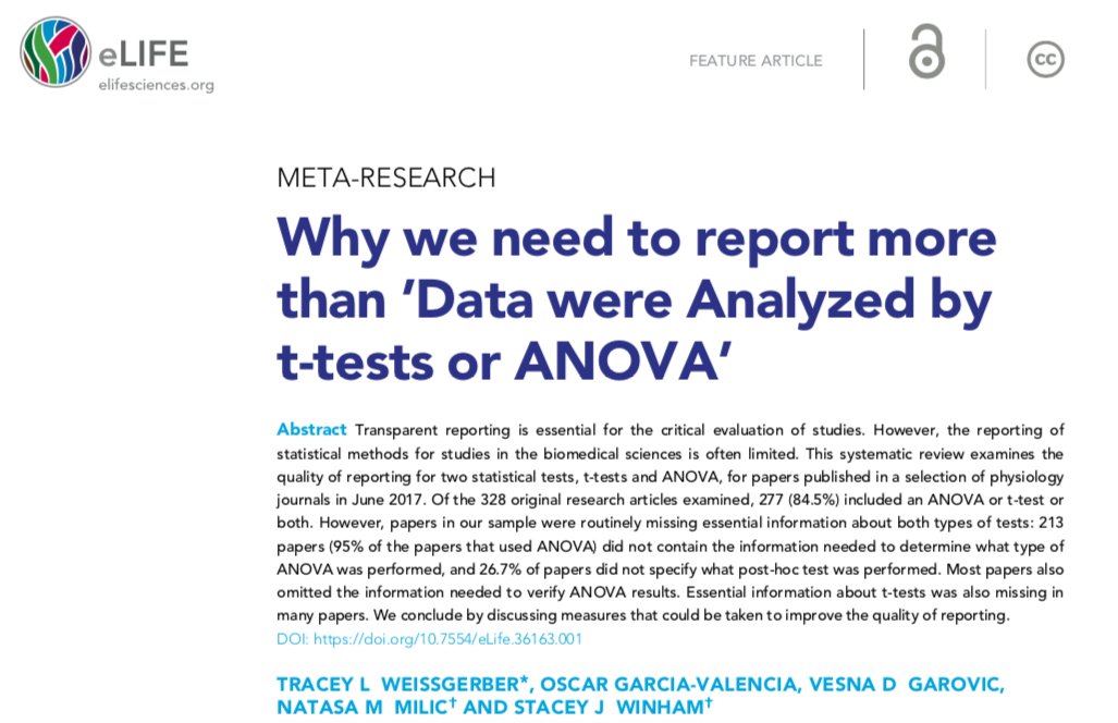
See our meta-research paper: Why we need to report more than “Data were analyzed by t-tests and ANOVA” on how to avoid problems caused by standard reporting practices. Clear reporting benefits everyone.
elifesciences.org/articles/36163
See our meta-research paper: Why we need to report more than “Data were analyzed by t-tests and ANOVA” on how to avoid problems caused by standard reporting practices. Clear reporting benefits everyone.
elifesciences.org/articles/36163
“What can I do to encourage others to use more informative figures in papers, talks and posters?”

“What can I do to increase the likelihood that authors will improve their graphics when I request more informative figures as a reviewer or editor?”
Provide citations to references and resources that will help your colleagues to understand the problem and make better graphics
Provide citations to references and resources that will help your colleagues to understand the problem and make better graphics