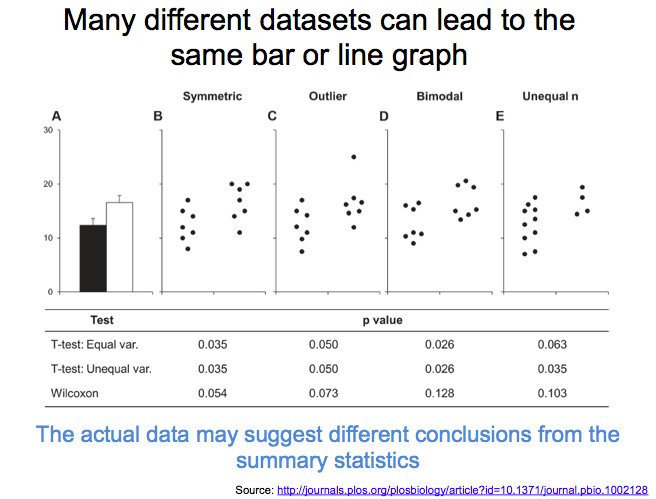
journals.plos.org/plosbiology/ar…
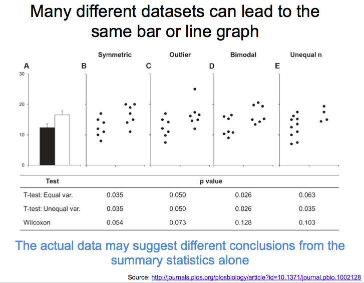
No – there are many free tools that make it easier to create more informative graphics.
See table 3 for a list of tools: ahajournals.org/doi/pdf/10.116…

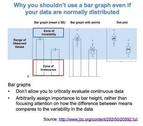
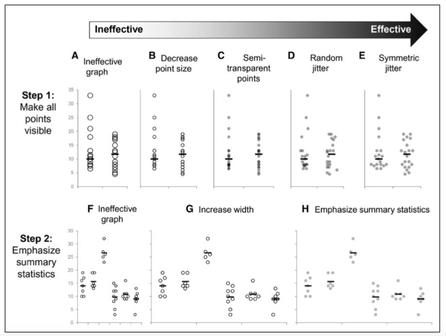
Emphasize the data points and de-emphasize the dots to convey a clear message while allowing readers to critically evaluate the data
ahajournals.org/doi/pdf/10.116…
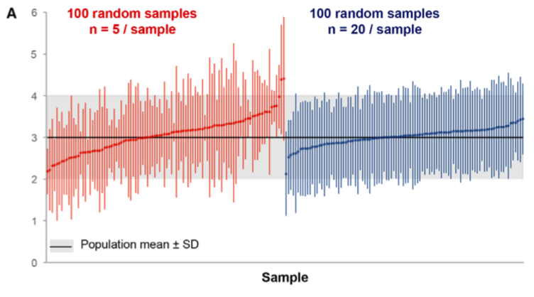
Summary statistics are only meaningful when there is enough data to summarize
ahajournals.org/doi/pdf/10.116…
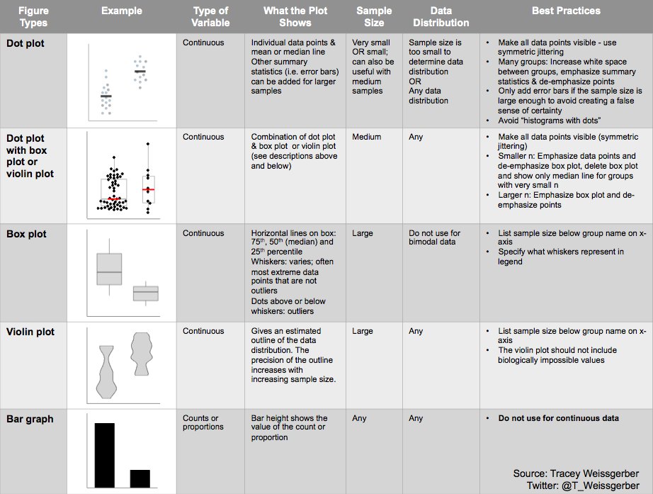
Box plots conceal the two peaks. Bimodal distributions are easier to see with dot plots (smaller samples) or violin plots (large samples)
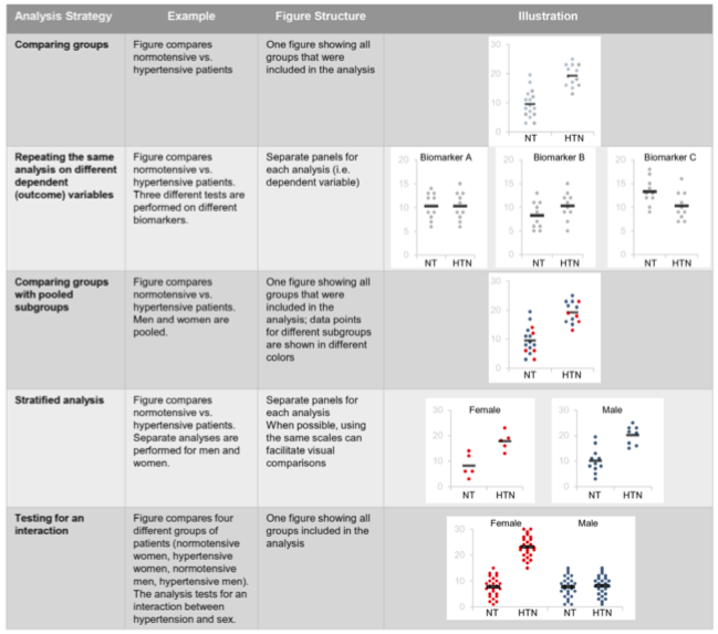
Yes – The structure of the figure gives the reader information about your experimental design and analysis. Avoid sending mixed messages
ahajournals.org/doi/pdf/10.116…
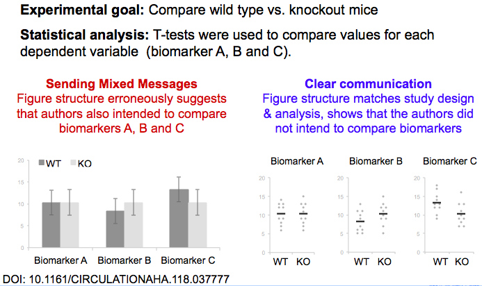
For simple analyses of small datasets, it’s often best to show one graph per analysis. The graph should include all groups, time points, or conditions from the analysis.
ahajournals.org/doi/pdf/10.116…
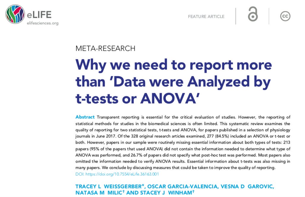
See our @elife "science of science" paper: Why we need to report more than “Data were analyzed by t-tests and ANOVA” on how to avoid problems caused by standard reporting practices. Clear reporting benefits everyone.
elifesciences.org/articles/36163
Provide citations to references and resources that will help your colleagues to understand the problem and make better graphics
