What font should be on your book cover? Well if you've had it with Helvetica and you're tired of Times New Roman why not revive a classic pulp typeface or two?
Here's a list of some pulpy fonts that are fruitier than Frutiger and louder than DIN 1931...
Here's a list of some pulpy fonts that are fruitier than Frutiger and louder than DIN 1931...

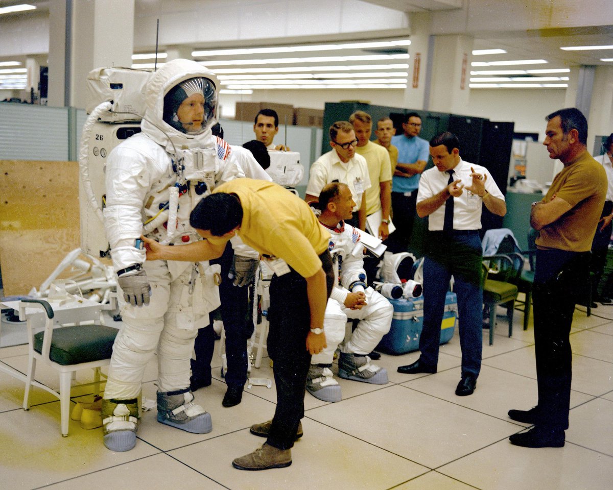
Any pulp sci-fi writer must give serious consideration to using Amelia as their book cover typeface. Designed by Stan Davis in 1964 it's the font used on the Moon Boot and reminds people we haven't actually been to the Moon since 1972, so we really should try again!

If your story is about computers then use Computer Monotone! David Moore created this in 1968 as an alphabetical extension of the E-13B font used on the bottom of cheques. It smells of Fortran an tastes of 4 bit processing, just like a real computer should...

For action stories you'll probably want to use Colin Brignall's 1965 font Countdown - as used on Countdown comic (d'uh!) as well as Byte magazine. You can almost hear the seconds counting down at the end of Rollerball as you squint at the text.


A sensuous book needs a sensuous font, and nothing smells more of white musk than Davida. Designed by Louis Minott in 1965 its languid curls conjure up a russet world of Bailey's Irish Cream sipped by a roaring log-effect gas fire. Bliss...
For female detective novels you should consider using Peignot, the Mary Tyler Moore font. Its ponderous Gs and pensive Ys suggest a steely feminine thoughtfulness and perspicacity, perfect for your intrepid heroine.

If you're writing gothic romance (and if not why not?) you may be considering a cursive typeface for your cover, such as Bookman Swash. But have you considered Albertus? It's the font from The Prisoner, so it's perfect for your heroine with great hair fleeing that gothic house!


For fantasy fiction the only typeface you need is the 1894 version of Bradley. Less fussy than Morris Troy and less shouty than American Text it was designed by Will Bradley for a Christmas issue of The Inland Printer. It is the font of wizards, winters and sensitive Goths.


An action hero needs a heavyweight font, which is why The Black Samurai always uses Novel Gothic. Charles Becker's 1928 typeface is smooth, sharp and heavy-hitting, just like our hero Robert Sand.

For a more film noir look you may want to take a trip from Pan Books and plump for Fanfare. Designed in 1927 it's a big-shouldered bruiser of a font that looks dangerous and acts slightly deranged: perfect for the doomed anti-hero type.

If you want real impact don't use Impact font, instead go for Futura ND Black - Bauer's 1929 heavyweight champion of a typeface. It's big, bold and aesthetically correct, giving more bang for your buck!

In pulp you can never be too bold, especially with typefaces. Gill Kayo Ultra Bold has a nice Clockwork Orange vibe, whilst Humanist 521 Ultra Bold is a veritable dreadnaut amongst fonts. Let battle commence!


Don't be afraid to play against type with fonts. You may think that the Art Nouveau feel of Arnold Böcklin wouldn't work for sci-fi, but its 1904 arts and crafts styling adds an esoteric imprimatur to these Bruce Pennington covers. The title sets the tone...


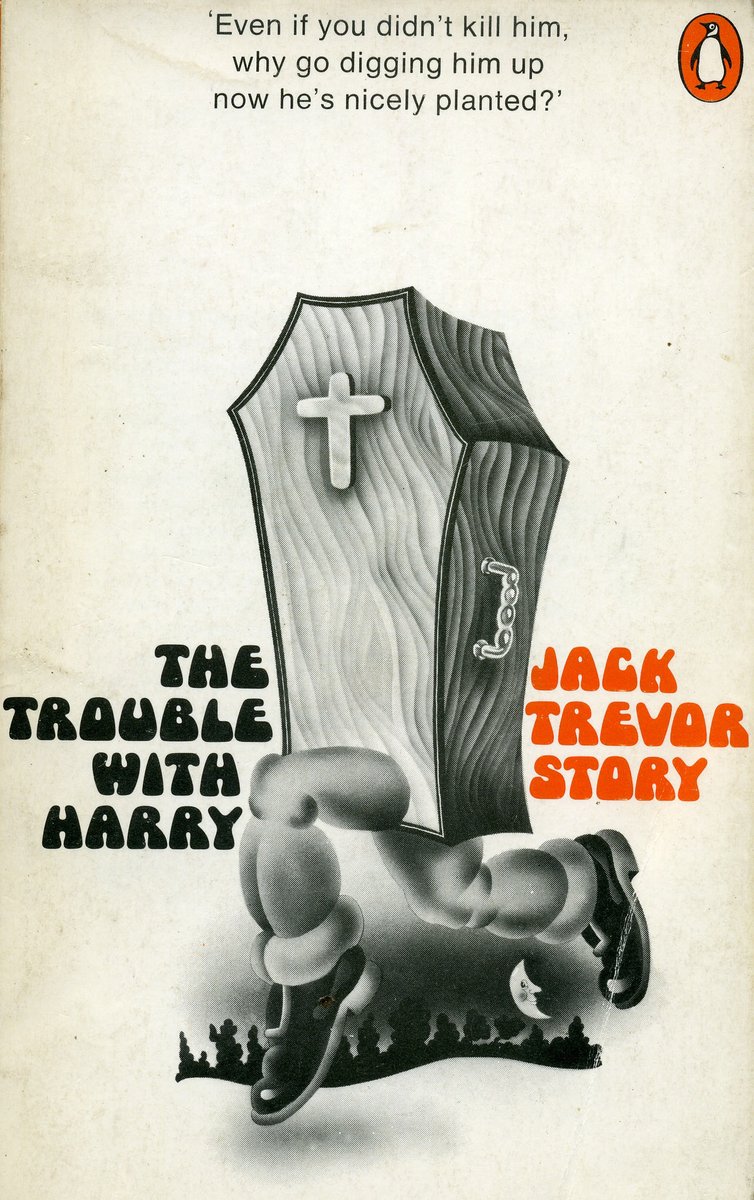
And finally... how can we not acknowledge the twin princes of sixties typefaces: Mania and Obese! These two similar 1968 fonts are fat, funky and fantastic. Every glyph is a brow-beating heavy leather resurrection shuffle of enjoyment, so go on - let the good times roll!


Your publisher may think otherwise but trust me: less isn't more, less is a bore! Your typeface should be as shameless and brazen as your story, so whatever you choose keep it pulpy!
More stories another time... #amwriting
More stories another time... #amwriting