I haven’t been enjoying drawing or sketching or the whole illustration process for a while now. Months, even. I've been itching to find a way to shake it all up.
I got some feedback from a free portfolio review with Mark English. Here's some of my takeaways:
I got some feedback from a free portfolio review with Mark English. Here's some of my takeaways:
He told me I need to vary my mark-making. He could tell that there was a lack of variety in my work that’s stifling its energy. I agree.
While I’m sorting this all out, he also told me I need to:
-rely less on outline, let shape and value do the work
-focus where I place visual interest in a piece
-make sure the lines I do make aren’t uniform everywhere
-everything must have energy or support energy
-rely less on outline, let shape and value do the work
-focus where I place visual interest in a piece
-make sure the lines I do make aren’t uniform everywhere
-everything must have energy or support energy
Continued:
-most of my work looks like it could have been done by 3-4 other people (he’s right).
-I need to play to my strengths right now instead of suppressing them.
-I need to have fun drawing
-most of my work looks like it could have been done by 3-4 other people (he’s right).
-I need to play to my strengths right now instead of suppressing them.
-I need to have fun drawing
At the same time, he tells me:
-my sense of composition is solid; I design my images well (thanks @kalidraws) bit.ly/2qiQM8l
-I have a sense of voice that artists work years to find, but I found mine.
-to inject attitude in my work, and make it a dominant part of it
-my sense of composition is solid; I design my images well (thanks @kalidraws) bit.ly/2qiQM8l
-I have a sense of voice that artists work years to find, but I found mine.
-to inject attitude in my work, and make it a dominant part of it
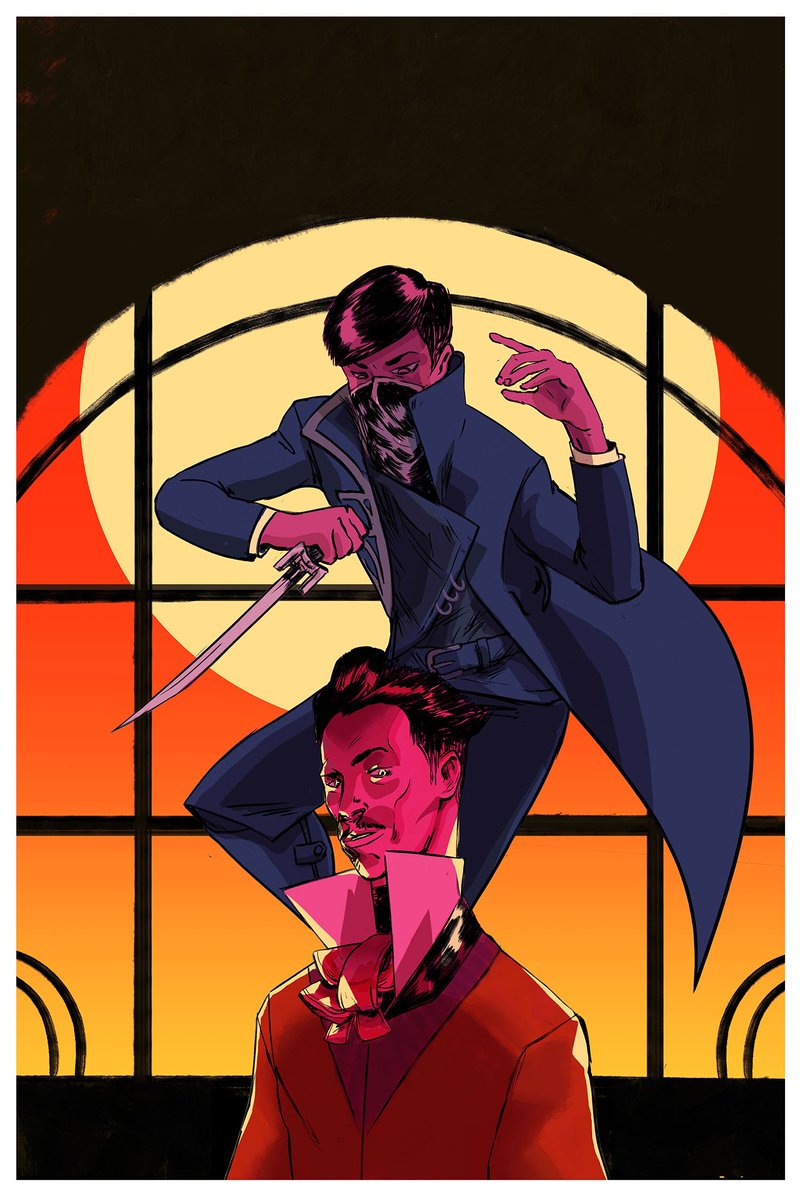
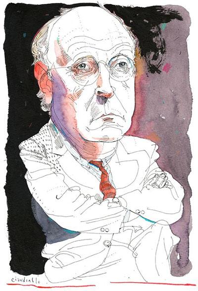
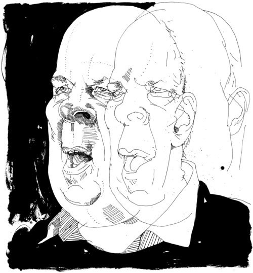
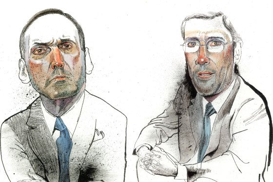
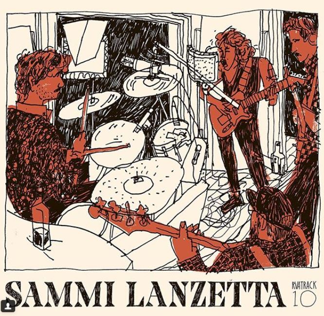
He kept coming back to this image because he loved the drawings in the back, but thinks the portrait up front totally kills the momentum of the piece. He's also right there. I remember finishing this but feeling like I could do more. 
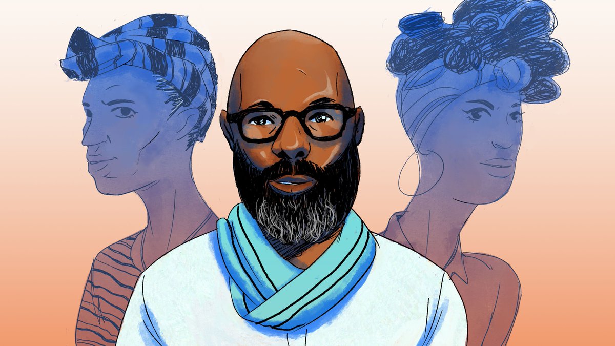
Mark said that the outline around Richelieu didn't have the same energy, and that I needed to treat focal lines and supporting lines differently.
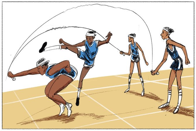
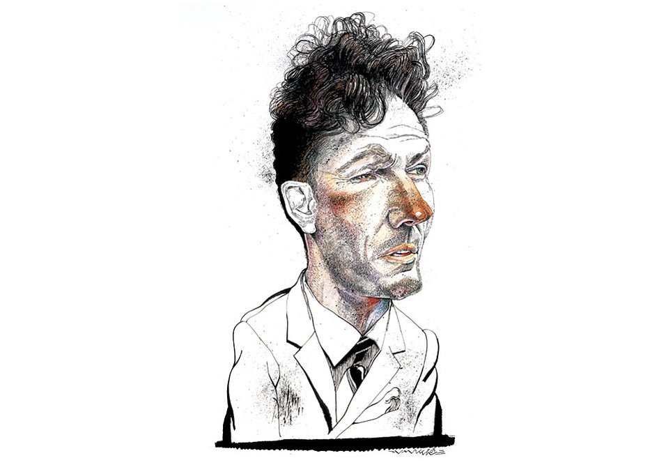
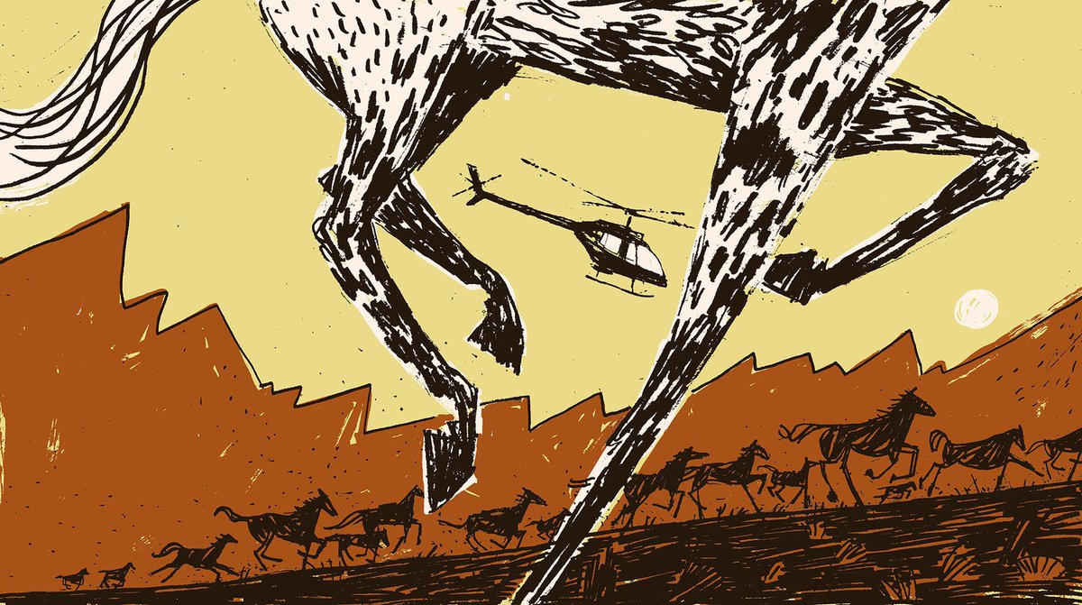
He says my strongest pieces are the ones that rely on my drawing skills -- the ability to say what needs to be said as succinctly as possible. In terms of brevity, I feel like I've been chasing this energy since I made it.
In fact, I made this piece around the same time. I remember going up to my professor literally puzzled at why he liked this image more than anything else I'd done.
He pointed me back to that energy and brevity.
He pointed me back to that energy and brevity.
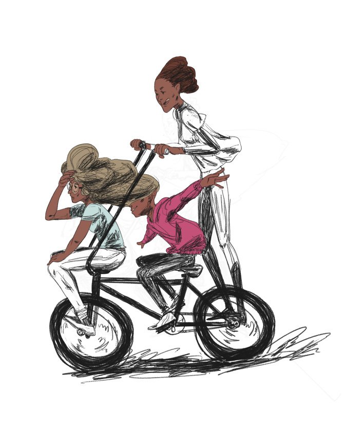
However, I felt like I should have been doing more. Like...you know. More detail, more color, more ~world-building~, all that. I was taking that period of my work for granted though, because I didn't realize that I was enjoying myself while making these until after I cast it away
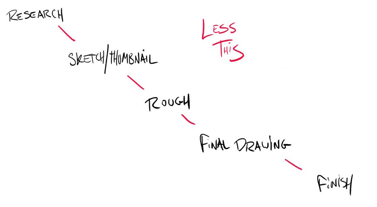
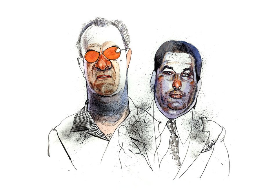
He was NOT a fan of this piece. Not because it was bad, but because it didn't have to be this stiff. I remember being obsessed with following this "illustration-by-the-numbers" approach where I'd do a sketch then ink over it and flat and check all the This Is A Good Piece Boxes.
(shouts out @NYUGameCenter for commissioning this btw)
He said that the piece could have focused on Jindosh, and the interesting shapes and details within his face. He also told me to pay attention to how I vary my lines between the foreground and background. The thicknesses were the same and made everything feel static.
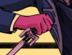
And another point of his: Let the shapes and values do the work. Instead of outlining this hand, it could have been defined by the shapes and values surrounding it. If he'd known the context of this piece, he could have tore into me more lol.
Back on track tho:
What I took away from that critique is that I need to get comfortable with the undefined parts of my process. Remove what slows me down and not be afraid to walk out into open water artistically.
What I took away from that critique is that I need to get comfortable with the undefined parts of my process. Remove what slows me down and not be afraid to walk out into open water artistically.
Because it's SO EASY to sit back and let the Illustration By Numbers approach take hold and stagnate your work. It's like going on autopilot. It'll give you predictable results, but predictable results aren't what you always want as an artist.
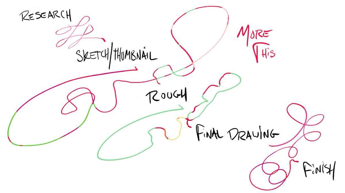
What I'm proposing to myself -- and you, if the shoe fits, is to use that by-the-numbers approach as a tool. Set those points of the process as checkpoints, but feel free to take any route but the most direct to get there.
I guess I'm still going! He talked me through some artists that follow a similar lineage to my work, and how I can look at them to see masterful use of variety in line, shape and value.
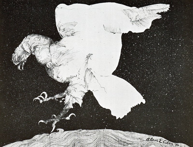
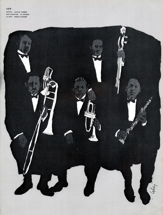
The first was Alan Cober:
The first was Alan Cober:
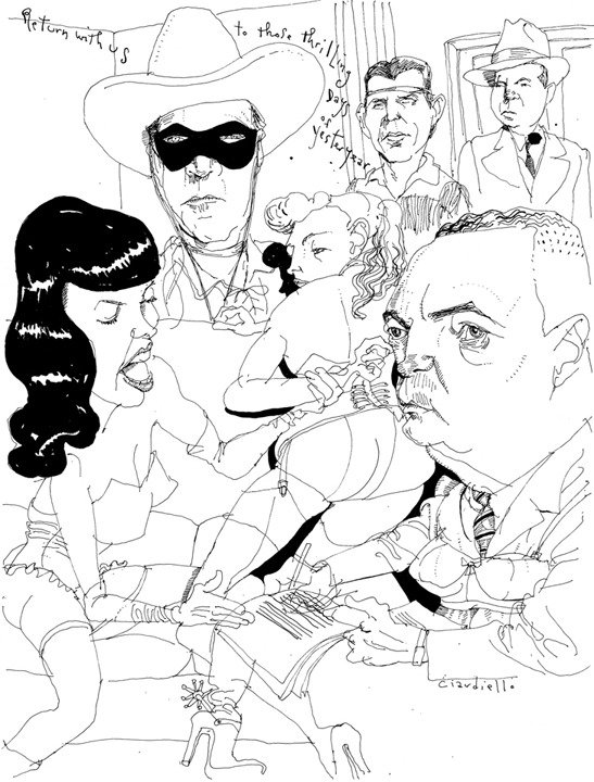
Next up was Joe Ciardello and his judicious use value/color to contrast his thin line
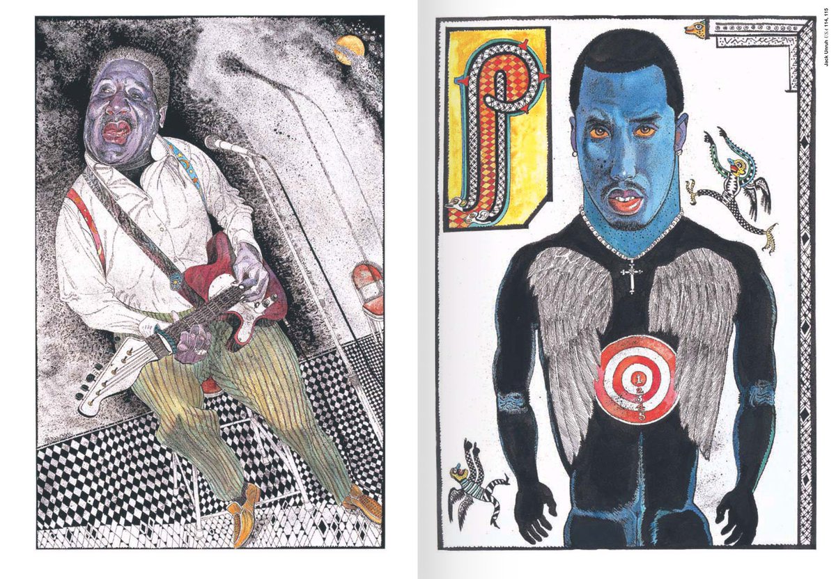
Jack Unruh for the way he splits the focus of his details. He goes from a high render on faces to a thick bold line to close out the figure.
Putting this extra Unruh in here because damn:
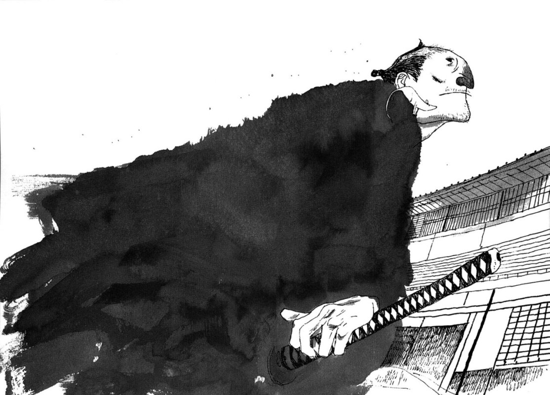
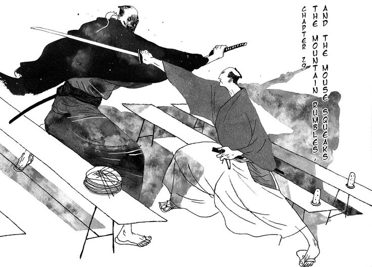
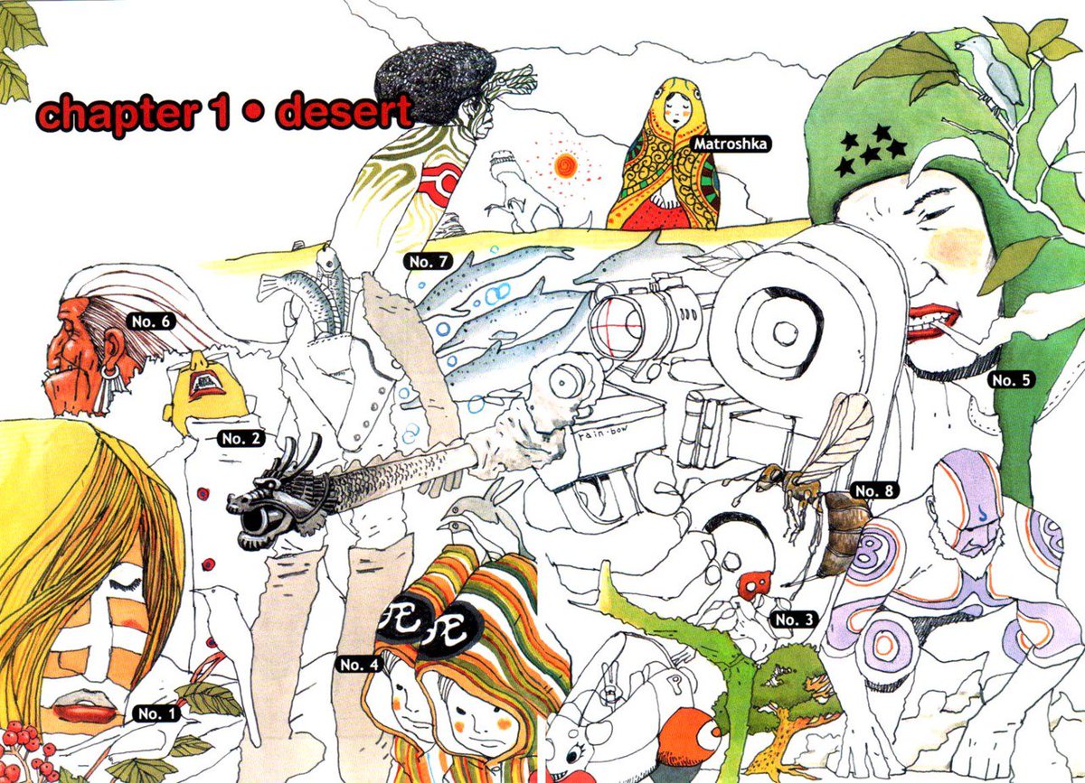
And here in the critique I began to see the through-line in artists that had that Thing I was chasing. Naturally there's Matsumoto (from Takemitsu Zamurai and No. 5 respectively):
And @LesHerman's energy and ability to Just Fucking Draw left a strong impression on me in school:
I'm gonna stop here for now, but I'll leave this thread open to revisit over 2018 as I learn to loosen up and draw with my whole self again. Thanks for indulging my story on how I got roasted by a legend lol
By the way, Mark English is still taking bookings for portfolio reviews. Gone head and get you one!
bit.ly/2qEKCQk
bit.ly/2qEKCQk