
Mobile is not desktop. Stop trying to squeeze 1990s Web 1.0 PC paradigms into your mobile app and websites.
Understand how people interact with small, touchscreen devices to design them to work well.
1/
Understand how people interact with small, touchscreen devices to design them to work well.
1/
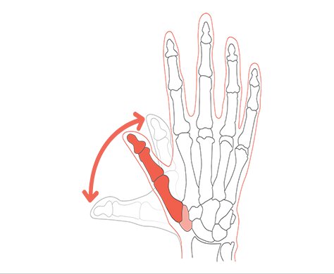
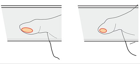
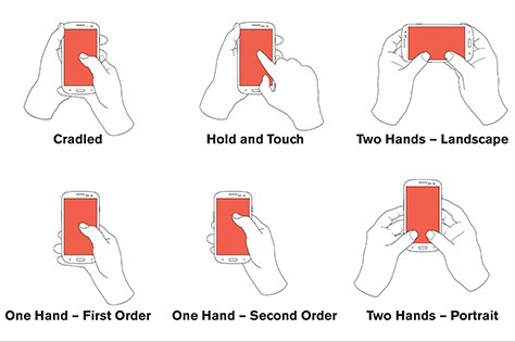
A good start is reading all about how people really touch and hold phones in this three part summary:
1) uxmatters.com/mt/archives/20…
2) uxmatters.com/mt/archives/20…
3) uxmatters.com/mt/archives/20…
1) uxmatters.com/mt/archives/20…
2) uxmatters.com/mt/archives/20…
3) uxmatters.com/mt/archives/20…
Then, recognize not every choice is either/or.
Multivariate testing is fine. A/B testing is often not.
Understand the context and what you are missing out on with your A vs B choice.
Moving on...
Multivariate testing is fine. A/B testing is often not.
Understand the context and what you are missing out on with your A vs B choice.
Moving on...
Since mobile design keeps being boiled down to “don’t use a hamburger menu” let’s just talk about wayfinding and discovery.
This is covered in the above articles. First, you have to understand that people don’t read mobiles top-left to bottom-right. No f-pattern, etc.
This is covered in the above articles. First, you have to understand that people don’t read mobiles top-left to bottom-right. No f-pattern, etc.
Mobile is read, and interacted with, from the inside out.
Center gets the most views, and touches:
Center gets the most views, and touches:

Yes, even on phablets. Even on tablets.
Not coincidentally, people are more accurate at the center. So you can put more stuff there. At the edges, you can put few functions, tabs, etc. as people cannot hit them as well.
Not coincidentally, people are more accurate at the center. So you can put more stuff there. At the edges, you can put few functions, tabs, etc. as people cannot hit them as well.

What this means is that nav bars of any sort are not looked at so much.
That’s great as we already knew that hidden nav like overflowing tabs, dot menus, or hamburger menus cannot entice people.
That’s great as we already knew that hidden nav like overflowing tabs, dot menus, or hamburger menus cannot entice people.
Because: invisible. You totally can use a hamburger or dot menu. It works great and I get literally 100% of all participants in research to find items I put there.
Because I pick the items in there carefully. They are secondary or tertiary things the users expect, so seek.
Because I pick the items in there carefully. They are secondary or tertiary things the users expect, so seek.

So how do we design? We architect solutions! No magic bullet nav exists. And no UI will fix your bad IA.
Design the system to drill down. Design to offer key content (or categories) in the middle of the page.
Weather you need is in the middle of the page on load
Design the system to drill down. Design to offer key content (or categories) in the middle of the page.
Weather you need is in the middle of the page on load

Your calendar, or map, is in the middle of the page.
Secondary items, are along the edges. Users may want to add an appointment, or get directions, so they go to the edges to seek those functions.
Secondary items, are along the edges. Users may want to add an appointment, or get directions, so they go to the edges to seek those functions.

I have come up with a three tier hierarchy:
Primary in the middle
Secondary items /visible/ along the edges
Tertiary items hidden in hamburger or dot menus
Primary in the middle
Secondary items /visible/ along the edges
Tertiary items hidden in hamburger or dot menus

Successful sites and apps… already do this! Often without knowing why except a lot of analytics and tweaking towards that (iterate, multivariate, not a/b!)
But it’s true when you start looking around.
But it’s true when you start looking around.

When next designing, try it yourself. Architect a solution, instead of doing UI design first.
Make templates that support that, with key info in the middle of every page.
Use “drilldown,” (click the item in the middle, get more details or the next section on a new page)...
Make templates that support that, with key info in the middle of every page.
Use “drilldown,” (click the item in the middle, get more details or the next section on a new page)...
…to navigate inside the app.
Navigation is how one moves around the product and understands you position. It’s not a UI widget that magically solves your problems.
/
Navigation is how one moves around the product and understands you position. It’s not a UI widget that magically solves your problems.
/
P.S. Oh yeah, I have a design consultancy. Sure, I’ll be happy to fly over and talk about how to improve your specific product.


