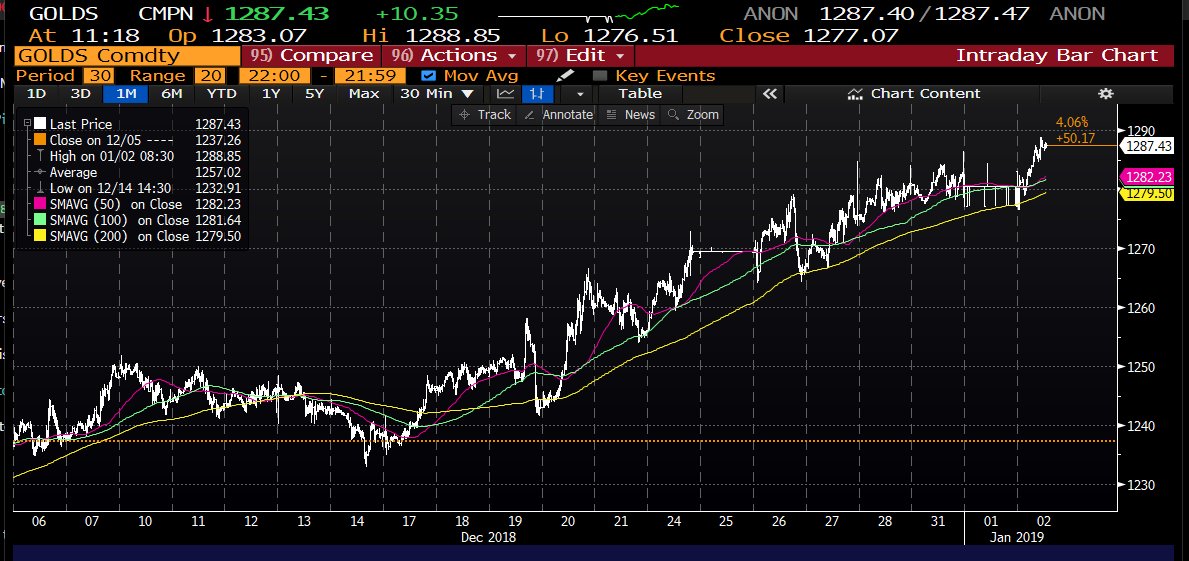
,
3 tweets,
1 min read
Read on Twitter
I know I've posted it before, but this graph never ceases to amaze me.
Total compensation, adjusted for PCE inflation, has grown by 87% since 1973.
Average hourly earnings for production and nonsupervisory workers, adjusted for CPI inflation, has shrunk by 4% since 1973.
Total compensation, adjusted for PCE inflation, has grown by 87% since 1973.
Average hourly earnings for production and nonsupervisory workers, adjusted for CPI inflation, has shrunk by 4% since 1973.

How much of this comes from the difference between "production and nonsupervisory workers" and "all workers"? The latter is only available since 2006Q3, but it looks like the difference isn't large, and has been shrinking in percentage terms.

If that has been the general rule before 2006, then the big difference between the two lines in the original graph is due to A) health care costs and other benefits rising as a share of compensation, and B) different measures of inflation.