
,
22 tweets,
9 min read
Read on Twitter
I couldn't be more thrilled that our paper - "Data is Personal: Attitudes and Perceptions of Data Visualization in Rural Pennsylvania" - received a Best Paper Award at #chi2019! 🎉
Blog post soon, but until then:
- paper: arxiv.org/abs/1901.01920
- data: osf.io/uxwts/
Blog post soon, but until then:
- paper: arxiv.org/abs/1901.01920
- data: osf.io/uxwts/

If you never read our paper, read this:
- Interpreting data is *critical* in 2019
- Vis amplifies our interpretation, but probably not equally for everyone
- We need to do better understanding who does (and doesn't!) currently trust or value vis
- If we don't, we deepen divides
- Interpreting data is *critical* in 2019
- Vis amplifies our interpretation, but probably not equally for everyone
- We need to do better understanding who does (and doesn't!) currently trust or value vis
- If we don't, we deepen divides
PAPER SUMMARY THREAD
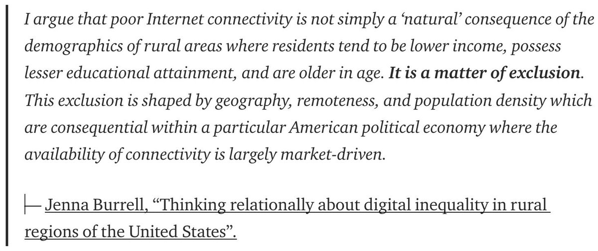
First, I want to share the awesome research by @jennaburrell on connectivity in rural regions because I think it's an important reminder that our access to data is NOT equal and that we should be exploring these inequalities more (firstmonday.org/ojs/index.php/…)
First, I want to share the awesome research by @jennaburrell on connectivity in rural regions because I think it's an important reminder that our access to data is NOT equal and that we should be exploring these inequalities more (firstmonday.org/ojs/index.php/…)
WHY WE CARE
The idea of data exclusion is near to our hearts, and we think it extends to the decisions we make about how to COMMUNICATE data too. A glance at the '16 election map tells us that we don't all see the world the same, does that impact who cares about vis?
The idea of data exclusion is near to our hearts, and we think it extends to the decisions we make about how to COMMUNICATE data too. A glance at the '16 election map tells us that we don't all see the world the same, does that impact who cares about vis?

HOW WE RAN OUR STUDY
So we decided to talk to the people in our own PA rural community about how they see, trust, and value data. We went to the farmer's market, brought visualizations about drug abuse, and asked people to rank them (1 is best, 10 is worst).
So we decided to talk to the people in our own PA rural community about how they see, trust, and value data. We went to the farmer's market, brought visualizations about drug abuse, and asked people to rank them (1 is best, 10 is worst).


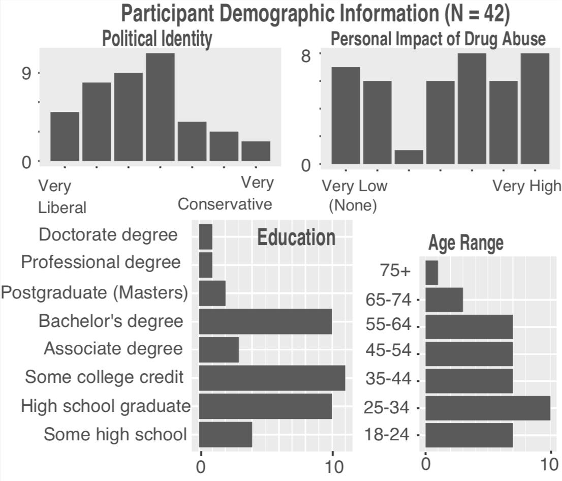
WHO WE TALKED TO
The 42 people we talked to were diverse in their age and educational background, and many had been deeply impacted by drug abuse (in particular, opioids). That will be important in a minute.
Material/data reminder: osf.io/uxwts/
Onto the results!
The 42 people we talked to were diverse in their age and educational background, and many had been deeply impacted by drug abuse (in particular, opioids). That will be important in a minute.
Material/data reminder: osf.io/uxwts/
Onto the results!
COLOR AND CLARITY?
When people first ranked our visualizations, they tended to rank simple, colorful graphs higher! Good news, right? Well, kind of.
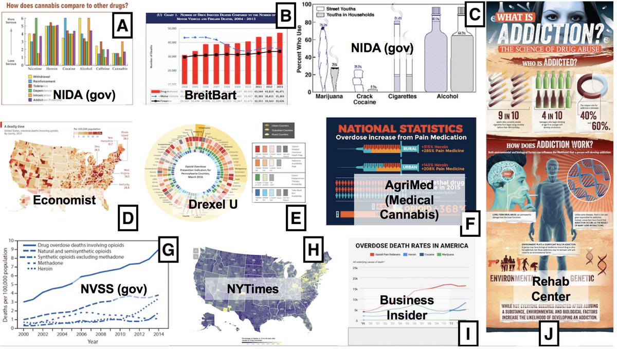
The reality was MUCH messier. Take a look at the distribution of rankings for each of our graphs. There is a LOT going on.
When people first ranked our visualizations, they tended to rank simple, colorful graphs higher! Good news, right? Well, kind of.
The reality was MUCH messier. Take a look at the distribution of rankings for each of our graphs. There is a LOT going on.

HIDDEN STORIES
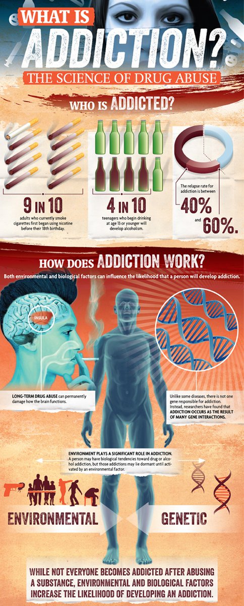
For example, the infographic below received the most 1 rankings (good!) AND the most 10 rankings (bad!)
Divisive opinions have important design considerations. We didn't see any obvious demographic correlations... so what stories were hidden in our distributions?
For example, the infographic below received the most 1 rankings (good!) AND the most 10 rankings (bad!)
Divisive opinions have important design considerations. We didn't see any obvious demographic correlations... so what stories were hidden in our distributions?
For the people who felt comfortable speaking about it, we saw one theme emerge over and over again.
Data is intimate.
Data is personal.
And no matter the encoding, finding a personal connection to a graph seemed to override every other design property. One quote:
Data is intimate.
Data is personal.
And no matter the encoding, finding a personal connection to a graph seemed to override every other design property. One quote:

DATA IS PERSONAL
The terrible impact of opioids loomed over the decisions of many people. Remember, many of them had been deeply impacted by drugs.
We would see people search for and prioritize graphs with opioids, and in some cases, ignore graphs WITHOUT opioids.
The terrible impact of opioids loomed over the decisions of many people. Remember, many of them had been deeply impacted by drugs.
We would see people search for and prioritize graphs with opioids, and in some cases, ignore graphs WITHOUT opioids.

DATA IS PERSONAL
Personal interactions were not just limited to their own experience. One school principal started judging graphs based on how they could effectively communicate that information to OTHER people - the parents and children of their school district
Personal interactions were not just limited to their own experience. One school principal started judging graphs based on how they could effectively communicate that information to OTHER people - the parents and children of their school district

DATA IS PERSONAL: WHERE IS HOME?
People brought personal stories into judgments about geographic vis as well. They often evaluated maps based on *how easy it was to find Pennsylvania*, sometimes deemphasizing what we might consider beautiful overview maps of the USA.
People brought personal stories into judgments about geographic vis as well. They often evaluated maps based on *how easy it was to find Pennsylvania*, sometimes deemphasizing what we might consider beautiful overview maps of the USA.


DATA IS PERSONAL
My thoughts: For many people, these experiences probably went unspoken in interviews. Who knows how these factors drove the decisions of the people who remained silent...
But for such a powerful driver of attention, how can we serve it better through design?
My thoughts: For many people, these experiences probably went unspoken in interviews. Who knows how these factors drove the decisions of the people who remained silent...
But for such a powerful driver of attention, how can we serve it better through design?
ON TRUST: DO SOURCES MATTER?
Now a twist! Up until this point, people judged visualizations WITHOUT knowing where they were from. To dig into trust a bit, we revealed a diverse set of sources from the graphs, and allowed people to rerank them.
Now a twist! Up until this point, people judged visualizations WITHOUT knowing where they were from. To dig into trust a bit, we revealed a diverse set of sources from the graphs, and allowed people to rerank them.
INFO IS OBJECTIVE
But still, 60% of people decided NOT to change their rankings.
Many of these people suggested that information is objective and that source doesn't matter... which is somewhat frightening given what the ways we know that data can be manipulated and framed.
But still, 60% of people decided NOT to change their rankings.
Many of these people suggested that information is objective and that source doesn't matter... which is somewhat frightening given what the ways we know that data can be manipulated and framed.

FIRST IMPRESSIONS MATTER
We think we might be seeing an anchoring effect as well - some participants suggested they might not change their rankings *no matter what new information was presented*.
For example, one person explicitly told us "[I] don't often change my mind".
We think we might be seeing an anchoring effect as well - some participants suggested they might not change their rankings *no matter what new information was presented*.
For example, one person explicitly told us "[I] don't often change my mind".
EDUCATION
We also saw that more educated participants were far more likely to change their rankings after seeing the graph's source.
We need more studies to verify these observations, but we have to be careful of design guidelines formed by studies w. highly educated people.
We also saw that more educated participants were far more likely to change their rankings after seeing the graph's source.
We need more studies to verify these observations, but we have to be careful of design guidelines formed by studies w. highly educated people.

I accidentally broke the thread here... so this is my reattaching it :)
TRUST MATTERS
Okay, but what about those people who changed their rankings?
Not surprisingly, source mattered more to them, and in some cases, it fell across political lines. For example, some conservatives *significantly* dropped their rankings of vis from the NYTimes.
Okay, but what about those people who changed their rankings?
Not surprisingly, source mattered more to them, and in some cases, it fell across political lines. For example, some conservatives *significantly* dropped their rankings of vis from the NYTimes.

TRUST MATTERS
This matters because the vis community often celebrates *wonderful* graphic powerhouses like the New York Times... but some people just won't trust them no matter what.
Aside from political divides, at least one person saw it as a local issue...
This matters because the vis community often celebrates *wonderful* graphic powerhouses like the New York Times... but some people just won't trust them no matter what.
Aside from political divides, at least one person saw it as a local issue...

WHAT DOES THIS ALL MEAN?
There are a lot of stories here (read the paper!). Many need replication and more highly-controlled investigations.
But at the very least, I think we have to explore who *doesn't* pay attention to or trust vis (not just who doesn't understand it)
There are a lot of stories here (read the paper!). Many need replication and more highly-controlled investigations.
But at the very least, I think we have to explore who *doesn't* pay attention to or trust vis (not just who doesn't understand it)
Finally, I want to think carefully about who might not be represented enough in our vis studies. Even more diverse web experiments might miss enormous populations (I doubt ANY of our participants have heard of MTurk).
Paper: arxiv.org/abs/1901.01920
Data: osf.io/uxwts/
Paper: arxiv.org/abs/1901.01920
Data: osf.io/uxwts/


