,
5 tweets,
4 min read
Read on Twitter
A fantastic achievement by Great Britain. The country is phasing out coal extremely rapidly.
The visualization shows the daily share of Britain's power generated by coal. Over the course of only 7 years.
Source: theguardian.com/environment/ng…
The visualization shows the daily share of Britain's power generated by coal. Over the course of only 7 years.
Source: theguardian.com/environment/ng…
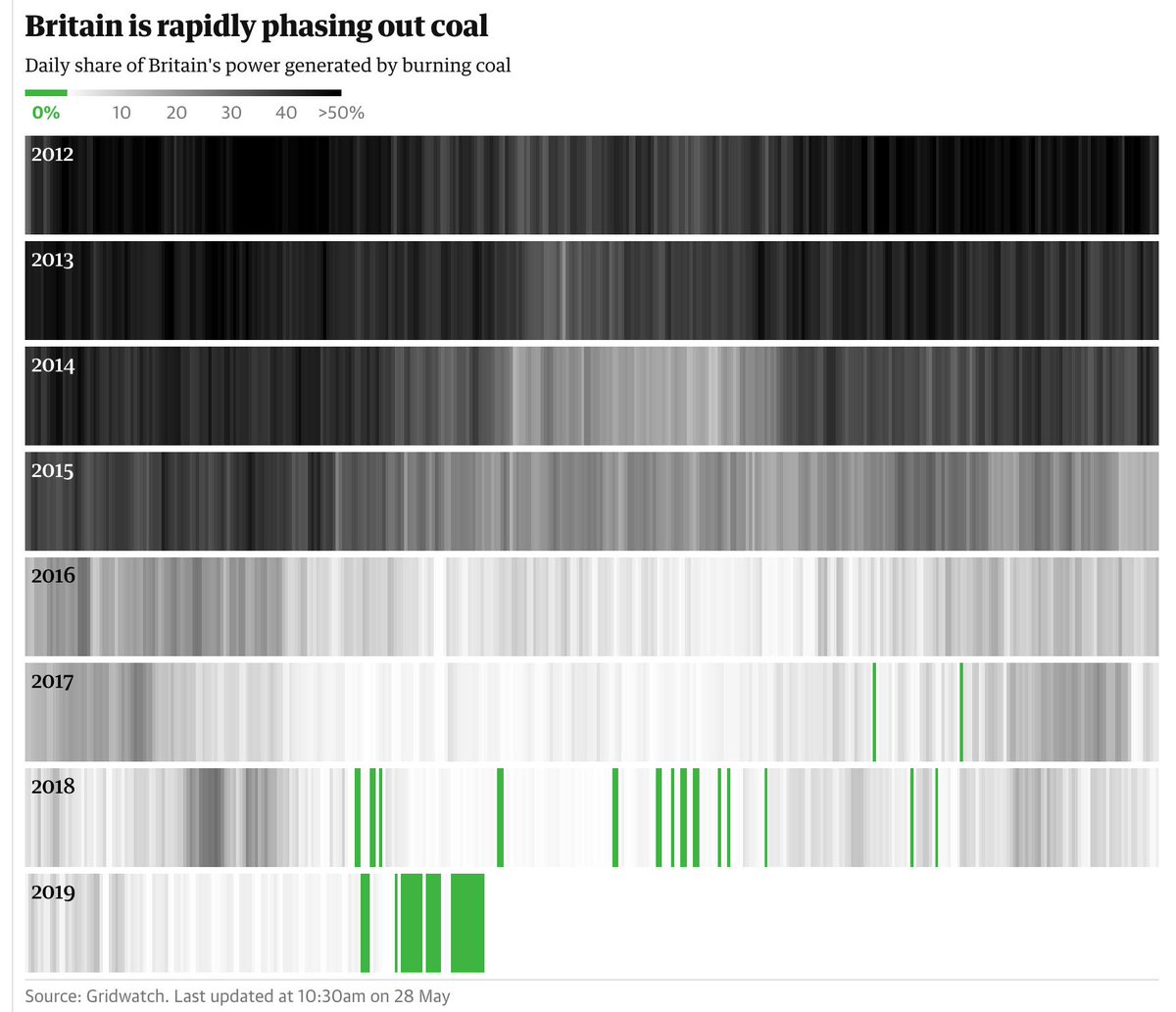
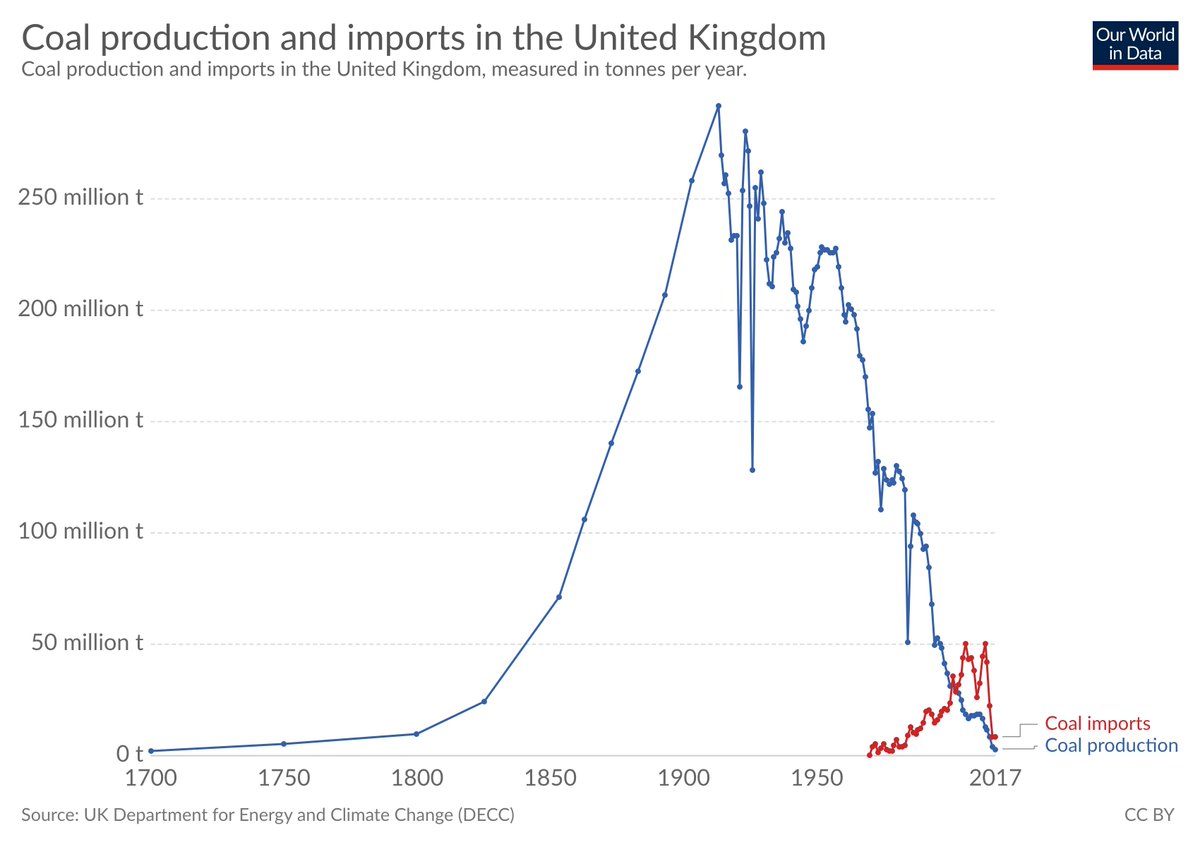
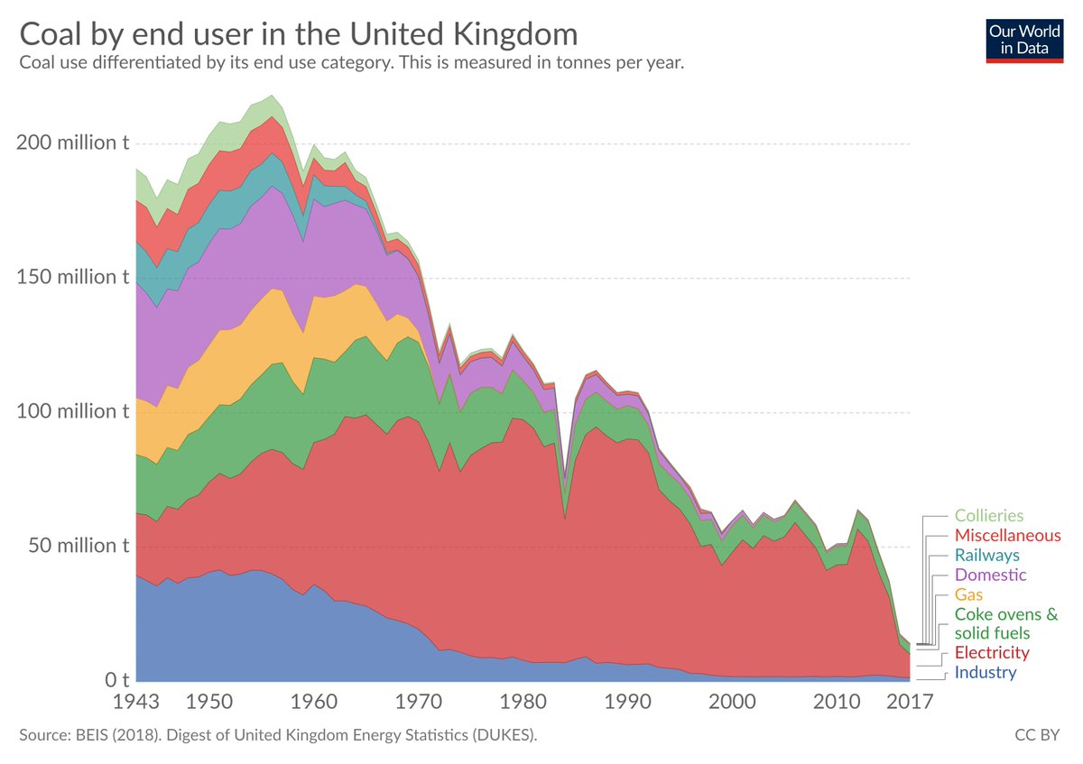
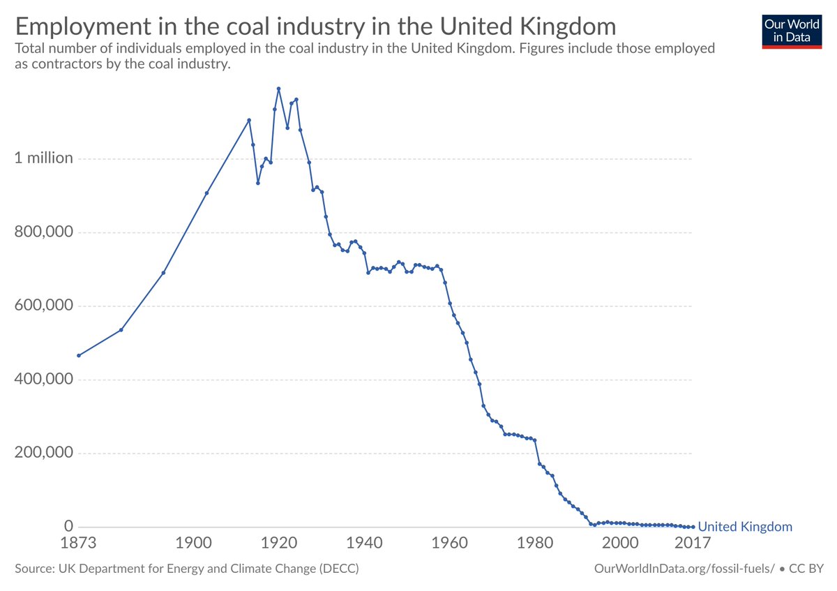
Here are three charts from @OurWorldInData's 'The death of UK coal in five charts’ [ourworldindata.org/death-uk-coal]
to put the last 7 years – shown in the chart above – in context.
This is the transformation of an entire economy.
to put the last 7 years – shown in the chart above – in context.
This is the transformation of an entire economy.
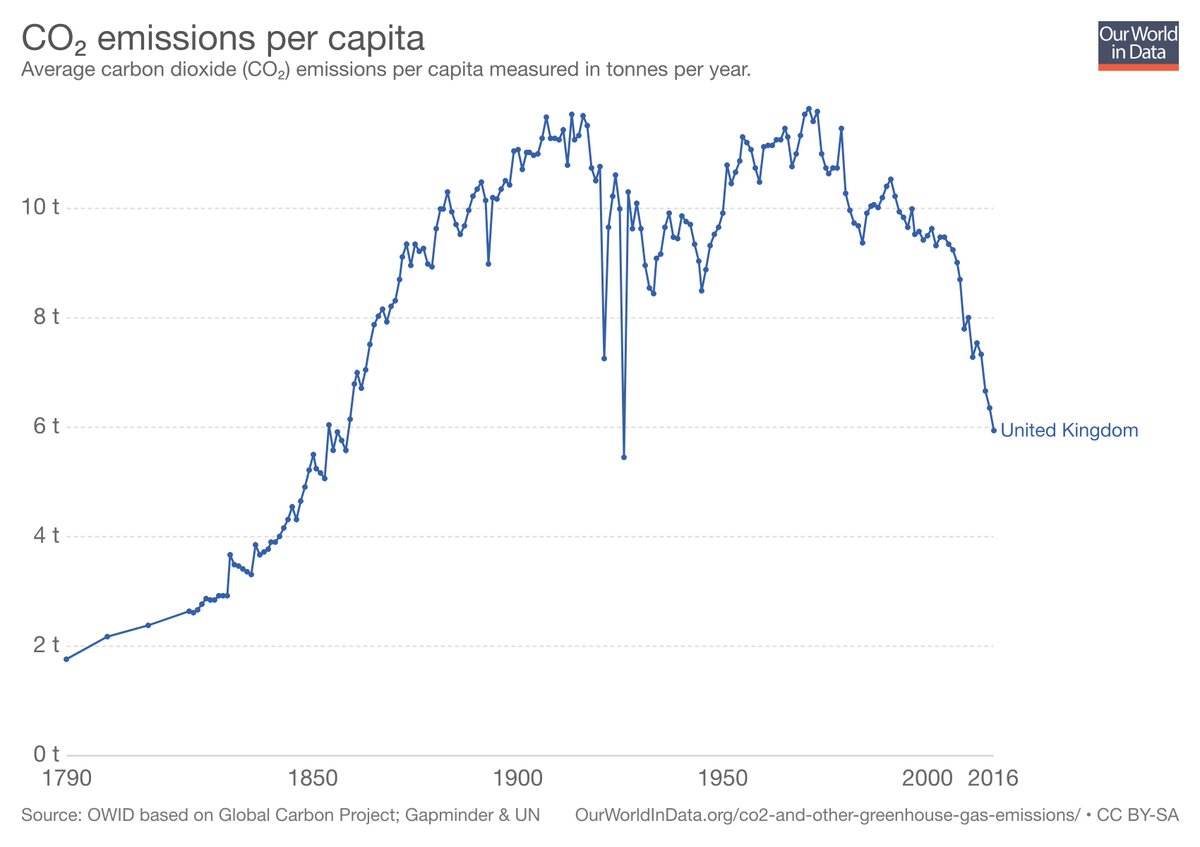
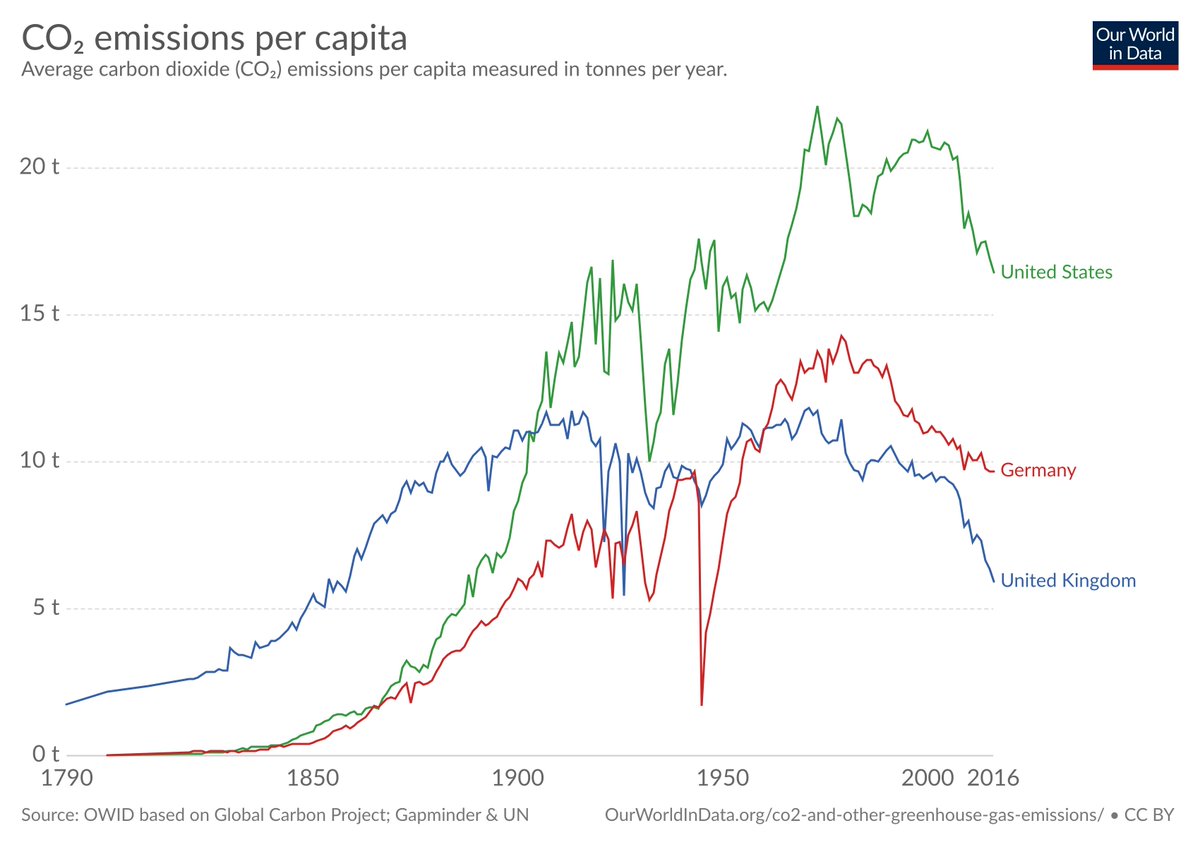
@OurWorldInData And as a consequence CO₂ emissions are now falling rapidly in the UK.
US: 16.4 tonnes per head
Germany: 9.7 tonnes per head
UK: 5.9 tonnes per head
[as low as back in 1859]
From our entry on CO₂ emissions: ourworldindata.org/co2-and-other-…
US: 16.4 tonnes per head
Germany: 9.7 tonnes per head
UK: 5.9 tonnes per head
[as low as back in 1859]
From our entry on CO₂ emissions: ourworldindata.org/co2-and-other-…
@OurWorldInData An important reason for lower CO₂ emissions is that some production is outside the country. To account for this we should also look at CO₂ emissions embedded in trade.
This data is available from 1990 onwards as shown here.
From the same entry: ourworldindata.org/co2-and-other-…
This data is available from 1990 onwards as shown here.
From the same entry: ourworldindata.org/co2-and-other-…

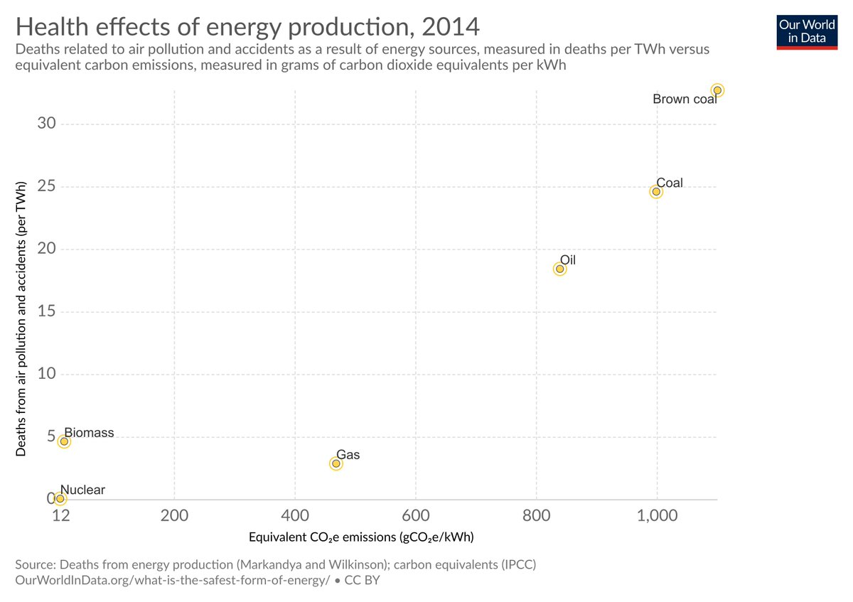
@OurWorldInData Coal is the worst for us today and for those that come after us:
– Per unit of energy it is the deadliest source of all major sources (because of air pollution).
– And per unit of energy it also has the highest greenhouse emissions.
From: ourworldindata.org/what-is-the-sa…
– Per unit of energy it is the deadliest source of all major sources (because of air pollution).
– And per unit of energy it also has the highest greenhouse emissions.
From: ourworldindata.org/what-is-the-sa…