,
9 tweets,
4 min read
Read on Twitter
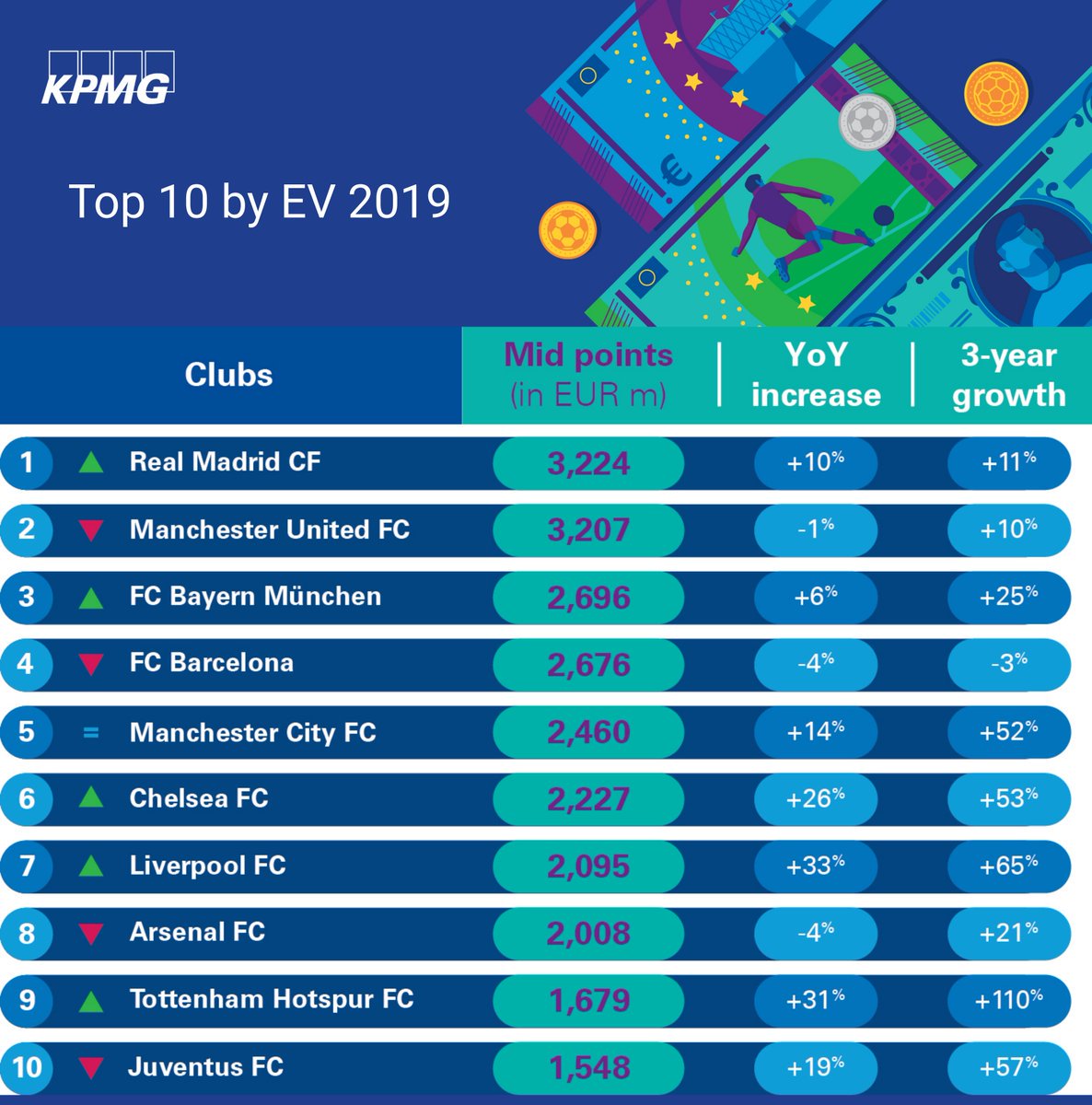
The world’s most valuable football club @realmadrid ($ 4,239,000,000) has a new shirt typeface! And it’s bad in many ways. Why? Thread! ⬇︎ 

❶a Does it suit a football/soccer club?
Not quite. It’s a typical sports typeface, but rather associated with US sports.
Not quite. It’s a typical sports typeface, but rather associated with US sports.

❶b Does it suit the club?
No. Real is a glamourous club that wants to sign the best players and stands for an elegant game. Gold doesn’t make the numbers more elegant, though.
No. Real is a glamourous club that wants to sign the best players and stands for an elegant game. Gold doesn’t make the numbers more elegant, though.
❷ Is it unique & distinct?
No. The design is widely used in US sports – but not only there:
The best punchline of last season was ManU’s kitman borrowing the very similar numbers from PSG: dailymail.co.uk/sport/football… (via @_Bands_FC)
No. The design is widely used in US sports – but not only there:
The best punchline of last season was ManU’s kitman borrowing the very similar numbers from PSG: dailymail.co.uk/sport/football… (via @_Bands_FC)

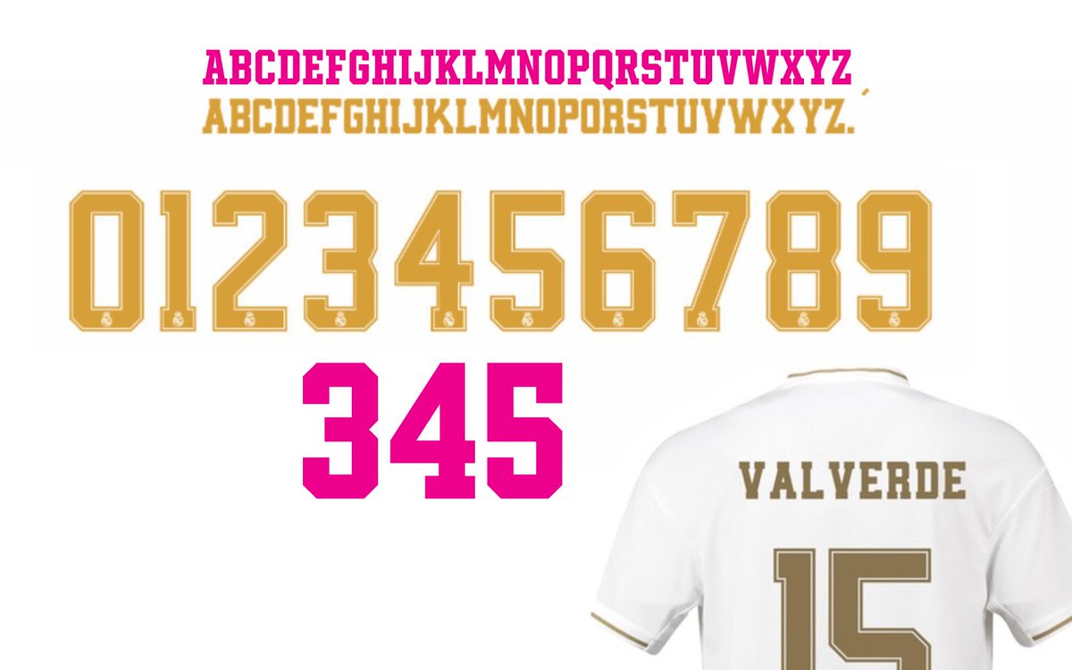
❸a Is it a good typeface (numerals)?
Not quite. You can’t do much wrong here, but the 4 can make a difference. The difference here is that it’s bad: Waist too high, counter too small, appearing black & narrow.
Not quite. You can’t do much wrong here, but the 4 can make a difference. The difference here is that it’s bad: Waist too high, counter too small, appearing black & narrow.

❸b Is it a good typeface (letters)?
No. Again, not a difficult genre, but: Stubby serifs. Counter of A too small, unbalanced K. Is this a Q? etc. No kerning, see gaps in “Valverde”.
(“Winner” is my take on the genre, here in magenta.)
No. Again, not a difficult genre, but: Stubby serifs. Counter of A too small, unbalanced K. Is this a Q? etc. No kerning, see gaps in “Valverde”.
(“Winner” is my take on the genre, here in magenta.)
❹ What could be better?
The typeface could be professional. Additionally you could add an optical size for the smaller application on the shorts. Outline would need to be adjusted, as shown here in Variable Libero (WIP)
The typeface could be professional. Additionally you could add an optical size for the smaller application on the shorts. Outline would need to be adjusted, as shown here in Variable Libero (WIP)
❺ Who cares?
I admire @typesupply’s work for @ussoccerfndn (see gif), also @letterbeeld’s research and his work for @WillemII, just to name a few.
Currently I’m designing a typeface for a Bundesliga team which appreciates good quality – and has a much lower budget.
I admire @typesupply’s work for @ussoccerfndn (see gif), also @letterbeeld’s research and his work for @WillemII, just to name a few.
Currently I’m designing a typeface for a Bundesliga team which appreciates good quality – and has a much lower budget.
❻ So?
This is as if Real signed an amateur american-football player as the captain of their team.
Good distinct shirt typography is one of the most visible parts of a club’s visual identity – and not too expensive. I’m surprised this still gets so little attention.
This is as if Real signed an amateur american-football player as the captain of their team.
Good distinct shirt typography is one of the most visible parts of a club’s visual identity – and not too expensive. I’m surprised this still gets so little attention.