, 11 tweets, 7 min read
My Authors
Read all threads
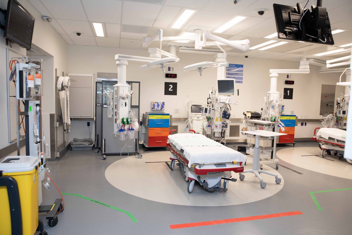
Last week, we posted about the opening of our new trauma bay @UnityHealthTO, a space that we “purposely designed, extensively tested, revised with end-user feedback.” – @HumanFact0rz #design #trauma #emergencymedicine

Here's a thread with more details 1/
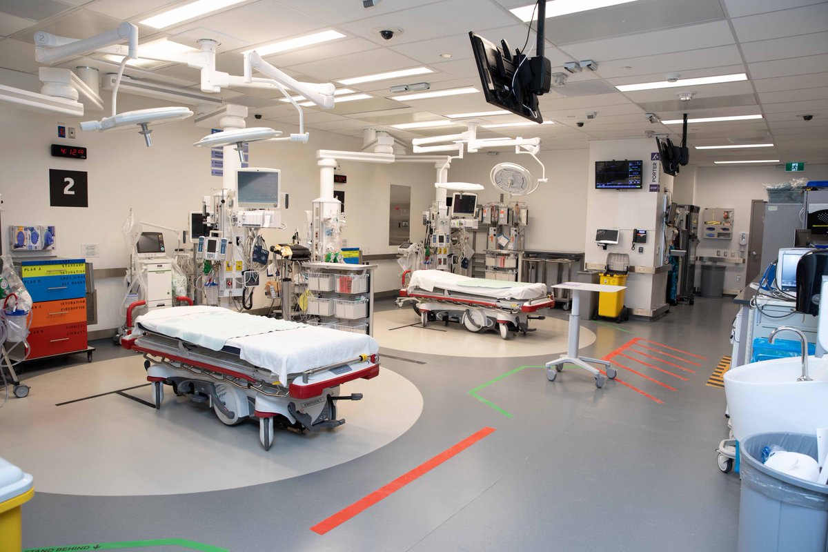
We received considerable positive feedback and questions about the details of the process. This was a team effort from architects, operational readiness, clinicians, sim team to name a few. Here goes... 2/
Once upon a time…(all good stories start like this) 4 yrs ago we ran a study, called TRUST (Trauma Resus Using in situ Simulation for Team training). Using debriefing feedback & human factors expert video review we identified latent safety threats within our old trauma bay. 3/
This step is CRITICAL to the process. #designthinking emphasizes the importance of understanding the “end-user” before trying to change anything. So we did. We watched, we listened, we studied and we analyzed. 4/
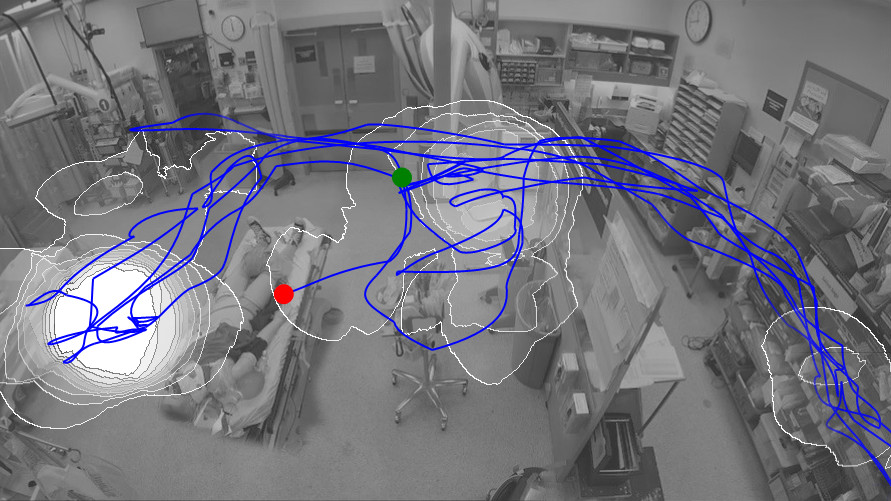
We took this data to inform the design of the new space. We used our tracing tool to show our architects @NORR_AEP data-informed recommendations for spacing between patients, ideal # of beds and how ppl move in the space. They listened and updated designs. 5/
We built a small scale version of the trauma bay to help people visualize it. Blue prints are difficult to interpret for most clinicians. Prototypes are critical, come in many forms & evolve over time. 6/
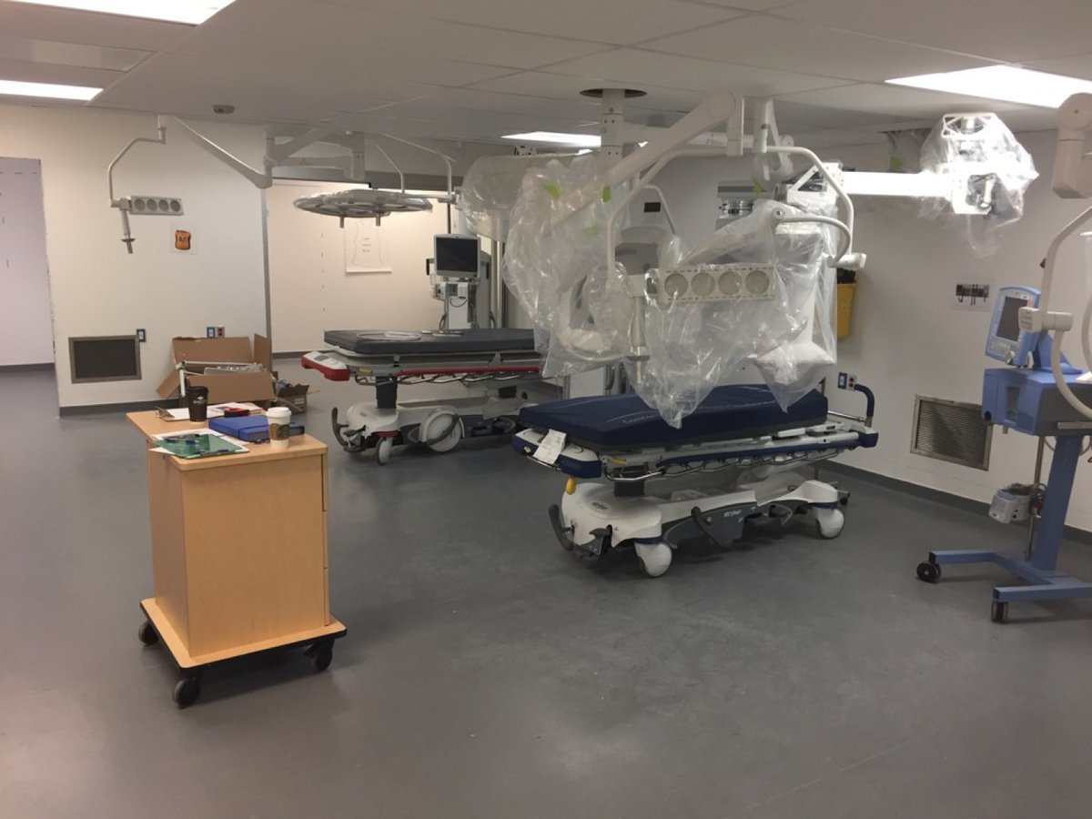
@unityhealthTO then built us a full scale mock-up for simulations --> feedback. I cant recommend this enough. You cant understand a space without using it. This further informed the #design process. We fed back findings to our architects/designers/operational readiness team. 7/
We formulated a few #design principles
1. 360o access to patient
2. Enhanced monitor visibility located at foot, head & side of each stretcher
3. Enhanced equipment accessibility: essential equip close to patient
4. Easy equipment identification with easy to read labels

8/
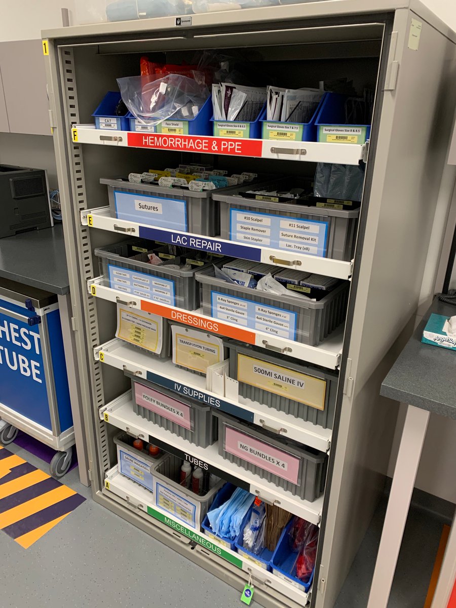
5.Beside procedure carts with flat workspace
6.Floor markings to nudge people thru high traffic areas

These are just a few of the things we integrated from our original observations of how ppl work.

9/
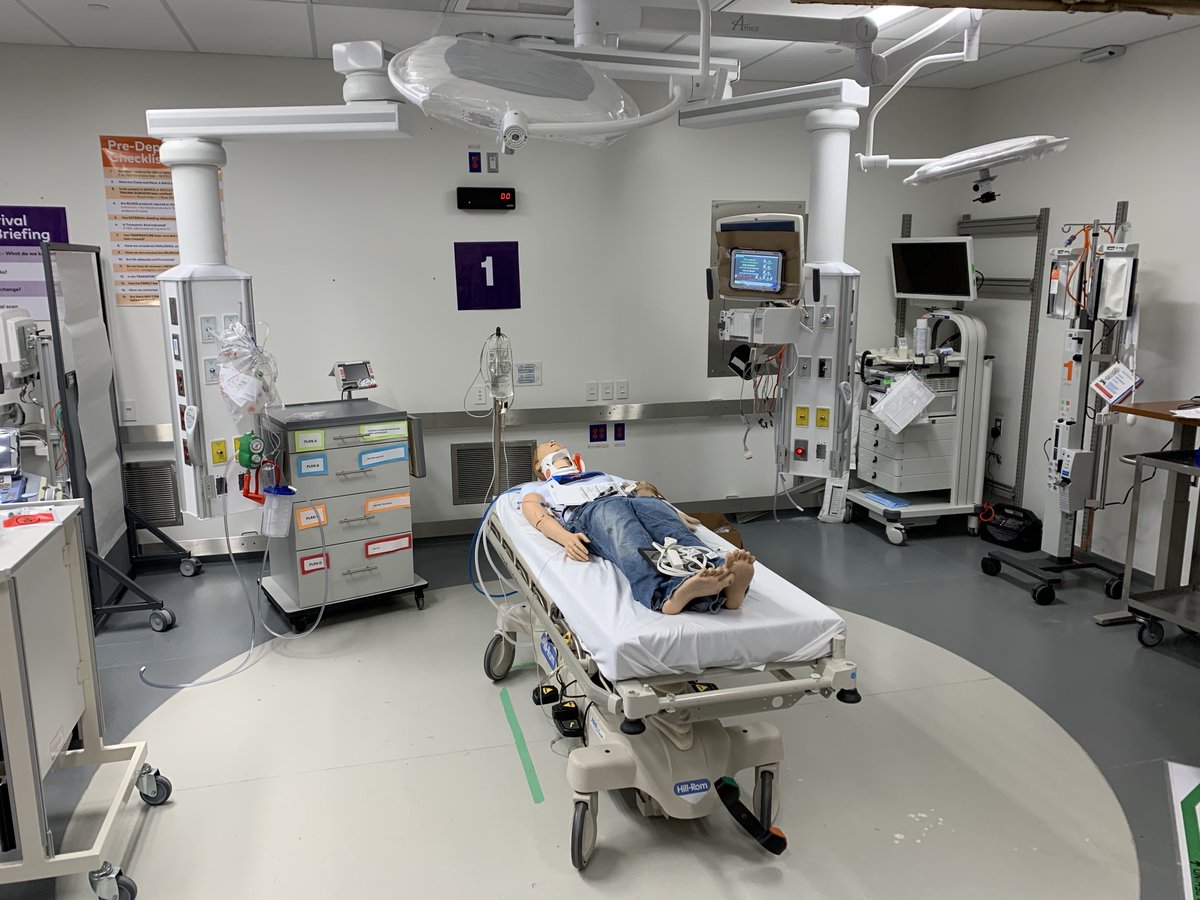
Before we went live, we ran 6hrs of simulation over 2 days ~100 feedback items identified from multi-disciplinary teams. Each one was addressed and fixed in an iterative process. Huge effort by our @Sim_StMikes team making this possible! Note, prototypes of airway carts!

10/
From the beginning, we sought to understand our end-users. The design emerged from watching & listening. We’re very happy with the result. For patients & for our staff.

Thank you to all who made this project possible.

/End.
Missing some Tweet in this thread? You can try to force a refresh.

Enjoying this thread?

Keep Current with Andrew Petrosoniak

Profile picture

Stay in touch and get notified when new unrolls are available from this author!

Read all threads

This Thread may be Removed Anytime!

Twitter may remove this content at anytime, convert it as a PDF, save and print for later use!

Try unrolling a thread yourself!

how to unroll video

1) Follow Thread Reader App on Twitter so you can easily mention us!

2) Go to a Twitter thread (series of Tweets by the same owner) and mention us with a keyword "unroll" @threadreaderapp unroll

You can practice here first or read more on our help page!

Follow Us on Twitter!

Did Thread Reader help you today?

Support us! We are indie developers!


This site is made by just three indie developers on a laptop doing marketing, support and development! Read more about the story.

Become a Premium Member ($3.00/month or $30.00/year) and get exclusive features!

Become Premium

Too expensive? Make a small donation by buying us coffee ($5) or help with server cost ($10)

Donate via Paypal Become our Patreon

Thank you for your support!