How to design locations by thinking of depth in layers. It's a simple formula.
Foreground. Midground. Background.
Let's dive deeper.
A thread:
Foreground. Midground. Background.
Let's dive deeper.
A thread:

I work in television animation so that's my context, but these ideas apply elsewhere.
This is the storyboard panel that I begin with, drawn by a board artist, not me.
The setting is rough but gives enough information to expand on the composition.
I look for depth in the panel.
This is the storyboard panel that I begin with, drawn by a board artist, not me.
The setting is rough but gives enough information to expand on the composition.
I look for depth in the panel.

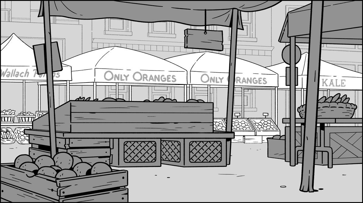
At first glance, you'd think foreground is the crate, midground is the booth and background is everything else behind the farthest character.
Not so fast.
Not so fast.
The crate itself isn't that important on its own. It's part of the booth setting.
In fact, the entire row of close booths serves as the foreground layer.
I rough in the shapes of the booths and vertical poles to frame the characters and thus support their interactions.
In fact, the entire row of close booths serves as the foreground layer.
I rough in the shapes of the booths and vertical poles to frame the characters and thus support their interactions.

With the foreground composition working strong, I can move back in space.
I define the midground as only the opposing row of booths because it's key to establishing the setting.
I make sure characters' faces are still framed pretty well.
I define the midground as only the opposing row of booths because it's key to establishing the setting.
I make sure characters' faces are still framed pretty well.

Finally, the background layer.
Working back in space is a brilliant way to avoid tangents. You design what's behind to work around what is in front.
Working back in space is a brilliant way to avoid tangents. You design what's behind to work around what is in front.

I clean up the drawing in the same order.
Foreground, midground, background.
Foreground, midground, background.

Adding details is fun but likewise with the rough, when cleaning up, I pay close attention to avoiding tangents with more line work.

Even if things get tight in some areas, I know color will help push the layers forward or back.
Also notice how line thickness helps create depth.
Also notice how line thickness helps create depth.

Finally, I shade the design in a way to make clear the three layers of depth.
Doing this only serves as a guide for the background painters to understand my intentions with the composition.
It goes out of my hands at this point.
Doing this only serves as a guide for the background painters to understand my intentions with the composition.
It goes out of my hands at this point.
Depth can also be captured by:
- Only a foreground and background, no mid.
- Several layers of midgrounds.
- No background, just a foreground.
- Etc.
There aren't really rules to the formula because this is art. But it helps to think in layers in order to experiment with them.
- Only a foreground and background, no mid.
- Several layers of midgrounds.
- No background, just a foreground.
- Etc.
There aren't really rules to the formula because this is art. But it helps to think in layers in order to experiment with them.
Whoa, this thread is blowing up. I’m so glad so many people are finding value from it. That’s the point.
In the finished painted scene, you see the three levels of depth transferred to color.
Foreground - Primarily dark tones in shadow.
Midground - Saturated colors in bright sunlight.
Background - Subdued low contrast hues.
Foreground - Primarily dark tones in shadow.
Midground - Saturated colors in bright sunlight.
Background - Subdued low contrast hues.