Human civilization is in big trouble. The world has started believing that #Centralbankers are like the #Avengers wielding the superpower of cutting interest rates. Any crisis they can solve by cutting rates apparently.
Tomorrow even if there is an #alieninvasion, humans may first line up outside central banks to cut #interestrates and feel safe !!!
Do you believe #markets are #cyclical in nature?
Do you think #history#rhymes, if not #repeats?
Do you agree #greed and #fear are two main forces in the market?
If answer of above Q's is yes then following tweets will solidify ur view if its a no then they will change ur view.
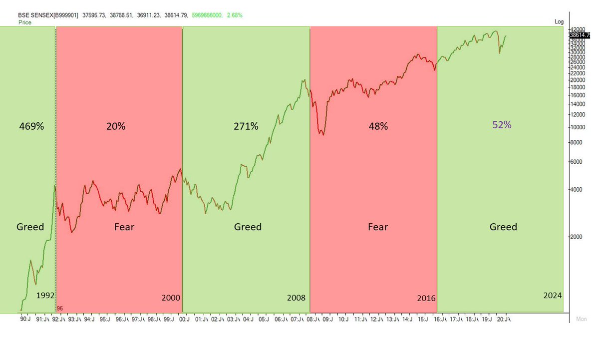
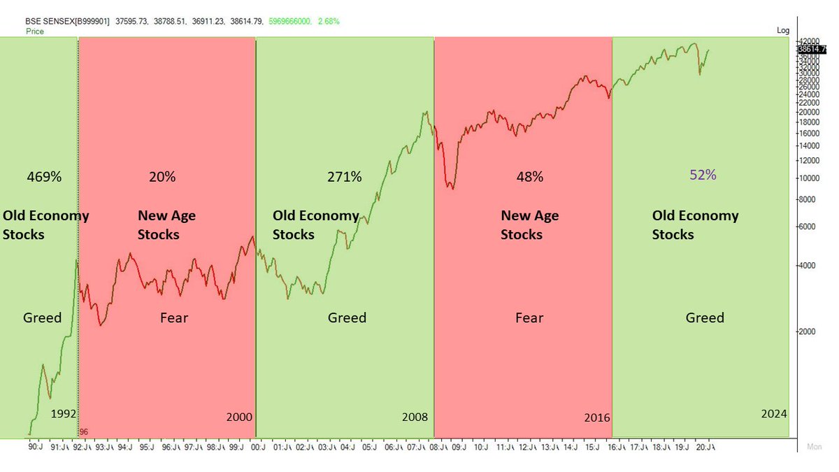
Above is a monthly chart of #Sensex. It goes through an alternating #greedandfear cycle of 8 years. Sensex moves up in greed phase and consolidates in fear phase. It was up 469% in greed phase of 1992. was up only 20% from 1992 to 2000. From 2000 to 2008 it was up 271%.
In fear phase of 2008 to 2016 it was up only 48%. #Sensex has entered greed phase in 2016 and will stay there till 2024. So far its up more than 50%. But the story doesnt end there. The sectors which move up during these phases also go through a cycle.
Have you ever felt that you have lived the present situation before? Its called #Déjàvu. Right now I'm experiencing this moment in the markets. #PSUBanks are going through tough times. But this isnt new. They were in a similar situation back in 2016. (1/n)
#PSUBanks were dealing with NPA's and losses in Mar 2016. Their troubles are amplified after the #COVIDー19 outbreak. But it seems worst is over. Here's a weekly chart of #NiftyPSUBank index. (2/n)
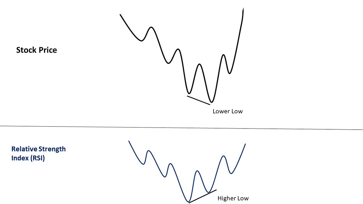
#PSUBanks are forming bullish divergence in #RelativeStrengthIndex(RSI) on weekly charts. #RSI is a momentum indicator. Bullish divergence in it indicates that ongoing downtrend is losing steam. It doesnt guarantee a reversal but increases the chances. (3/n)
#Market#breadth is weak despite 100 point gap up in #nifty...quite unusual considering the recent rally in broader markets👀 Lets see if it catches up during the day
But don't know whats the best approach to pick one?
#Ratio#charts can help you identify the best stock for #trading and #investment. You can plot a #ratiochart by dividing the price on one stock with another. Its preferable to divide the high priced stock with low priced one to get ratios greater than 1.
He adds another #RTM: 4 Week EMA / 12 Week EMA on the #charts to get a holistic view
So the two #RTM's work like a MACD except that an #MACD plots the absolute difference between 2 mvng avgs. But since we are dividing one avg with another in #RTM we can use it to compare one stock with another which we cant do in a MACD.
I have applied the concept of RTM on F&O stocks and come up with some insights. If the daily #RTM value is above the Weekly #RTM value then I define the trend as bullish. Then I calculate the difference between Daily and weekly #RTM's across F&O stocks.
My friend @VMK100 sent me this insightful short note on mental fitness for traders by @normanhallett. I'm summarizing the points worth learning in this thread for the benefit of #trading community.
1. You've got a superb #tradingsystem...so why are you losing?