nytimes.com/interactive/20…

Saying NYC > Italy per capita isn't a great comparison; huge parts of Italy unaffected, NYC still better than Lombardy, which is what 'Italy' evokes
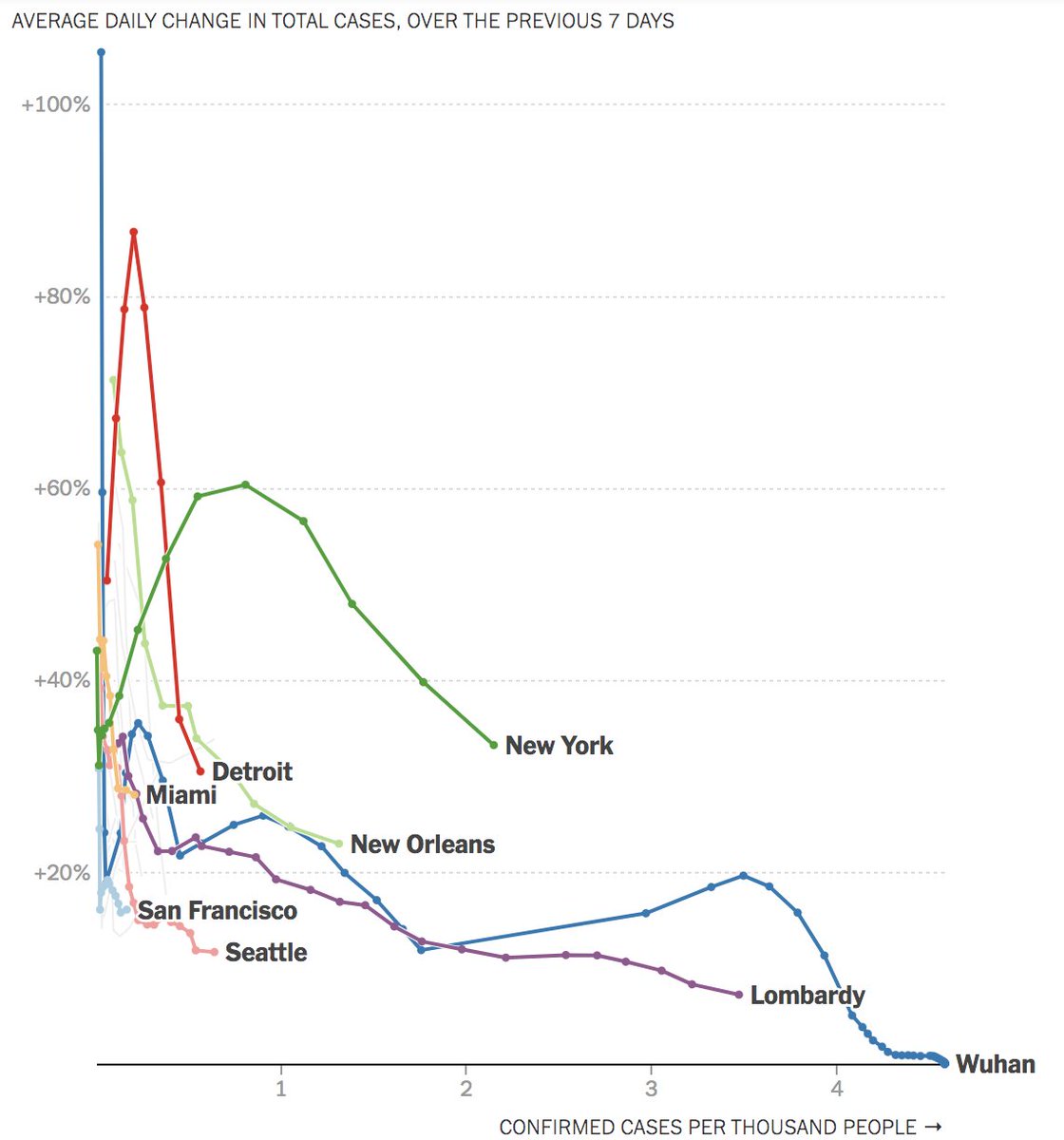
Everyone's interested in 'bending the curve.' You can guess it by eyeballing it on a chat of cases. But a chart of rate of growth = just a direct measure of whether the curve is flat or steep
This might take more than one tweet.
Time is the natural one, I get it. But with growth, the question is not *when* rapid growth happens, but whether growth is happening on a base of large N
On that chart, your eyes are drawn to the country that's highest. You might assume they're worst. But that's not true, if they've since slowed the growth in cases.
On this chart, the metro that's highest at a given value of x is the one that's doing the worst job of "flattening the curve" at a comparable stage of its outbreak. So it's visually intuitive


