Profile picture
, 14 tweets, 4 min read Read on Twitter
Stare at each icon below for a sec. Imagine it's your phone. How does each make you feel?

That feeling says so much about the product. Notification behavior is one of the most important aspects of mobile UX to get right to in the long run.

Thread! 👇
Compare how each makes you feel now vs. years ago. For me:

• FB's used to be exciting, now its birthdays, group posts, other BS. They're hyperinflating it to zero
• Unlike FB, Snapchat's usually means a social interaction
• SMS is decent, but automated texts are devaluing it
Lower quality notifications hurt the user's relationship w/ the product

• Noisy slack integrations make the badge unpredictable
• Uninteresting content (someone posted a photo) makes me care less about FB
• LinkedIn inbound spam means I feel nothing about their notifs
User behavior can also devalue the app’s notification power, weakening the draw of the product. Ex:

• “Mark as unread” for email changes the badge from “unseen” to “incomplete busywork”
• Group chat changes SMS badge from “friends are talking to you” to “friends are talking”
If Apple let apps have two types of notification badges (say, a red and a blue badge) I bet that would help engagement.

For example, SMS and Messenger could use the blue badge for unread group chats and red for unread direct message. Email: blue = unread, red = unseen
I feel like big tech companies (FB, Snap, Slack) need a Steve Jobs-esque notifications czar.

It’s so easy to juice engagement of new or declining products by exploiting the notification counter. Engagement booster in the short term, tragedy of the commons in the long run.
Notification behavior should be customized to each user. When I had 50 followers, I wanted a see every like. I still want my phone to buzz for RTs, but that would obviously stink for @naval.

AFAICT, Twitter appropriately calibrates notif behavior to the user’s hedonic treadmill.
Perfecting notification behavior is tough:

• Should the product decide it all?
• Can the user customize?
• How much customization?

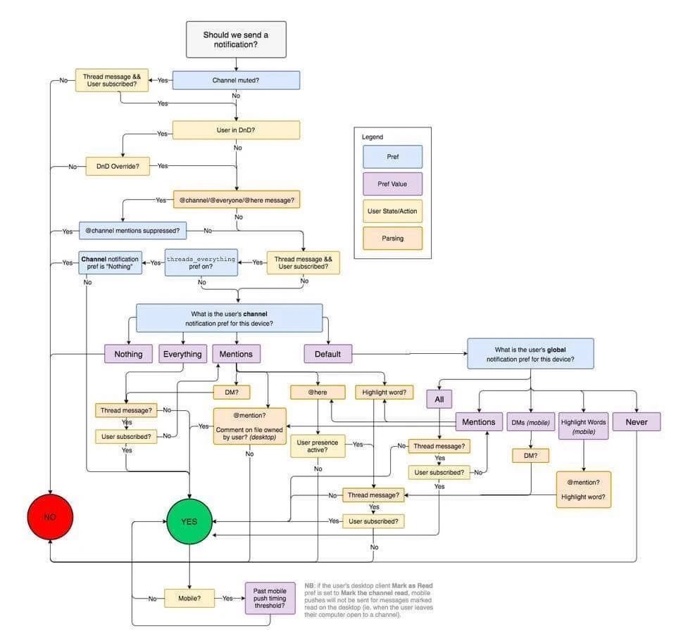
Muting and receiving notifications are both crucial for @Slack. Look at how complex it gets when you try to juggle defaults and customization!
Everyone points to what teens are doing in order to figure out what social networks are dying.

Want a more direct sign? Look at the notifications!

FB notifies me about so much crap that I miss the real stuff. Snapchat just started notifying me when friends post stories. 🤔
Old school: Ruin your brand? Rebrand! Comcast → Xfinity

New school: Ruin the power of your notifications? Separate apps! FB → Messenger, WhatsApp, FB Local

Careful though, you’re starting from zero so make them count. Oculus ruined their notification power right away 👇
Notification UI is sacred. High value notifications should be unmistakable and only used for dopamine bursts.

Twitter’s iOS copy animation kills me. Don’t reuse the “someone liked/retweeted your tweet” animation for that. You’re Pavlov, I’m the dog, and you just rang the bell!
FB needs a notification nudge unit to trim the fat. For example, display a notification saying

> You haven’t checked your high school group in a while. We’ll show you fewer notifications from now on.

With a button that lets the user opt back in to receiving all notifications.
IMO, Apple should enforce notification rules for iOS apps. Apps like DoorDash and Venmo shouldn’t default to texting me and sending a push notification for the same info. That hurts Messages’ brand.

Make exceptions for apps like PagerDuty, but be strict otherwise.
I can’t think of a more tragedy-of-the-commons notification system than email

Spam detection is good and newsletter bundling is improving, but creating filters and aggressively snoozing/archiving feels like bad design. Like booby trapping my house just so strangers don’t walk in
Missing some Tweet in this thread?
You can try to force a refresh.

Like this thread? Get email updates or save it to PDF!

Subscribe to John Backus
Profile picture

Get real-time email alerts when new unrolls are available from this author!

This content may be removed anytime!

Twitter may remove this content at anytime, convert it as a PDF, save and print for later use!

Try unrolling a thread yourself!

how to unroll video

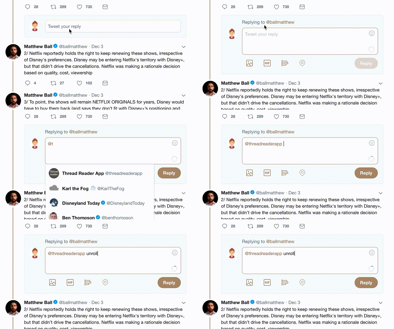
1) Follow Thread Reader App on Twitter so you can easily mention us!

2) Go to a Twitter thread (series of Tweets by the same owner) and mention us with a keyword "unroll" @threadreaderapp unroll

You can practice here first or read more on our help page!

Follow Us on Twitter!

Did Thread Reader help you today?

Support us! We are indie developers!


This site is made by just three indie developers on a laptop doing marketing, support and development! Read more about the story.

Become a Premium Member ($3.00/month or $30.00/year) and get exclusive features!

Become Premium

Too expensive? Make a small donation by buying us coffee ($5) or help with server cost ($10)

Donate via Paypal Become our Patreon

Thank you for your support!