, 34 tweets, 12 min read Read on Twitter
When you are just starting out with FB ads, you are guaranteed to make mistakes.

Especially when it comes to creating ads.

So, as I see bad ads I'll add them to the thread and provide some improvements.

**Bad Ads Thread** ⬇️
I have no big issue with the image or the text, they could definitely convert.

However, I do have an issue with the headline.

Having just the name of the store is not a good approach.

"Chargii, The World's Strongest Charging Bank"

Something like this would work better.
I've heard of Lux before and know they are a pretty large brand which is why I'm surprised to this ad.

There is no headline or call to action button.

Which makes me think they are just boosting a post which just doesn't make sense to me, especially for a company like them.
I hope this was put up on accident.

If not I feel really bad for the person who thought this ad would result in sales.

You can't even tell what the product is, which is really bad obviously.

I think we can all agree this ad is terrible.
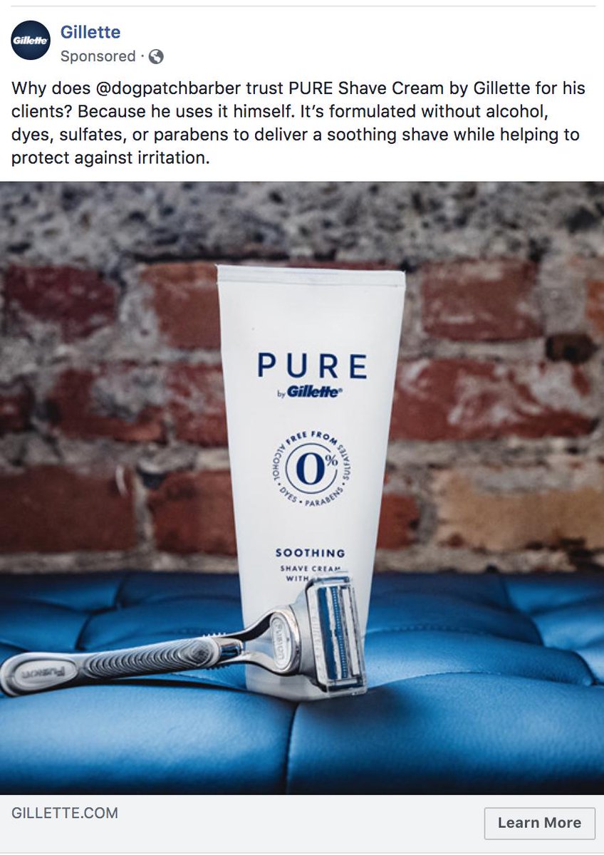
Yoooo, @gillette whoever is running your ads forgot to add a headline.

You'll see some better performance if you add one.
When you write your copy for an ad, it's important to have it organized in a way that's easy to read quickly.

Having things spaced out helps with that.

Because when you have things organized like the ad below people will end up, not reading the body text and not converting.
There are two main issues I have with this ad:

1) Obviously their is way to much text on the first image and it's way too small.

2) It's not a good idea to include this much info in an ad.

You want the ad to make a user curious/excited and then you inform them on your website.
I've seen a huge decline the past year in performance with this classic spammy copy set up with all the emojis.

Also, I've seen better performance typically with just individual product pictures in carousel ads. I only use them when selling multiple products or variations.
This is just sad.

If you are thinking of trying to sell fake jerseys, DON'T!

Sure you might make a quick buck but it will get shut down.

Stop thinking so short term, create something that can last and grow.

Also, people know now a days and will call you out like below.
I've never heard of this brand before

and they show me an ad of their gravity blanket in box at someone's door.

Let me explain this to you guys.

You don't buy a product because it has home delivery or fast shipping, you buy a product because you like it/solves a problem.
There are two things that I don't like.

1) If you are going to include a link, at least create a redirect with a smaller url or use a bitly.

2) The headline sucks. Of course you love the product you are selling, C'MON.

Put some more effort in.

Just seems lazy.
1) This bag is for women. I am not a woman. They must like wasting money.

My relationship status on FB is single so it's not like they are targeting me and other guys in the hope we buy it for our significant other.

2) I like using testimonials but this is way too long.
smh....
I don't even have to explain this one, it's pretty obvious it looks like a terrible ad 🤮🤮🤮
Don't mind the text or creative but just no effort on the headline.

Also, the ad leads to a terrible home page that probably leads to a huge drop off rate.

The link in the copy goes to the product page which is what the shop now button should go to as well.
NEVER put hashtags in an ad.

Especially this many.

Looks so bad and will increase your cost per link click.
Lets see who's been paying attention.

Why is this a bad ad?
Really need to show a video of someone using this.

Pictures don't do a good job of showing this product off compared to what a video would do.
Whoever created this ad was super lazy.

Literally, no effort went into coming up with the copy.

I don't understand how someone can put something up like that and just waste money on it.
I'm really curious as to the thought process of the person who made this ad.

Why on earth would they think this image would help them sell low quality products from China?

I don't think I'll ever know.....
This ad had a video with a voiceover but no subtitles.

Remember, 85% of people will see your ad and not have the sound on.

Having subtitles is very important.

Make sure you double check them so they actually match whatever is being said.
1. Need a 1:1 ratio instead of a 16:9

2. The creative is pretty bad. Would have better results with a creative focused on a stressed person or using the product itself

3. Listen to the people!

They should hide negative/promotional comments and test out lower prices.
I think Facebook is starting to show me bad ads on purpose since I always click on them......
😤
🤮🤮🤮🤮
Nothing to hook you in.

This product would sell much better with a video.

Also, the product page is horrendous.
If you are going to photoshop stuff, make sure it doesn't look this bad.
What a terrible ad.

0% chance it will get a conversion because

you can't just tell someone they need your product or say it will change their life.

Why would they believe you?

You have to show them why they need it.

Seeing is believing!
Black subtitles over a black chair......

SMFH
You don't try and tell a story in your headline.

Look how bad that looks.

Something quick and to the point will work.

Hell, sometimes I'll just have the name of the product.

Keep things simple guys.
No text.

Is it a new strategy or incompetence?

What do you think?
Video looks like crap.

Looks like they took this straight from aliexpress.

Anti-theft bags are no longer a viral product.

It's going to be very difficult to sell it consistently like this.

Stop trying to sell stuff that's already peaked and look for new stuff to test out.
If you are using carousel ads, please don't use the exact same headline for every single card.

It looks terrible.
Always double check to make sure your images are cropped correctly.

Also, have a headline that at least has something about your product.

Having the name of your website that has nothing to do with your product is not a good idea.
Missing some Tweet in this thread?
You can try to force a refresh.

Like this thread? Get email updates or save it to PDF!

Subscribe to Ads Alchemist
Profile picture

Get real-time email alerts when new unrolls are available from this author!

This content may be removed anytime!

Twitter may remove this content at anytime, convert it as a PDF, save and print for later use!
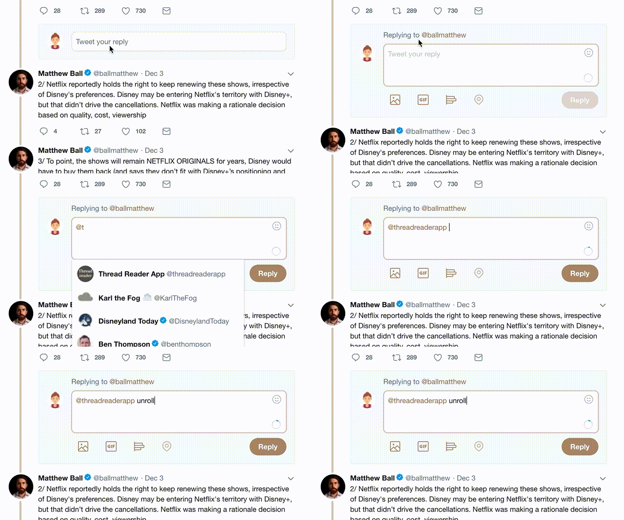
Try unrolling a thread yourself!

how to unroll video

1) Follow Thread Reader App on Twitter so you can easily mention us!

2) Go to a Twitter thread (series of Tweets by the same owner) and mention us with a keyword "unroll" @threadreaderapp unroll

You can practice here first or read more on our help page!

Follow Us on Twitter!

Did Thread Reader help you today?

Support us! We are indie developers!


This site is made by just three indie developers on a laptop doing marketing, support and development! Read more about the story.

Become a Premium Member ($3.00/month or $30.00/year) and get exclusive features!

Become Premium

Too expensive? Make a small donation by buying us coffee ($5) or help with server cost ($10)

Donate via Paypal Become our Patreon

Thank you for your support!