Crash Course #2: 🖥 sRGB or P3? What even are they? Let’s talk about Colour Profiles and Colour Management 👇 

1/10
To talk about colour profiles, first, we need to touch on colour space.
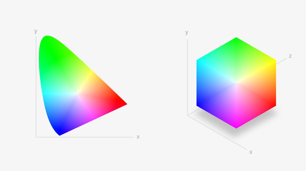
You may have seen these intense charts before.
These graphs depict the visible colour spectrum that humans can see
To talk about colour profiles, first, we need to touch on colour space.
You may have seen these intense charts before.
These graphs depict the visible colour spectrum that humans can see
2/10
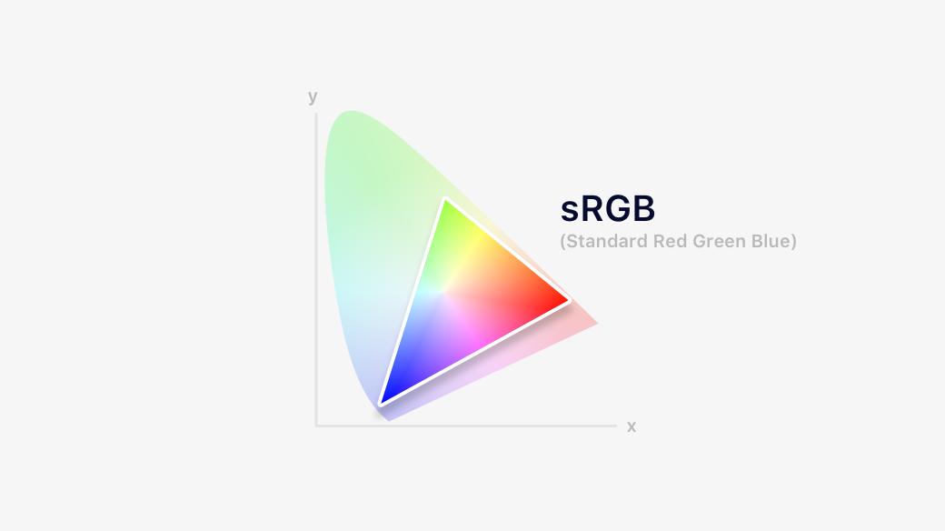
A colour profile describes the range (gamut) of colour that can be shown.
sRGB covers colours you're used to seeing on the web and on computer screens in general.
A colour profile describes the range (gamut) of colour that can be shown.
sRGB covers colours you're used to seeing on the web and on computer screens in general.
3/10
Display P3 colour space was created by Apple and was derived from a similar profile that has been used by the cinema industry for decades.
Display P3 has a wider gamut and it can represent more colours, especially vivid reds and greens.
Display P3 colour space was created by Apple and was derived from a similar profile that has been used by the cinema industry for decades.
Display P3 has a wider gamut and it can represent more colours, especially vivid reds and greens.

4/10
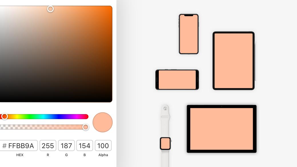
By selecting a colour profile in our design tools, we’re making sure that the colours we’ve selected in our documents will more accurately match the intended output.
Think of it as an ingredient, we've given the amount (#FFBB9A) and now we've specified the type (grams, kg)
By selecting a colour profile in our design tools, we’re making sure that the colours we’ve selected in our documents will more accurately match the intended output.
Think of it as an ingredient, we've given the amount (#FFBB9A) and now we've specified the type (grams, kg)

6/10
SO! What the hell do we use?
Simply, If you’re designing a website then your documents should be set to sRGB.
iOS, Android, or Mac apps should also work in sRGB as you’ll need a full set of sRGB assets anyway
SO! What the hell do we use?
Simply, If you’re designing a website then your documents should be set to sRGB.
iOS, Android, or Mac apps should also work in sRGB as you’ll need a full set of sRGB assets anyway

7/10
If you’re working with 4k+ TVs or photos, then using P3 can produce richer, more saturated colours than sRGB.
If you do this then use 16bit and export images in .png format.
To design with Display P3 you’ll also need a wide colour display (most modern laptops are fine)
If you’re working with 4k+ TVs or photos, then using P3 can produce richer, more saturated colours than sRGB.
If you do this then use 16bit and export images in .png format.
To design with Display P3 you’ll also need a wide colour display (most modern laptops are fine)

8/10
All-in-all, be wary and understand what colour profile you're designing for.
If you copy-paste colours from one profile to the other rather than converting them, they’ll look either too vivid or too dull in your design tool/app.
As the saying goes: When in doubt, use sRGB
All-in-all, be wary and understand what colour profile you're designing for.
If you copy-paste colours from one profile to the other rather than converting them, they’ll look either too vivid or too dull in your design tool/app.
As the saying goes: When in doubt, use sRGB

9/10
What if I want to design for both profiles?
You’re in luck! There are 2 web-based solutions we can use:
- Media query that can test the range of colours supported by the user agent and the output device
- Colour space value
Both methods can reference srgb, p3 or rec2020
What if I want to design for both profiles?
You’re in luck! There are 2 web-based solutions we can use:
- Media query that can test the range of colours supported by the user agent and the output device
- Colour space value
Both methods can reference srgb, p3 or rec2020

10/10
Now for the love of all that is good, go and apply a God damn colour profile in your design tool (if it has the option) - just don’t leave it unmanaged 😅
Now for the love of all that is good, go and apply a God damn colour profile in your design tool (if it has the option) - just don’t leave it unmanaged 😅

Thanks for listening!
This was a super diluted intro to colour profiles.
Colour Management is an extremely complex topic, so I highly recommend you check out @marcedwards' 3-part series on it. He's done an amazing job at breaking everything down.
bjango.com/articles/colou…
This was a super diluted intro to colour profiles.
Colour Management is an extremely complex topic, so I highly recommend you check out @marcedwards' 3-part series on it. He's done an amazing job at breaking everything down.
bjango.com/articles/colou…