, 16 tweets, 4 min read
My Authors
Read all threads
Quick startup PSA: Your “competition” slide doesn’t have to take the form of a 2X2 grid with your logo in the upper right quadrant. Explaining how your startup fits in the broader market is incredibly important, but there are better ways! A few ideas:

/1
🥇 Focus on the basis of competition

The first thing to do is make sure you can clearly explain the choices you’ve made that allow you to be competitive in the market. Many startups skip this step!

This should be 2-4 sentences that form a compelling mini-pitch, e.g.:

/2
“By using *this* emerging technology, we’re able to offer *this* unique product, which provides customers *this* benefit while providing us *this* other benefit. We’re targeting *this* particular kind of customer and going to market in *this* differentiated way.”

/3
For example, if I was going to write a version of this for @fcollective, it might be: “Our mission is to be the most aligned fund for founders at the seed stage. We believe if we’re able to embody that mission, we believe the best entrepreneurs will choose to work with us.”

/4
“FC is structured to achieve this goal in two key ways. Our deliberately small funds (~$75M/fund) reflect the fact that we’re not life-cycle VCs and don’t participate in future rounds of funding, which aligns our financial interests closer to the founders than other VCs.”

/5
This description glosses over a lot of nuance, and I could point to a lot of other great aspects of our firm, but it’s the rough outline.

You may not agree with this strategy, but it’s differentiated, and thus far has proven effective!

forbes.com/midas/#52c31c1…

/6
99% of the time when the competition slide is weak, it's because the team hasn't come up with a clear articulation of its strategy.

Once you’ve got a clear set of talking points, you can then start to think about how to present the case visually.

/7
2⃣ The 2X2 Grid:

The favorite of consultants the world over, the 2X2 combines Cartesian precision with astrological divination. It usually takes the form of a dozen competitor logos arrayed semi-subjectively across two of potentially dozens of competitive axes.

/8
This format provides a fine first approximation, but wastes a tremendous amount of space conveying an extraordinarily small amount of information.

It has the patina of precision without much empirical backing.

They’re also highly reductive — markets/customers are messy!

/9
🕶️ The Feature Matrix:

This is a lesser used, but often more effective way to frame the competition. The format, popularized by Consumer Reports, can communicate nuanced info about feature sets, pricing, and positioning in the way a 2X2 can’t.

/10
This format is especially useful where the competitive landscape is complex. It helps illustrate how certain classes of customers value different things, e.g. an iron clad SLA vs. features vs. price.

This extra detail makes strengths and weaknesses immediately obvious .

/11
The downside to this approach is that it tends to overload the viewer. It’s a great slide to have in an appendix, or to send in advance of a meeting, but it can be a lot to take in during a pitch.

/12
🍊🍏 Apples & Oranges:

Often, startups face competition from legacy vendors on one side, and a host of recently founded startups on the other. A bespoke graphic illustrating the basis of competition against each is often better than shoehorning both onto a pair of axes.

/13
There is no ideal template for depicting the competition. The important thing to remember is that the format shouldn’t serve as a replacement for thinking. Too often, founders reach for a readymade slide rather than wrestling with how their startup will compete.

/14
Your goal is to educate potential investors. Don’t default to a cargo cult slide just because you think it’s what investors expect to see. Conflict is the heart of any good narrative. Give yours its due!

/End
“Also, our smaller fund size means that a larger share of exits ‘move the needle’ for our fund. A $100M exit is effectively worthless to a fund with $1B in AUM, but would be significant for our fund — and for the startup’s founders.”

/5A
Missing some Tweet in this thread? You can try to force a refresh.

Enjoying this thread?

Keep Current with Joseph Flaherty

Profile picture

Stay in touch and get notified when new unrolls are available from this author!

Read all threads

This Thread may be Removed Anytime!

Twitter may remove this content at anytime, convert it as a PDF, save and print for later use!

Try unrolling a thread yourself!

how to unroll video

1) Follow Thread Reader App on Twitter so you can easily mention us!

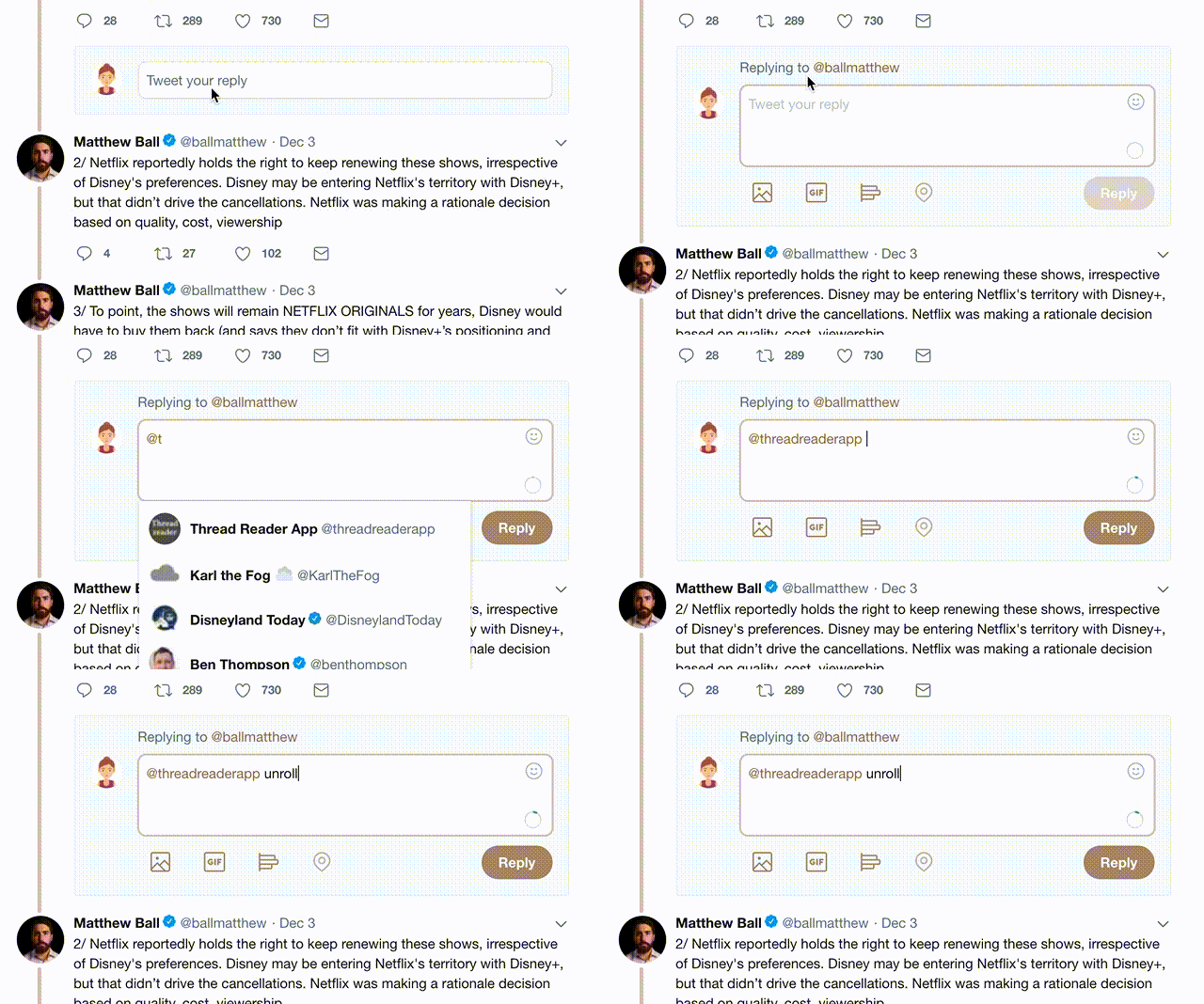
2) Go to a Twitter thread (series of Tweets by the same owner) and mention us with a keyword "unroll" @threadreaderapp unroll

You can practice here first or read more on our help page!

Follow Us on Twitter!

Did Thread Reader help you today?

Support us! We are indie developers!


This site is made by just three indie developers on a laptop doing marketing, support and development! Read more about the story.

Become a Premium Member ($3.00/month or $30.00/year) and get exclusive features!

Become Premium

Too expensive? Make a small donation by buying us coffee ($5) or help with server cost ($10)

Donate via Paypal Become our Patreon

Thank you for your support!