The good people at @CTVNews are collecting how many cases and where they are in Canada in a handy map: ctvnews.ca/health/coronav…
And given that we’re all cooped up… let’s make some charts. From Canadian numbers you might think that Ontario is not the place to be… but cases per million people might be a better estimate of risk.
docs.google.com/spreadsheets/u…
docs.google.com/spreadsheets/u…
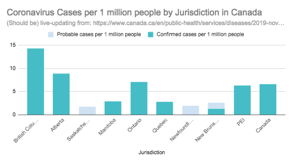
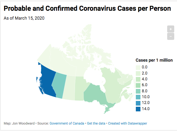
In that case, it’s British Columbia that rises to the top, at 14 cases or so per 1 million people. (That’s just under Portugal, which has about 16 cases per million people at my last count.) Here’s a map to that effect: datawrapper.dwcdn.net/Yv1Qx/2/
I'm in Europe (and hoping to get out real soon). Here’s an interactive chart of how it's going here. It’s a log scale, so the steeper the line, the faster the growth. If you want to guess where a country will be in a few days, just draw the line forward. jtgwoodward.github.io/EuropeMarch15.…
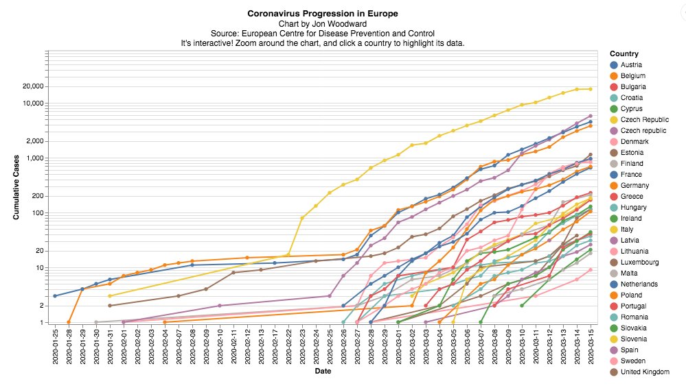
The recent numbers from Italy after the lockdown are very encouraging – just 90 new cases instead of the previous day’s 2247. But look at the slopes of the other countries -- even the ones with low case numbers are on the same trajectory. Hence the restrictions we're now seeing.
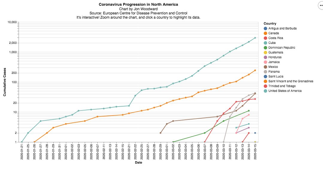
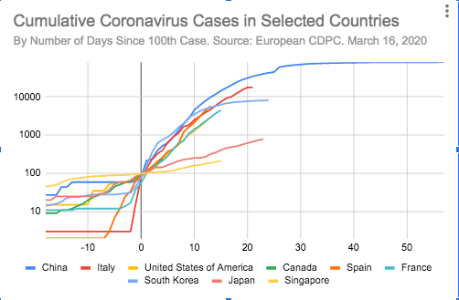
Looking over at North America… the US and Canada are similarly sloping up. Tough to interpret this data – the testing in the US has been very behind. Their line could indeed be much steeper. jtgwoodward.github.io/NorthAmericaMa…
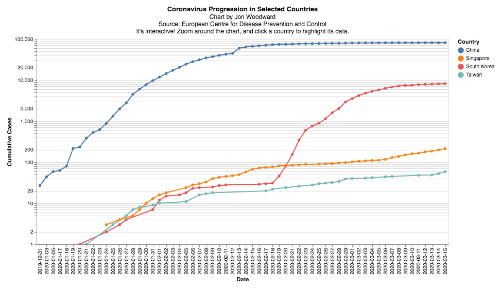
Something to watch as we go into start #SocialDistancing and we #selfisolate is: do the slopes on these graphs start to change? China, South Korea and others are making a dent: jtgwoodward.github.io/SelectedCountr…
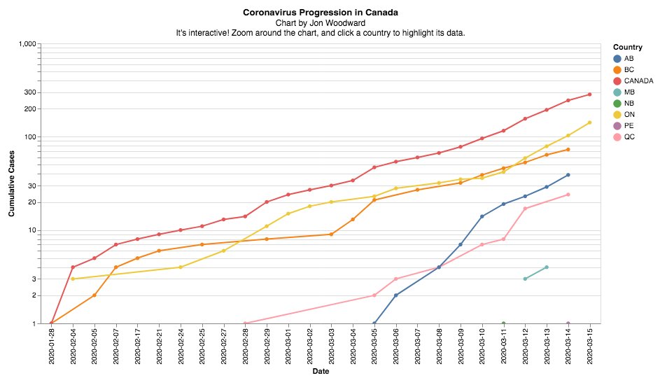
Here is the log chart for the Canadian provinces (limited data so on some provinces you can just see one or two points). Ontario's slope is steeper -- a worrying trend for that province jtgwoodward.github.io/CanadaMarch15.…
Here's an interactive version of the back-of-the envelope calculation we did on March 9 when deciding not to enter Spain. It shows the cases lined up where "0" is the day the country got 100 cases. docs.google.com/spreadsheets/d…
Why didn't we enter Spain? Because the line showed then that Spain -- at about 600 cases if I recall -- was on track to become Italy. (It's now at 7800 cases.) The other takeaway was that Singapore and Japan did #FlattenTheCurve .
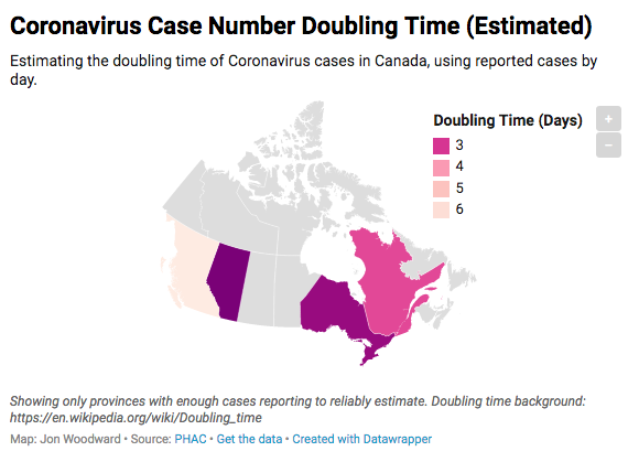
This is another map that really brings it home: how long I estimate it will take for the number of cases in each province to double.
BC is highest (which is good) at around 6 days - but Ontario and Alberta face doubling times of between 2 and 3 days.
datawrapper.dwcdn.net/URN4p/1/
BC is highest (which is good) at around 6 days - but Ontario and Alberta face doubling times of between 2 and 3 days.
datawrapper.dwcdn.net/URN4p/1/
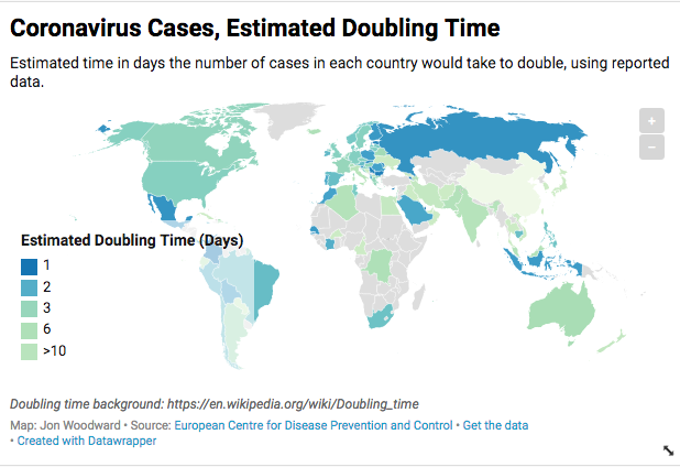
This is the another estimated doubling time chart, but for the world. Note that many countries are seeing a doubling time of 2-3 days, including Canada. Some countries have made a difference: Japan is 8, Taiwan at 13, South Korea is at 54. datawrapper.dwcdn.net/UYWtq/1/