,
17 tweets,
6 min read
Read on Twitter
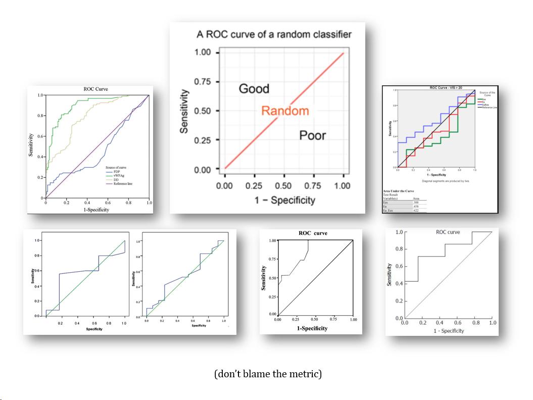
The area under the ROC curve (AUC) is so frequently criticized and misunderstood that I often wonder whether I am the metric’s only fan. Let me explain why how I see and value the AUC.
(thread)
(thread)
When we make a risk model/score and calculate predicted risks for all people in the study, we can plot distributions of risks for people who will develop the disease and those who will not (let’s call them patients and nonpatients): scores on x-axis, frequency on y-axis.
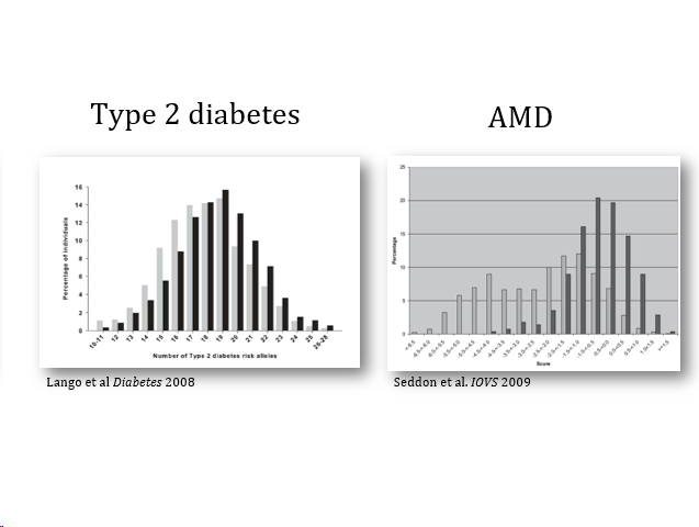
We want these risk distributions to be separated so that, when we use the risk model to select high-risk individuals for treatment, we are more likely to select people who will benefit from it

More separation between the distributions means that patients tend to have higher risks than nonpatients, or … that a random patient has a higher risk than a random nonpatient. This pair must sound familiar.
AUC is a metric for the degree of separation between these two risk distributions. Nothing more and nothing less.

When distributions largely overlap, AUC is close to 0.5, when they are largely separated AUC approaches 1. More separation between the risk distributions means a larger area under the ROC curve. Why does that make sense?

Here’s how to get from risk distributions to ROC curves in 3 steps. 1. We can transform both risk distributions into cumulative risk distributions (A-->B), where, at each predicted risk, p is the proportion of people with a predicted risk *lower than* that predicted risk.
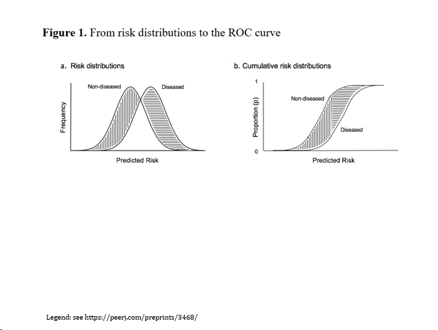
2. Instead of predicted risk on the x-axis we can also present the cumulative proportion of nonpatients at each predicted risk (B-->C). Note that the diagonal line is the cumulative proportion of nonpatients---a straight line because the same proportion is also the x-axis.

3. If we flip both axis (C-->D), we get the ROC plot. The diagonal line, often referred as the reference line, is still (based on) the cumulative proportion in nonpatients (for more detailed explanation see legend)
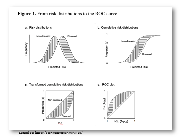
So: the ROC plot is just an alternative way to present risk distributions and AUC is just a metric how much the distributions are separated.
Seeing the ROC and AUC from this perspective shines a different light on some of the criticism.
Seeing the ROC and AUC from this perspective shines a different light on some of the criticism.
It is argued that AUC is only for binary risk categories (one threshold). This sounds true if predicted risks are considered as potential thresholds, but the risk distributions are what they are irrespective of the number of risk categories.

It is said that AUC does not change even when predicted risks change, which is true. This particularly happens when baseline AUC is high. AUC is a rank test for discriminating between groups. Use other metrics (like IDI) if interest is in improving individual risks.

Individuals may move between risk categories when AUC hardly changes. True. This particularly happens for risk thresholds in the center of the risk distribution, where minor changes in predicted risks can move many people to the neighboring category, yet in both directions.

It occurs to me that researchers often criticize AUC when the metric fails to deliver. If you don’t trust AUC, don’t use it. Use a metric which results you are willing to accept (and show risk distributions before and after adding variables to the risk model---we know).
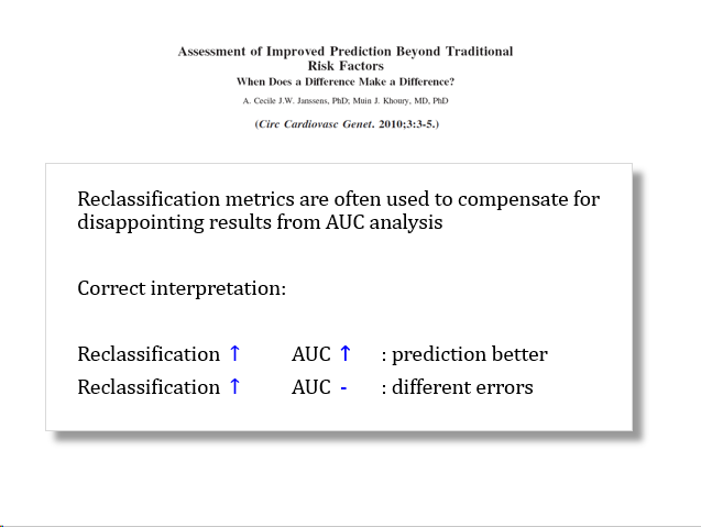
Finally, and most importantly: AUC is *not* a measure of utility. What value of AUC is high enough depends entirely on what the risk model will be used for. For some applications 0.65 will be high enough, for others 0.90 might be too low.

So, my rule of thumb:
AUC is close to 0.5 -> ROC curve close to diagonal -> risk distributions overlap.
Adding variables does not change AUC -> ROC curves overlap -> risk distributions stay the same.
There are some exceptions when I would not rely on AUC, but these are rare
AUC is close to 0.5 -> ROC curve close to diagonal -> risk distributions overlap.
Adding variables does not change AUC -> ROC curves overlap -> risk distributions stay the same.
There are some exceptions when I would not rely on AUC, but these are rare
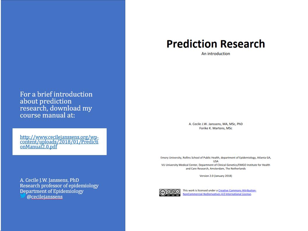
More on this can be found course manual on prediction research, including many references to key methodological papers (update is on its way).
The slides of this thread can be downloaded here: cecilejanssens.org/slides-from-tw… (later today)
The slides of this thread can be downloaded here: cecilejanssens.org/slides-from-tw… (later today)