, 28 tweets, 15 min read Read on Twitter
So I'm seeing a lot of #MarioMaker2 fans asking for advice on #LevelDesign and I thought I could help! Here's a thread on level design tips in Mario Maker, from a guy who wrote a book on level design.

Keep in mind that some of these tips work in both 2D and 3D!
1. Give your level a "core mechanic" - Don't just make your level about any and every mechanic, but select a central one to be your level's gameplay theme.
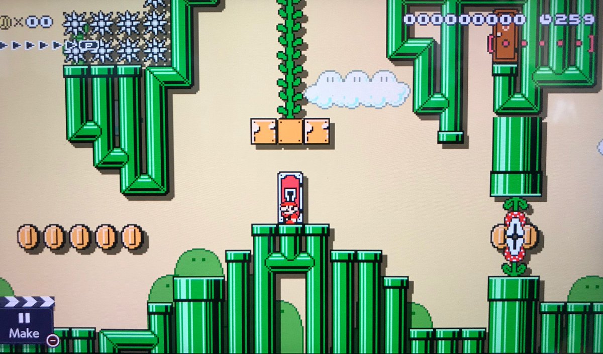
In this level, I wanted to make a level about the jump-through rainbow blocks. I tried to think of other kinds of gameplay worked well with them. I ended up with a level that had vertical exploration and auto-scroll. Start with a core and add new ideas that support or improve it.
2. Build in "scenes" (term adapted from Anna Anthropy and Naomi Clark's great book, Game Design Vocabulary.)

Scenes (as I use them) are easily-understood chunks of gameplay that players see in their immediate present. Think of them as "what the player sees on the screen now."
The grid in Make mode supports this: thick lines on the grid are screen edges. This helps you identify what will be in the player's vision. Give each screen a clear beginning, middle, and end. Avoid "leaps of faith" and "gotcha" things that kill from off-camera.
3. Break rules 1 and 2
Sometimes it can be fun to add an ambiguous path forward or a hidden surprise (hiding a clear "end" to a scene.) Maybe this path leads to a place where you have a core mechanic different from the rest of the level. Design that "other core" area as its own scene. Discovery is fun!
4. Good levels teach players how to play the level.

A great method for this comes from Super Mario 3D Land director Koichi Hayashida, as described in his interview with @gamasutra: gamasutra.com/view/news/1684…
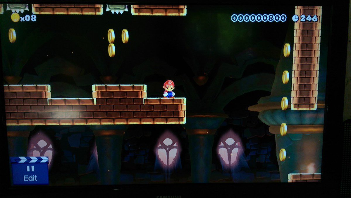
The concept is called "kishoutenketsu" and it describes a 4-step way to introduce ideas: 1) Safe introduction; 2) Develop the idea; 3) Twist the idea; 4) Final Exam. In this level from Mario Maker 1, I did this with wall-jumping.
First the mechanic is introduced in a place where the player can practice without dying. Then, the player has to move forward via wall-jumps with increasing stakes. Third, they have to use wall slides to reach different areas - platforms and new areas. Finally, combine everything
5. Think in metrics.

Metrics are Mario (or any game character's) movement capabilities. Not only WHAT they do (running, jumping, sword swinging, hiding in cardboard boxes, etc.), but how big the movement is or how far it takes the character. This is usually measured in "units"
Units in Mario Maker are represented in 1 block measurements on the grid. When you work with Mario's capabilities, you can tweak how easy or hard it is to navigate jumps and obstacles. Easy things are well within his capabilities, while difficult things are at the edges of them.
If you plan around metrics and add bonus mechanisms that enhance them (coins, enemies to bounce on, goals, etc.) you can "juice" the actions and make them "feel" good. Player actions then become more "epic" (this is a small portion of what pros call "game feel" or "juice.")
6. Think about the pacing and amount of rewards in your levels.

It's not good to just throw challenge after challenge at players. Break up long stretches of challenge with restful moments and rewards like items or coins.
@MegaMan 1 and 2 director Akira Kitamura did this in his games. He would add a wave or scene of low challenge after 3 or 4 scenes of high challenge. This made players feel empowered. I try to do the same.
Read more here (links to the original interview): gamasutra.com/view/news/2656…
Rewards (items , coins, and lives) also just make players feel awesome and can be like patting the player on the back. Plus, in this game in particular I like to be generous for players who get my levels in the Endless Challenge mode: I challenge them but let them stock up.
7. Make players curious

Use the 2D camera to its full advantage and show players what lies beyond the room or area they're occupying. Lead the players from one screen to another. Entice the player to explore your world!
These screenshots are from the main "golden paths" of some of my levels. Showing players things that lie beyond via enemies, passages, doorways, or big rewards makes players want to diverge and explore.
8. Use items to assist and create tension

Okay this has 2 parts: items are great for leading the player where you want them to go or communicate things to the player, but they're also great for creating dilemmas.
So, first: items are great as indicators of what to do in certain situation. You can't be next to the player telling them where the next place to go is.

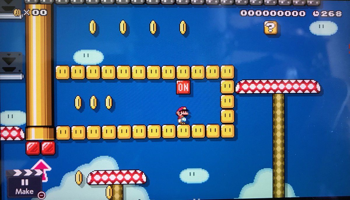
In this screenshot, the player doesn't see the goal until very late but needs the hill to jump to it, so I added hint coins
BUT you can also use items to distract the player from their path or take extra risks. Players will take the safest path through obstacles unless you can tempt them otherwise. In these shots, the player is led to take risks and waste time in auto-scroll areas or around enemies.
9. Playtest Playtest Playtest

Your primary goal as a level designer is to make a good experience for the player and to do that you need to test with players! Levels by designers who don't playtest are usually too hard, feature areas where players get stuck, or can be broken
Time to call myself out: Here you have the 2 courses I've made so far in #MarioMaker2 - 1 has over 3 times the likes of the other. Why?

I was designing to my own skill instead of the player's. Most players die in this early stretch and never see any of the level's cooler areas
10. Not everything you make has to be perfect.

You learn more from mistakes than you do from successes. It's okay to post a bad level: it's better for work to be "out there" where others can find you than to be a secret with no audience. Post things. Get design EXP. Improve.
There's not really a great screenshot for this point, so here's Bob Ross
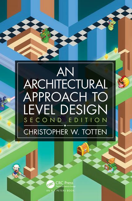
So hey - no Soundcloud here, but there are level design tips like these AND MORE in my book, An Architectural Approach to Level Design. Get it here: amazon.com/Architectural-…

Also, please buy my latest game, La Mancha, an award-winning storytelling game! lamancha.backerkit.com/hosted_preorde…
I said this at the beginning of the thread but these tips can be used in almost any type of game - 2D, 3D, non-digital etc.

I even used #LevelDesign principles in the pacing of the Journey Deck in La Mancha: testing the probability ("pacing") of getting difficult or easy cards
Wow lots of people asking about my levels, follow me at XJT-FY9-KRF to check them out!
Missing some Tweet in this thread?
You can try to force a refresh.

Like this thread? Get email updates or save it to PDF!

Subscribe to Chris Totten 🛏✨🌝
Profile picture

Get real-time email alerts when new unrolls are available from this author!

This content may be removed anytime!

Twitter may remove this content at anytime, convert it as a PDF, save and print for later use!

Try unrolling a thread yourself!

how to unroll video

1) Follow Thread Reader App on Twitter so you can easily mention us!

2) Go to a Twitter thread (series of Tweets by the same owner) and mention us with a keyword "unroll" @threadreaderapp unroll

You can practice here first or read more on our help page!

Follow Us on Twitter!

Did Thread Reader help you today?

Support us! We are indie developers!


This site is made by just three indie developers on a laptop doing marketing, support and development! Read more about the story.

Become a Premium Member ($3.00/month or $30.00/year) and get exclusive features!

Become Premium

Too expensive? Make a small donation by buying us coffee ($5) or help with server cost ($10)

Donate via Paypal Become our Patreon

Thank you for your support!