, 17 tweets, 4 min read Read on Twitter
Alright! Back after the morning tea break and we're going into:

Designing for people in crisis.

With @jr_briarbird & Lan Huang

Content warning based on the title.

#uxaustralia
We'll be covering the redesign of the website for the Victorian Mental Health Tribunal
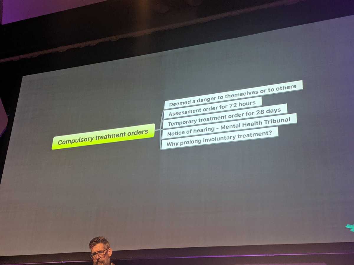
When people are in crisis they can be subjected to a compulsory treatment order:

At the end of the 28 days if your mental health team thinks you need to continue involuntary treatment they must seek an order from the tribunal.
The tribunal wants to move people from an involuntary treatment to a voluntary treatment.

Unfortunately most patients have never heard of the tribunal and the first time they hear about it is under involuntary treatment.

They have a complex relationships they need to navigate
They observe tribunal settings.

The tribunal of 3, the treatment team and the person with their support person.

They observed the hearings but they needed to speak with patients and carers

People who had experienced the tribunal or could experience it.
So how do you go into this incredibly sensitive area and find the right people?

There is a strong network of organisations and the advocacy and carers orgs managed the recruitment.

They created a thorough document outlining everything about the research.
It's important when working with vulnerable groups to have all the information they need before they agree to be interviewed.

Make sure the setting is their choosing, can leave at any time and have support accessible.
They opened the interview with "Tell me about your situation"

A simple open question that allowed the participant to share information at a level they were comfortable with.

Very few probing questions and allowing them to vent.
They found people had little access to information when they were in traumatic spaces

"What the fuck am I going to do with a website"
They had to answer the big question of compulsory treatment before they gave insight into the tribunal process.

There was a complex relationship but they were completely separate things.
People in a traumatic space need simple paired back design as simple as possible so that people weren't overloaded.

The content needed to be condensed from 40 pages to 4.

They used the language their research participants used.
The first experiment was a conversational interface that took the 3 main things the carers cared about and thought about it as a conversation.

The idea was to minimise the amount of content people had to wade through.
It kind of worked, but it was at odds with the information architecture they had created. What was the relationship and the overlapping experiences.

What the experiment allowed was to change the information architecture to reflect the conversational architecture
It was the simplest way to get fast, direct experiences to access the answers they needed about the tribunal.
The work is a team sport. And this is the way they worked through the project.

Once everyone is on board with the research and defined the goals you use it to reflect back at all the design stages to make sure you're still focusses and solving the problem.
They were able to make things better.

It's not the best.

We often only design in a small section of the journey that we are unable to influence. So what can you achieve with the slice that you have control over.
@threadreaderapp unroll please!
#uxa19
Missing some Tweet in this thread?
You can try to force a refresh.

Like this thread? Get email updates or save it to PDF!

Subscribe to Rohan Irvine
Profile picture

Get real-time email alerts when new unrolls are available from this author!

This content may be removed anytime!

Twitter may remove this content at anytime, convert it as a PDF, save and print for later use!

Try unrolling a thread yourself!

how to unroll video

1) Follow Thread Reader App on Twitter so you can easily mention us!

2) Go to a Twitter thread (series of Tweets by the same owner) and mention us with a keyword "unroll" @threadreaderapp unroll

You can practice here first or read more on our help page!

Follow Us on Twitter!

Did Thread Reader help you today?

Support us! We are indie developers!


This site is made by just three indie developers on a laptop doing marketing, support and development! Read more about the story.

Become a Premium Member ($3.00/month or $30.00/year) and get exclusive features!

Become Premium

Too expensive? Make a small donation by buying us coffee ($5) or help with server cost ($10)

Donate via Paypal Become our Patreon

Thank you for your support!