THREAD
Please RT and share
How to read markets / charts for trading
Here I want to talk about how to analyse and interpret financial markets. This is mainly based on the wonderful work by Richard Wyckoff (1873-1934).
Please RT and share
How to read markets / charts for trading
Here I want to talk about how to analyse and interpret financial markets. This is mainly based on the wonderful work by Richard Wyckoff (1873-1934).

I have always been fascinated by financial markets and how they operate. Some years ago I decided to educate myself on this topic, and I found one great method of explanation that captivated me for two reasons:
1) it accurately explained many or all of the things we observe in
1) it accurately explained many or all of the things we observe in
the markets and price movements and
2) it was largely based on how human natural emotions contributed to the markets operating in this way.
Ok, first of all, we will be talking about candlestick charts - a candlestick (or candle) is one way of representing price movements.
2) it was largely based on how human natural emotions contributed to the markets operating in this way.
Ok, first of all, we will be talking about candlestick charts - a candlestick (or candle) is one way of representing price movements.
Let us look at a single candle – green means the price rose (bullish market) and red means the price fell (bearish market).
So a candle captures the 4 key elements of price data in a certain timeframe (eg 1 day, 1 hour, 1 minute) – these elements are:
So a candle captures the 4 key elements of price data in a certain timeframe (eg 1 day, 1 hour, 1 minute) – these elements are:

- opening price
- highest price
- lowest price
- closing price. (these four data points are referred to as OHLC)
Let’s compare how a candlestick charts looks compared to a regular bar chart:
- highest price
- lowest price
- closing price. (these four data points are referred to as OHLC)
Let’s compare how a candlestick charts looks compared to a regular bar chart:

We can see that a line chart just represents a single price for each time point, but the candlestick chart has a single candle for each time point, which delivers a lot more data.
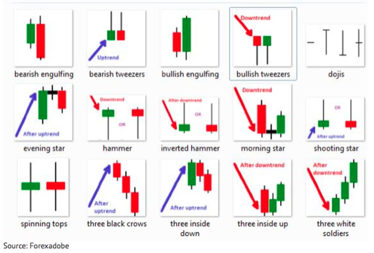
Now, when trading using these charts, many traders like to use patterns that they see in the types
Now, when trading using these charts, many traders like to use patterns that they see in the types
of candles in the chart, and use them to draw conclusions on whether they should trade (buy or sell). Each pattern has its own name.
In my view, this is too simplistic and plain wrong.
In my view, this is too simplistic and plain wrong.
The way to look at candles is to acknowledge that they present data, and then we have to assess that data.
That assessment can only be made once you understand the general position of that market at that time – does it show signs of strength, weakness, or neither?
That assessment can only be made once you understand the general position of that market at that time – does it show signs of strength, weakness, or neither?
As an example, let us look at this type of candle:

On it’s own, this means very little, but when we see it as in the image below, then it MIGHT mean something:
We can see in this case the hammer candle was a good sign that the market is going to rise.
Of course, there must be other conditions to be met for this to be a
We can see in this case the hammer candle was a good sign that the market is going to rise.
Of course, there must be other conditions to be met for this to be a

reliable sign – on it’s own, this candle is not meaningful.
For example, here is a hammer candle that did not result in any price rise:
For example, here is a hammer candle that did not result in any price rise:

For a hammer candle to be meaningful, we need the market to be showing several signs of strength at that time – then, if we see a hammer candle at the right time, this MAY be an indication that prices will rise. But why is this the case?
A hammer can represent the situation whereby sellers tried to make the price fall, but they failed and were overwhelmed by buyers. The buyers are stronger than the sellers at this time.
However, even this conclusion can be false. One of the key bits of information to tell an important hammer from a pointless hammer is to look at the volume of trades at that time.
If the volume is well above average,
If the volume is well above average,
then it means that there was a strong effort by sellers to reduce the price, and that there was an even stronger response by buyers to overcome this selling. This shows that, at least in this candle, buyers appear to be in control.
This can be a meaningful candle
This can be a meaningful candle

If the volume is low, however, then it is not easy to draw any conclusions from this. It means that the price did begin to fall, but there was no support at all from other sellers, so there was no sustained price fall. However, it does not mean that buyers overwhelmed sellers.
It just means that there is no strong buying or selling sentiment in the market at that time. The price is equally like to rise, fall or go sideways after this – there simply is not enough information.

What are the other signs, apart from, high volume?
Well, if this apparent rejection of lower price takes place at a level that showed previous rejection, then this adds more relevance to this candle. This means that this candle occurred at a known level of support:
Well, if this apparent rejection of lower price takes place at a level that showed previous rejection, then this adds more relevance to this candle. This means that this candle occurred at a known level of support:

Not only is this candle showing the potential presence of strong buyers, it is occurring at a price level that had already shown the presence of strong buyers. This gives us some more comfort that this new candle might be more meaningful.
However, depending on your risk appetite, you should be looking for more signs of confirmation.
For example, if this price level is one that was NOT supported the last time price came to this level, then this should make you hesitate buying at this price.
For example, if this price level is one that was NOT supported the last time price came to this level, then this should make you hesitate buying at this price.
Essentially we want the market to show multiple signs of strength before we commit to a trade here.
I realise I have just been explaining quite basic stuff, and have not started any analysis! I will end this thread now and may come back to it later if there is interest.
/THREAD
I realise I have just been explaining quite basic stuff, and have not started any analysis! I will end this thread now and may come back to it later if there is interest.
/THREAD