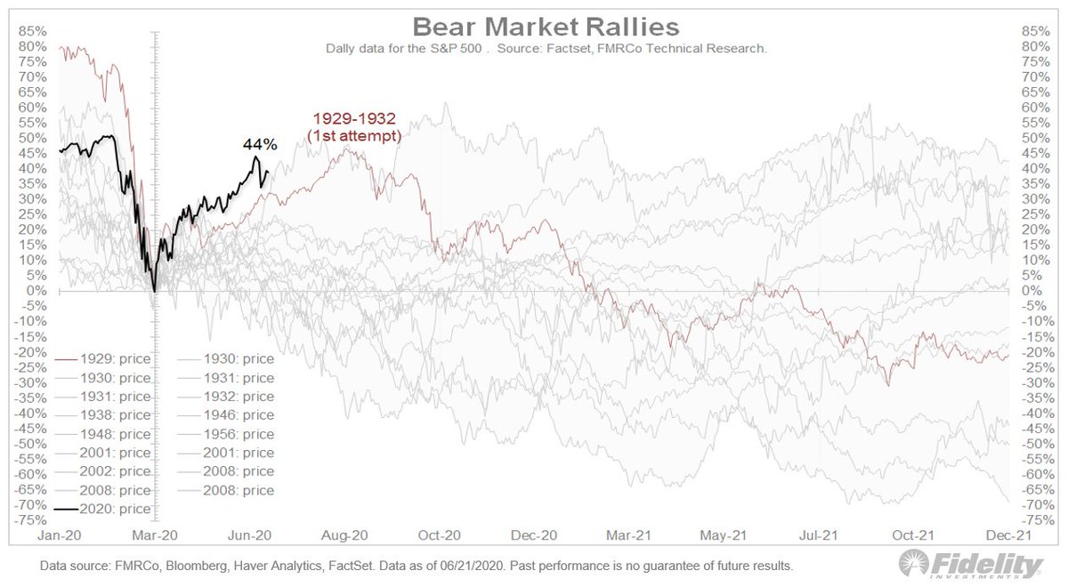
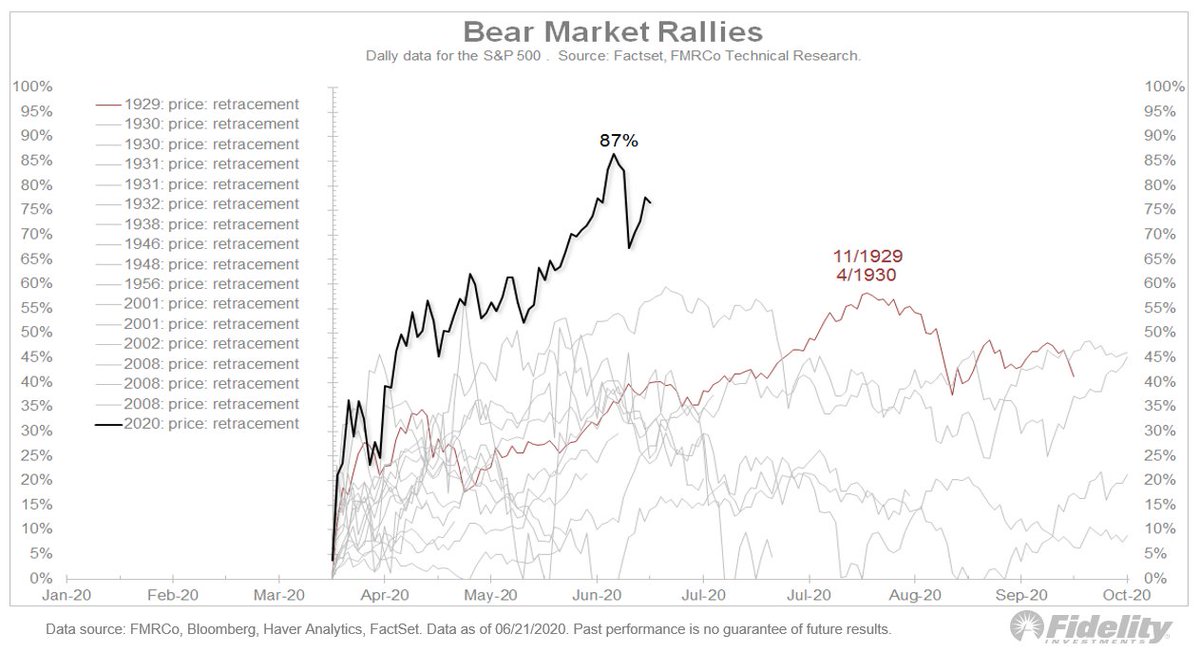
One noteworthy aspect of the #COVID19 market has been the success with which the #Fed & other #centralbanks have been able to stem the “Covid Crash” and then help control the recovery. The current backdrop reminds me a bit of the 1942-1946 #QE cycle. Let’s take a look. (THREAD)
1/ After the Great Depression, the government went into high gear during WWII and, in the process, ran up huge government debt. Federal debt as a percent of #GDP jumped to 116% from 39% during the 1st half of the 1940s.
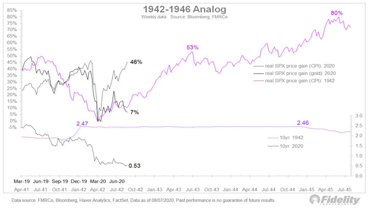
2/ Not only did the Fed monetize the debt by increasing its balance sheet 10-fold, it repressed the entire #yieldcurve by capping short rates at 3/8% & long rates at about 2.5%. #Inflation ran up but, with the #Fed repressing rates at low levels, real rates went negative.
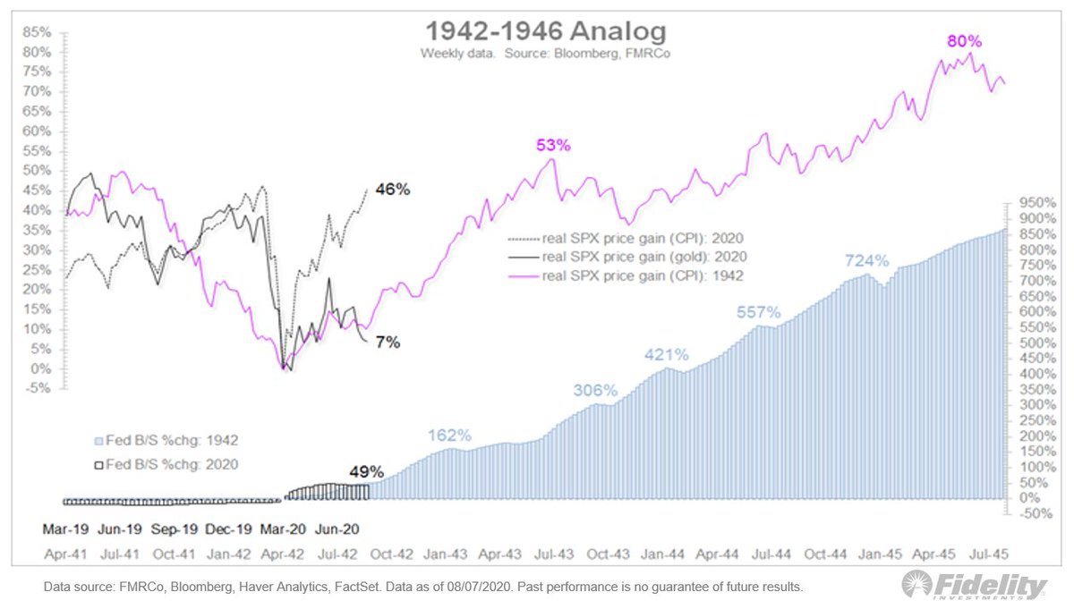
3/ One way to measure how equities fare in a reflationary “money illusion” is to price the market in #gold terms. In the 1940s, the “adjusted” gold standard meant gold was fixed at $35 so for this exercise I’m deflating the 1940s market by the CPI.

5/ The bottom panel shows real rates. For the current cycle I’m measuring this as the 10yr TIPS real yield & for the 1940s, I’m measuring it as the nominal yield minus the 5yr #inflation rate. Not apples to apples, of course, but helpful to show what #investors expect right now.
6/ I use the 5-year #inflation rate to smooth out the extreme war-related volatility in the 1940s. As you can see in that chart, not only is the reflation-adjusted price behaving the same, so are real rates.
7/ Now, the Fed’s balance sheet. Here, the % growth from the 1942 low. Negative real rates + massive balance sheet expansion is the ultimate reflation & that’s what the #Fed did in the 1940s—increasing its balance sheet 10-fold—to offset the increase in Federal debt. 

9/ And here, long Treasury yields. Same thing. The 10-year flatlined near 2.5% for years despite a massive #debt run up and (at times) runaway #inflation. An impressive episode of financial repression.
10/ A big difference between then & now: The #yieldcurve was steeper then at about 220 bps. Now it’s just 44 bps. Wonder if the #Fed thinks it has created too much of a good thing on the rate front?
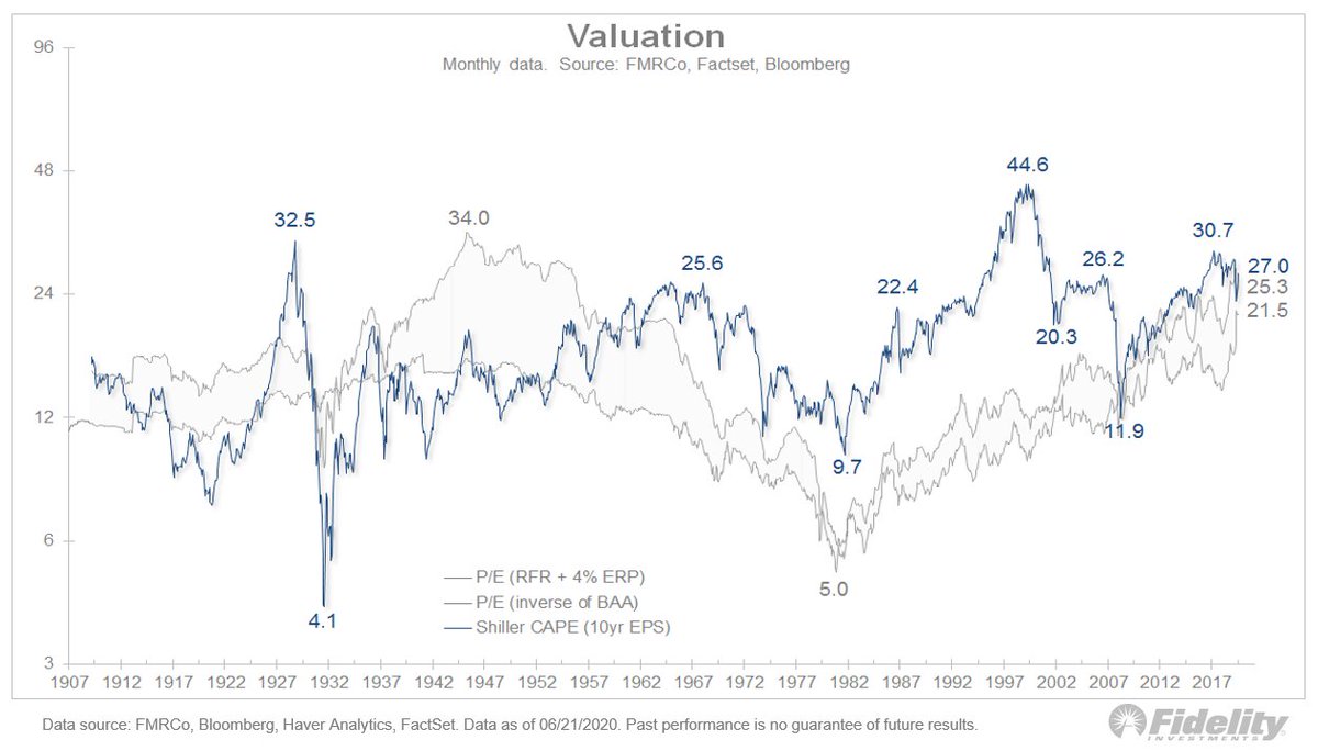
11/ While charts I’ve shared suggest the #Fed is creating successful reflation, which could continue to drive #stocks higher, another caveat is #valuation. This chart shows the market was orders of magnitude cheaper back then, as one would expect following the Great Depression.

12/ Today the equity risk premium (ERP) is at 3.7% after peaking at 6.2% in late March. Back in 1942 the ERP stood at 11.1% when the market bottomed in 1942. That equates to a trailing P/E ratio of 7.4x (vs 23.7x today).
13/ From the 1942 low, the ERP improved rapidly to 7.7% by the time the analog overlays to today. Ultimately it fell to 4.5% in 1944, which is in line with historical averages.
14/ This stark difference in the valuation backdrop is certainly a caveat to the otherwise bullish implications of the #SPX price analog. From 1942 to 1945 the real SPX price index gained 80%, coming off a 7.4x P/E at the low. We don’t have that low starting point luxury today.
15/ Market breadth then & now. The weekly percentage of stocks above/below their 52-week highs/lows is tracking closely but the ’42 low had the typical technical setup of a lower price low & a higher breadth low, which didn’t happen this time.

16/ The chart below is a close-up that shows the daily percentage of stocks above/below their 50-day moving average.

17/ These charts show an interesting analog for today’s dynamic of rapid debt accumulation and the Fed’s mitigation through #QE and forward guidance (financial repression).
18/ One thing to keep in mind: the “price” for rising debt can be higher taxes, at least it was prior to the 1980s. Note, in this chart, how tax rates skyrocketed during WWI, the Great Depression & then WWII. The run-up in debt appears to have led to big increases in tax rates.

19/ As for the high tax rates in that chart, an important thing to keep in mind is that the top marginal tax rates during the 1930s & 1940s applied to only high-income households. In the 1930’s the 80% tax rate applied to income over $5MM. That would be $77MM in today’s dollars.
20/ Still, it’s worth noting that in 1942, when the US started ramping up for the war, the top marginal tax rate was raised to 94% from 88% while the income threshold was lowered to $200k from $5 million! That’s wartime fiscal policy for you.
21/ Final caveat to bullish implications from the 1940s analog: Back then, debt/GDP skyrocketed but off very low levels (39% to 116%), whereas today it is rising from already very high levels. Plus, the proceeds were being used much differently then (production).
22/ This suggests that we could get less bang for the buck this time around.
23/ There are many differences between today & the 1940s, but there is a precedent for a sharp increase in debt to get successfully absorbed through reflation & repression. You can see this in the falling dollar, rising gold, & a widening gap between nominal yields & TIPS. (END)