After a successful weekend with Biomass again, I figured I'd share a bit about its inception 🧵⬇️
HOW I MADE THIS: Visualizing the Biomass of Life #biomass #wip #process #art #science #datavisualization #dataviz #infographic #biodiversity
HOW I MADE THIS: Visualizing the Biomass of Life #biomass #wip #process #art #science #datavisualization #dataviz #infographic #biodiversity

The original paper that this graphic is based on was published by @yinonbaron @MiloLabWIS @WeizmannScience. It came across my desk working at Visual Capitalist and the crew wanted to see what I could do with it. pnas.org/doi/10.1073/pn…
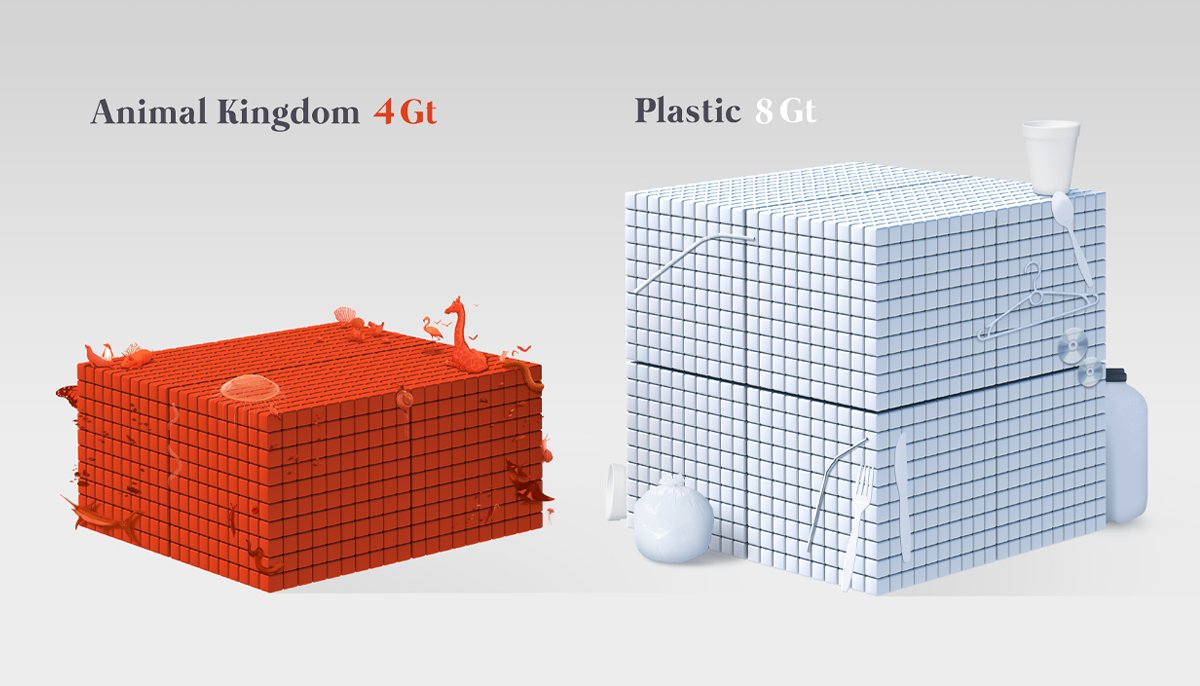
There was already a graphic explaining the key findings in the paper, shown here. It's a really nice Treemap visualization using a #voronoi pattern (random Fun Fact: voronois are everywhere in biology: bone matrices, cell shapes, wing scales, etc.)

My approach to science illustration/data viz is made up of multiple parts: 1⃣ 🗣️What is the key message and how can we best say it? 2⃣ 🖼️Where can visuals supplement learning? 3⃣📢 What other sources rival (or compete) with that message? and 4⃣ How can we make it look pretty?✨
(I want to be clear that there is nothing inherently wrong or disadvantageous with how the paper chose to show its data: it's pretty straightforward. My gut feeling was that this is an amazing story that needed an editorial facelift, especially for a general audience 🎨🎉)
For this project, ruminating 3⃣ had the biggest impact. Before any project, I always investigate what's already out there: Has this been visualized before? Has it been done in a better way? Which ones work best? Is there room to improve on it? Are any audiences left out?
Since this topic is from 2018, there were already a few news sources that visualized these data in different ways. You can see their examples below (credit in order: reddit [u/soSpursy7], @sciam, @TheEconomist and @Britannica)


There are also some gorgeous illustrated versions here! (credit left: @PressReader right: a paper by @UNEP Ricardo O Barra and Eduardo Brondízio)


You might be able to see some of the influence I've taken from some of these versions to get to mine. The one that was most impactful to me was seeing @JZarracina's beautiful contribution to Vox's article, shown here: vox.com/science-and-he…


I investigate the best and clearest way to get a message across and sometimes others find it. Since I was targeting general audiences who may not appreciate biomass, I knew that showing weight with blocks was an immediate concept, no need for reinvention ✅ Thx @JZarracina 👊🏻
With all this inspiration, I had to consider my approach 🤔 The big questions I had: What could make this attractive❓ What will people respond to❓ What is familiar❓ In what ways can I build a bridge so that any person could understand this topic❓ #HumanCentricDesign
You might've noticed that other visuals of this story began describing the major kingdoms of life before drilling down into the animal kingdom to describe where humans lay. I purposely flipped this 🔃💡Start with the reader: where would they see themselves? #HumanCentricDesign
We humans are animals!! (🙀) So, I built my visual narrative in this way: 1⃣Here's where humans are 2⃣Here's how you relate to many creatures you are already familiar with, and 3⃣Here's how you compare with everything else.
This is also where I thought I could help push it further by injecting some "narrative load", adding elements of the story into the data viz for immediate comprehension. In this case: animals! 🦀🐌🦎🐓🦇 This way, the topic could be immediately familiar + the star of the piece.
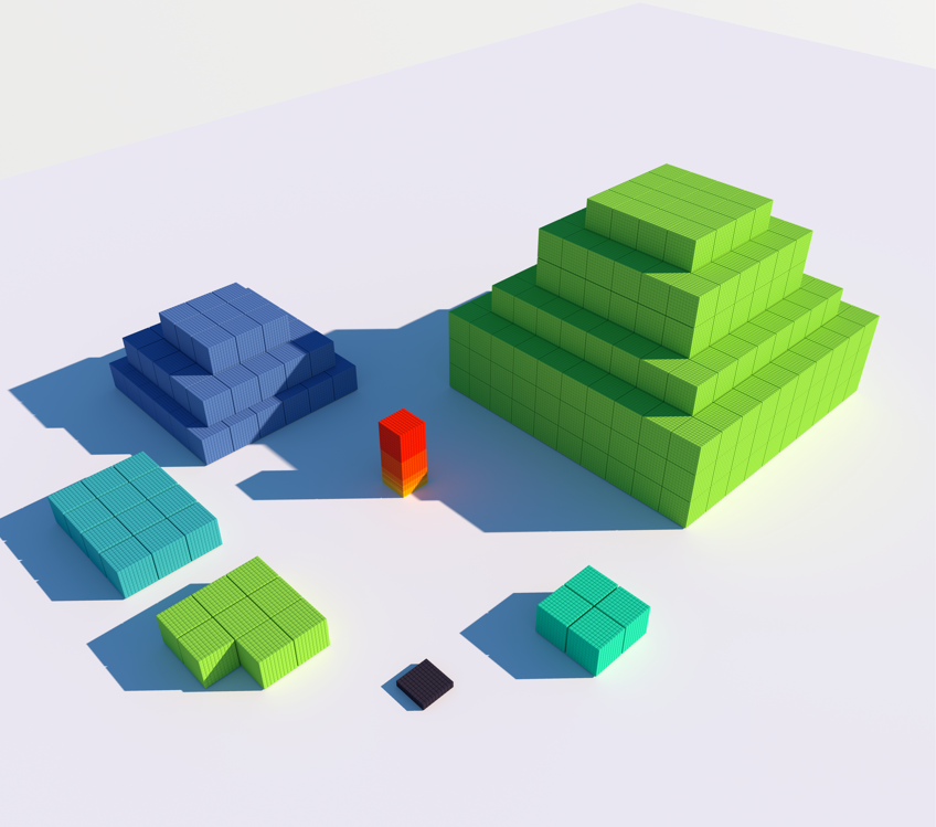
After that, moving forward became a matter of figuring out placement/layout. I *really* dislike "scrollytelling" (long, vertical infographics) and knew that data blocks would need a different layout if they should fit in one view. That's where sugar cubes came in 🫙🧊

(Working with multiple arrangements and configurations in 3D software was too laggy/demanding for my CPU, so I figured maximizing problem-solving in real time would be best with these guys 🧊) #AlwaysProblemSolving #TheSweetLife
I built the data blocks in #Cinema4D. Here are some behind-the-scenes sneak-peeks 🕵🏻♂️👁️👨🏻🎨


The animals are all digitally hand drawn in Photoshop ✍️🏻While it was a lot of work (~2 weeks), I had a lot of fun doing it. I used some 3D models from #Sketchfab as references, since you can turn the models around within a browser to get the lighting + angles you need.


Here's the final illustrative block of animals ⬇️🐦🐞🪱🦐🦀🦩🦑🐖
I like breaking expectations: green for biomass was too obvious. Red felt like an antithetical idea (though now I think of 🥩... it worked out, since Plants needed to be green!)
I like breaking expectations: green for biomass was too obvious. Red felt like an antithetical idea (though now I think of 🥩... it worked out, since Plants needed to be green!)

Also, the positioning and perspective was purposely done, to give it a sense of scale and imposition. I wanted it to look 'heroic', so it was important that it towered to the reader at first but also tapered at the bottom for easier legibility. It's a neat effect!✨
After that, some general editing, color grading, and last-minute polish to get the final presentation in order and the final infographic was done! You can read the full story and see the full infographic at Visual Capitalist: visualcapitalist.com/all-the-biomas…
Thank you all for the support and kind words about this piece. I truly did not expect the kind of response it's gotten -and it's bred so much pressure trying to deliver at this level consistently 😅 For those interested in prints, you can pick one up here store.visualcapitalist.com/product/all-th…
Last note: Do you like this topic? Got some data on the distribution of plants or microbes or other critters similar to this study? I'd be happy to take a look and see what we can make of it! DM me! 💌📥 #DataDigging
• • •
Missing some Tweet in this thread? You can try to
force a refresh