
Telling science stories with the power of visuals✨ Graphics Editor @QuantaMagazine prev: @visualcap @rednucleusHQ Founder @artscistudios | 🇨🇦🇭🇷🇪🇺
 First - I love the stippling illustrations. This is a nice technique that offers good contrast between structures.
 The original paper that this graphic is based on was published by @yinonbaron @MiloLabWIS @WeizmannScience. It came across my desk working at Visual Capitalist and the crew wanted to see what I could do with it. pnas.org/doi/10.1073/pn…


 My name's Mark and I am super passionate about telling science stories with the power of visual media🎨 I love illustration, I learn best with visuals, and I am constantly looking for (er, doodling?) ways to make pictures say MORE than just "a thousand words” 😉


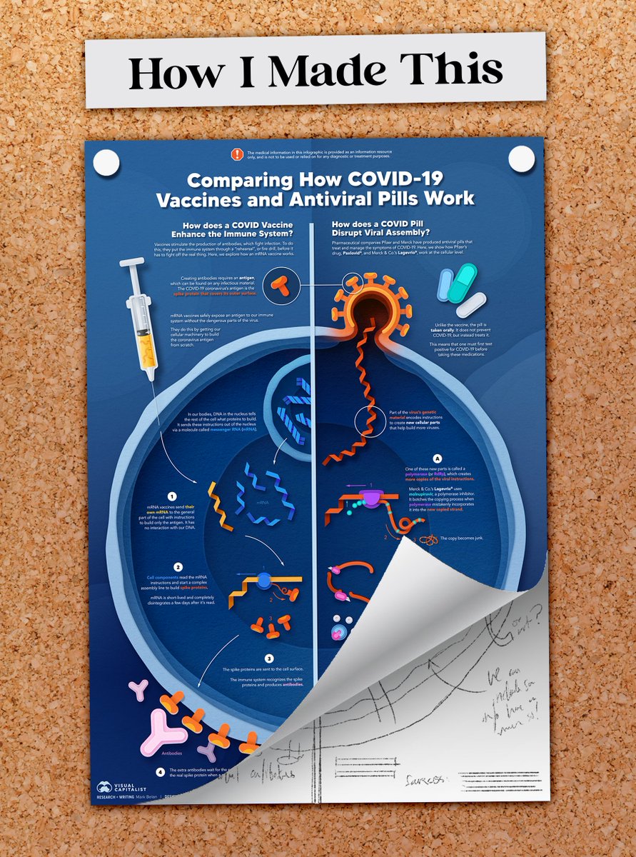 The original inspiration for this piece was the newly marketed antiviral pills by Pfizer and Merck for the treatment of COVID-19. I thought with hearing so much about vaccines this year, and with pills entering the arena, people might be curious about what each does in the body.
 Since 1900, we've been making a LOT of stuff...and it's been piling up. In 2020, the material output of humans on Earth SURPASSED the total (dry) weight of all living things on Earth!

 This one is a fun topic for me - I've always been fascinated with society's disdain for Pluto's downgrade, but the complete lack of interest for the other members of Pluto's family!!