Here are a few tips on improving your next PowerPoint presentation [THREAD]
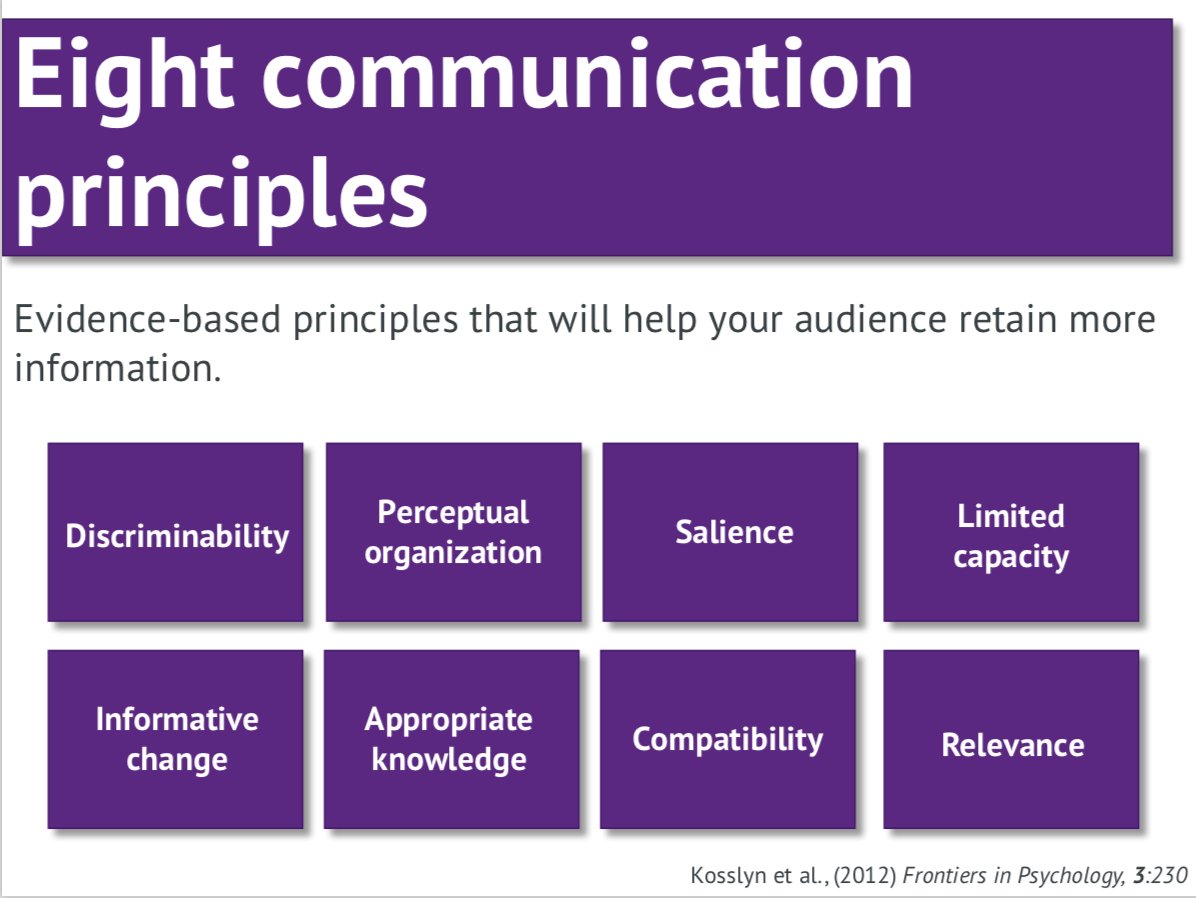
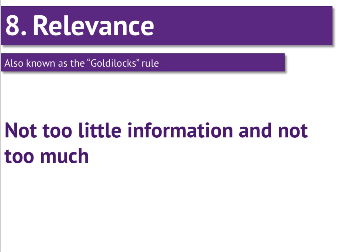
Following these eight principles can help your audience retain more information. These principles are outlined in this excellent paper frontiersin.org/articles/10.33…
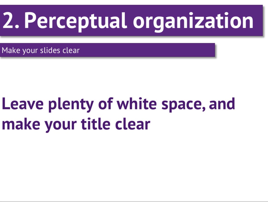
Use clear and large typefaces that can be distinguished from the
background.
Seems like a no-brainer, but people make this mistake ALL THE TIME

Don't let your message get lost in a busy slide
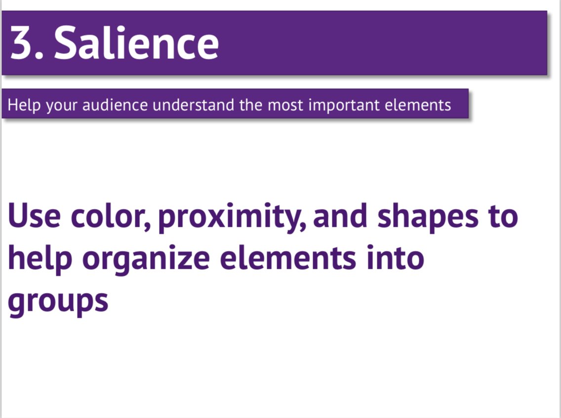
Guide the audience to the most important elements of your talk - what are the main ideas you want them to walk away with?
Read each slides out loud. If it takes you longer than 30 seconds, there's too much text and your audience will probably switch off.
Don’t mix up your fonts or colours, *unless* you want to indicate change
It’s better to *slightly* underestimate your audiences’ familiarity with your topic.
TIP: Do a google image search for inspiration (e.g., line chart)
Reverse engineer the audience’s goals, and your goals. Consider what the audience wants from your talk, and what do you want from the audience, then prepare your presentation accordingly
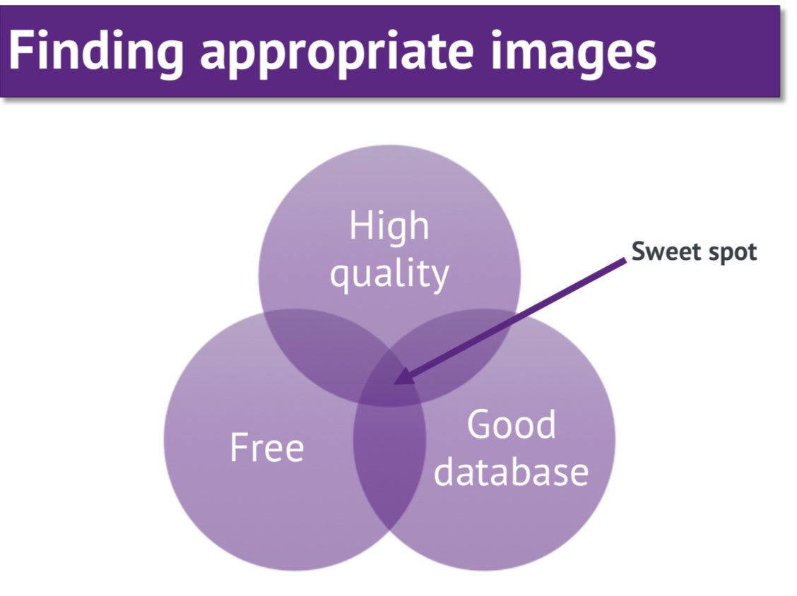
When it comes to finding great images for your presentation, you'll need high quality images, from a good database, that are also happen to be free.
Unsplash.com fits the bill, with FREE high-quality images, and a good search function
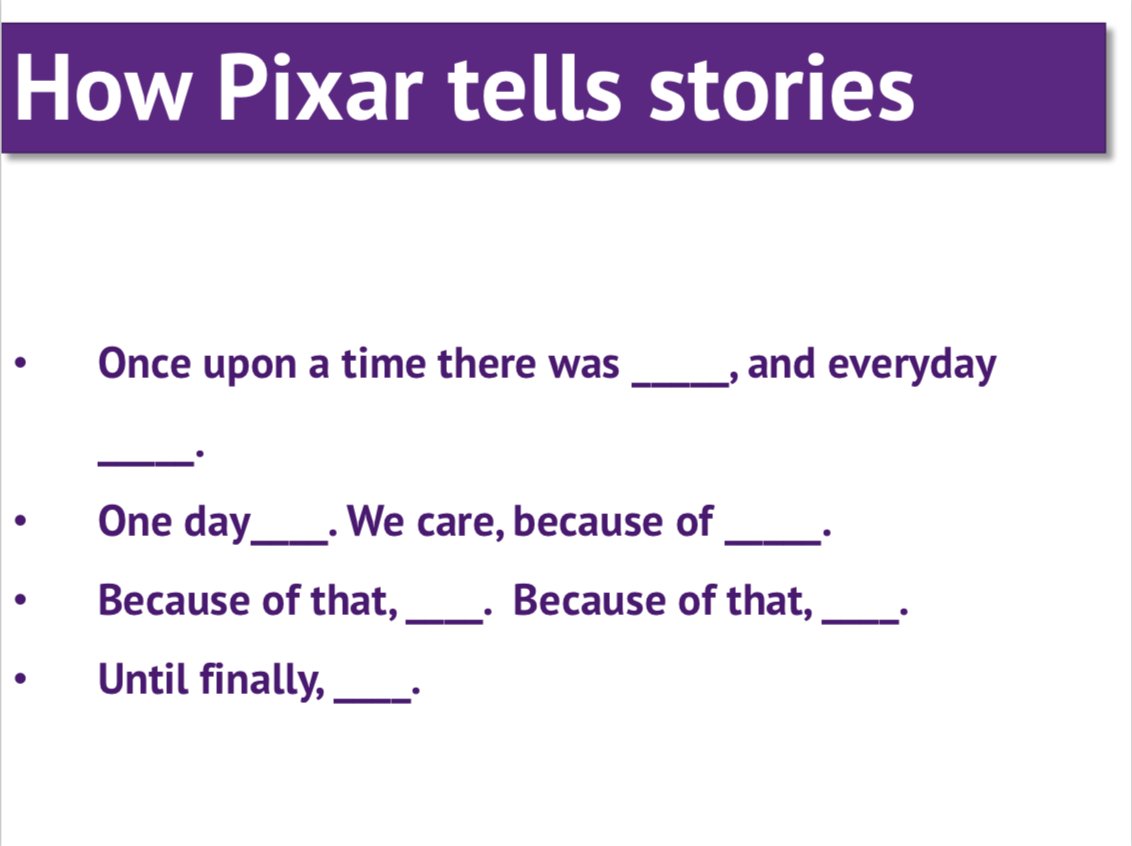
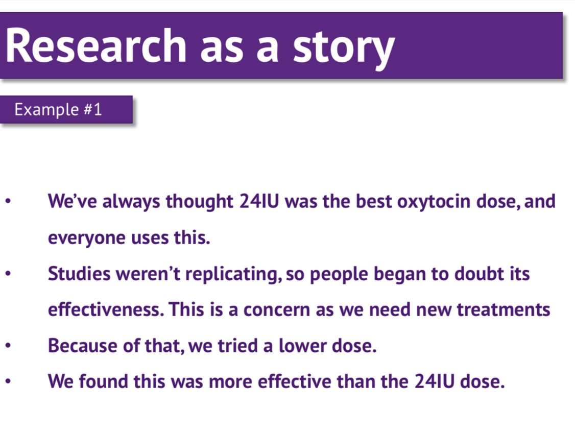
You know who tells good stories?
Pixar. They tell great stories

- Use a 4:3 slide size
- Avoid complex transitions/animations
- Make your Powerpoint in PowerPoint (don't convert from Keynote)
@OSFramework is a great option, that's where I posted the slides for the presentation this thread was based off osf.io/y8xfa/ (PDF and .PPTX).
You can also post a screencast on @YouTube, like I did here
