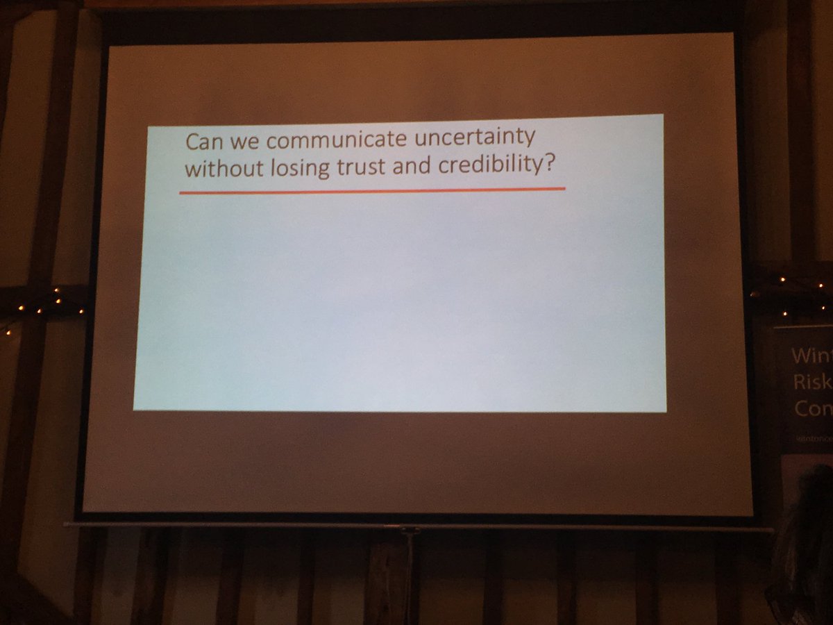
It can be difficult agree. It’s more difficult when you don’t know of tools that can help make this easier.
So here is one. With screen shots.
THREAD
/1
So here is one. With screen shots.
THREAD
/1
@d_spiegel has created what is IMO a great site for risk communication. Here it is:
understandinguncertainty.org
On the site he has things called ‘animations’ which are flash (being updated I believe) tools. One of these is ‘Spin the Risk’.
/2
understandinguncertainty.org
On the site he has things called ‘animations’ which are flash (being updated I believe) tools. One of these is ‘Spin the Risk’.
/2
@d_spiegel This tool allows the user to look at different ways of expressing risk using visuals and text.
It covers absolute (natural frequencies) & relative risk (%) & number needed to treat (NNT). It also covers ‘chance’ (individual risk), population and ‘future possibilities’ of risk.
/3
It covers absolute (natural frequencies) & relative risk (%) & number needed to treat (NNT). It also covers ‘chance’ (individual risk), population and ‘future possibilities’ of risk.
/3
@d_spiegel Finally, you can frame the risk either positively or negatively.
Let’s take a look. Here’s the first screen you see when you open up.

Across the top you have the types of animation/data vis available.
On the side you will see all the options I described above.
Let’s take a look. Here’s the first screen you see when you open up.

Across the top you have the types of animation/data vis available.
On the side you will see all the options I described above.
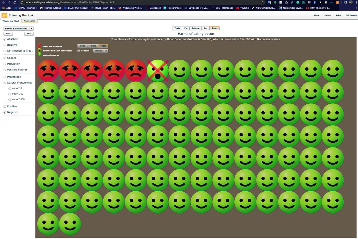
@d_spiegel The data you are seeing are based on pre-entered data around the risk of colon cancer associated with eating bacon. Very apt given the recent nutrition headlines.
There is also pre-loaded data for 10yr risk of a heart attack with statins.
/4
There is also pre-loaded data for 10yr risk of a heart attack with statins.
/4
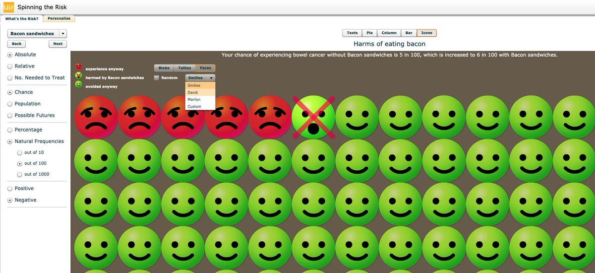
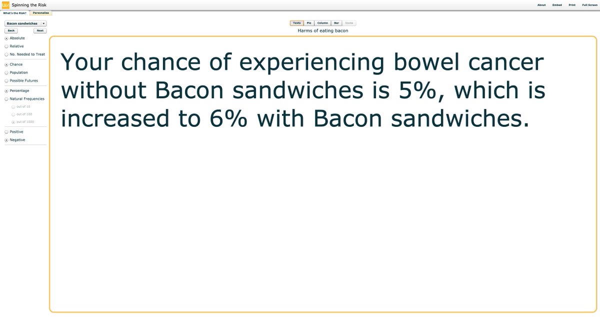
@d_spiegel Sticking w risk of bacon eating, at the top there is a text description of what the animation is showing
Here it's describing your chance of bowel cancer (sorry I said colon above) if you do/do not eat bacon, out of 100.
Absolute risk is given as selected in the side panel
/5
Here it's describing your chance of bowel cancer (sorry I said colon above) if you do/do not eat bacon, out of 100.
Absolute risk is given as selected in the side panel
/5
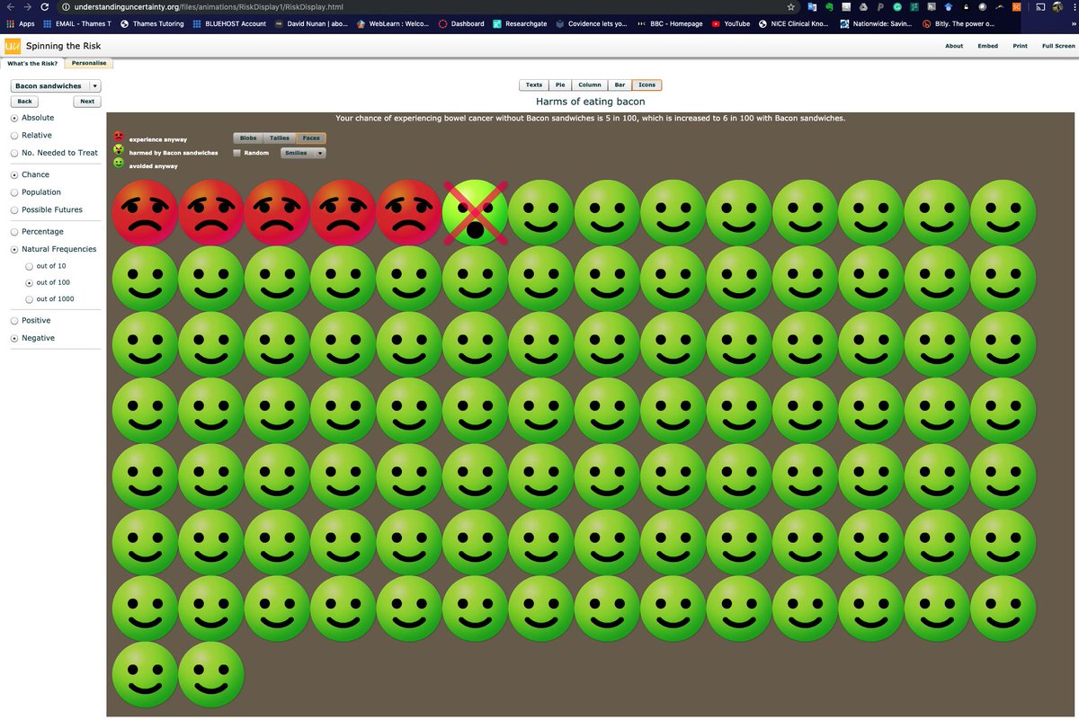
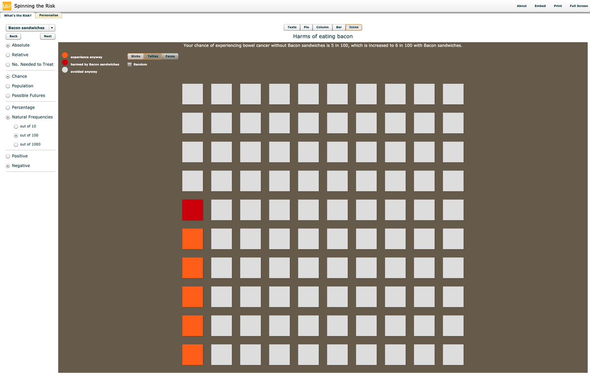
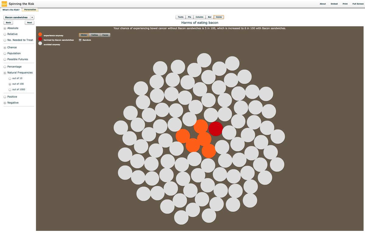
@d_spiegel You can display risk as smiley faces, or as ‘tallies’ or ‘blobs’ (see pics).
The text at the top stays the same based on the settings selected in the left hand panel.
/6
The text at the top stays the same based on the settings selected in the left hand panel.
/6
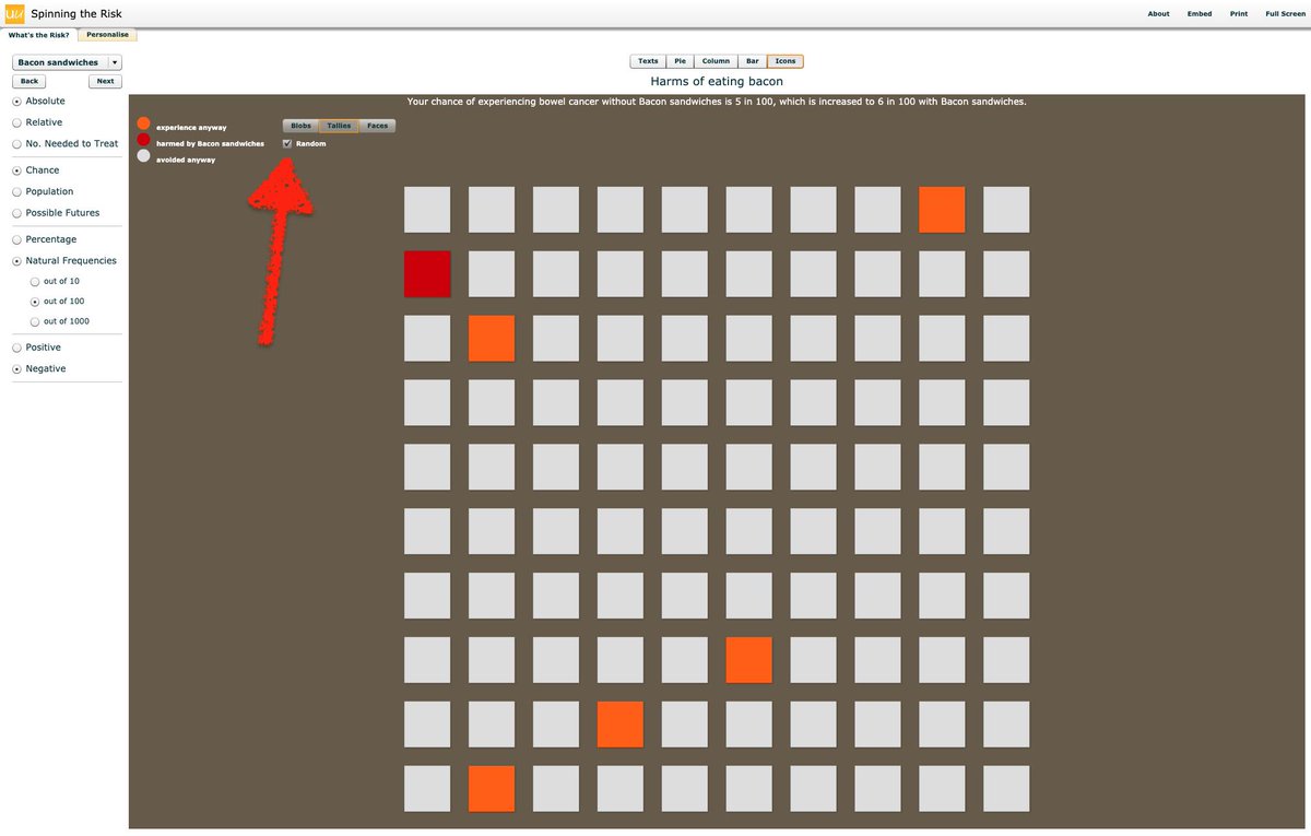
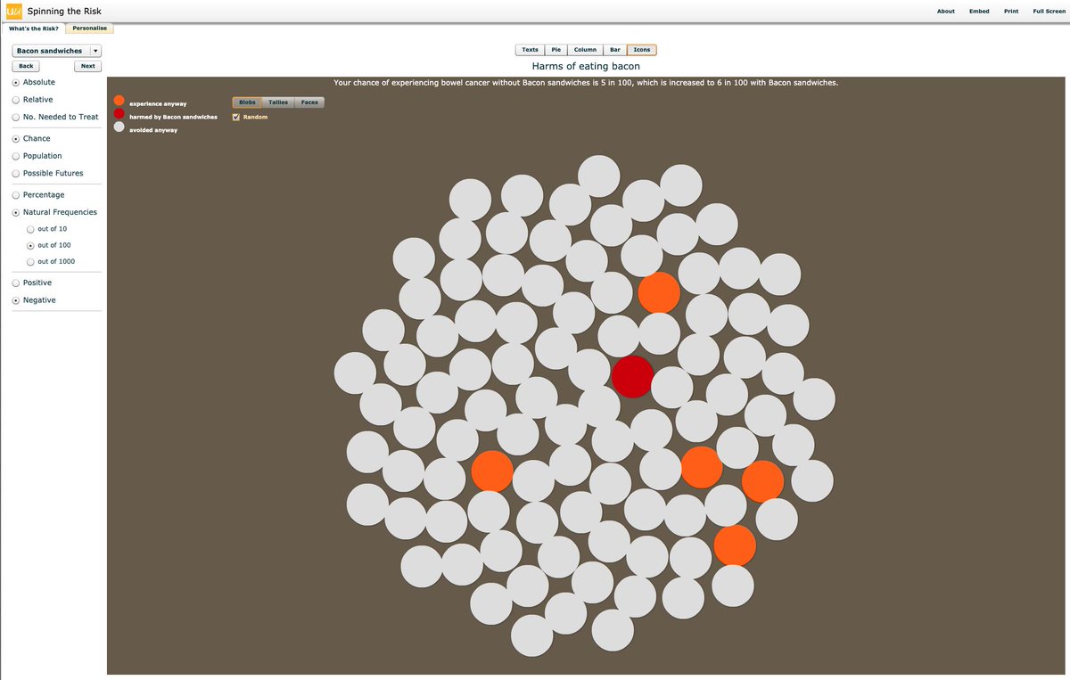
@d_spiegel You can display the icons in each animation in a structured order (like I showed in tweets 5 & 6), or you can choose a random order by selecting the ‘☑️ Random’ box.
/7
/7
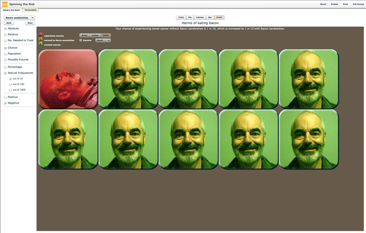
@d_spiegel In an attempt to overcome possible known academic stereotypes (particularly statisticians), David has included a fun feature whereby you can change the smileys to any picture you would like.
He provides as default a picture of Marilyn Monroe and...
/8
He provides as default a picture of Marilyn Monroe and...
/8

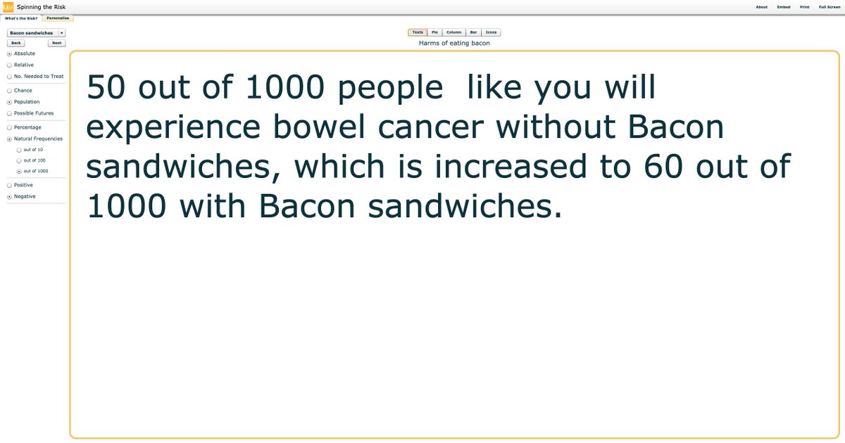
@d_spiegel Ok. Going back to the left panel, under ‘Natural Frequencies’ you can choose from 1/10, 1/100, 1/1000.
Here’s 1/10. Ugh!!
/10
Here’s 1/10. Ugh!!
/10
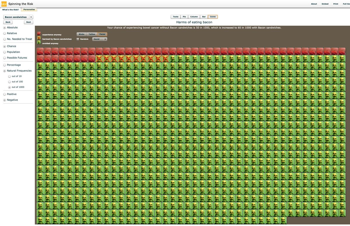
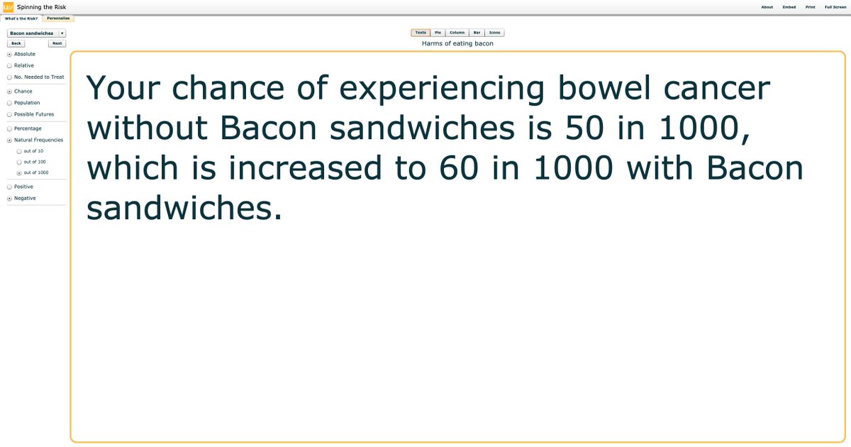
@d_spiegel Note how the text at the top also changes accordingly. We are still in ‘Chance’ mode (left panel) so it describes your chance of bowel cancer out of 10.
Here’s out of 1000.
/11
Here’s out of 1000.
/11
@d_spiegel And here’s a clip of changing from ordered to random, which shows how actually these events occur by random.
/12
/12
@d_spiegel Where were we. Oh yes.
You can also display risk (and change in it) using column/bar charts...
/13
You can also display risk (and change in it) using column/bar charts...
/13

@d_spiegel And (my personal favourite), text.
@d_spiegel We can change the animations/charts and text from natural frequencies to percentages using the left side panel options.
We are still on absolute risk (as percentage) and your individual risk.
/16
/
We are still on absolute risk (as percentage) and your individual risk.
/16
/


@d_spiegel We’ve been talking individual risk up until now. Using the options in the left panel, we can choose to look at ‘population’ risk:
/19
/19

You can also have risk explained in possible futures:
/21
/21

And these can again be in absolute (tweet 21) or relative terms:
/22
/22

Due to our cognitive biases (in this case anchoring), you may not have noticed the framing of risk up until now. It has all been NEGATIVE. Eg. ‘Your chance of EXPERIENCING…'
Well, you can choose to switch this to a POSITIVE framing:
Well, you can choose to switch this to a POSITIVE framing:

And the positive framing can be as individual risk (tweet 23) or again population level risk:

The tool also has 10 yr risk for statins built in.
Here’s a positively framed absolute individual risk of heart attack
/25
Here’s a positively framed absolute individual risk of heart attack
/25

And to finish - remember that I said you can personalise the smileys…..
/26
/26


For me this is one example of a great tool to help me understand the different ways risk can be understood, practiced, learnt and taught.
We just need it as a modern #Python #Shiny App to use at the beside. @d_spiegel ???
END
We just need it as a modern #Python #Shiny App to use at the beside. @d_spiegel ???
END