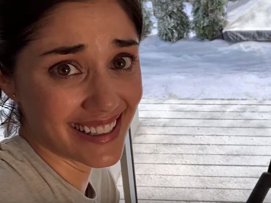
🙈 why is she so scared?
🙈 why is she so filming herself?
but that's not WHY it's so disturbing. it's disturbing because…………
who are we?
we watch her get the present.
we watch her get on the bike.
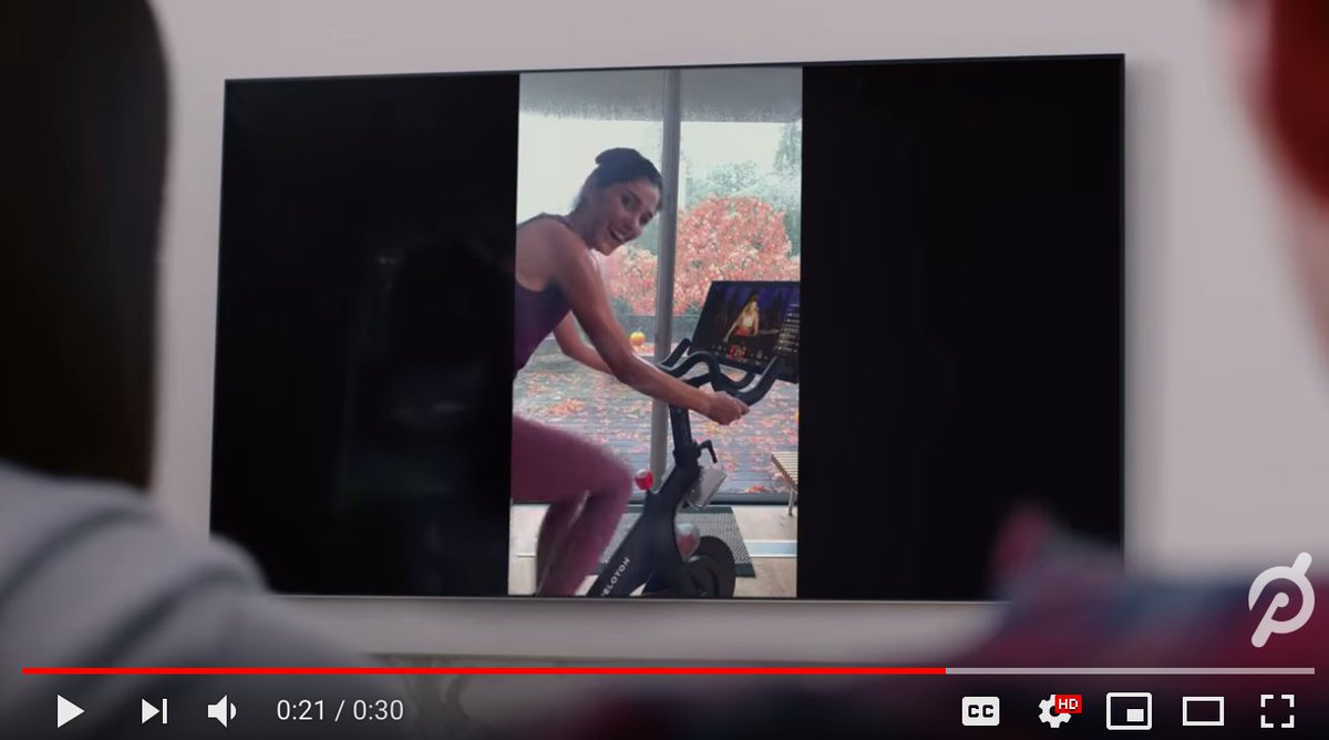
we watch the video she filmed.
but… who are we?
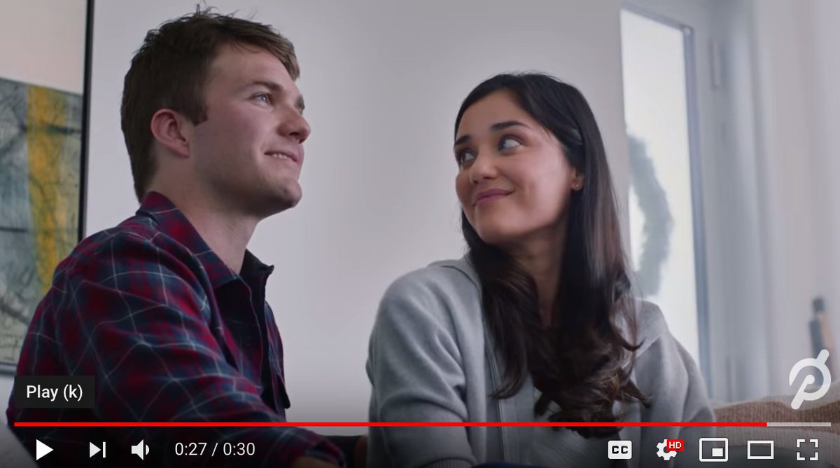
the scriptwriters actually wrote OUR PERSPECTIVE to be the husband's perspective.
all her work… is for us.
she does not CHANGE
she does not OVERCOME
she does make a lot of facial expressions at us/the husband stand-in.
the "star" of the commercial, who it's ALL FOR, is the passive buyer of the product. not the user.
we get turned into a character we didn't ask for,
looking at out a world that isn't ours,
being pandered to in a way that feels super gross
example with a woman fencer:
who's it for?
what do they want?
how does the product deliver that?
good copywriting makes the reader the star… the hero of their own journey. not the product.
and definitely not a weird, mute, gift-purchaser stand-in like peloton did.
first person
second person
third person
third person omnicient
same for tv scripts, and there's a reason it's almost never "second person" (you). but that's what peloton picked.
it's gross because
we feel gross because
she made that scared face AT US
unpacking the peloton, setting it up, cringing at the first exercise, slapping the 6am clock even while she was rubbing her hair and yawned, and at the end she said:
"i did it."
that would have been a winner.
stackingthebricks.com/how-i-increase…
the husband… watches. a passive voyeur, not the star.
stackingthebricks.com/subscribe/
the creepiness isn’t in the text, it’s in the subtext. the framing, the point of view, the timing
just like how someone recut Mary Poppins like a horror movie
all human work deserves criticism — meaning the analytical kind:
🤔 does it work?
🤔 how?
🤔 why?
🤔 what choices did they make?
🤔 what’s the outcome?
for
1. understanding
2. improvement
3. society
that is next level


